

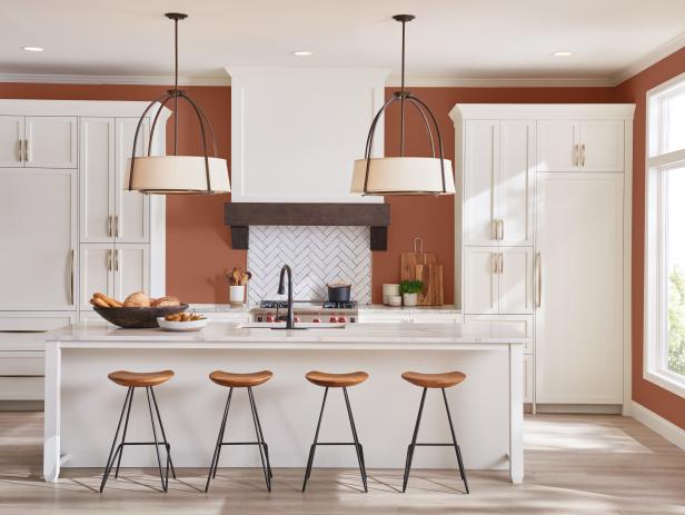
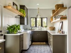
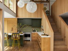
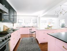
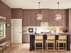
Top 50 Kitchen Paint Colors 51 Photos
Have you ever seen a kitchen cabinet or wall color you loved and wanted to know the exact paint shade? We have you covered! From modern desert clay to sophisticated seafoam and everything in between, these top 50 colors will transform your kitchen.
Editors' Picks


Our Latest Design Ideas


Color Tips and Tricks
More in Decorating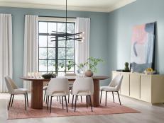


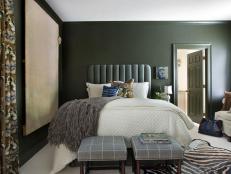


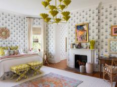


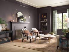


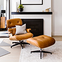
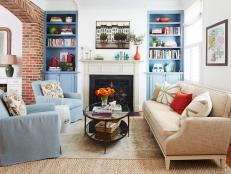
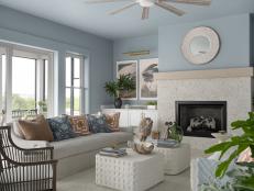
Living Room Design Ideas
More in Rooms


Homes We Love
More in Home Tours


Watch: Handmade Home Tours

Shop Our Favorite Home Decor

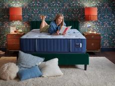
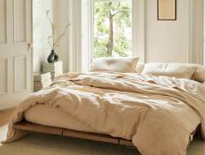
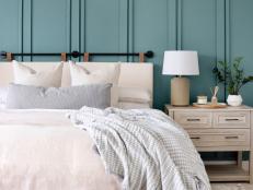
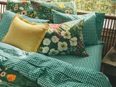
16 Breathable Bedding Sets for Summer May 13, 2024
Give your bedroom a summer refresh with lightweight, cooling bedding that's perfect for warm nights and hot sleepers.

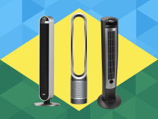
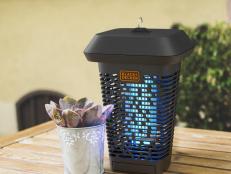
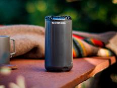
The Best Garage Fans to Keep You Cool This Season May 9, 2024
Staying cool during hot months is essential, especially when you're spending time in your garage or workshop. Add one of these fan …
The Best Furniture to Buy on Amazon for Every Room May 1, 2024
Style your space without spending a pretty penny.

The 10 Best Bookcases and Bookshelves on Amazon Apr 30, 2024
Boost the storage and style in your home with the best bookcases on Amazon — all under $250.

Mermaid + Blobcore = Jellyfish Aesthetic, and We’re Ready Apr 17, 2024
With wild geometry, deep-sea neon, glistening iridescent finishes and graceful flow, jellyfish-inspired decor is design’s new darl …

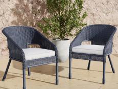
105 Best Patio Furniture Buys for Every Style and Budget Apr 12, 2024
From Adirondack chairs to benches to gliders, refresh your space with our top picks for patio furniture seating so you can kick ba …
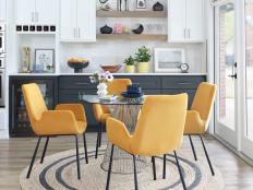
20 Dining Room Rugs for Every Style, Size and Budget Apr 12, 2024
See which type of area rug goes best with your dining table, and shop our favorites.

The Best Kitchen Faucets for Every Style and Budget Mar 27, 2024
Make a splash in your kitchen design with our favorite faucet finds.
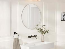
35 Best Bathroom Sinks for Every Style and Space Mar 27, 2024
Clean up your act with a new bathroom sink. Shop our top picks for popular styles like pedestal, undermount, vessel and more.
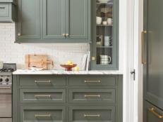
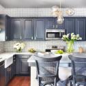
The Best Kitchen Cabinet Hardware Finds in Every Finish Mar 25, 2024
Give your dated kitchen drawers and cabinet doors a refresh with our designer-worthy hardware picks in every finish.

10 Best Hammocks of 2024 to Help You Enjoy Some R&R Mar 4, 2024
Spring is in full swing! Make sure you get a little "me time" with these top-rated hammocks.
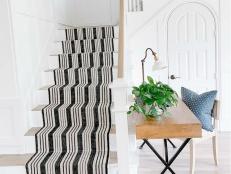
The Best Rugs for Every Room in 2024 Mar 1, 2024
Ground your space in style and function. Bring our know-how underfoot to discover which rugs to put where in your home.

The Best Futons for Every Budget and Style Feb 29, 2024
Make any room guest-ready with a versatile futon that transforms from seating to a bed in mere seconds.
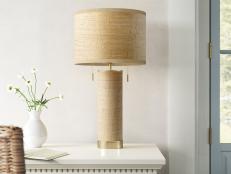
The Best Table Lamps for Every Style in 2024 Feb 28, 2024
Set the mood and make a statement in any room of your house with the help of our hand-picked table lamp finds.

The 20 Best Home Decor Pieces on Amazon That Look Expensive Feb 23, 2024
Shop the best decor finds that all ring in under $200.
The Best Spring Bedding and Sheet Sets of 2024 Feb 22, 2024
Welcome the sunshiny season ahead with these fresh comforters, sheet sets and throw blankets.
The Best Spring Decor Under $50 on Amazon Feb 20, 2024
Ring in the cheeriest season with pastels, fun prints and florals — and our picks all cost less than $50.
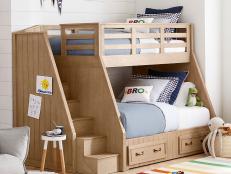
25 Best Bunk Beds for Kids and Teens Feb 16, 2024
Double (or triple!) the sleeping capacity of your room with these stylish and uber-functional bunk beds.
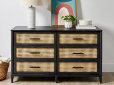
The Best Dressers Under $500 Feb 14, 2024
Get the storage you need (without breaking the bank) with these beautiful and budget-friendly dressers.

The Best Pet-Friendly Couches of 2024 for Every Budget and Style Feb 12, 2024
Having pets doesn't mean you have to let your sofa go to the dogs (and cats). Discover the best fabric for a pet-friendly couch, a …
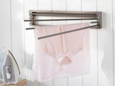
The Best Clothes Drying Racks Feb 8, 2024
Not all our clothes and linens are made for the dryer. Keep your favorite pieces looking brand new with the right drying rack for …
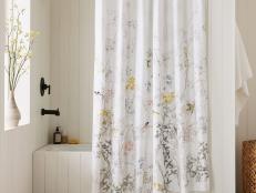
The Best Shower Curtains for Style and Functionality Feb 6, 2024
Pull out all the stops with these top-rated shower curtains.
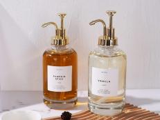
This Amazon Store You've Never Heard of Is Full of Stylish, Perfectly Imperfect Home Goods May 7, 2024
Amazon might not be the first place you'd think to shop for hand-blown glass, ceramics, real linen textiles or home decor in gener …
13 Best Sectional Sofas for Every Space Feb 2, 2024
Stretch out in style with these comfy L-shaped, U-shaped and modular sectionals.

10 Best Beds With Storage for Every Style Jan 31, 2024
Sleep easy knowing your bedroom is clean and organized with these dreamy storage bed designs.
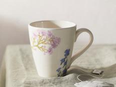
36 Mugs You'll Love, According to Your Horoscope Jan 18, 2024
It's a sign! Find your perfect mug with a little help from the zodiac.

The Best Protective Couch Covers for Pets and Kids Jan 30, 2024
Messy fingers and muddy paws don't stand a chance against these sofa slipcovers.

The Best Kitchen Rugs for Style and Function Jan 29, 2024
Get the best of both worlds with our favorite kitchen rugs that are comfortable, practical and good-looking.
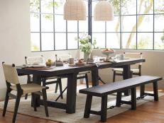
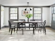
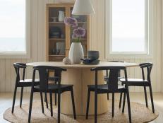
The Best Dining Room Tables for Large Crowds Jan 26, 2024
Whether you have a large family or are always hosting grand get-togethers, an extra-large table is a must. These tables were made …
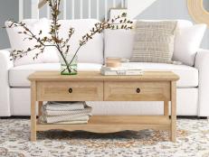
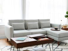
14 Best Coffee Tables With Storage for Every Living Room Jan 30, 2024
You can never have too many hiding places for your stuff. Check out our top-rated coffee table picks with unmatched style and ampl …