HGTV Home by Sherwin-Williams Announces Its 2024 Color Collection of the Year
Make your home your personal retreat with this year's trending color palette, Renewed Comfort. These 10 soft yet expressive paints (including the Color of the Year, Persimmon) bring a restorative calm — and a touch of personality — to every room.

Related To:

Photo By: HGTV Home by Sherwin-Williams
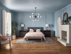
Refresh Your Space With Renewed Comfort
Creating a more comfortable home will continue to be a guiding design principle in 2024, and HGTV Home by Sherwin-Williams is embracing the trend with their new color collection, Renewed Comfort. These 10 softened shades aim to create cozy interiors without shying away from color. The result: A soothing space with plenty of personality.
Get inspired by these refreshing paints shades and see how you can use them in your home.
2024 Color of the Year: Persimmon
The brightest color in the palette is Persimmon — HGTV Home by Sherwin-Williams' pick for the Color of the Year. This lightened-up terra cotta hue looks sorbet-like in sunny rooms, making it the ideal mix of earthy and vibrant.
How You Can Use It
Cover all the walls and trim in a living space for a happy, saturated feel that gets progessivly warmer and cozier as the sun sets. This fruity shade pairs perfectly with the more neutral paints in the collection as an accent on furniture, like a bathroom vanity or kitchen island.
Stardew
This watery blue hue, Stardew, has sparkling and airy qualities, but gray tones keep it calming. It's a mature and multifaceted light blue that brings instant rejuvenation.
How You Can Use It
This versatile paint would feel at home in almost any space. Whether your style is modern or farmhouse or traditional (or somewhere in between), this agreeable shade would freshen up walls, ceilings or cabinetry with ease.
Oakmoss
"Calling all Anglophiles! This is pretty much the color of every fancy house's library or drawing room in all your favorite British period movies," says Kate Doherty, market director, HGTV Magazine. This classic, earthy green — Oakmoss — is full of character and charm.
How You Can Use It
In your favorite period dramas, it would be paired with leather chesterfields and antique rugs, "but it looks just as good today with a crisp white sofa and graphic modern accessories," says Doherty.
Cyberspace
The deepest color in the collection is Cyberspace — a rich charcoal gray with cool undertones.
How You Can Use It
This dark neutral works well with all the other paints in the collection and would look sleek and modern on trim or other accents. Use it in a room with white walls for an unexpected, softened alternative to black paint.
Utaupeia
This reliable shade of beige may be trending, but it also has classic appeal. "Utaupeia evokes comfort and warmth that will bring a timeless look to your space for the next 20 years," says Lauren Fansler, contributing writer and designer liaison for HGTV.com.
How You Can Use It
Try it on bedroom walls for a serene spot that can change with your ever-evolving design style. With this true neutral as a backdrop, upgrading your space is as simple as swapping in new pillows or changing your bedding.
Friendly Yellow
"In my early 20s I made the mistake of painting a windowless room in my apartment an eye-searingly bright yellow in an attempt to cheer up the space," says Jessica Dodell-Feder, executive editor, HGTV Magazine. "I wish Friendly Yellow had been around then. It reminds me of fresh butter and wildflowers."
How You Can Use It
"It's the color you'd see in the most perfect country cottage," says Dodell-Feder. Try it on the walls or ceiling of any room for a joyful glow that won't overwhelm the space.
Dark Auburn
"Brown is back, but this brown-meets-red shade is more fun," says Jami Supsic, home and style director, HGTV Magazine. Dark Auburn strikes the right balance of brick and burgundy. "Red paint usually skews modern, and this one certainly could," she says, "but it also feels organic."
How You Can Use It
"I love the drama of painting this color on all the moldings, ceiling and walls in a room," says Supsic. "It has a stunning effect."
Softer Tan
"Softer Tan offers both the happiness of yellow paint and the airiness of a subtle neutral," says Caroline Alkire, convergent managing editor, HGTV.com. Like a sunny field of wheat, this paint shade evokes the warmth and comfort of nature.
How You Can Use It
"I’d use it to freshen up my bathroom, bedroom or even my kitchen," says Alkire. "Alongside terra-cotta-colored furnishings and flooring, as well as bold accessories, this shade becomes even warmer."
Waterloo
"Blue is my favorite color, and I admire how refined this shade is," says Lora Yoon Huh, deputy home director, HGTV Magazine. With warm gray notes, Waterloo is a rainy blue that envelopes you like a peaceful sky after a storm.
How You Can Use It
"I really like how adaptable this color can be," says Yoon Huh. "It could create a moody powder room or a cheerful and balanced living room." In a kid's room, like this one, it's a versatile backdrop that can grow and change with your child.
Pearly White
The collection's most functional shade comes in the form of Pearly White. This not-so-bright white has hints of gray, so it creates a clean look that's not at all sterile.
How You Can Use It
Siding, ceilings, trim, walls — this hardworking white paint can do it all!