HGTV Home by Sherwin-Williams' 2023 Color Palette Is Full of Vintage-Inspired Charm
Romantic and nostalgic, the Vintage Homestead collection embraces the comforts of the past. Comprised of 10 earthy tones — including the Color of the Year, Darkroom — the palette mixes and matches to create a look that effortlessly balances modern style with tradition. Here's how you can use it in your own space.

Related To:

Photo By: HGTV Home by Sherwin-Williams
Slow Down With Vintage Homestead
As periods of restriction and uncertainty continue to shape daily life, the Vintage Homestead collection from HGTV Home by Sherwin-Williams looks to the past for a sense of comfortable ease. The palette of 10 heritage-inspired hues satisfies our nostalgia for simpler times and a slower pace. Take a look through the gallery and you’ll see how these timeless shades evoke joy when mixed with new and old design elements.

Darkroom
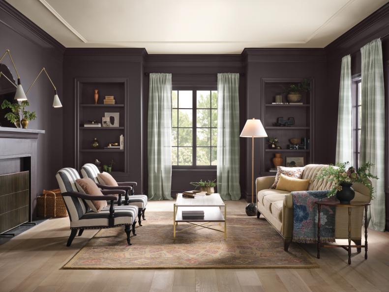
The boldest shade in the collection, Darkroom has earned the title of HGTV Home by Sherwin-Williams’ Color of the Year. This rich black with eggplant undertones is undoubtedly romantic, moody and elegant all at once.
How You Can Use It
The purple notes in this black paint means it adds drama to almost any space in a soft, inviting way. In a living room, it elevates the design while maintaining a cozy and relaxed feel. Another plus: Since it’s a neutral, it accents the other shades in the collection effortlessly and can be used indoors and out.
Restrained Gold
“Like a sunwashed field of wheat or the subtle gleam of burnished brass, this golden hue takes its color cues from Mother Nature,” says Camille Smith, design and decorating managing editor, HGTV.com.
How You Can Use It
“Warm and inviting, Restrained Gold is the perfect backdrop to an activity-filled common area like a foyer, mudroom or family room,” says Smith. “Color psychologists credit all shades of yellow with sparking creativity, optimism and imagination, making this sunny shade a great choice for home offices and kids' playrooms, too.”
Wall Street
“Wall Street is a soothing shade that fosters a relaxing vibe and adds just the right amount of color to a space, without being overwhelming.” says Lauren Fansler, contributing writer and designer liaison for HGTV.com.
How You Can Use It
This traditional-meets-trendy paint adds charm and sophistication to functional rooms like a den, family room or even a powder room. “This modern hue will prove to be a timeless addition to any space,” says Fansler.
Hot Cocoa
Warm, velvety, indulgent — just like everyone’s favorite cold weather treat. Hot Cocoa is a surprising favorite in the palette. “Brown is back, baby, and I'm loving it!” says Jami Supsic, home director, HGTV Magazine. “This shade is perfect for people who want to dip their toe into the brown trend. It’s a contemporary mauve.”
How You Can Use It
“Since it pairs well with oak, brass and black — all of which are extremely trendy at the moment — this color would be a stunning pick for cabinetry,” says Supsic.
Cool Beige
Cool Beige is a work horse in the palette, as it blends beautifully with all the other colors in the collection. This contemporary taupe exudes classic comfort.
How You Can Use It
This paint color is a winning choice for a formal space, like a dining room where it strikes the perfect balance between traditional elegance and relaxed style. This muted hue mixes well with vintage-inspired decor, like traditional rugs, as well as earthy elements like caning and natural fibers.
Pewter Green
"I’ve always been attracted to greens, so I was really excited to see Pewter Green in this year’s palette," says Caroline Alkire, managing editor, convergent, HGTV.com. This muted forest green ties into the collection's theme of the romance of rural living. "It's so calming and classic," says Alkire.
How You Can Use It
"I'm usually inclined to decorate with neutrals, but I would totally use this color in a bedroom. Paired with rustic elements, like exposed beams and a mix of wood tones, Pewter Green would create an inviting place to unwind," says Alkire. "It would also make for a pretty entrance used on a front door."
Glamour
"Pink is becoming the design aficianado’s new gray — a works-everywhere shade that lends a flattering glow to people and spaces," says Felicia Feaster, managing editor, HGTV.com.
How You Can Use It
"Glamour would perform beautifully in a dining room, either on the walls, or for the less adventurous, on the ceiling to make sure your guests look great. It looks especially luxe when paired with gold accents," says Feaster. "This dusty pink is also a lovely pick for a powder room to lend an elegant but still on-trend look."
Poetry Plum
"This distinguished shade of purple is full of nuance and depth," says Lora Yoon Huh, deputy home director, HGTV Magazine. "Depending on the time of day, it could read as a rich plum or a purple-y gray, which makes it a total color chameleon."
How You Can Use It
Poetry Plum has cozy qualities that would envelope a space. "It could transform almost any spot into a vintage jewel box," says Yoon Huh. "In a little girl's room, it has the potential to age with her through her teen years."
Natural Linen
Simple, organic and inviting — indicative of the Vintage Homestead collection — Natural Linen is the hardest-working color in the line (and the easiest to use). It creates a warm neutral backdrop that plays well with every other hue in the palette.
How You Can Use It
Molding, hallways and doors, oh my! This color can do it all. If you’re jumping on the wainscoting or picture molding trend, Natural Linen is a can’t-go-wrong choice for two-tone walls.
Austere Gray
Like morning fog resting on the hills, Austere Gray inspires peace and stillness. The green undertones make this misty gray extra special.
How You Can Use It
"If I owned a dreamy country cottage, I’d paint it this green-gray shade. Maybe one day!" says Jaimie Dalessio Clayton, deputy editor, HGTV Magazine. "In the meantime, I think it’s a perfect non-boring neutral for any room."