Next Up

How to Make the Best of Bad Decorating Mistakes, According to HGTV Stars

May 02, 2024
Follow Kathleen on:

We've all faced design hurdles in our homes. Here's how to overcome them using HGTV hosts' genius ideas.

Price and stock could change after publish date, and we may make money off these affiliate links. Learn more.
From: Jasmine Roth
Scroll For More Photos
1 / 29

HGTV Stars Are Here to Help!

Owning or renting a home comes with challenges. There are endless decisions to make when creating a comfortable space that reflects our personal style — like deciding on a layout or picking paint colors. It can be daunting to navigate. Luckily, we have talented HGTV hosts and designers to look to when mistakes inevitably get in our way. Read on for their brilliant ideas on how to fix any and all home decorating woes.

More photos after this Ad

Photo: Michael Dawkins Home. From: Michael Dawkins Home
2 / 29

Problem: A One Note Living Room

Contemporary decor can be great for those looking for a tidy, modern space. But this all-white living room lacks personality and character. Multiple forms of seating in the same fabric combined with a neutral rug fall slightly flat.

More photos after this Ad

Photo: Shawn G. Henry/Getty Images. From: Jonathan Knight, Kristina Crestin and Farmhouse Fixer
3 / 29

Solution: Mix Materials

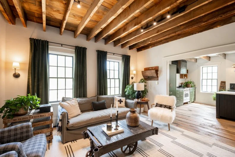
Farmhouse Fixer hosts Jon Knight and Kristina Crestin pull off their signature collected style with a carefully balanced mix of materials. Green velvet drapes, a furry side chair, a slipcovered sofa and a reclaimed wood coffee table come together to give this living room a found feel. Mixing and matching fabrics and finishes allows each piece of furniture to tell a story of its own.

GET FARMHOUSE STYLE IN YOUR HOME

More photos after this Ad

Photo: Rick Mattson
4 / 29

Problem: Cramped and Forgotten Patio

No matter the size, outdoor spaces are an opportunity to make your home feel bigger. But an ignored patio with no seating, a bulky storage unit and no personality isn't inviting in the least.

More photos after this Ad

Photo: Rick Mattson. From: Jasmine Roth
5 / 29

Solution: Set Up Small-Scale Furniture

The key to maximizing tight outdoor spaces is to find the right sized furniture. Jasmine Roth, host of Help! I Wrecked My House, redesigned the back patio of her mom's condo. A single sofa with storage under the arms and a petite ottoman that doubles as a side table are all she needed to create a cozy, functional corner. String lights, a vintage surfboard and genius click-in wooden floor tiles add to the ambiance without taking up square footage. “If you do it right, patios can feel like you’re adding an entire room to your house,” Jasmine said.

TOUR THE CONDO

More photos after this Ad

6 / 29

Problem: A Dated Fireplace

A fireplace stuck in the past had lots of potential in this Help! I Wrecked My House home, but its finish looked cheap and its mantel was too small for its large scale.

More photos after this Ad

From: Jasmine Roth
7 / 29

Solution: Resurface the Brick

Without changing its footprint, Jasmine gave the dated fireplace a cali-cool refresh by resurfacing it with stone veneer. A more prominent wood mantel brings in new texture and fits better with the scale of the fireplace, while an extended hearth leaves room to stylishly store spare logs.

Get More Ideas

More photos after this Ad

8 / 29

Problem: Furniture in Front of Windows

Sometimes the shape of a room makes configuring the right layout difficult. In this living room from Season 2 of Build It Forward, the bookshelf and television unit are positioned directly in front of the only windows, blocking any natural light from coming into the space. Oversized furniture, old beige carpet and a lack of lighting fixtures worsen the dingy atmosphere.

More photos after this Ad

Photo: Betsy Dutcher
9 / 29

Solution: Create a Smarter Layout

Taniya Nayak created a layout that works with (instead of against) the room's existing architectural features. She moved the television to the opposite wall and selected a low-profile sectional to sit in front of the windows. Now natural light floods into the room through sheer curtains. A neutral color palette with layered texture keeps the ambiance bright and airy.

THE THE HOME

More photos after this Ad

Photo: Christina Wedge. From: Robin LaMonte
10 / 29

Problem: Front-and-Center Work Space

Work-from-home spaces are a new essential these days — but for a healthy work-life balance, they shouldn't be the center of attention. A large desk in the center of this home's living space is a constant reminder of work. Not to mention, it's not so pretty to look at.

More photos after this Ad

From: Hilary Farr
11 / 29

Solution: Disguise Your Desk

Take a note from Hilary Farr's design from Tough Love With Hilary Farr and camouflage your workspace. The built-in bookshelf in the back right corner of this living room doubles as a desk. “Consider what your home office constitutes,” said Hilary. “Do you need a printer? Two screens? Find a surface that isn’t the kitchen table or countertop. You need to be able to tuck it out of sight so it’s out of mind."

MORE TIPS FROM HILARY

More photos after this Ad

Photo: Brian O'Doherty
12 / 29

Problem: Bulky Furniture

Heavy, wood furniture in this dated main bedroom from Season 3 of the Ugliest House in America reads as way too big, even if the room is spacious. And rose patterned wall-to-wall carpeting isn't doing the space any favors.

More photos after this Ad

Photo: Noah Willman. From: Alison Victoria
13 / 29

Solution: Choose Clean Lines and Multi-Functional Furnishings

Alison Victoria said bye-bye to the roses and hello to new luxury-vinyl flooring that brightens and modernizes the room. Midcentury-modern furniture boasts sleek lines and a clean feel. Nightstands that double as dressers offer more storage than the previous clunky wood pieces. Rotating the bed to the opposing wall even left room for an intimate seating area.

TOUR THE HOME

More photos after this Ad

14 / 29

Problem: Lack of Lighting

Two small light fixtures in a kitchen without any windows were not enough to illuminate this Season 4 Ugliest House in America space. Dark cabinets, dark counters and dark floors added to the dreariness.

More photos after this Ad

15 / 29

Solution: Add Recessed Lighting and Pops of Color

Once again: Alison to the rescue. She nixed the quirky fixtures that lacked purpose and opted for recessed lighting, which properly illuminates the kitchen despite it's lack of windows. Turquoise on the range hood and the refrigerator pop against brilliant white cabinets and add personality without weighing down the space.

TOUR THE HOME

More photos after this Ad

Photo: RYAN FEDOR
16 / 29

Problem: Disjointed Paint Job

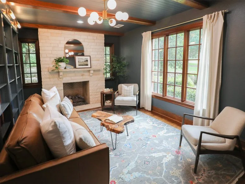
This No Demo Reno living room had some good things going for it: nice navy walls, a stunning stone fireplace, charming wooden beams and trim and plenty of natural light — but the white ceiling felt out of place.

More photos after this Ad

Photo: RYAN FEDOR. From: Jennifer Todryk
17 / 29

Solution: Envelop the Room In One Color

To fix the disjointed ceiling, host Jenn Todryk stretched a fresh paint job all the way the across the ceiling. Charming natural textures (the wooden beams and stone fireplace surround) paired with the worn, denim hue create an intimate, study-like ambiance. Jenn rooted the room with a pale area rug in the same color family.

MORE DESIGN IDEAS FROM JENN

More photos after this Ad

From: Rentfluencer
18 / 29

Problem: Unorganized Pantry

A standalone storage unit might not have enough space for all your food. The cabinet shoved into the corner of this kitchen looks out of place, and those boxes piled on top are hard to reach and an eyesore.

More photos after this Ad

19 / 29

Solution: Build Custom Storage

According to real estate moguls and hosts of Married to Real Estate, Mike Jackson and Egypt Sherrod, a built-in pantry is always worth it. “Pantries are huge for resale value, especially for families,” Egypt said of the custom storage space they created for their Rock the Block Season 3 home. Even if you don't have room for a walk-in pantry, consider building a smaller network of smart shelving somewhere in your kitchen. Include a mix of cabinets, open shelving and drawers (to hide clutter!).

MORE IDEAS FROM EGYPT AND MIKE

More photos after this Ad

Photo: @properties, a member of Luxury Portfolio International. From: @properties and Luxury Portfolio International®
20 / 29

Problem: A TV That Stands Out

Exposed wires and a lack of surrounding artwork make the TV in this contemporary space look like an obvious afterthought. The clear storage container below also highlights the TV's less-than-ideal placement.

More photos after this Ad

21 / 29

Solution: Make It Look Like Art

Faced with the challenge of where to put a TV in this tight living room, Egypt and Mike came up with the idea to build a frame that makes it look like art and not an eyesore. The wood back and small display shelf ensure the TV isn't the center of attention, while art displayed on the screen helps it blend in as decor.

See More From HGTV Magazine

More photos after this Ad

From: Erin Napier and Home Town
22 / 29

Problem: Bland Beginnings

This historic home was full of character on the outside, but inside was a different story. The fireplace's dull, skinny mantle had no pizazz and the faded yellow walls felt worn.

More photos after this Ad

Photo: Todd Douglas/ Getty Images. From: Erin Napier and Home Town
23 / 29

Solution: Create Your Own Character

Home Town host Erin Napier took this living room from bland and boring to homey and historic without any major renovations. Textural elements — natural wood beams made from salvaged lumber and a "new" fireplace built out of old bricks — add vintage charm. Antique furniture and accessories complete the room's lived-in feel.

MORE SUPERCUTE MAKEOVERS

More photos after this Ad

24 / 29

Problem: Unused Rooms

This Fixer to Fabulous couple faced a few problems with the layout of their home. They regularly used their office, but had a formal dining room they almost never touched.

More photos after this Ad

Photo: Fixer To Fabulous, After Bedroom, Closet, Interior
25 / 29

Solution: Rethink a Space's Purpose

To make their clients' home work better for their lifestyle, hosts Jenny and Dave Marrs transformed the unused dining area into a new office. In turn, the old office became a walk-in closet. They decked out the reinvented space with ample clothing storage for both homeowners — as well as whimsical floral wallpaper on the ceiling. Rethinking how the couple used their home maximized functionality and cut down on wasted space.

MORE IDEAS FROM JENNY AND DAVE

More photos after this Ad

Photo: Jeff Herr . From: James Farmer
26 / 29

Problem: Cramped Canopy Bed

Yes, the main feature of any bedroom should be the bed, but a too-big canopy bed shoved into a too-small room is not the way to go, according to Property Brother Drew Scott. "People may aim for luxury with a canopy bed, but it usually just ends up looking gaudy and too traditional. Also, because canopies take up so much space, they make a room seem cramped," Drew told HGTV Magazine.

More photos after this Ad

Photo: DENNYS ILIC. From: Drew Scott
27 / 29

Solution: Try a Chandelier Instead

Instead of filling a room with a massive bed, Drew suggests hanging a chandelier instead. "It’ll add interest without the bulk," Drew told HGTV Magazine. The crystal one used in his Season 8 Brother Vs. Brother home makeover draws the eye up and adds interest without overwhelming the space.

MORE DESIGNS FROM THE SCOTTS

More photos after this Ad

Photo: Costas Picadas . From: Andrew Suvalsky Designs
28 / 29

Problem: Plain Vaulted Ceiling

This attic bedroom's cool angular ceiling gets lost amid all the white walls. The triangle structure feels like a forgotten feature rather than a unique form of architecture.

More photos after this Ad

Photo: Gilles Mingasson/Getty Images. From: Christina On The Coast
29 / 29

Solution: Go for Some Shiplap

The expert at making neutrals cool, Christina Hall, host of Christina on the Coast, highlighted the vaulted ceilings throughout her Southern California house with vertical beams and horizontal panels of shiplap. Yes, her ceiling is white, but the beams and panels add dynamic and eye-catching charm. Luckily, shiplap will always be one of Christina's design "ins."

MORE IDEAS FROM CHRISTINA