Let’s Not Tear Down This Wall
More photos after this Ad
In the Kitchen: Streamlined Serenity
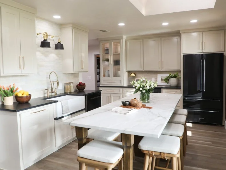
This L-shaped Season 3 kitchen had taken a turn for the worse with a mini-peninsula that killed its flow and cramped would-be cooks. Jenn swapped the stove and the sink to reorganize the space, then replaced the peninsula with a long table that parallels the rest of the room. All-new wood flooring updates the dated white tile, while black stone countertops lend the new cabinetry a hint of crisp, contemporary chic.
LEARN LAYOUTS
More photos after this Ad
In the Kitchen: Ultra-Luxe Island
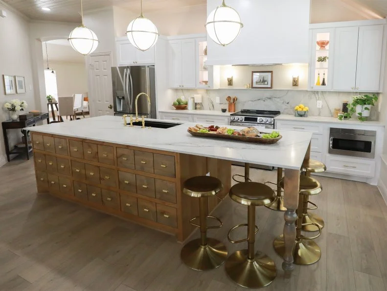
Ah, the mixed blessing of a truly massive kitchen: all the space you could possibly need is also a lot of ground to cover. Jenn gave this potentially cavernous room definition by whisking away a kitchen table that smothered the sunny window seat and bringing in a trio of oversized globes to illuminate a magisterial new island. (A massive marble slab, apothecary-cabinet details, room for six brass-accented barstools, oh my!) In place of unflattering gray paint, a dated tile backsplash and builder-grade fixtures, she’s introduced spectacular stone, architectural sconces and an oversized hood that connects the cabinetry with the soaring ceiling.
MORE KITCHEN INSPO
More photos after this Ad
In the Kitchen: More-Is-More Floor
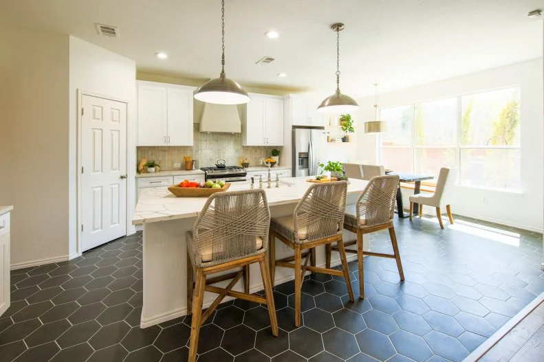
The sizable hex tiles Jenn chose for this Season 2 kitchen makeover hit the once-bland space like a twist of cracked pepper: Now there’s the spice it needed! She replaced a split-level island with a generous and multi-functional one, then brought in a trio of graphic perches to give it an eclectic edge. New custom cabinetry frames an elegant range hood, and soldier-patterned handmade tile replaces ho-hum terra cotta on the backsplash. A pair of gleaming swag lamps, in turn, finish the room like jewelry.
More photos after this Ad
In the Kitchen: Giving a Galley Breathing Room
This once-cluttered space had too many patterns, too many cabinets, too many features — and little room to move. In a galley kitchen, wall-to-wall and floor-to-ceiling storage starts to feel stifling. Jenn peeled back dated colors and finishes to reimagine the room with a pale, sleek hood, understated uppers and a soldier-patterned backsplash that delivers style without tiring the eye. Low-contrast countertops are smooth and serene, and a pair of plush chairs give the breakfast nook by the window a sense of generosity.
More photos after this Ad
In the Kitchen: Big Finishes
Jenn knocked two line items from her budget in this kitchen by keeping the floor and the layout just as they were, then updating key installations to improve functionality. Out: a two-level peninsula surface that wasn’t working as a bar area or as a sink area, too-busy granite and a diminutive island with a surface that was mostly stovetop. In: a new island devoted to storage and prep, sleek white countertops, a crisp tile backsplash crowning a relocated range and modernized cabinets that rise all the way to the ceiling.
THE NAPIER'S KITCHEN HACK
More photos after this Ad
In the Kitchen: Precious Stone
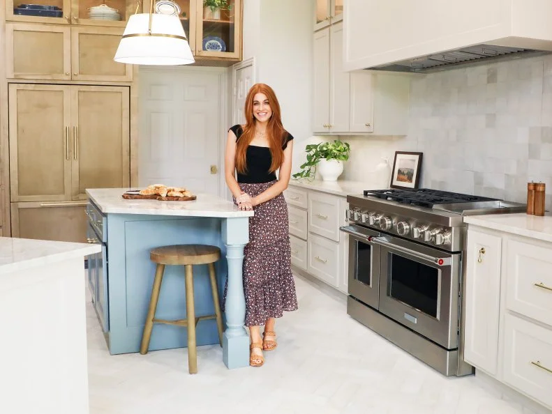
Jenn liberated this once-drab kitchen from a neutral purgatory — muddy beige tile, unlovely granite and uncoordinated, lost-in-space cabinets — with the help of some downright spectacular quartz. Installed as a waterfall to encase the new statement island, the high-contrast material sets the tone for everything that follows: Two-tone cabinets now carry their confidence to the doors leading out of the kitchen, luxe uppers meet the ceiling, stacked subway tile texturizes the backsplash and a column of appliances anchors the work area.
More photos after this Ad
In the Family Room: A Balanced Palette
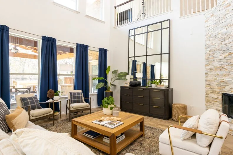
Gray had completely overtaken this sitting area, where innocuous neutral choices added up to a grim landscape of undifferentiated tones. Jenn knew the room needed a bolder tone to serve as an anchor, and sure enough, the blue hue she chose for the window treatments is just right. The color works its way down into the space through accent pillows and a richly traditional area rug. This room is still neutral, mind you, but it’s come to life.
MORE LIVING ROOM INSPO
More photos after this Ad
In the Living Room: Cool, Cohesive Color
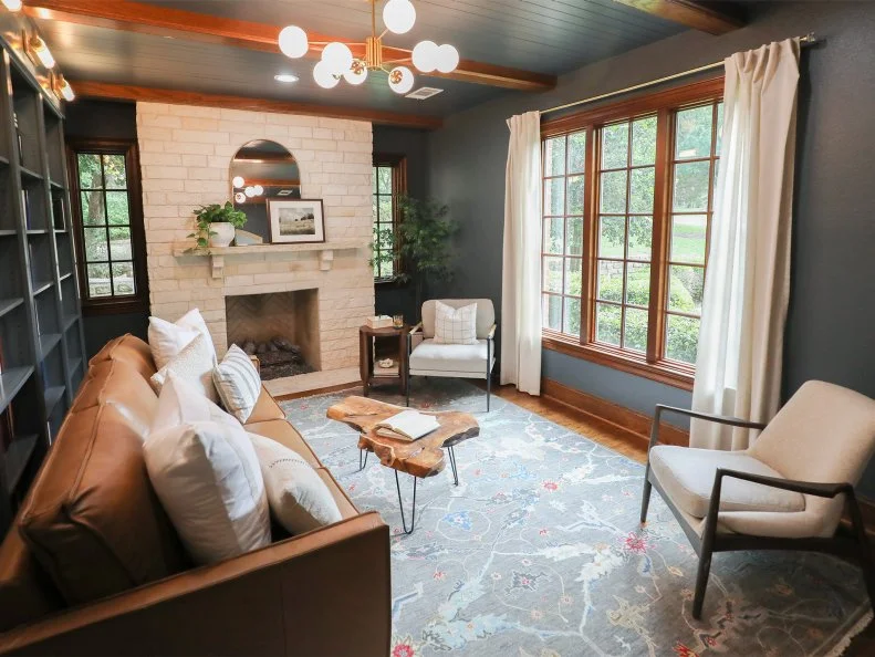
When Jenn first encountered this cozy chamber, a cream-colored ceiling made the space look disjointed — and she knew it should be enveloped in a single, all-encompassing hue. She leavened that strong statement with a mirror above the mantel, a pale area rug and a bold, midcentury-inspired statement pendant. The lesson here? When you’re lucky enough to have natural light to spare, you can double down on deep tones.
SEE MORE
More photos after this Ad
In the Living Room: Smooth Transitional
An oppressive mantel, kooky paint scheme and space-gobbling sectional made it difficult to appreciate this room’s beautiful bones and versatile interior architecture. Jenn reinvigorated it by highlighting those details more naturally: Low-contrast sand and cream tones now offer a more subtle version of the tray ceiling. A scaled-down piece of reclaimed wood lets the hearth speak for itself. Casually assorted seating — a caramel leather sofa, linen loveseat and ivory armchairs — create a space that can adapt to any gathering.
More photos after this Ad
In the Living Room: Crisp New Classics
Jenn knew that less would be much more when it came to this living room, where blowsy antique furniture, heavy woodwork and darker walls weren’t taking advantage of its two-story sunbeams. She balanced long white sofas on either side of a cylindrical, farmhouse-inspired coffee table, then chose a slightly bluer white and barely-there gray to update the walls and molding surrounding the fireplace. Cream and cocoa tones on a high-pile area rug ease the visual transition between the room’s now-airy upper reaches and its deep, walnut-toned flooring.
HOW TO USE WHITE PAINT
More photos after this Ad
In the Living Room: Reclaiming Wood
Jenn’s best friend, Alicia, was less than enamored with the red oak beams that dominated the living room in her family’s ‘80s-era home. Jenn knew the ceiling had potential, and she re-stained its wood in a darker hue that now looks downright contemporary beside much-brighter walls. A delicate new chandelier descends from the dramatic vault to (literally) lighten the mood, and sage green paint on a wall of built-in cabinets and shelves counterbalance warm floorboards and an intricate area rug.
TAKE A TOUR
More photos after this Ad
In the Dining Room: Dimensional Design
This feature-free dining room cried out for finishing touches that would make it feel both larger and richer. Jenn cultivated that sophistication by papering the upper portion of the walls with a pattern that functions a bit like paneling, then adding a chair rail and cool greige paint below. A showstopping built-in on the far wall features warm and textural interior details, and layered lighting — from the undersides of those shelves to embedded ceiling fixtures and a curvaceous bubble pendant — will give future dinner parties a just-so glow.
More photos after this Ad
In the Library: An Atmospheric Dream
This identity-free room boasted floral wallpaper and little else when Jenn got her hands on it. Drawing inspiration from her best friend’s kids (who told her how much their mom loved to read), she framed the space’s magnificent windows with her bestie’s books, created paneling coated with serene silver-green paint that carries across the ceiling, and added plush, pale seating to amp up the organic-coziness factor. The library she created looks like it’s been part of her friend’s home all along.
More photos after this Ad
In the Playroom: Working Every Angle
Once a bland workout space with a wall-spanning mirror and grim rubber flooring, this pretty playroom now boasts loads of built-in storage, pinstripes that draw the eye to its excellent architecture and an array of touchable textiles. Jenn layered a geometric area rug on top of the plush gray carpet to add graphic impact and define the space. She also tucked a loveseat beneath the window to create the perfect spot for storytime.
More photos after this Ad
In the Office: Bespoke Built-Ins
When Jenn first encountered this once-directionless room — with a desk floating in front of the window, a TV mounted on the rear wall and a pair of armchairs lost in space — she knew it was destined for greater things. She added paneling to the upper portion of the walls, then painted them a chic gray-green that carries down and across an elegant, all-new built-in storage space. That installation’s arches echo the lines in a new, better-situated desk, and well-placed art makes the most of the new paneling. Now this is a room with purpose.
HOME OFFICE IDEAS
More photos after this Ad
In the Bedroom: Paneling That Pops
Adding visual interest to a bedroom can be tricky: The room should feel finished, but too much detail can read as exhausting rather than restful. Jenn hit upon a just-right level of dreamy detail by using thin pieces of wood to create vertical "paneling," then giving the suite’s molding a floor-to-ceiling wash of pale blue paint. A gallery light and table lamp will add atmosphere in the evening when the overhead lights go down, and a distressed area rug beneath the bed contributes just a bit more luxury underfoot.
More photos after this Ad
In the Bedroom: Morning Mist
Jenn chose a barely-there marine-layer green to cultivate a sense of calm and emphasize the entryway nook’s graceful curves in this spacious bedroom. Restraint is a key component of the space’s relaxing atmosphere: Simple, symmetrical nightstand vignettes flank the bed, and understated patterns embellish the bedding and area rug. Jenn added just a bit of intrigue with the drum-shaped ottomans she added in lieu of a bench at the foot of the bed.
MORE STAR INSPO
More photos after this Ad
In the Bedroom: Pattern Play
With electric green(!) paint, a dark and stodgy furniture suite and dingy neutral carpeting, this bedroom was a parody of an old soap opera set. Jenn established its new character by grounding it with a lushly patterned, low-contrast feature wall that adds depth and interest without feeling busy, then chose a more casual combination of a chic caned bed and walnut-stained nightstands. Handsome hardwood was waiting to emerge from beneath all that tired carpet, and an overdyed area rug adds coziness under the bed without covering it up all over again. This laid-back style won’t feel dated any time soon.
More photos after this Ad
In the Sunroom: Four-Season Functionality
This jewel box had the potential to feel like a sophisticated solarium, but its glaring white walls, mottled brown brick and ill-fitting furniture gave it a neglected-patio vibe. Jenn dialed back the brightness with a moody green tone that modernizes all that brick and renders the window hardware virtually invisible. A plush, oversized white sectional balances all that deep paint, and refined details like the sleek new light fixture and illuminated art provide the luxe-accessories component of the now-successful indoor-outdoor space.
MORE SUNROOM STYLES
More photos after this Ad
In the Bathroom: Sleek Scrub-Up
Once a green meanie with a tub its owner detested, this primary bath is now a monochromatic marvel. Jenn installed sand-colored floor tiles in a handsome herringbone pattern, then carried marble up the lower half of the wall and across the new white double vanity. Warm brass faucet and cabinet hardware matches a pair of round mirrors and triple sconces, and a sculptural new tub serves as a capstone for the space’s newfound sense of quiet luxury.
BATHROOM INSPO
More photos after this Ad
In the Bathroom: Blinds and Tub, Begone!
This masterful makeunder featured the one-two punch of removing window treatments (to let the windows’ graceful shape and the sunlight they usher in take center stage) and nixing a never-used old bathtub to free up floor space. Jenn brought in chic hexagonal tiles for the floor, reimagined the shower as a vitrine, and hung a round mirror above the angular new vanity. How’s that for advanced geometry?
More photos after this Ad
In the Bathroom: Peeling Back Partitions
This main bath was once a maze of fussy half-doors, unnecessary divisions and overbuilt countertops. Jenn realized she could give her friend a much more functional retreat by whisking away all of those features and keeping things simple: A generous glass-walled shower now stands beside a bold, black double vanity while Scandinavian-style shelving rises above a streamlined soaking tub. In this more minimalistic space, the sweet demilune window just below the ceiling beam can finally enjoy the attention it deserves.
MORE STAR INSPO
More photos after this Ad
In the Bathroom: Tile With Style
Previously a “motel bathroom” groaning beneath heavy, dark tile on the floor and walls, this now-sparkling suite features barely-there glass shower walls and a shapely new soaking tub. The trio of tiles Jenn selected for the bath — crisp white underfoot, delicate Zellige tiles in the shower, and gorgeously green Moroccan tile for the vanity backsplash — infuses the room with boutique-hotel tranquility.
MORE FROM JENN
More photos after this Ad
In the Bathroom: Minimalism and Soothing Neutrals
A walled-in shower and angular tub plinth(!) made this principal bath’s soaking space look like the teleportation chamber on an old sci-fi series. Jenn grounded the space in this century by reconfiguring it as a single, integrated glass chamber with both a curvaceous soaking tub and a walk-in shower. Hand-crafted and tumbled tiles add subtle variegation to the walls and infuse the room with gentle, Mediterranean-inspired warmth.
SEE MORE