36 Interior Design Mistakes to Avoid
Interior designers have seen it all — from DIYs done wrong to retro finishes, impractical layouts and so much more. We're shining a spotlight on their biggest design pet peeves, and some of them may surprise you. Read on to see the most common interior design mistakes you might be making in your home — and how to fix them.
The first mistake on our list is also one of the most common: awkwardly arranged furniture. This neutral living room isn't small, but the way the furniture is jammed in around the fireplace makes the whole space feel cramped.
More photos after this Ad
Solution: Refocused Floor Plan
Designer Heather Scott rearranged the furniture in this living room to open it up and improve the flow. The fireplace is still the focal point, but repositioning the sofa and chairs to face each other instead of the mantel makes better use of the space.
How to Arrange Living Room Furniture
More photos after this Ad
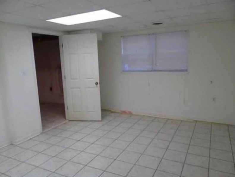
Mistake: Drop Ceiling
A drop ceiling is an unattractive design element that dates your space and makes a room feel smaller.
More photos after this Ad
Solution: Put in Drywall
One thing is for sure, you will not regret removing a drop ceiling from your space and replacing with drywall. Taller ceilings make a room feel larger and will make your space more visually appealing.
See Our Drywall Guide
More photos after this Ad
Mistake: Angled Furniture
This dining room table is positioned diagonally, cutting the room in all the wrong places.
More photos after this Ad
Solution: Making the Most of Every Inch
Designer Kim Stoegbauer of The TomKat Studio positioned the dining table in a way that makes more sense in the space, and now this dining area is completely transformed! Not only does this solution visually enhance the look of the room, it also adds more square footage.
See More Dining Room Design Ideas
More photos after this Ad
Mistake: Oversized Furnishings
This living room is out of balance and overpowered by the dark wood fireplace surround that is too large for the space.
More photos after this Ad
Solution: Employ Furnishings That Fit Your Square Footage
Simplifying the fireplace creates a more appropriate scale for this living room and opens up the space.
See These Living Room Layout Ideas
More photos after this Ad
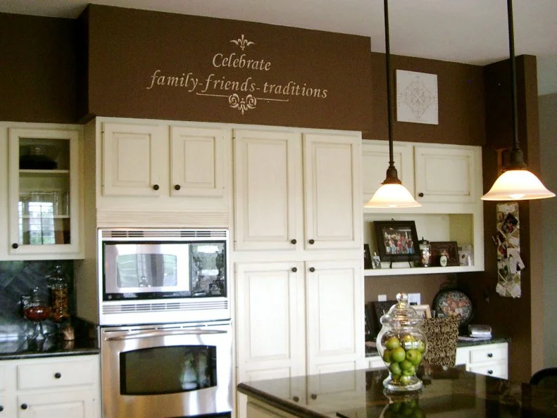
Mistake: Stencil on Walls
Much of the kitchen design is focused on the cabinets and functionality, but when homeowners rely on stencils, designers would love to show them how they can do so much more with that space.
More photos after this Ad
Solution: Curate a Collection
Incorporating something unique in the open areas above kitchen cabinetry is much more of a statement than a trendy wall decal or "cutesy" words, say the designers with Duet Design Group. Whether it be a few pieces of art that bring the rest of the kitchen together or a gathering of several vases or ceramic pieces, the options are endless.
More photos after this Ad
Photo: Robert Paul Properties, a member of Luxury Portfolio International, Tyra Pacheco Photography
11 / 72
Mistake: Short Canopy
Canopy beds are versatile, adding romance to a master bedroom or acting as the perfect hideaway spot for a child, said designer Marie Flanigan. But short canopies hinder the impact they can have on a room.
More photos after this Ad
Solution: Complete the Look With Curtains
Originally designed centuries ago to create privacy for the aristocracy, draping a canopy bed in curtains is a longstanding tradition that continues to generate texture and visual interest in bedrooms, says designer Marie Flanigan. "Just like drapes surrounding windows, canopy curtains should kiss the floor or have a slight break," she said. "Whether the intention is to draw the canopy curtains or not, it’s imperative to have the option, ensuring there is enough fabric to completely enclose the bed." Ethereal, gauzy fabrics have less visual weight.
See These Dreamy Canopy Beds
More photos after this Ad
Mistake: One Accent Wall
Designers warn to avoid painting just one wall which results in a design that feels incomplete.
More photos after this Ad
Solution: Bold Color Everywhere
Instead of one accent wall try painting all 5 walls the same color, including the ceiling. This method will have a greater design impact and create a stunning, eye-catching space, as seen in this delightfully bold blue dining room by designer Shauna Glenn.
Tour This House
More photos after this Ad
Mistake: Impractical Curtains
These dated window valances provide no actual purpose in this space, and only block the beautiful natural light from coming into the bedroom.
More photos after this Ad
Solution: Opt for Dramatic, Functioning Curtains
Instead of valances that don't match the design of your bedroom, opt for dramatic curtains that can be closed at night and opened during the day to flood the room with gorgeous natural light.
More photos after this Ad
Photo: Profusion Realty, a member of Luxury Portfolio International.
From:
Profusion Realty
17 / 72
Mistake: Bland Entry
A bland foyer does not leave a great first impression on guests. This foyer lacks personality and interest, making for a underwhelming welcome.
More photos after this Ad
Solution: Funky Foyer
Color, houseplants, art and funky rug all comprise this home's foyer and help to create a incredible first impression. Bringing your personality into your home will always be a great way to take the design of your space up a notch.
See More Foyer Design Ideas
More photos after this Ad
Photo: Anna Braund
19 / 72
Mistake: Clashing Zebra Rug With Patterned Furniture
Mixing patterns can easily go wrong. Before its makeover, this sitting room featured outdated furniture and a dizzying amount of clashing patterns. The space lacked fluidity and style.
More photos after this Ad
Solution: Pair Zebra With Solids
Zebra rugs are great for grounding a space and instantly make a sitting area feel complete. Being bold with a zebra rug doesn't mean you have to go over-the-top with prints and color in the room, says designer Abbe Fenimore with Studio Ten 25. "I love to start with great basics and ground the room with a sofa, accent chairs and accent pieces that are classic and usually upholstered in a solid fabric," she says. "Animal prints can easily overwhelm a space visually but mixing them with organic florals and plenty of texture will allow them to become part of the overall design without taking over."
See More About Zebra Print
More photos after this Ad
Mistake: TV Plays a Solo Act
A common challenge for modern homeowners is integrating televisions into their home’s decor without creating an eyesore. This pre-renovation space makes the television the star of the design of this living room.
More photos after this Ad
Solution: Create a Mixed-Media Gallery Wall
The TV doesn’t have to stand alone, says designer Marie Flanigan. The TV can also be the focal point of a gallery wall. Surround it with family photos and pieces of art, drawing the eye away from the TV when it’s not in use. "Create balance by flanking the TV with floating shelves, decked with personal treasures," she said.
Check Out These Enertainment Center Ideas
More photos after this Ad
Photo: Todd Douglas / Getty Images
23 / 72
Mistake: Random Coastal Decor
In this living room before a renovation, bright blue walls and sea life art fail to create a cohesive space.
More photos after this Ad
Solution: Contemporary Coastal Art
When trying to create coastal-themed design, use colors and texture rather than having everything layered in seashells, says designer Jennifer Mehditash with Mehditash Design. Select a more contemporary piece of art, such as the photograph of a floating jellyfish, along with basketweave fabrics, like on this sofa bed, to hint at nautical-inspired materials. "The beautiful tones allow you to create your very own personalized look and keep it sophisticated and modern," she says. Another tip: Don’t forget to look up and add something special to your ceilings. She added grasscloth to almost every ceiling in this Maui beach house.
Browse These Coastal Designs
More photos after this Ad
Photo: Stephanie Diani / Getty Images ©.
From:
Brother Vs. Brother
25 / 72
Mistake: Bland Dining Room
A small, plain space with poor lighting, as seen on HGTV's Brother Vs. Brother, is in need of a redesign because it presents a missed opportunity. Dining room and kitchen spaces can be challenging when it comes to adding color and pattern, because they rely on durability and function first, designer Abbe Fenimore says.
More photos after this Ad
Solution: Bold Art and Furniture
Paint the room — and even the ceiling— a subtle color and allow that to be the jumping-off point for your color palette, designer Abbe Fenimore says. "Art is a great way to bring in texture and pattern, and large-scale pieces look fabulous in small rooms and will make them feel larger," she says. "Think outside of the box when selecting your tables and chairs. Dining sets don't have to match, and once you find pieces you love, complement them with something in a similar style or upholster your chairs with a bold indoor/outdoor fabric for a pop of pattern and color."
More photos after this Ad
Mistake: Unorganized Open Shelving
Open shelving is an up-and-coming trend, but in this pre-makeover kitchen, the effect is just messy.
More photos after this Ad
Solution: Gather Items to Show Off
Consider how to display a collection, such as vintage cookware or ceramics, on open shelving. Designer Leanne Ford turned these industrial-style shelves into a charming spot for practical everyday dishes and a curated collection of vintage copper pots.
More Open Shelving Ideas
More photos after this Ad
Mistake: Overshadowing Windows
Windows are a beloved feature in a kitchen, but some homeowners tend to overlook them, like in this kitchen before a renovation seen on HGTV's Home Town.
More photos after this Ad
More photos after this Ad
Mistake: Tile Countertops
Tile countertops were common in the '80s, but with a wealth of materials available now, there are better options. Not only are they not the most stylish choice, but the grout can also hold years' worth of grime.
More photos after this Ad
More photos after this Ad
Mistake: Cluttered Storage
Clutter can make even a well-designed space look like a total mess.
More photos after this Ad
Solution: Stylish Storage
The home features built-in storage where the once-cluttered cabinet stood before. Creating a place to hide your personal possessions — which are less than attractive — will make your space feel more orderly.
Find More Storage Ideas
More photos after this Ad
Mistake: Bland Design
This kitchen lacks any color or personality, making it bland and forgettable.
More photos after this Ad
Solution: Personality-Filled Spaces
The newly designed kitchen features Shaker-style cabinetry, with light wood lower cabinets paired with white uppers. The gray-and-white buffalo check tile flooring adds a unique design flair that gives the space character.
How to Add Character to Your House
More photos after this Ad
Mistake: Beige + Brown
The beige wall and ceiling combined with the dark brown woodwork makes this large living room feel dark, dated and cramped.
More photos after this Ad
Solution: Cohesive Color Palette
Removing the heavy bookcases on either side of the fireplace made an immediate difference in the transformation of this living room by designer Bailey Austin Bird. The fresh white paint on the walls and ceiling also opens up the space and gives the room a more refreshing look.
See The Top Living Room Color Palettes
More photos after this Ad
Mistake: Dark Painted Ceiling
With dark wood cabinets and beige walls in combination with a dark painted ceiling, this space feels cramped and gloomy.
More photos after this Ad
Solution: Ceiling Accents
Ceiling Beams add architectural interest and coordinate with the darkly stained lower cabinets. This makes for a better solution than the prior dark painted ceiling.
More photos after this Ad
Mistake: Forgetting a Focal Point
This bedroom lacks any focal point and is just a bland, forgettable space.
More photos after this Ad
Solution: Create a Wow Factor
The bed in this renovated bedroom features a large, tufted headboard, creating a focal point for the space. The blue armchairs in front of the bay windows provide a welcome splash of color.
More photos after this Ad
Mistake: Uninteresting Lighting
This living room is a large space that features a bland light fixture that looks more like a sprinkler system.
More photos after this Ad
Solution: Go Bold With Your Light Fixtures
If you have the room, incorporate a bold, sculptural light fixture. This living room now has a dramatic chandelier that emphasizes the height of the two-story living room.
See More Living Room Light Fixtures
More photos after this Ad
Mistake: Blocking Natural Light
The piano in this living room is blocking the natural light streaming in through the gorgeous arched windows. All the space needs is a fresh coat of paint and rearranged furniture.
More photos after this Ad
Solution: Embrace Natural Light
Because this room had such great bones, the designers only needed to paint the walls white and rearrange the furniture to make the space feel fresh and bright. Moving the piano to the other side of the space allows the gorgeous natural light to stream in through the windows.
More photos after this Ad
Mistake: Unnecessary Signage
Signage that tells guests where to eat is just plain unnecessary. We all know what a kitchen and dining room are for, thank you very much.
More photos after this Ad
Solution: No Signage Needed
Let the kitchen and dining space speak for themselves. The design of this chic space is much more impactful without the unnecessary "eat" signage.
More photos after this Ad
Mistake: Oppressive Red Kitchen
Dated, dark cabinetry, dark finishes and a dark red accent wall make this kitchen look and feel cramped and uninviting.
More photos after this Ad
Solution: Sophisticated Neutrals
A variety of neutrals, that work seamlessly together, prove to be a welcoming and timeless look for any kitchen space.
See These Neutral Paint Ideas
More photos after this Ad
Mistake: '80s Strip Lighting
Lighting is key in any space, especially the bathroom. This '80s strip lighting gives this room no appeal and makes the space look dated.
More photos after this Ad
Photo: Robert Radifera, Charlotte Safavi, Jack Rosen Custom Kitchens, Dave Costopolous of Dynamic Renovations, Gretchen Everett of Everett Design.
From:
Haus Interior Design
52 / 72
Solution: Stunning Sconces
Modern sconces, on either side of the bathroom mirror, prove to be a much more beautiful design choice that will add luminance to any bathroom space.
More photos after this Ad
Mistake: Chevron
Chevron was the "it" pattern a few years back, but now designers are tired of seeing it.
More photos after this Ad
More photos after this Ad
Mistake: Carpeted Bathroom
Carpeted bathrooms are unsanitary and smelly. Any designer would recommend immediately ripping out this design feature that should be left out of the bathroom.
More photos after this Ad
Solution: Easy-to-Clean Tile
A sleek, clean tile is the best solution for any bathroom. Easy-to-clean and more sanitary than carpet, this solution is a no-brainer.
See HGTV's Fave Bathroom Tile Designs
More photos after this Ad
Mistake: Intricate Railing
The intricate stair railing, seen here, distracts from the design of the space and makes the room feel too busy.
More photos after this Ad
More photos after this Ad
Mistake: Not Accenting Original Details Properly
Before you rip out your home's original features, like a turquoise sink and toilet, first consider how these fixtures are accented.
More photos after this Ad
Solution: Making the Most of Original Fixtures
This beautiful, baby blue sink is brought back to the 21st century with gorgeous gold hardware and a matching blue-and-white floral wallpaper.
More photos after this Ad
Mistake: Unnecessary Railings
Railings like these were probably originally designed to add architectural interest, but now they just don't make sense in the space.
More photos after this Ad
Solution: Open it Up
Today, everyone loves an open-concept home, so rip those unnecessary railings out and open-up the space.
More photos after this Ad
Photo: Sarah Wilson / Getty Images.
From:
Fixer Upper
63 / 72
Mistake: Farmhouse Signage
Having a sign that says "farmhouse" does not mean you live in an actual farmhouse. Designers are sick of seeing this tired trend.
More photos after this Ad
Solution: Let the Design Speak for Itself
You can have a country kitchen without a sign that tells people so. This chic kitchen space is a modern take on country design and gets the point across without any signage.
More photos after this Ad
Mistake: Dull Laundry Room
Laundry is not the most fun household chore, but it is made worse with a uninviting laundry room.
More photos after this Ad
Solution: Cheerful Laundry Space
Having a well-designed laundry room will make doing this chore more enjoyable. This space features bright and preppy hues with an interesting floor design for a refreshing space to complete this mundane task.
See More Laundry Room Design Ideas
More photos after this Ad
From:
Run My Makeover
67 / 72
Mistake: Mismatched Appliances
Appliances in a mishmash of finishes and time periods, like this kitchen on HGTV's Run My Makeover, irk designers.
More photos after this Ad
Solution: Make Appliances Cohesive in Finish
Kitchens are about togetherness, and design choices should reflect that. Stainless steel appliances and chairs give a modern touch to this bright, contemporary kitchen. "Regarding the appliance finishes, I'd say the most important aspect is cohesion in finish," says architect and designer Jeff Troyer. "I don't necessarily need to use the same brand of appliance, but a matching finish is important." He offers one more tip: Make sure that when using different brands of appliances that the handles match.
Check Out These Kitchens With Hidden Appliances
More photos after this Ad
Mistake: Boob Lighting
Boob lighting is a common light fixture that totally dates your home and makes designers cringe. While the fixture is compact and space-saving, it is not a stylish selection. Nothing will date your home more than unattractive light fixtures.
More photos after this Ad
Solution: Eye-Catching Pendants
There are endless lighting options available, from pendants to chandeliers across many different design styles. If you don't have room for a pendant, like these, try a sleek can light instead.
Get Inspired by These Kitchen Lighting Ideas
More photos after this Ad
Mistake: Ignoring Lighting
Kitchens are lively spaces, so a designer pet peeve is when lighting is an afterthought. This before kitchen is seen on HGTV's Home Town.
More photos after this Ad
Solution: Use Different Types of Lighting
Use both overall light and task lighting in a kitchen. "I ask my clients, when helping with lighting, what they plan to do in each area of the kitchen, and we talk about what type of light would be needed," says Heather N. Guss with E.W. Kitchens. "We try to make sure that function matches form and create beautiful spaces. Also, under-cabinet lighting is a must!"
See These Kitchen Light Fixtures