


Connecting Rooms With Color
One of the most frequent requests I hear is: "I want my rooms to flow." What do homeowners mean when they request "flow"? According to Webster, flow is "to have a smooth continuity." That’s a fair definition of what I think most of my clients want, which is a color scheme that works smoothly from room to room in connecting spaces.

Expert Tips for Choosing the Perfect Paint Color 9 Photos
Nothing transforms a room like paint, so we've gathered our top tips to help you select paint colors like a pro.
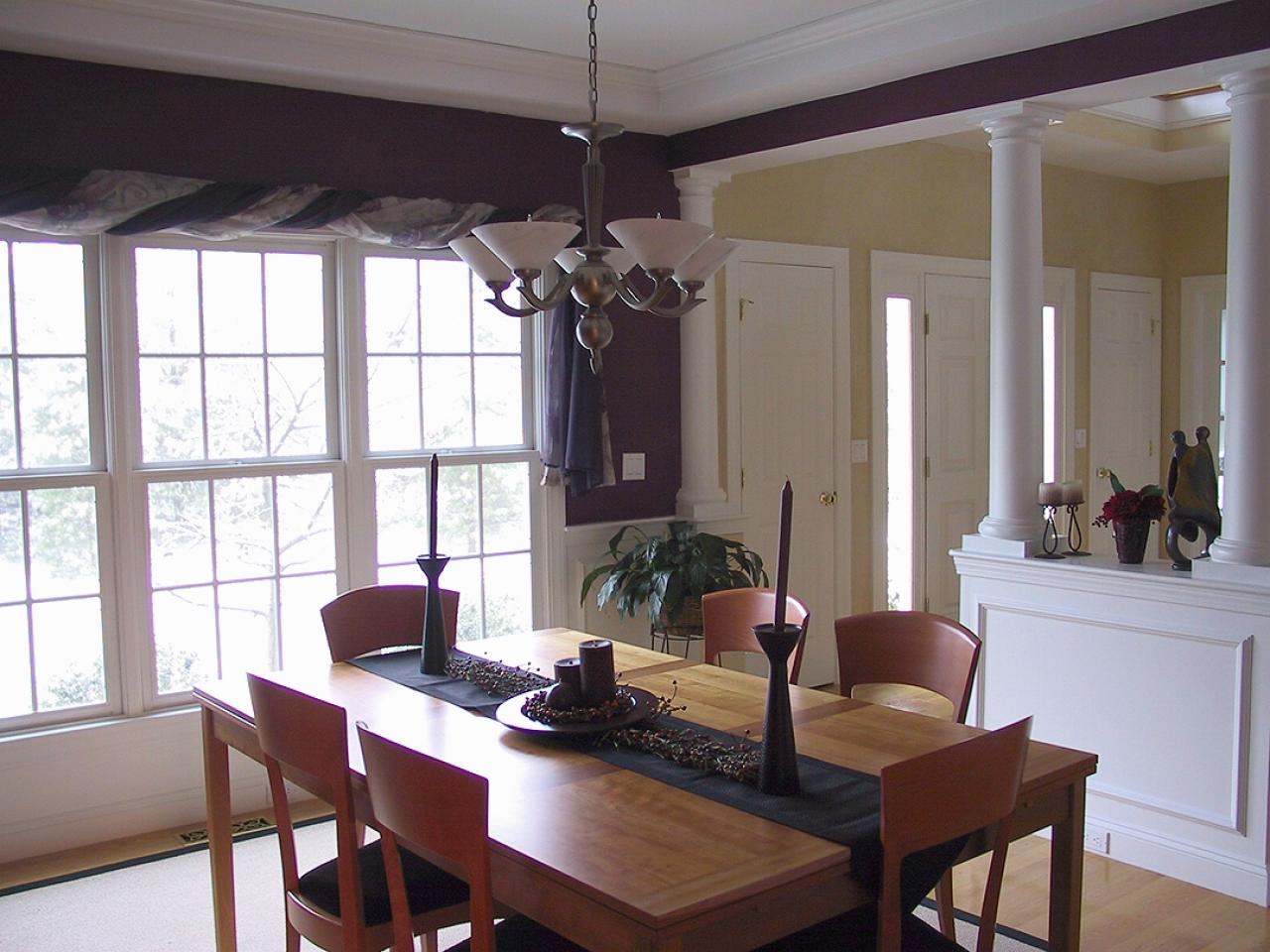
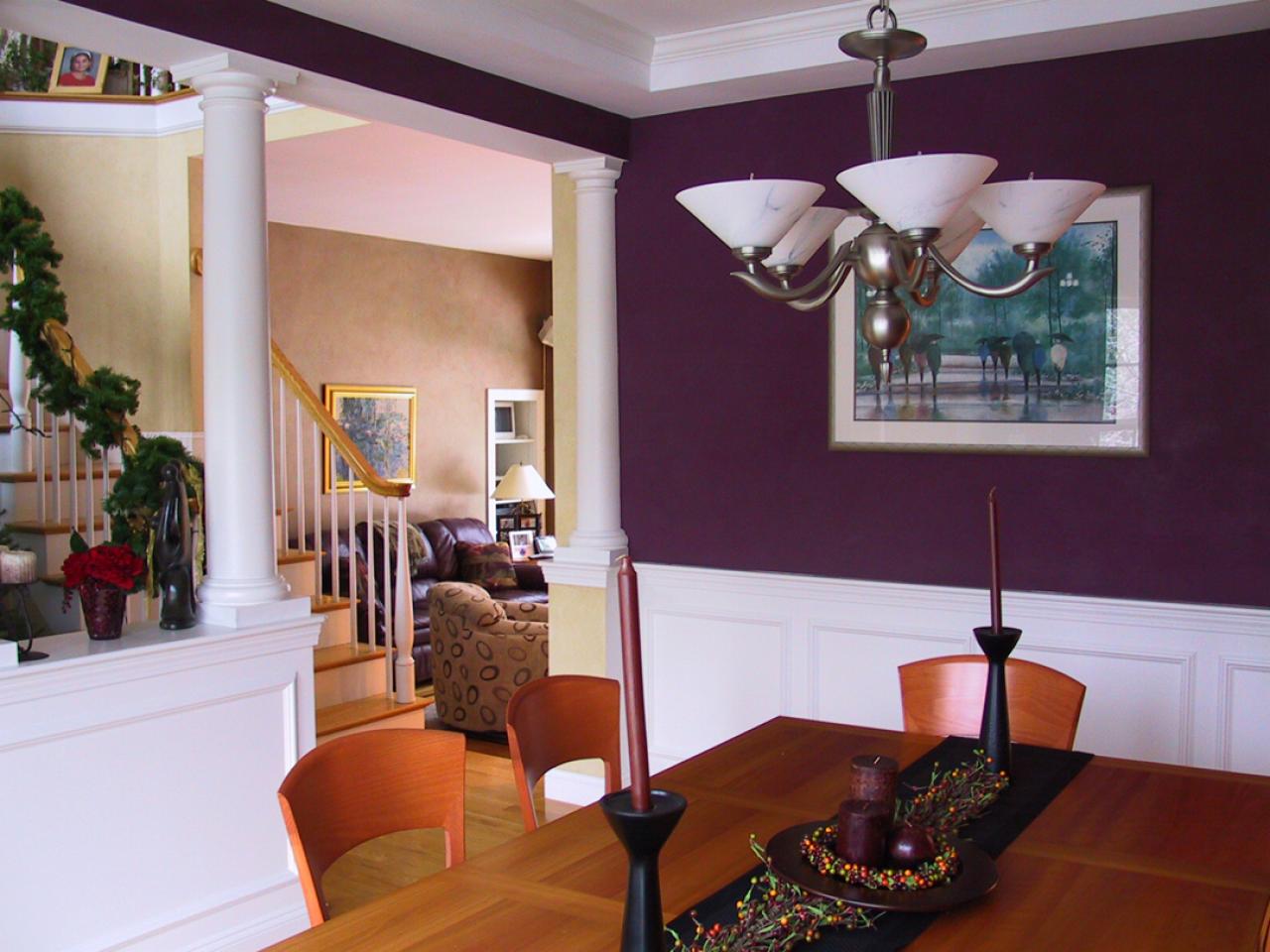
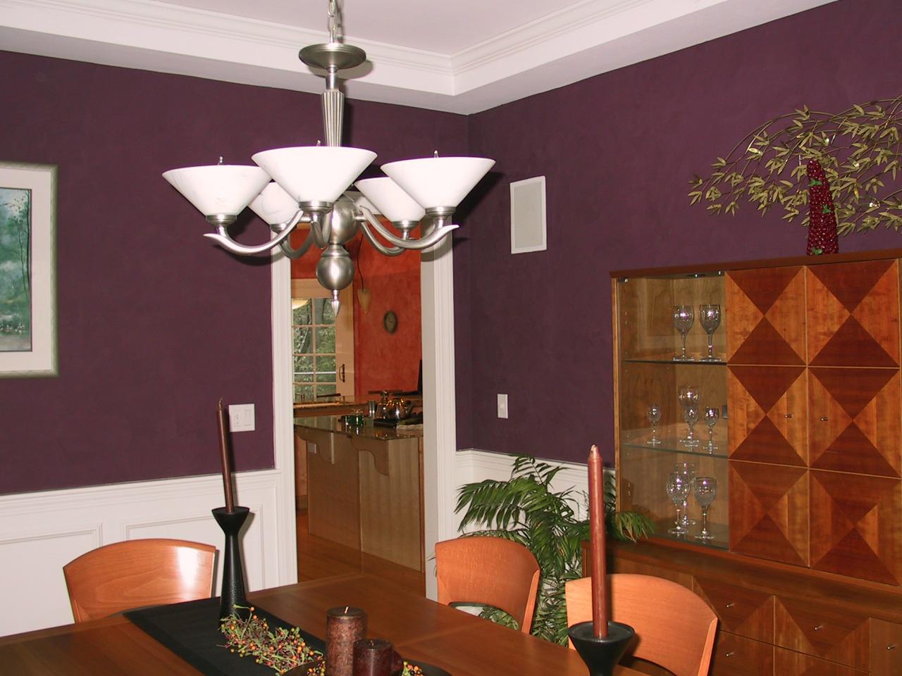
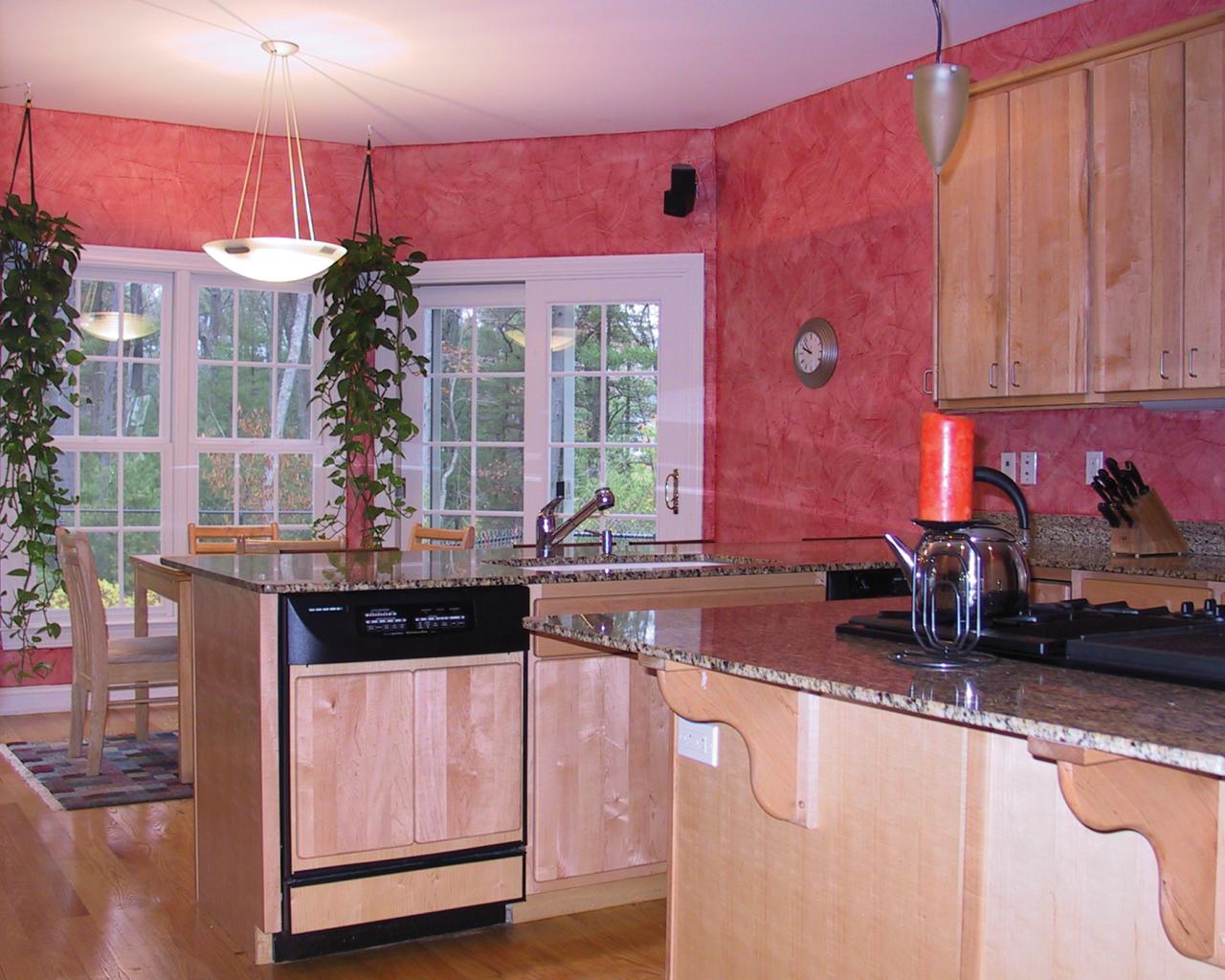
Many of today’s homes feature open floor plans, and that is the case in my example home. You can stand in any of four connecting rooms—kitchen, family room, foyer and dining room—and see portions of the other rooms.
The Challenge
A color scheme that effectively flows from room to room needs to do so without repetition. The space should be dynamic but not too distracting. There needs to be balanced amounts of light, texture, contrast in hue or value, and movement or pattern.
The Solution
To create a successful flow, you need to tap into the basic elements of design: color, shape, scale, light, texture, pattern and balance. Ideally, these components are combined in a way that creates a pleasing flow, like a quietly moving stream with undercurrents rather than a completely still pool or wildly moving rapids. The key is to look at the big picture. Regard the connected spaces together, not as separate entities. Take in the entire vista as you would if you were looking at a distant view from the top of a hill.
The Method

Choose three to five favorite colors and consider how you want to see them in the space. What color will be in the background or featured more prominently? Which colors will carry through from one room to the next, and where will they appear? Let existing furnishings, artwork or wall colors inspire you.
The most obvious way to create a pleasing flow is to carry elements of the rooms into each other. These color connections can be bold or subtle. For instance, in the home that illustrates this story, we layered colored glazes of soft patinas to evoke a sense of colored air. This subtle technique allows you to include colors that may not be distinctly visible but have an almost internal effect of connecting spaces.

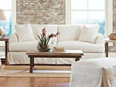
The family who owns this house loves color and is not afraid to use it. Their home is an excellent example of color that effectively flows from room to room, creating spaces that are dramatic and comfortable.
Color Theory Basics
You know that red, yellow and blue are the primary colors; green, orange and purple/violet are secondary. But it is through the value (lightness and darkness) and saturation (strong, hue-rich "saturated" color or weaker versions of the same color) that the colors we use are most often defined. For example, is a red the color of a ruby or a tomato? American flag red, or "old rose"?

Colors are grouped in color schemes, such as complementary, split complementary or triad. You can see these color combos when you look at the color wheel, which can help you choose color pairings and proportions that will become the springboard for selecting actual paints and fabrics.
Color Tips

• Vary the colors from room to room by varying the intensity of colors within adjacent color families: for example, blues and greens together.
• Contrast fabrics to walls, or relate them to wall colors as monochromatic variations. In a low-contrast palette, texture creates visual interest.
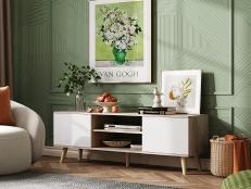
• To create a pleasing scale, choose color accents (small areas) that contrast with walls and floor colors (large areas).
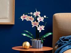
• Feature artwork or other special items by creating a focal point through contrasting color or brightness.


