Pantone’s 2019 Color of the Year Is Living Coral

This year's color is inviting, tactile, warm and totally fun.

Photo by: Pantone Color Institute

Pantone Color Institute

Related To:

It’s that time again. In 2000, Pantone Color Institute famously graced us with its first-ever color of the year, and the company has announced a new hue—chosen with societal trends in mind—annually since.

Photo by: Pantone Color Institute

Pantone Color Institute

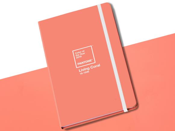
In 2018, we had some fun with Ultra Violet, but Pantone has officially dished all the details on its much anticipated 2019 pick, and it’s definitely not purple. This year, the global color experts are going with Living Coral.

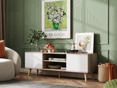
Moving closer to nature, the “vibrant, yet mellow” shade of golden-orange is meant to provide comfort and social connectivity in our ever-changing environment.

"Representing the fusion of modern life, Pantone Living Coral is a nurturing color that appears in our natural surroundings and at the same time, displays a lively presence within social media," the institute explains in its announcement.

While other design brands have announced more muted, moody yearly colors moving into 2019, we’re pretty excited about the design possibilities surrounding this fun, happy shade. Accent walls? Definitely. Lamps, bedspreads and more? We hope so.

According to Pantone, Living Coral exudes tactility and warmth, so what better way to show it off than in rugs, blankets and cozy pillows?

“Color enhances and influences the way we experience life,” says Laurie Pressman, Vice President of the Pantone Color Institute. “As a shade that affirms life through a dual role of energizing and nourishing, Pantone 16-1546 Living Coral reinforces how colors can embody our collective experience and reflect what is taking place in our global culture at a moment in time.”

Next Up

A Minimalist's Guide to Designing With the Color Black

The perfect way to decorate using the color black.

The Psychology of Color

Use color as a mood-lifting design tool that evokes calm, drama, cheer or comfort.

How to Match Paint Colors

Whether you're trying to find paint to match an existing wall color or pull your inspiration color from an upholstered sofa, family heirloom or your favorite flower, here's how you can get that perfect color match in a can of paint.

Color Schemes for Kids' Rooms

Follow top designers' tips and tricks for selecting the perfect color palette for your kid's room. Plus, their favorite color combinations for boys', girls' and gender-neutral rooms.

Pantone Creates Brand-New Hue for 2022 Color of the Year

Very Peri, a striking shade of periwinkle, makes history as Pantone's newest addition to the blue color family and the institute's chosen 2022 Color of the Year.

Transitional Design Style 101

Timeless, harmonious and warm, transitional style combines traditional and modern sensibilities to create spaces that will always feel contemporary.

Two-Toned Kitchen Cabinets

Browse your options for two-toned kitchen cabinets, and prepare to add an eye-catching design that can make your kitchen feel larger and increase your home's resale value.

Paint It Black: Inspiration and Tips for Bold Interior Doors

Bold, black paint can turn even the most basic builder-grade closet doors into architectural statements. See how to make a black door work in your own interior space.

The 3 Colors You Hate Most + The Right Way to Use Them

Orange, brown and lime green — these colors can be tricky to get right. A designer weighs in on these underrated hues and explains how to use them correctly.

Behr’s 2023 Color of the Year, Blank Canvas, Can Transform Any Space Into Its Namesake

The warm, tranquil white complements a variety of patterns, hues and materials, allowing us to create a completely-personalized space that makes us feel at home.