


Pantone’s 2020 Color of the Year Is Classic Blue
Simple but bold, Pantone’s color pick for 2020 will infuse our interiors (and our minds!) with a relaxed confidence we've been craving. Plus, there are SO many design possiblities.

Pantone
The news is in! Pantone’s 2020 Color of the Year is Classic Blue (19-4052) — a rich, dreamy, dark, beautiful shade of azure — and we’re just basking in the wonderful simplicity of it all.

Pantone
In case you didn’t know, Pantone Color Institute is the go-to source when it comes to color. Pantone experts study global culture and societal trends looking for color influences that will affect home design, fashion, textures and more.
In 2019, we floated through the year with lively Living Coral (16-1546), but now we’re building a stable threshold with Classic Blue. Take a moment to really look at the color. You might picture a vast and infinite night sky … or maybe it’s dusk and the sun’s setting. Or perhaps a sense of peace and calmness is washing over you?
“We are living in a time that requires trust and faith. It is this kind of constancy and confidence that is expressed by Pantone 19-4052 Classic Blue, a solid and dependable blue hue we can always rely on,” says Leatrice Eiseman, Executive Director of the Pantone Color Institute.
This particular shade of blue is reflective, anchoring and self-assured. It’s relaxed and restful — meant to offer us all a sense of needed tranquility. And according to Pantone, amidst the race to keep up with technology, humans are drawn towards colors that offer the promise of protection.
In a nutshell: Classic Blue.
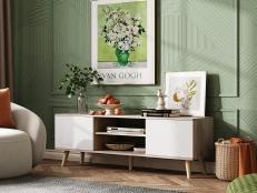
Use It In Your Home

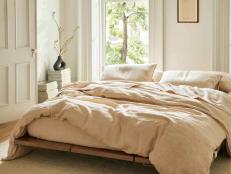
Navy and White Master Bedroom
Choose a navy and white master bedroom - Navy and white is one of the most elegant colour combinations, and a timeless one at that. Navy is dark enough to provide contrast but the blue adds a touch of warmth. If you start with blue walls, you can afford to bring in a lot of white in the ways of curtains, cushions, upholstery or bed coverings.

Photo by: Chipper Hatter
Chipper Hatter
As for home design, this stable shade injects creative confidence into a space, making it the perfect protective refuge.

We suggest using Classic Blue on the walls of your living room or bedroom for a bold statement. Or try incorporating it more subtlety with accessories — couches, chairs or lamps — for a more elegant feel. Want a monochromatic look? Muted blues may work best. For a more girly vibe, try corals or pinks.
The good news is, blue is timeless; pair it with white and you truly can’t go wrong.
“Classic Blue encourages us to look beyond the obvious to expand our thinking; challenging us to think more deeply, increase our perspective and open the flow of communication,” says Leatrice.


