Our Editors React to Pantone's 2018 Color of the Year: Ultra Violet
It's official! Pantone's Color of the Year is here. See what our design experts think about the pick.


Photo By: S&K INTERIORS ©Scripps Networks
Photo By: Neil Landino Jr., and Chichi Ubiña
Photo By: Fermob
Photo By: Sam Oberter Photography
Photo By: Jeff Herr Photography
Photo By: Burnham Design
Photo By: Jason Kisner; Design by Chih-Wei G.V. Chang
Photo By: Claire Esparros for Homepolish
Fit for a King
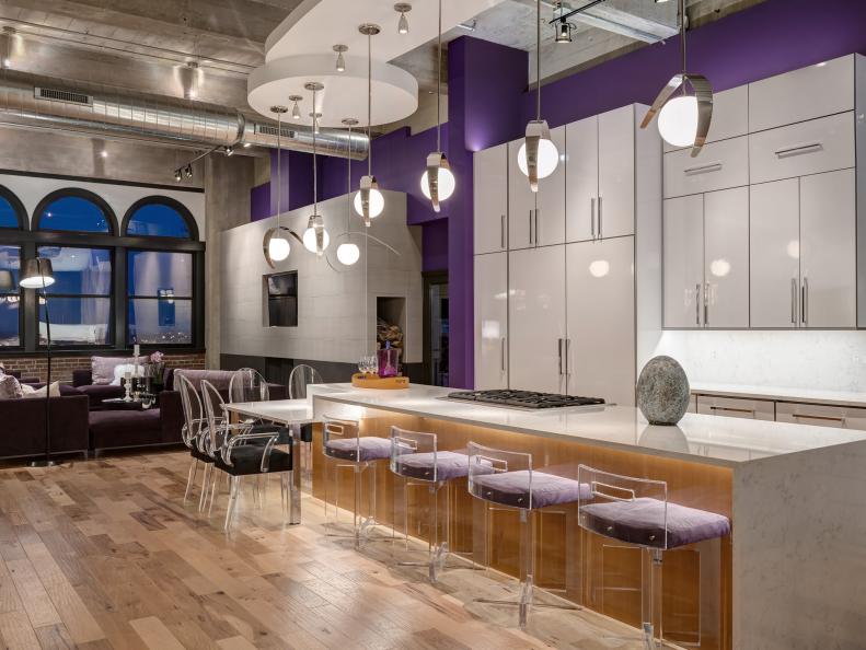
I love it. Purple has historically been the color of royalty. It can look so regal and yet be hip and funky at the same time. This color is a great way to make an unexpected statement, like the way these vibrant violet walls, lilac stools and plum chairs contrast and warm this loft’s industrial, modern features. - Jackie McGilvray, Managing Editor
Essence of Empowerment
As a child of the 80s, this color takes me back. And as a woman of today, I find it oddly empowering. It has a feminine feel but not in a soft way. It’s bold and outspoken and self-aware, just like most women who inspire me. I love seeing it here in a teen girl’s space, where it (and she) can be friendly and fierce at the same time. - Kelly Smith Trimble, Editorial Director
Pool of Purple
Purple is one of my favorite colors so naturally, I love it. Plus, it’s clearly a Prince tribute (one of my favorite people). BRB, buying purple everything. Thanks, Pantone! - Jessica Yonker, Online Editor
Violet Rays
While it usually takes me a while to determine my feelings about Pantone’s color choices, I was on board for this one right away. I’m always a fan of moody, sultry hues, so this deep purple is a win in my book. I love that it has blue undertones and will play well with the other dark shades we’re going to see so much of in 2018. Midnight blue, anyone? - Keri Sanders, Assistant Editor
Electric Feel
I am a big fan of this intense, juicy purple and can see it bringing a real spark and energy when used in small doses as with this kitchen island, or with a window seat painted in a glossy violet, a dining room table or even a gorgeous wool rug. How hot is this fireplace tile surround in an unexpected, electric purple? I am trying to bring some fun to my space with a backdrop of neutrals to which I add this sort of color jolt. In the past, my go-to shade was international orange but ultra-violet may be the perfect, new way to get that effect. - Felicia Feaster, Managing Editor
The Perfect Blend
I love the fact that Pantone picked a purple, the color formed by primary colors blue and red. In an often chaotic world, the harmony of these polarized colors coming together is quite beautiful. While I can appreciate the choice for a color that “communicates originality, ingenuity and visionary thinking that points us toward the future,” I think I’d personally take that inspiration and tone it down to a deeper hue I’m more likely to use in my own home, like eggplant or plum. Check out the dose of drama this eggplant kitchen island adds to an otherwise neutral kitchen. Plus, it looks amazing with the brass details! – Laura James, Assistant Editor
Pro Purple
I’ve always been a fan of purple so I’m pro this year’s Pantone pick. But, just like anything else, too much of a good thing is, well, too much. When using ultra violet in an interior, take a cue from designer Betsy Burnham and choose plummy hues that are a bit less saturated and more grayed down. And, focus on incorporating this cheery color in accents like pillows, throws or flowers — items that can be easily swapped out as your taste or style shifts. - Camille Smith, Managing Editor
Space to Grow
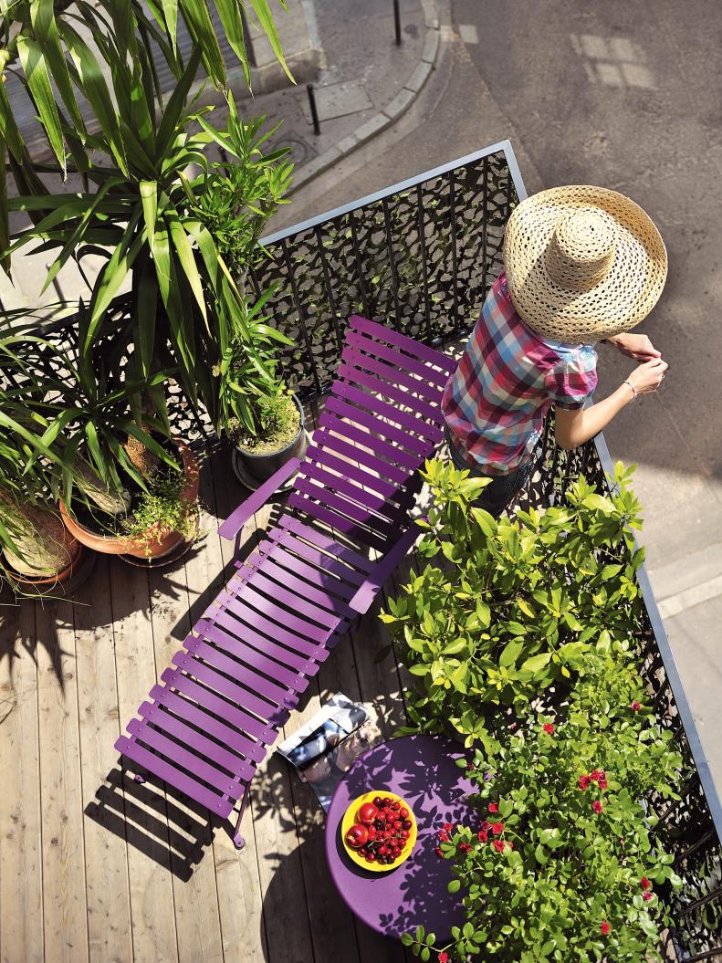
I love what Ultra Violet represents more than I love the actual color. It’s not one I would use in my home, but I can get behind the message of "visionary thinking" propelling us forward into a brighter future full of hope, creativity and calm. That said, Ultra Violet is a very soothing, inspiring color that would work well in a yoga/meditation room or outdoor space. - Molly Miller, Apple News Editor
Color Story
I’m all about color, so I’m a huge fan of Ultra Violet. I love the idea of using it with a variety of purple shades to add drama to a forgotten nook or to highlight a book collection. - Farima Alavi, Assistant Editor
Sharp, but Subtle
There are shades of purple that I love: lavender, periwinkle, eggplant, boysenberry, plum. But Ultra Violet doesn't personally speak to me. I can appreciate its thoughtful and imaginative message; however, I prefer hues with a deeper tone in my decor and attire. Since my home has a neutral base with colorful, eclectic accents, I actually do have some subtle hints of Ultra Violet: a wool throw pillow and Richard Phillips’ "Spectrum" painting, as seen on Gossip Girl in the Van der Woodsen penthouse. Unless UV is your favorite color, go small and pair with neutrals. - Kayla Kitts, Managing Editor
Shades of Purple
I have mixed feelings about Pantone’s Color of the Year. Would I want my walls painted Ultra Violet? Nope. Would I want a violet-colored sofa? Not a chance. However, used sparingly I think it could be a unique way to add intrigue to a space. I’m thinking a splash of Ultra Violet in wall art or a small piece of decor is all I could stomach. - Ryan Reed, Editor
Ultra Cool
While I personally wouldn’t choose Ultra Violet for my own home — I’m more into blues, greens and neutrals — I do think it’s a fun color for a kid's bedroom. It looks glamorous but not too grown-up in this room designed by Brian Patrick Flynn. - Shannon Petrie, Managing Editor