Next Up

Trend Forecast: 2019 Colors of the Year

October 22, 2018

Leading paint brands have unveiled their color picks for 2019. From a warm clay to a calming gray, check out the industry color trend predictions.

1 / 11
Photo: Courtesy of Pantone

Pantone's Living Coral

Pantone's highly-anticipated color of the year pick is here, and it's brighter and bolder than ever. Say hello, to Living Coral (16-1546)! An animating shade of orange with a golden undertone, the color falls on the warmer end of the spectrum compared to last year's pick, Ultra Violet.
More photos after this Ad

2 / 11
Photo: Courtesy of Pantone

Pantone's Living Coral

Inspired by nature and symbolizing our innate need for optimism, Pantone's pick is a reaction to the onslaught of digital technology increasingly embedding into daily life. Pantone says Living Coral represents the pursuit of authentic and immersive experiences that enable connection and intimacy. "Color is an equalizing lens through which we experience our natural and digital realities and this is particularly true for Living Coral," says Leatrice Eiseman, executive director of the Pantone Color Institute. "With consumers craving human interaction and social connection, the humanizing and heartening qualities displayed by the convivial Pantone Living Coral hit a responsive chord."

More photos after this Ad

3 / 11
Photo: Benjamin Moore

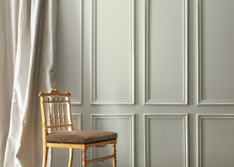
Benjamin Moore's Metropolitan

Last year, Benjamin Moore spiced things up with Caliente (AF-290), but this year, they're toning things down quite a bit by naming the effortlessly sophisticated and oh-so-calming gray hue called Metropolitan (AF-690) their 2019 Color of the Year.

More photos after this Ad

4 / 11
Photo: Benjamin Moore

Benjamin Moore's Metropolitan

If you're over the all-white-everything look but still want a calming, neutral canvas for your home, Metropolitan might just be what you've been looking for. "It’s a color in the neutral spectrum that references a contemplative state of mind and design," Ellen O'Neill, director of strategic design intelligence at Benjamin Moore, describes. "Not arresting nor aggressive, this understated yet glamorous gray creates a soothing, impactful common ground."

More photos after this Ad