


7 Color Combos That Are Dating Your Space (Big Time!)
Buh-bye, beige! See ya, sage!

With a new "it" color every season, it's easy for even our most style-savvy readers to fall into a self-inflicted trap of doomed, dated color schemes in their home. One year we’re gushing over mint and coral, the next we’re dying to add some rose quartz and serenity blue into our lives.
Having a hard time keeping track of the “in” and “out” hues for your home? I’ve rounded up the color combinations you need to update (or, better yet, donate) pronto.
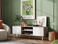
Turquoise + Chocolate Brown

Turquoise goes with everything as far as I’m concerned. (You know the way designers preach that leopard print is a neutral? Think along those same lines for turquoise.) That said, even the most versatile colors can be overplayed. Case in point: Turquoise and chocolate brown.
Coral + Mint

This was all the rage when I was in college, and I may or may not have decorated my entire bedroom in this once-cool color combo. You can understand, then, the level of my regret when the coral and mint trend came to an abrupt halt about six months later.
Black + Hot Pink

Ah, hot pink and black. This once-haute combo reigned supreme during the early 2000s and was often accompanied by a slew of zebra-print textiles, silvery sequins and high-gloss decorative accents.
Beige + Sage Green

Before there was our beloved “greige”, there was simply beige. Where there was beige, sage green was never far behind. Together, beige and sage coated the walls of contemporary and traditional homes alike as the on-trend neutral color combination.
Bubblegum Pink + Lime Green

Once upon a time, pink and purple was the go-to color scheme for tween bedrooms. That was around 1995. Fast forward 10 years and bright, bubblegum pink and lime green were the way to go. These days?
Latte + Chocolate Brown

Latte and chocolate. This lovely flavor combo makes for an extremely dated color combination. Admire the colors from your coffee cup and steer clear from using ‘em to coat your walls.
Red, White + Black

What’s black, white and red all over? Stylish spaces and wedding decor alike, circa the year 2004. Like trusty turquoise and brown, RW+B exemplifies that even the most classic or versatile color scheme can be played out with overuse.


