15 Classic Color Combos
Trends come and go, but these tried-and-true color palettes have stood the test of time.
Related To:

Photo By: Nancy Nolan
Photo By: Seth Caplan
Photo By: Lulu Designs
Photo By: Allison Corona Photography
Photo By: Dustin Halleck
Photo By: Jeff Herr Photography
Photo By: Chris Amaral © 2013, HGTV/Scripps Networks, LLC. All Rights Reserved.
Photo By: Jacob Snavely
Photo By: Laurie Perez
Photo By: Christy Dunbar
Photo By: Grey Crawford
Green and Yellow
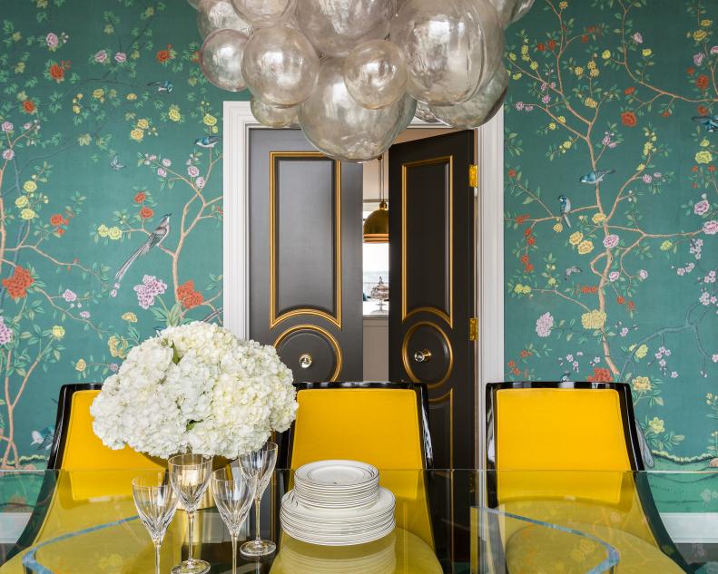
"Most classic color combos in design are those borrowed from nature," says California designer and color expert Kelly Berg. Case in point: yellow and green, reminiscent of sun and plants. "If nature tells us they work together, then they work together," Kelly says. And since there isn't just one yellow and one green, the combination can create many different effects. Use the two as a base, Kelly suggests, and then add a third and a fourth color to the mix, such as blue or red.
Earth Tones
As the name implies, these colors are derived from earthy elements such as rock, clay or plants. Stick to this palette for a more neutral color scheme, or add bright green houseplants for a punch of color.
Primary Colors
Take a page out of color theory 101 the next time you redecorate. The primary colors — red, yellow and blue — make a color triad. A triad is made up of three colors evenly spaced out on the color wheel. Red, yellow and blue are equals, so one color doesn’t overpower another.
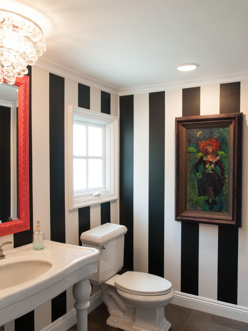
Black and White
The most classic color scheme of all — black and white — is inherently sleek and sophisticated, according to Jessica Geller and Virginia Toledo of id 810 Design Group. What they love most is the backdrop the two colors provide for unexpected pops like hot pink, turquoise or lime green. Their go-to white paint: Benjamin Moore's Super White. "It's our staple white because it doesn't change tone with other colors and remains a true white," Virginia says.
Green and Blue
Designer Cynthia Mason says that the blue and green combo she's partial to "can be traditional or go all the way modern." Apple green and light blue work well together, or you can deepen the intensity to kelly green and navy.
White and Yellow
Yellow is a great color for guest bedrooms. It’s inviting, and even vibrant shades aren’t too overpowering. Pair lemon or mustard wallpaper with white furniture and accents for a cheery vibe.
Pink and Green
Bright colors were briefly popular during the mid-1800s, but it was mid-20th-century homemakers like Dorothy Draper who really made them famous. Her modern Baroque style and bold use of colors like hot pink, apple green and turquoise were exemplars of the era, says color expert Jane Hall. Today, rock the combo with millennial pink and palm green.
White and Gray
Hotel rooms. Spas. Gourmet kitchens. White and gray design is everywhere in the hospitality industry because it’s calming and clean. If you want the same serene, uncluttered vibe at home, try a white and gray kitchen with modern metallic accents.
Orange and Blue
Like all of the classic combinations shown here, varying shades of orange and blue work well together. Tangerine and cornflower. Coral and teal blue. And, here, true orange is a great counterpoint to navy blue.
Robin's Egg Blue and White
Although it dates back to the French courts of Louis XI and Louis XIV, this airy palette works well with modern design, too. We love pairing gray and white neutrals with a pop of this bright blue.
Red, White and Blue
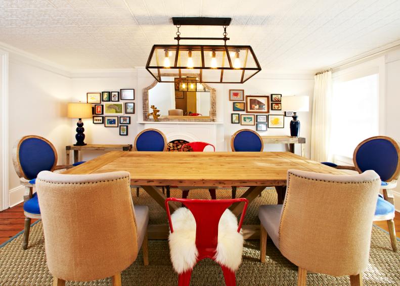
Red, white and blue is the perfect, preppy color scheme if you love nautical style. Red is a bold color so use it as an accent. And instead of true cobalt blue, try using a mix of baby blue and navy for textiles.
Neutrals
Bold isn’t always better. And neutrals aren’t boring. Layering several neutrals together, such as canvas, cognac and warm wood, creates a dynamic yet calming color palette without any flashy colors. A neutral color palette also allows you to change out accent pieces easily without totally redoing a room every time a new trend comes around.
Yellow and Gray
Whether it’s lemon and dove gray or mustard and charcoal, yellow and gray just belong together. We love pairing a velvet yellow couch with neutral gray walls.
Navy and White
From fashion to interior design, this preppy combo is timeless. Navy works great as a neutral, yet it's not so neutral that it makes a room feel bland or cold.
Red and Gold
Often paired with deep green, these colors were used in many Tudor-, Renaissance- and Victorian-era homes. Red was a favorite for dining rooms in particular, giving dinner guests a warm feel in the days before central heating. Today, you can tone down the dramatic red for a trendy blush pink and gold combo.