Picking the Perfect Shade
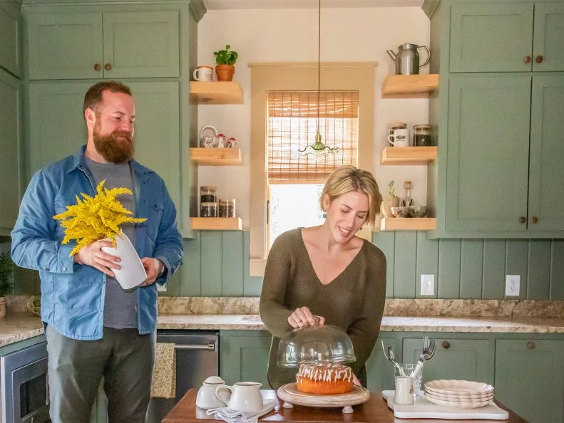
As an artist and graphic designer, Erin Napier understands the impact color has on a room — especially when it comes to paint. Erin and her husband Ben Napier have transformed hundreds of homes with paint on their show Home Town, so we’re taking a deep dive into the soft neutrals, earthy hues and brilliant colors they've used in some of their most popular designs. In this kitchen, Erin coated the cabinets in Benjamin Moore’s Jojoba, a muted olive that instantly warmed up the space. Putnam Ivory (also by Benjamin Moore) on the walls behind the open shelving allows the green cabinets to take centerstage.
More photos after this Ad
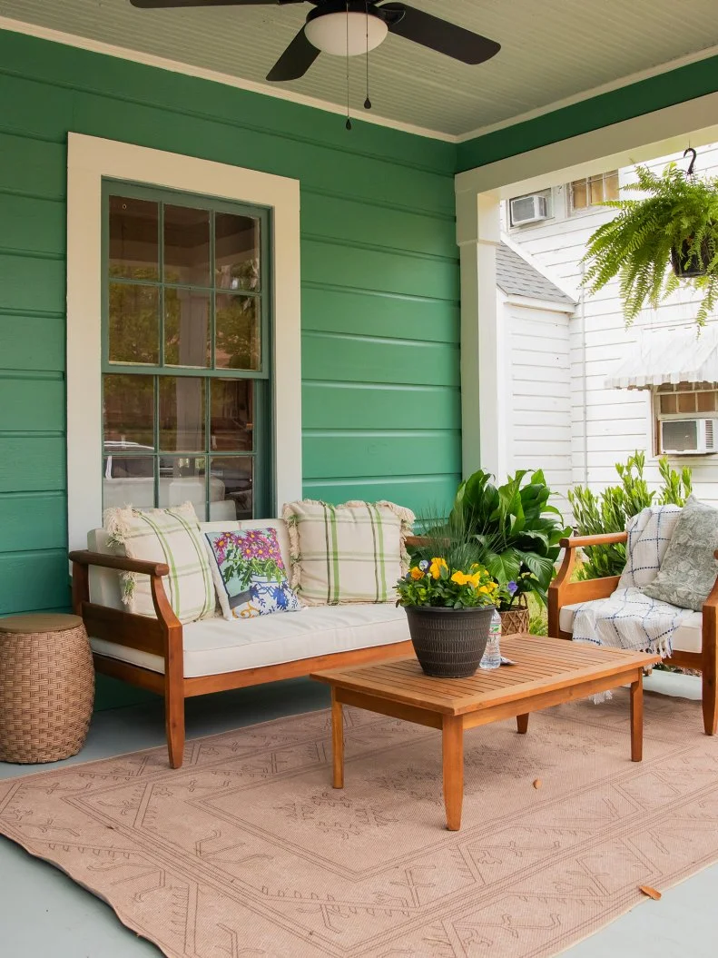
The Paint: Blue Grass Mood, Valspar
How Erin Used It: First impressions are everything, and this home greets with a burst of lush color. The siding boasts Blue Grass Mood by Valspar. Erin paired it with two chic neutrals: Murky Sage on the porch floor and Comfort Gray on the ceiling, both by Valspar.
More photos after this Ad
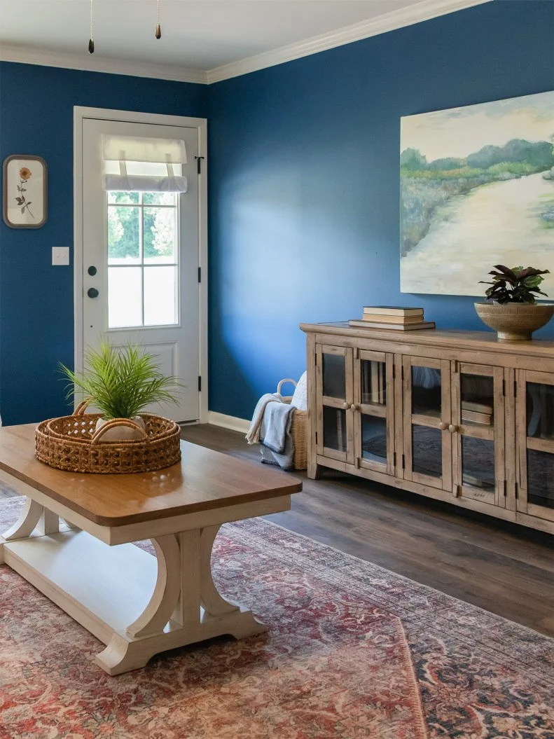
The Paint: New York State of Mind, Benjamin Moore
How Erin Used It: Nothing says, "Come on in!" like a deep blue entry. A twist on classic navy, New York State of Mind by Benjamin Moore sets a bold and cheerful tone. Erin offset its inky vibrance with crisp white trim and warm wood furnishings.
More photos after this Ad
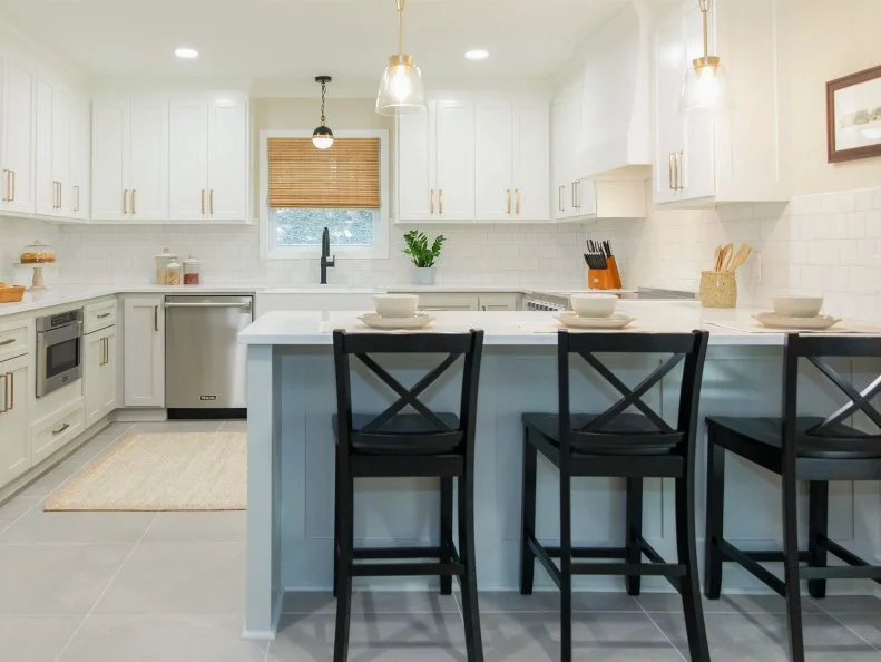
The Paint: Roycroft Mist Gray, Sherwin-Willaims
How Erin Used It: Erin followed the design-savvy "rule of third" trick in this kitchen. She selected Roycroft Mist Gray for the base cabinets and paired it with neutral Whitetail on the uppers — both Sherwin-Willaims. To complete the trio of shades, she accented the space in matte black.
MORE KITCHENS FROM 'HOME TOWN'
More photos after this Ad
The Paint: Timber Beam, Sherwin-Williams
How Erin Used It: All this living room needed was a fresh coat of paint. Erin cozied up the wall's earthy brown shade, Timber Beam, then refreshed the dated fireplace with Cotton, both by Sherwin-Williams. This contrasting color duo makes for striking, yet neutral design.
More photos after this Ad
The Paint: Meander, Sherwin-Williams
How Erin Used It: Ben and Erin met and fell in love at Jones College, so they were thrilled when asked to restore The Old President’s House for the school's chief of staff in Home Town. Since it’s a home where students gather, it was important to create a welcoming atmosphere. A calming, comfy color for the walls was in order: Meander by Sherwin-Williams. Erin amplified the hue with equally warm-toned furnishings and brass accents.
MORE ON THIS EPISODE
More photos after this Ad
The Paint: Nicolson Green, Benjamin Moore
More photos after this Ad
The Paint: Tapestry Beige, Benjamin Moore
How Erin Used It: Beige isn’t a bad word in this living room. For the walls, Erin chose Tapestry Beige by Benjamin Moore as the champion neutral background. With a collected-over-time design that stays uncluttered, the space is now a cushy getaway for hanging out with friends, curling up with a book or simply relaxing at the end of a long day.
More photos after this Ad
The Paint: Greenblack, Sherwin-Williams
How Erin Used It: A traditional rancher got a major midcentury modern update. New Craftsman-inspired shelving turned the fireplace into a showpiece, but instead of leaving everything natural wood, Erin created deep contrast by coating the built-ins with Sherwin-Williams’ Greenblack.
ERIN AND BEN'S LOVE STORY
More photos after this Ad
The Paint: Repose, Sherwin-Williams
How Erin Used It: In this spa-like space Repose Gray by Sherwin-Williams (on the walls and trim) sets a calming ambiance. A turn-of-the-century-inspired bathtub and Carrera marble tiled floor complement the neutral paint, while bringing the relaxing sanctuary to life.
More photos after this Ad
The Paint: Regatta, Sherwin-Williams
How Erin Used It: These clients love Mexican-inspired design, so color was an absolute must in their kitchen. Terra-cotta tiles ground the space, while brilliant blue cabinets (Regatta by Sherwin-Williams) balanced with granite countertops bring the fun. Erin also used neutral-colored Spanish tile vertically laid for the backsplash.
TOUR THE NAPIER COUNTRY HOME
More photos after this Ad
The Paint: Cosmopolitan Olive, Valspar
How Erin Used It: Cosmopolitan Olive by Valspar brings an Old World feel to this living room. The shade amplifies the space's unique blend of vintage and modern architectural elements and furnishings.
More photos after this Ad
The Paint: Sea Spray, Sherwin-Williams
How Erin Used It: Outdated paneling gets new life with a fresh coat of Sea Spray by Sherwin-Williams, which bathes this cozy living room in a gentle, muted blue. A terra cotta-colored sofa and wood coffee table add appealing contrast.
More photos after this Ad
The Paint: Country Tweed, Sherwin-Williams
How Erin Used It: Erin gave the interior of this kitchen door a facelift with Sherwin-Williams’ Country Tweed. The cool neutral stands out against bright white cabinets and trim (Cotton by Sherwin-Willaims) and pale, creamy beige walls (Threaded Loom by Sherwin-Williams).
More photos after this Ad
The Paint: Beau Green, Benjamin Moore
How Erin Used It: Color is the power player in this kitchen. On the cabinets, Beau Green by Benjamin Moore fuses deep emerald and sapphire together in a shade sure to wow. For the walls, Erin selected a simple off-white hue with muted undertones of blue-gray, called Moonshine by Benjamin Moore.
More photos after this Ad
The Paint: Gray Wisp, Benjamin Moore
How Erin Used It: The walls of this traditional dining room with dark-wood furnishings and white-painted classic built-ins called for a timeless hue: Gray Wisp by Benjamin Moore. The light gray shade boasts a touch of aloe green to convey a calm, enticing atmosphere.
More photos after this Ad
The Paint Combo: Rosemary and Evergreen Fog, Sherwin-Williams
How Erin Used It: If you’re nervous about dipping your toe into the color world, try a tone-on-tone scheme like Erin did in this kitchen and breakfast makeover. She decided on a deep green (Rosemary by Sherwin-Williams) for the breakfast room, and then paired it with a slightly lighter shade in the same color family for the kitchen cabinets (Evergreen Fog by Sherwin-Williams).
MORE CALMING PAINT COLORS
More photos after this Ad
The Paint: Rumba Orange, Benjamin Moore
How Erin Used It: When Ben and Erin met the young homeowners of this charming bungalow, they declared they wanted the design to reflect their positive attitudes. Vibrant Rumba Orange by Benjamin Moore greets guests and homeowners from the exterior door frame. Erin paired the hue with Douglas Fir by Benjamin Moore on the floor then layered a neutral rug over it.
More photos after this Ad
The Paint Combo: Antique White and Dirty Martini, Sherwin-Williams
How Erin Used It: So as to not distract from this dining room's impressive architectural detail, Erin went with neutral paint shades. Above the rustic wainscoting, she coated the walls with Antique White by Sherwin-Williams — a warm white with beige undertones. On the wainscoting, she opted for Dirty Martini by Sherwin-Williams — a slightly deeper neutral hue with yellow undertones.
More photos after this Ad
The Paint: Northern Juniper, Valspar
How Erin Used It: Here, Erin turned saturation up by painting every aspect — from the moldings to the doors to the trim — in the elegant blue-gray shade (Valspar’s Northern Juniper). To keep an airy ambiance about the room, she left the ceiling crisp white.
More photos after this Ad
The Paint: Tea Stain, Valspar
How Erin Used It: When redesigning this Victorian home, Erin and Ben wanted to stay true to its historic roots while placing it firmly in today. Tea Stain by Valspar swathes the primary bedroom in a cool neutral, providing a sophisticated backdrop for the four-poster bed, traditional area rug and classic botanical prints.
MORE BEDROOMS FROM BEN AND ERIN
More photos after this Ad
The Paint: Armagnac, Sherwin-Williams
How Erin Used It: Working with homeowners who adore color, Erin knew this living room needed to be anything but white. Now, a bold orange with terra cotta undertones (Armagnac by Sherwin-Williams), it infuses the space with radiance while complementing the light wood furnishings. White trim balances the saturated color.
More photos after this Ad
The Paint Combo: Creekside Green and Charcoal, Benjamin Moore
How Erin Used It: It's earth tones on earth tones in this bright kitchen. A hazy green-gray (Creekside Green by Benjamin Moore) on horizontal beadboard creates a calm ambiance. For contrast, Erin went with Kendall Charcoal by Benjamin Moore on the pantry door.
More photos after this Ad
The Paint: Rushing River, Sherwin-Williams
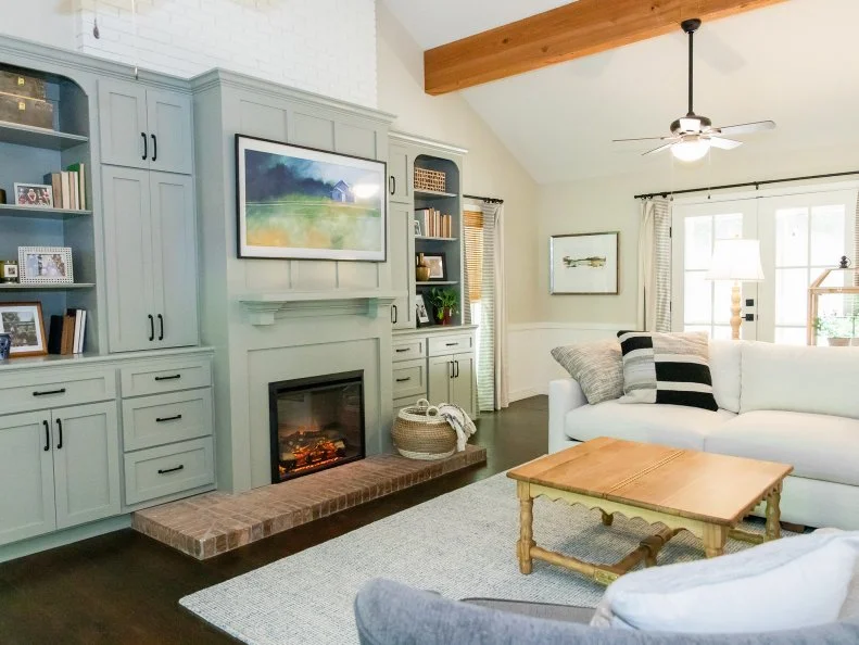
How Erin Used It: Instead of letting these built-ins disappear into the walls, Erin made them stand out with a soft-but-eye-catching blue hue (Rushing River by Sherwin-Williams). She topped off the look with sleek black cabinetry hardware and light living room furnishings.
More photos after this Ad
The Paint: Recycled Glass, Sherwin-Williams
How Erin Used It: Bright and cheery, this kitchen remodel makes the most of every square inch. The cabinets are covered in dreamy green paint (Recycled Glass by Sherwin-Williams). On the walls, Whitetail by Sherwin-Williams keeps the space light and airy.
More photos after this Ad
The Paint: Morning at Sea, Sherwin-Williams
How Erin Used It: Drawing inspiration from the sweet floral tile backsplash, Erin pulled out a matching blue hue for the base cabinets (Sherwin-Williams’ Morning at Sea). The upper cabinets are painted White Dove by Benjamin Moore. The classic blue-and-white color palette, as well as bricks laid in a herringbone pattern, give the entire space classic country charm.
More photos after this Ad
The Paint: Create, Sherwin-Williams
How Erin Used It: For this relaxing bedroom, Erin went with calming neutrals. Here, pale blue-green (Create by Sherwin-Williams) adds soft color against neutral furnishings. Light wood nightstands flank the iron bed, while the lamps and window treatments in light yellow-beige bring layered texture.
More photos after this Ad
The Paint Combo: Noir and Muted Ebony, Valspar
How Erin Used It: A modern and sophisticated design calls for a moody color palette. Thanks to the soaring ceilings in this kitchen, Erin was able to use dark hues — Noir on the cabinets and Muted Ebony on the ceiling (both by Valspar) — while maintaining a bright and airy ambiance. On the walls, Swiss Coffee by Valspar creates depth. Now, the homeowners are ready to host both big gatherings and intimate family get-togethers.
HOW BEN AND ERIN MET
More photos after this Ad
The Paint: Caviar, Sherwin-Williams
How Erin Used It: With high ceilings boasting exposed beams, a two-story fireplace and floor-to-ceiling windows, this living room is a designer’s dream. In a space with this kind of height almost any color goes. Erin created a focal wall with bold and black Caviar by Sherwin-Williams. In contrast, she kept it simple on the walls with Wool Skein by Sherwin-Williams.
More photos after this Ad
The Paint: Milestone, Valspar
How Erin Used It: Not every space needs a major color moment. Neutral shades allow the furnishings and architectural elements to shine. For this petite guest house, Erin handpicked soft Milestone by Valspar for the walls. The color grounds the various textures layered into this design.
More photos after this Ad
The Paint: Steamed Chai, Sherwin-Williams
How Erin Used It: Aptly named for the space, Steamed Chai by Sherwin-Williams coats the cabinets in this cooking-and-dining space. Erin paired the warm white shade with a crisper shade on the walls — Floral White by Benjamin Moore. The two neutrals mingle with character-adding elements, such as exposed wood beams, terra-cotta tile flooring, innovative artwork and statement lighting.