Next Up

HGTV Home by Sherwin-Williams's 2022 Color Palette of the Year Creates Calm

Follow Caroline on:

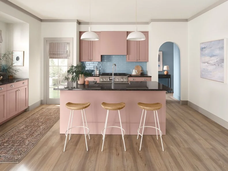
Tranquil and restorative, Softened Refuge is sweeping over us like a comforting blanket. Comprised of ten muted tones — including Color of the Year Aleutian — the palette boasts clean minimalism in sanctuary-like spaces. Here's how you can use it in your own space.

Photo: HGTV Home by Sherwin-Williams
Scroll For More Photos
1 / 11

Say Hello to Softened Refuge

Less is more when it comes to Softened Refuge, the HGTV Home by Sherwin-Williams 2022 Color Collection of the Year. As the 10-hued palette proves with natural tones, simplicity cultivates peace — especially in home design. Saturated with earthy colors like Whole Wheat and Retreat, as well as bolder hues like Slate Tile and Black Fox, Softened Refuge fosters both physical and mental wellbeing. Just take a look through this gallery and you’ll understand — muted colors, minimalistic accessories and raw materials evoke peace. Not to be overlooked: the crown jewel of the collection and the 2022 Color of the Year, Aleutian (a dreamy washed indigo). Ready to create a real-life refuge in your own space? Tips, tricks and a full collection breakdown lay ahead.
More photos after this Ad

Photo: HGTV Home by Sherwin-Williams
2 / 11

Black Fox

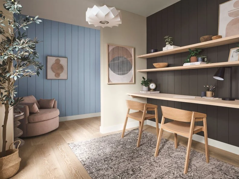
Don’t sleep on Black Fox, the dark horse of Softened Refuge. This grounding, brown-black tone is vital for adding depth to lighter designs.

How You Can Use It

We’ve got some ideas: On an accent wall (as pictured here) dressed up with light wooden shelves; on sleek modern dining chairs in an otherwise neutral room; on the rim of a mirror, hung above a credenza or bathroom vanity.

see more

More photos after this Ad

Photo: HGTV Home by Sherwin-Williams
3 / 11

Whole Wheat

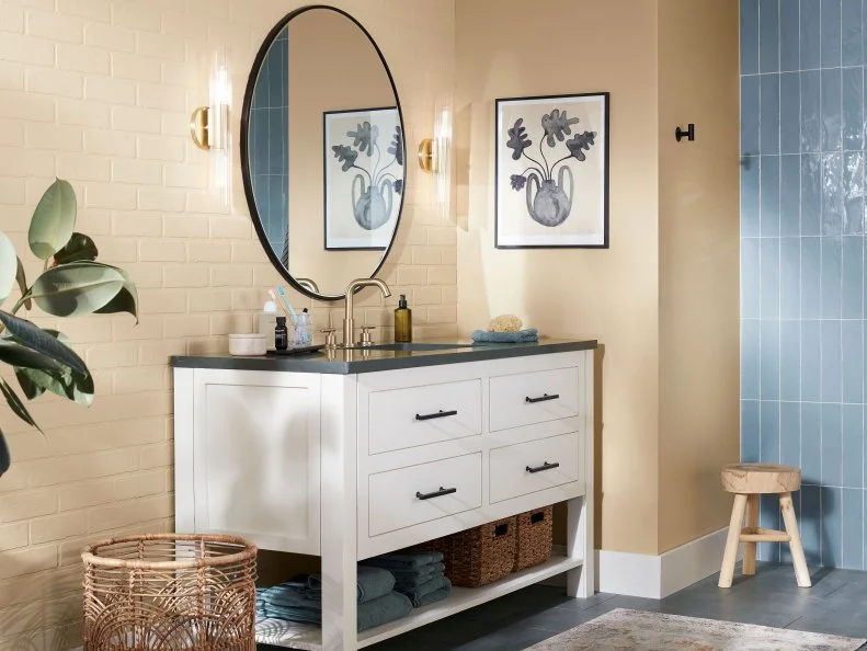
With warm and welcoming undertones, Whole Wheat is the friendliest color in the collection, bringing cheer to every space it enters.

How You Can Use It

Softened Refuge's tranquility derives from simple colors and raw materials: Whole Wheat on exposed brick, for example. Try it in a bathroom — it’ll make for a calm and happy morning routine. Diversify your design with Aleutian, then ground the whole look with accents in Black Fox.

see more

More photos after this Ad

Photo: HGTV Home by Sherwin-Williams
4 / 11

Canvas Tan

Fluid and flexible — like Softened Refuge itself — Canvas Tan creates comfort and cohesion with its neutral-warm undertones.

How You Can Use It

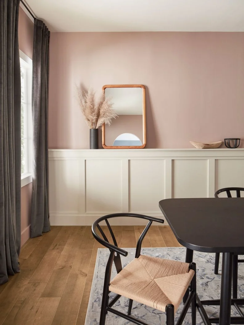
Say hello to two-toned walls. Complement a saturated wall with Canvas Tan-colored wainscoting. We also love this hue on trim, molding, ceilings and fireplace surrounds. You can also find it in natural accessories (like pampas grass).

see more

More photos after this Ad

Photo: HGTV Home by Sherwin-Williams
5 / 11

Retreat

It’s calming and sophisticated, yet lush in its natural form. Enter retreat: a muted, elevated shade of green.

How You Can Use It

Lean into Retreat’s earthiness, and pair it with natural materials such as exposed wooden beams, wood floors, rattan accessories or cane furnishings. This shade loves to be front and center, so complement it with cooler, less standout tones (Alabaster, Stone Isle, Black Fox).

see more

More photos after this Ad

Photo: HGTV Home by Sherwin-Williams
6 / 11

Perfect Greige

Finally, an elevated alternative to white. Perfect Greige single-handedly embodies Softened Refuge’s calming and familiar simplicity.

How You Can Use It

Perhaps the underdog of the collection, you’ll find Perfect Greige hiding just out of sight on molding and window trim — though the hue can hold its own on walls, too. Use it in a small bathroom or mudroom (as shown). Just don’t forget: Perfect Greige loves a little pick-me-up pairing (we recommend Aleutian or Slate Tile).

More photos after this Ad

Photo: HGTV Home by Sherwin-Williams
7 / 11

Stone Isle

This cozy neutral works with warm and cool tones. Perfect Greige and Alabaster bring balance to Softened Refuge, but every palette needs a tried-and-tried gray.

How You Can Use It

Try it with Aleutian stripes in a kids’ playroom or on a bookshelf decorated with vibrant accessories. Natural materials like light wood and rattan enhance Stone Isle’s coziness.

More photos after this Ad

Photo: HGTV Home by Sherwin-Williams
8 / 11

Emerging Taupe

In the right light, Emerging Taupe glows neutral-pink — one of our favorite shades.

How You Can Use It

Lay this color on thick in a well-lit room, and it’s airy calmness will envelope you like a blanket. Balance dark and light: Accessorize with window coverings (hung high) and furnishings in Black Fox or Slate Tile.

More photos after this Ad

Photo: HGTV Home by Sherwin-Williams
9 / 11

Aleutian

The cornerstone of the palette, HGTV Home by Sherwin-Williams' Color of the Year Aleutian bridges the gap between warm and cool, mingling perfectly with every color in the palette. Add some sunlight, and the washed indigo hue is almost reminiscent of water sparkling in the sun — no easy feat to capture in a home.

How You Can Use It

Create a bedroom sanctuary — the ultimate refuge within your refuge. Try it on the walls and ceilings (it’s almost like your bedroom is giving you a hug). For the ultimate sanctuary-like ambiance, try accessories in lighter tones like Alabaster or Stone Isle. Keep accessories and clutter to a minimum.

More photos after this Ad

Photo: HGTV Home by Sherwin-Williams
10 / 11

Slate Tile

Relax and unwind amidst the calming hues of Slate Tile. Bold as it is, this winning shade is still soft enough to evoke a peaceful tranquility.

How You Can Use It

A sitting room is the perfect lounging space for calming Slate Tile. Tone-on-tone texture (e.g. Slate Tile-colored curtains against Slate Tile-colored walls) will make your space feel bigger. For extra comfort: layer on the cozy pillows and throws in warmer shades like Emerging Taupe or Whole Wheat.

see more

More photos after this Ad

Photo: HGTV Home by Sherwin-Williams
11 / 11

Alabaster

Alabaster acts as the collection workhorse. It’s the lightest hue (read: easy and uncomplicated) — therefore complementary to every color in the palette. Airy and bright, it works in any design.

How You Can Use It

The middle child of the palette, Alabaster is a perfect buffer between competing colors. Here it offers a soft transition between Emerging Taupe and Aleutian. Decorate with Alabaster-colored accessories too: lamp shades, vases, cutting boards, art.