The HGTV Home by Sherwin-Williams 2020 Color Collection of the Year Will Make You Want to Go on Vacation
The HGTV Home by Sherwin-Williams 2020 Color Collection of the Year (including Color of the Year, Romance) is the warm, sophisticated palette we've been waiting for.
Eron Rauch
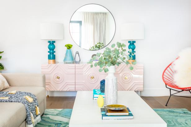
Just when you thought blush was taking a backseat (in my opinion, it will never not be the best shade around), HGTV Home by Sherwin-Williams announces its 2020 Color of the Year: Romance — a calming, yet posh, blush pink with apricot influences. Oh, the possibilities.
While I’m happy to douse everything in my room in Romance, and only Romance — I already have blush colored pillows (read: monochromatic interiors are a thing right now) — those who aren’t blush-obsessed (the rest of the population) might want a more varied palette to work with.
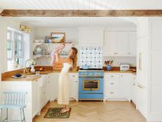
Thankfully, Sherwin-Williams also announced its HGTV Home by Sherwin-Williams 2020 Color Collection of the Year, Simply Blissful, a curated palette of 10 complementary hues: warm neutrals (including Color of the Year Romance, of course) and deep, yet peaceful jewel tones. Available exclusively at Lowe’s, the collection makes it easy to choose color combinations that suit your style — we’re talking paint, accessories and furnishings. Anything goes.
The Collection
Simply put, Simply Blissful as a whole kind of makes me want to go on vacation. You’ve got that deep, turquoise-y navy, Island Time — reminiscent of the Pacific Ocean at sunset — with shade Vanillin playing its sandy, neutral-colored complement.
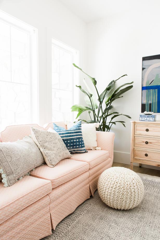
TravisJPhotography.2013
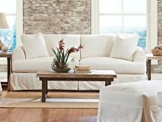
A blush pink couch pairs well with deep turquoise and sandy-colored throw pillows.
And then there’s Coral Reef, a shade almost identical to the orangey-pink coral reefs we wish we were swimming through right now. Throw in Restful, a serene, seafoam green and Finian Blue — think, the color of the sky after it rains — and you’ve got yourself a full-blown tropical getaway.
The best part about Simply Blissful? As HGTV.com’s assistant editor Chelsea Faulkner put it, “Finally! A color collection I would actually use at home. Can we get an amen for the color conservatives?”
Editor Tips: Use Simply Blissful at Home
Alise O'Brien Photography
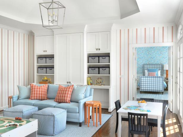
Coral, turquoise and warm neautrals make this dreamy family room totally blissful.
Switching up a room’s color palette can be overwhelming, so I tapped our HGTV.com editors for some tips.
Personally, I’m all about the monochromatic color scheme we talked about earlier — and if you are too, try pairing Romance with Coral Reef, or even Gristmill Greige with Vanillin.
Looking for a timeless palette? You’re in luck. “Every color is understated enough to live in (and with) for years, no matter how your style or tastes change,” says Chelsea. She gravitates toward Fundamental White. With its subtle gray undertones, it might look nice on the walls of a bedroom (her bedroom — but also, yours).
It's a no brainer that the collection lends itself perfectly to coastal-themed spaces, but Online Editor Jackie McGilvray sees these colors working in other, less-obvious ways. "The earthiness of the collection would be a cinch for gaining a boho Southwest vibe. I can even see this palette working in a mid-mod setting," she says.
HGTV.com’s Editorial Director, Kelly Smith-Trimble suggests using Romance as a neutral base, because while the shade doesn’t speak strongly alone, “when paired with any of the bolder hues in the palette, it becomes an unexpectedly ideal companion,” she says. “With the blues, it feels decidedly Scandinavian-inspired, and farmhouse-y with the sage green and off white.”
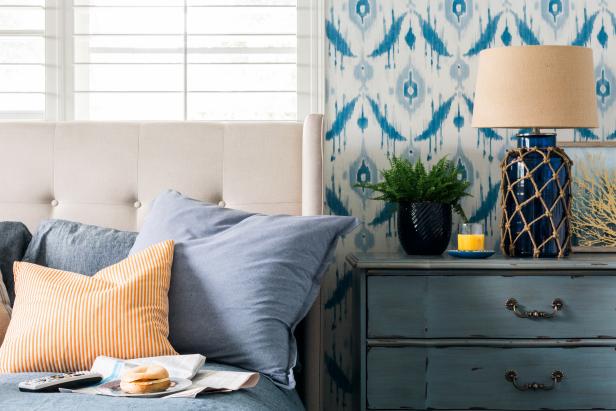
If you like bold on bold, why not try coral and teal together? Or even blue on blue.
Rustic White Photography
Want to add color to a smaller space? “While I’m a fan of Romance, I’ve been on the hunt for the perfect shade of blue for my guest bath and, it looks like Mint to Be is, well, meant to be,” says Managing Editor Camille Smith, who adds that the collection as a whole can look equally at home in a kitchen, living room, bedroom or bathroom.
Felicia Feaster, Managing Editor suggests using one of the rich, seafaring-evocative blues — such as Blue Endeavor — on kitchen cabinets or in laundry or mud rooms. “The HGTV Home color palette features the kind of subdued, tranquil hues — like Finian Blue, Fundamental White, Romance and, of course, the gentle seafoam shade Restful — that feel like a wonderful, peaceful respite from the hectic, busy world we live in.”
Sort of sounds like a vacation from … well, everything, right? Bring it on! There’s nothing better than creating your own personal oasis at home.
“Overall, the palette feels comforting and restful, like it’s encouraging us to ‘keep calm’ in 2020,” says Kelly. “That's advice we can all take to heart and to our homes.”


