


1 / 14
Photo: Pantone
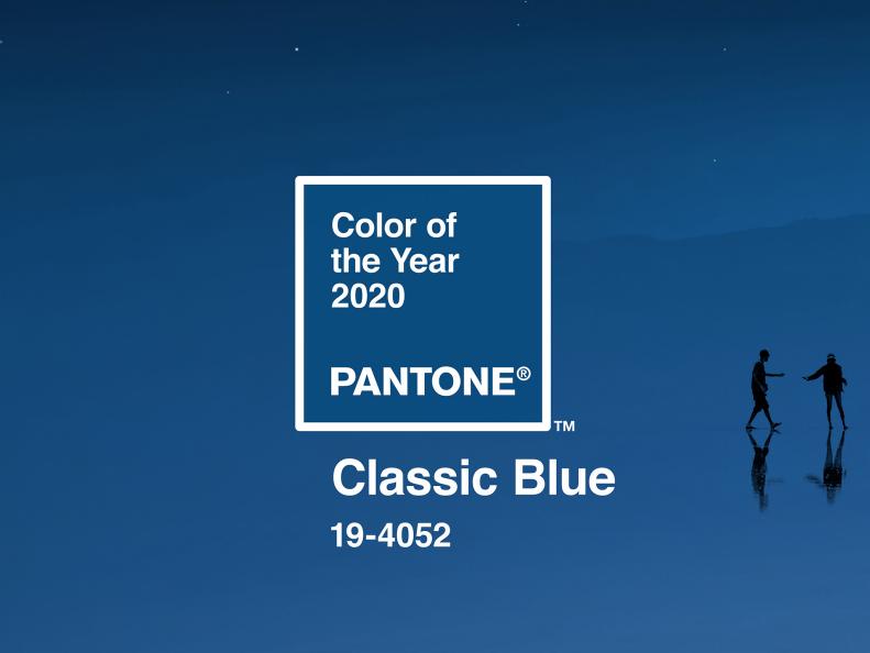
Pantone's Classic Blue
In 2019, we floated through the year with lively Living Coral (16-1546), but now we’re building a stable threshold with Pantone’s 2020 Color of the Year Classic Blue (19-4052) — a rich, dreamy, dark and beautiful shade of azure. “We are living in a time that requires trust and faith. It is this kind of constancy and confidence that is expressed by Pantone 19-4052 Classic Blue, a solid and dependable blue hue we can always rely on,” says Leatrice Eiseman, Executive Director of the Pantone Color Institute. This particular shade of blue is reflective, anchoring and self-assured. It’s relaxed and restful, and meant to offer us all a sense of needed tranquility.


