


A '70s Kitchen Gets a Much Needed Makeover
This dreary space featured in HGTV Magazine was in desperate need of an overhaul to stay in step with its sunny locale — and its growing family.

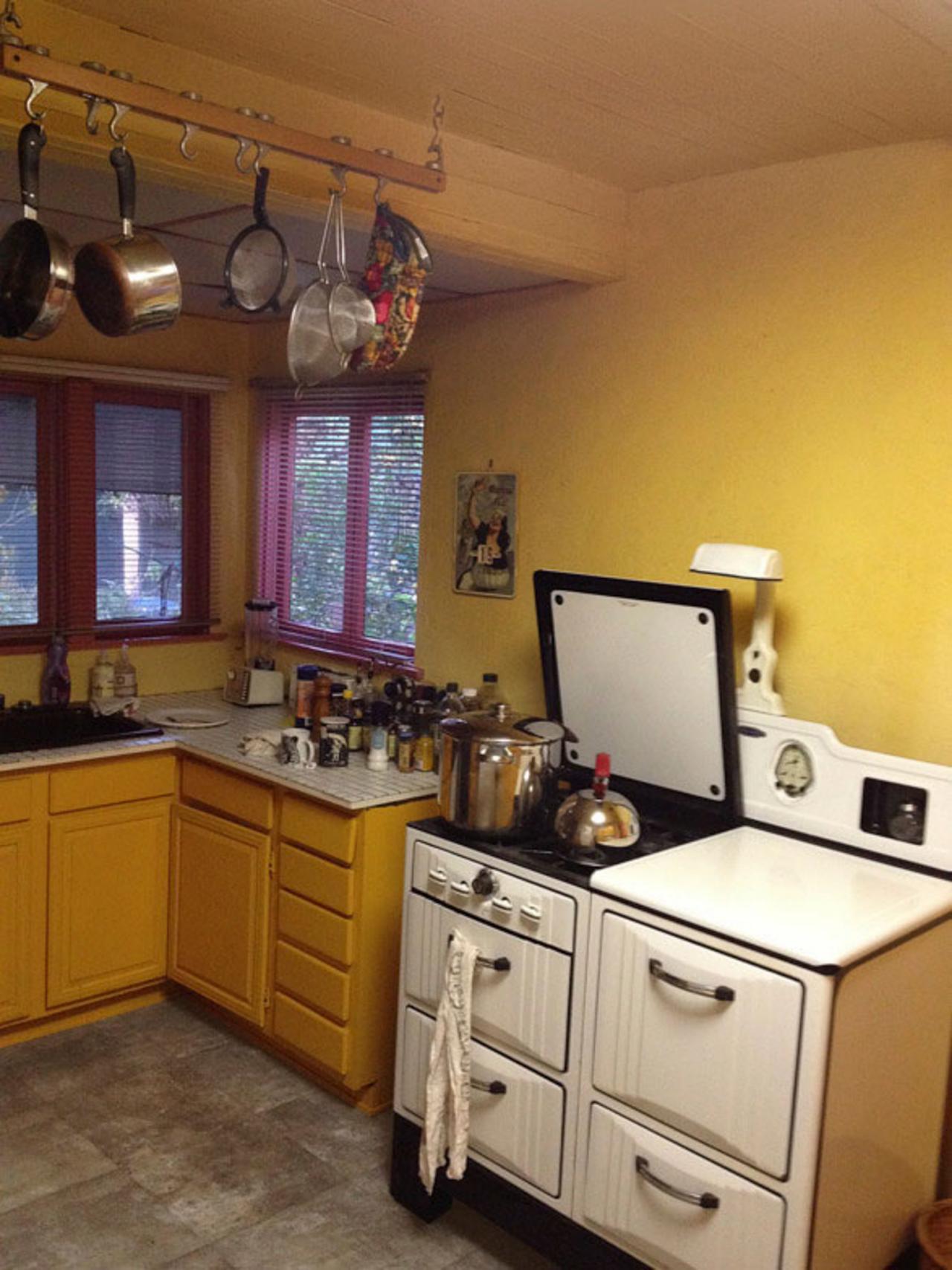
Before: Mustard yellow walls were way past their expiration date. But wait! Could the vintage range be saved?
Before: Mustard yellow walls were way past their expiration date. But wait! Could the vintage range be saved?
Before
The kitchen in Rebecca Wilkinson and Harry Owens’ 1925 Los Angeles bungalow was like an oversize time capsule, complete with mud-hued linoleum floors, icky yellow walls and, worst of all, 1-inch-square-tile counters with hundreds of grout lines that could be cleaned only with a toothbrush. It added up to a dark, outdated space that wasn’t just depressing to cook in but also so measly on cabinet space that the couple had to store drinking glasses in the dining room.

After two years of making do, Rebecca and Harry had finally had enough. Designer Jessica McClendon stepped in to help with a top-to-bottom renovation. Their new kitchen is bright, cheery and packed with storage — and with the overhaul complete, now they can focus on their next project: their first child. “People say that you get used to things after a while, but I think this kitchen will defy the odds,” Rebecca says. “Every time I walk in, I just feel happy.”
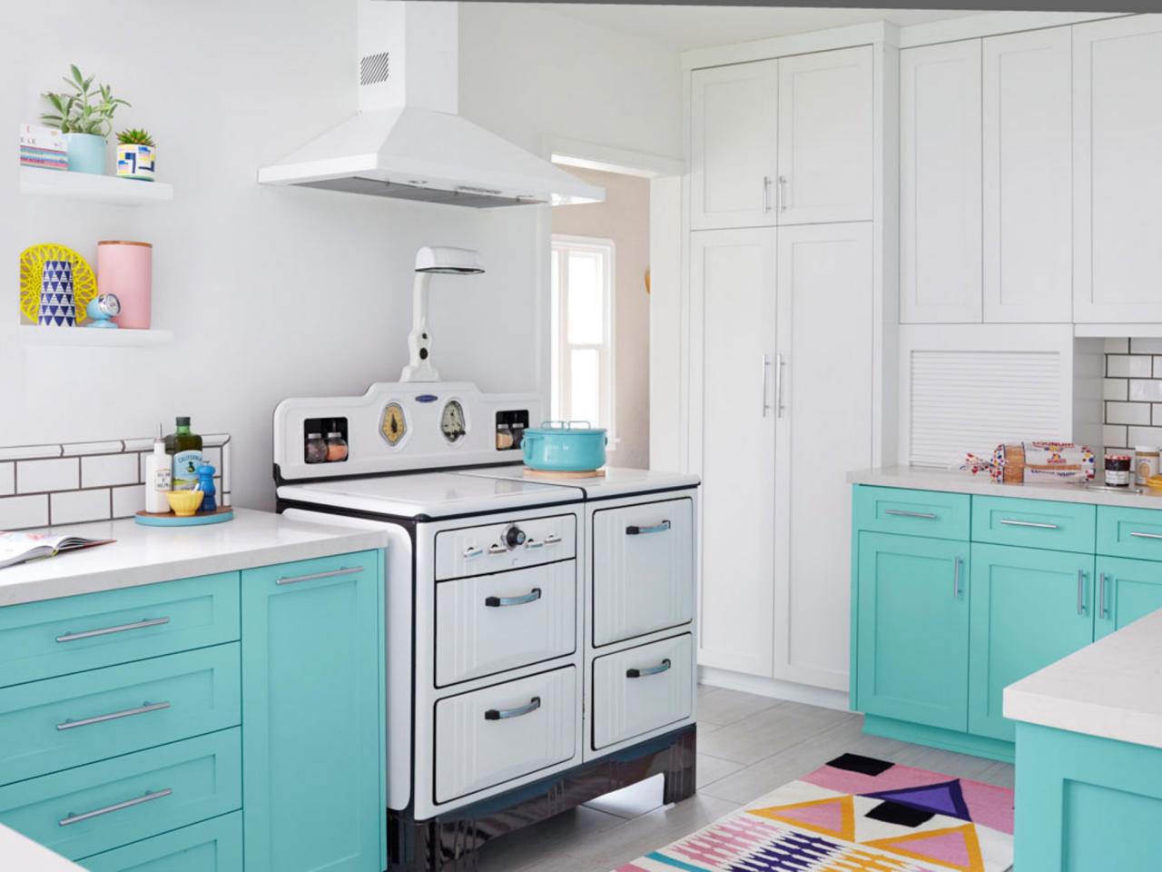
After

Vintage Stove: Rebecca was adamant about keeping her mint condition 1940s Gaffers & Sattler range with its oven, broiler and storage drawers. “We’ve never repaired it, and it still keeps perfect temperature,” Rebecca says. “The only thing I worry about is buying too big a turkey on Thanksgiving.” A new vent hood above it almost disappears, thanks to a white finish that matches the wall color (Super White by Benjamin Moore).

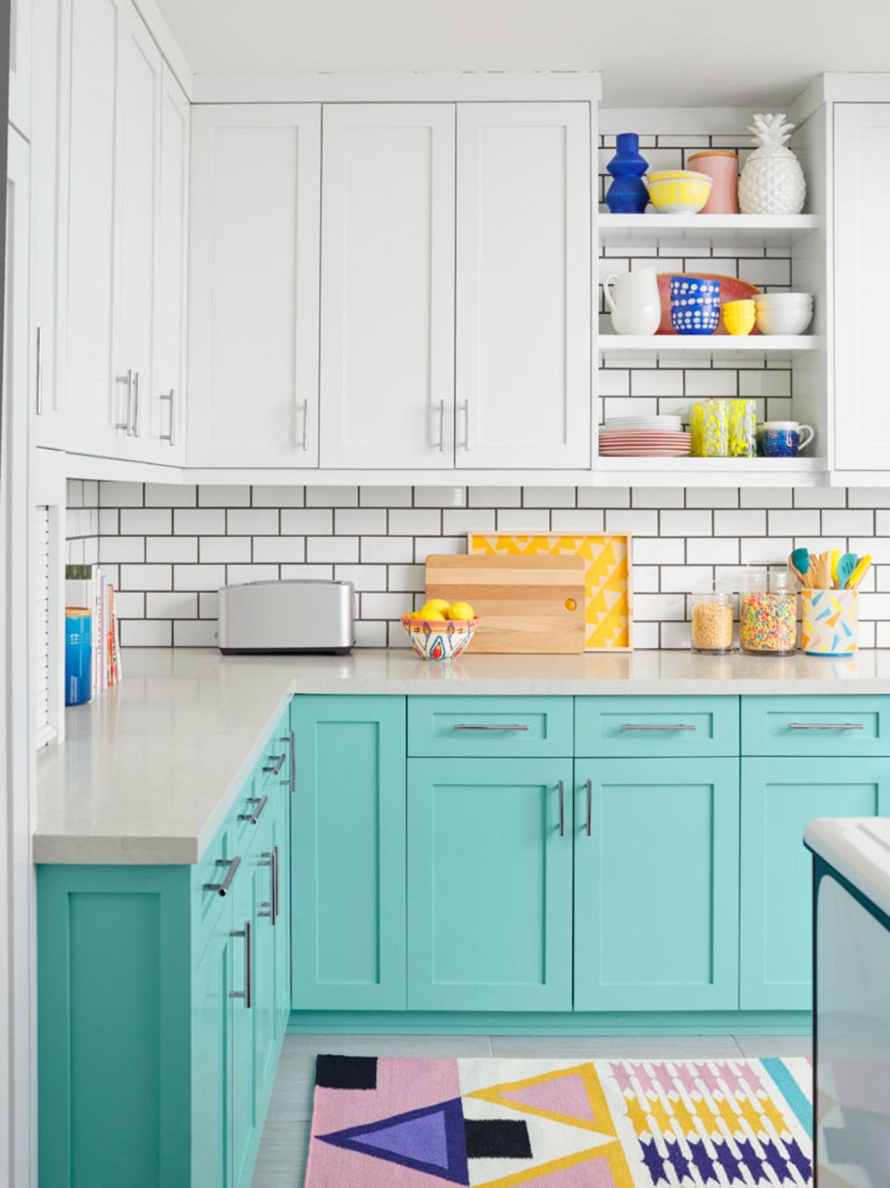
Backsplash: White subway tile, a turn-of-the-century detail, is a nod to the home’s 1920s roots. It’s set off with dark gray grout, and the high-contrast result is “simple and clean without being boring—exactly what we wanted,” says Rebecca.
Open Shelves: A niche of shelves with tiles behind them (clever!) breaks up the swath of white cabinets. At 24 inches wide with cabinets on both sides, the space is easy to keep neat.
Cabinets: To max out storage in the 13-foot-by-15-foot space, the upper cabinets reach to the ceiling. The couple initially planned to paint the whole assembly white, but designer Jessica suggested a different hue on the lower cabinets so the room wouldn’t feel stark. Harry chose this watery blue-green (Oceanic Teal by Benjamin Moore) that shifts with the light. “It brightens the kitchen, but in a not-garish way,” he says. The chrome bar pulls are from Top Knobs.

Sink and Faucet: “One thing I knew I wanted was a farmhouse sink,” says Rebecca. This glazed fireclay beauty from Whitehaus is 16 inches deep and faces the backyard. Pairing it with a polished chrome bridge faucet from Kohler gives it a modern flair.
Floor and Rug: At first Rebecca considered replacing the tired old linoleum with hardwood, but large matte gray porcelain tiles from Arizona Tile won out because they’re durable and easy to mop. “The finish is really natural-looking, like grayed driftwood,” she says. The flat-weave wool and cotton rug is from Aelfie.
Countertops: The 1½-inch-thick quartz countertops (Caesarstone London Grey) offer the look of white marble without fear of staining. “The tiles on the old counter would shake loose while you were wiping them down,” Rebecca says. “I’m so happy I don’t have to worry about that anymore!”


