


Color Consultation With David Bromstad

RX-HGMAG021_Color-Consult-046-a-3x4
HGTV Magazine gets help from paint pro David Bromstad, host of Color Splash, to help sort out your paint problems.
Photo by: Joe Schmelzer (styled by Kyle Schuneman)
Joe Schmelzer (styled by Kyle Schuneman)
Q: I’m worried about scuffs on my molding, so I want to paint it black. Is black as neutral as white or wood trim?—Alicia Garant, Freeland, MI
David says: Black may be neutral, but it’s actually the toughest color to take care of. I put black floors in my house and, honey, I’ll never make that mistake again! They show every footprint, paw print, and piece of lint. White trim, on the other hand, hides dust and is easier to touch up. If you’re set on darker trim, try an espresso stain. A stain seeps into the wood, so you’re less likely to see dirt on it.
Q: My house has an open floor plan, and everything in it is beige. I like pale blue, gray, and plum. How do I work them into the space so they flow together?—Cheryl Rykwalder, Old Hickory, TN
David says: To break free from your beige prison, I suggest making a big move: Paint the walls a mid-tone gray. It’s a soothing color that will make the space feel sophisticated. People think painting walls different colors in an open plan will help define the space, but it ends up looking disjointed, so use one color. Then bring in the blues and plums with upholstered furniture, an area rug, art, and accessories.
Q: What wall colors look good with dark woodwork? I don’t want to paint the trim that’s original to my house.—Linda Nicholas, East Liberty, OH
David says: Dark woodwork can be incredible, but only if the wall color majorly contrasts with it; otherwise it’ll look like a haunted house. That’s why I would go with white. (Yes, Mr. Color Splash loves white walls. Shh!) The lighter the walls, the more high-end the trim appears. If you love color, choose a pale shade, like a gray-blue or muted green, which will freshen up the dark wood.

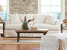
Beach House Blues
For a room with bright walls, David Bromstad, host of Color Splash recommends you keep your furniture neutral. "Think natural woods with crisp white or rich cream upholstery," says David.
Q: I painted every room in my house bright blue. My sister thinks it’s too much, but I think it’s happy and playful. Is it wrong to paint your whole house the same color—especially a vibrant shade?—Pamela Martin, Manasquan, NJ
David says: Tell your sister to mind her own business! Seriously, though, if you love a bright color on all your walls and don’t think you’ll get sick of it anytime soon, go for it. Just keep your furniture neutral—think natural woods with crisp white or rich cream upholstery. That will help the blue feel like a backdrop rather than competition for your eye. My other trick is to use even more saturated colors as accents. Fuchsia pillows, tangerine bowls, and a neon yellow vase or two will make an otherwise potentially crazy shade seem toned down in comparison.

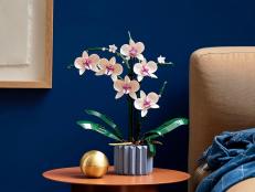
Avoid Going Match-y Match-y
Instead of pulling colors from the picture, David Bromstad, host of Color Splash recommends going neutral. "Gray is a great choice for a bedroom because it’s calming," David said. "And it’s one of the easiest shades for your eyes to adjust to when you wake up."
Q: I hung a large piece of art in my bedroom that shows island waters in vivid blues and greens. What color should the wall behind it be—a neutral shade or one that picks up a color from the artwork?—Linda Pike, Wooster, OH
David says: It looks like you have really good taste in art. But the minute you start pulling colors from the picture, you take away from its beauty. Instead of painting your walls blue or green, go with a neutral. Gray is a great choice for a bedroom because it’s calming, and it’s one of the easiest shades for your eyes to adjust to when you wake up. Taupe or another neutral would work too—basically, any color that let’s that gorgeous image be the star. Accent pieces are another story. A lot of designers say not to match your accessories with your artwork, but I say, “Why not?” A mint blanket or a turquoise lamp will pull the whole room together.

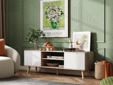
Great Room Color Consultation
David Bromstad, host of Color Splash recommends a neutral like taupe or beige to bring the focus to the window itself instead of a dark color like red-orange.
Q: Are feature walls outdated? I’m trying to figure out how to treat this tricky wall in my great room, which is one and a half stories tall.—Judi Gerstein, Rockford, IL
David says: I love a good feature wall, especially one with sky-high ceilings, but this one isn’t working. Don’t get me wrong—the window’s shape is stunning, but the wall color is too dark. You end up looking at the paint instead of the view. And the color is too orange, which clashes with the built-ins. I’d try a neutral like taupe or beige to bring the focus to the window itself. Want to know the real surprise? The feature wall in this room isn’t the one with the arched window—it’s the one with the fireplace, because that’s actually where people most often look. If you want to paint it, try a cool color like blue, purple, or green that will complement the honey-hued built-ins.


