


Oceanfront Apartment Showcases Art Collection
An oceanfront apartment is full of color and personality thanks to the Carter Design team. With a focus on the owner's art collection, the design emphasizes an open floor plan, natural materials and the spectacular views just outside.

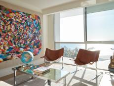
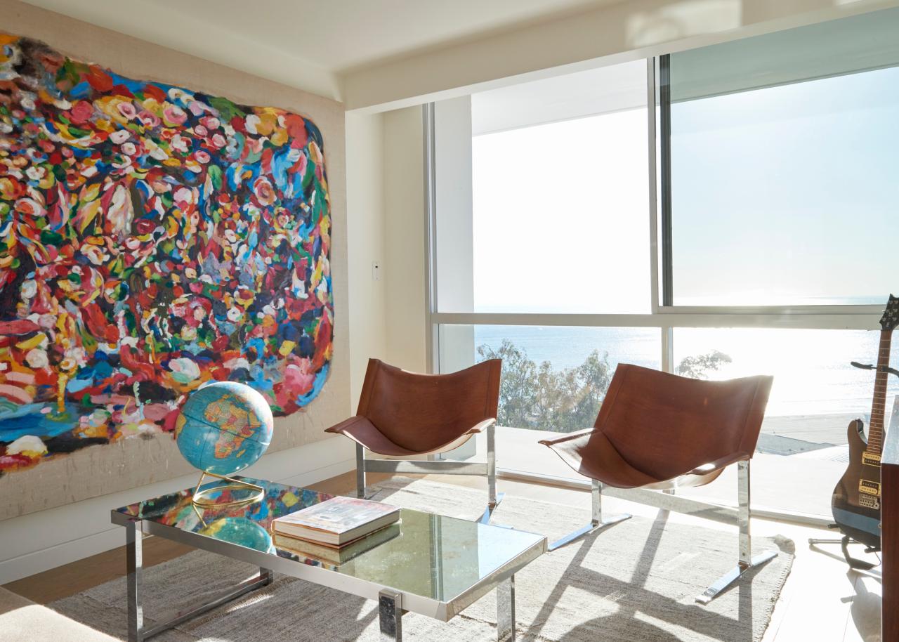
Music Room
The music room doubles as a guest room when the space is needed.

Photo by: Andre Vippolis
Andre Vippolis

What did your client want for their apartment?
They wanted to open up the apartment and expand the view. The client is an avid art hunter with a wonderful collection, so we also had to keep wall space. The apartment is relatively small so it was important to give it a cohesive feel.
How did you improve functionality for your client?
The apartment was divided up and did not take advantage of the incredible view of the California coastline visible through the full-height windows that run its western length. While we wanted to bring in the beach, the client is a world traveler who has spent extended time in Japan and Europe and on the East Coast. We never wanted it to feel like a “beach apartment.”
What was your biggest obstacle during this project?
We were locked into exact bathroom and fixture locations. The ceilings were originally very low, so we had to choose where and how to run soffits. At first this seemed like a huge obstacle, but once we embraced it we let the ceiling create space within the open floor plan and installed recessed lighting that washed over the soffits. This accentuates the gallery feel and allows the art to really shine.
Photos
See All Photos
What inspired this home’s design?
Every room has a view of the ocean. We moved walls and positioned things so that the client can lay in the tub and see the ocean. We looked at a lot of architect John Pawson’s work to study how he volumizes space and uses natural light and natural materials in a spare way. That influenced the shell of the apartment, which was inspired by light and the ocean. The furniture added personality. The client is very creative with a wonderful personality and sense of humor. He loves to play with color and tone and periods. We took an old pair of Donghia barrel chairs and upholstered them in serape blankets and paired a 19th-century Oushak rug with a midcentury Borge Mogensen sofa, and it all just worked.
How did you create room transitions?
The base layer throughout the space is all the same: same floor, same paint on the walls, same woodwork throughout. The living room is more collected and refined with a warm, sophisticated tone, the record room is more pop and exuberance, and the master is quiet thoughtfulness with indigos. I would say the function of each room defined their individuality.
How did you choose the palette?

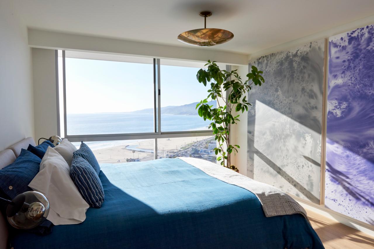
Master Bedroom With Ocean View
For the master bedroom, Carter Design wanted to highlight the view of the ocean. The blue bed spread makes a connection to the blue of the ocean outside.
Photo by: Andre Vippolis
Andre Vippolis
We had a lot of samples made to help choose the right floor, stones, woodwork, hardware and paint palette. We would lay down samples during the apartment demo at different times of day until we found something that clicked. The wall treatment in the master bedroom is a diptych photograph by artist Sayre Gomez.
What was your favorite room to design?
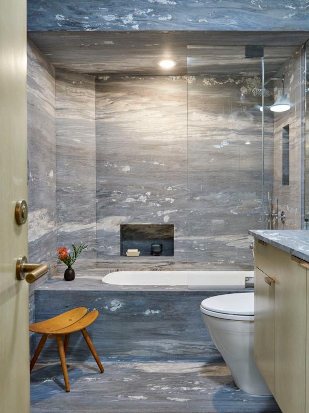
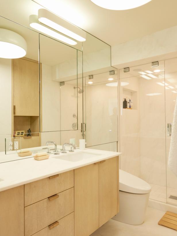
The front bathroom with the blue stone. We searched for the right stone because it was such an integral part of the design. The entire bathroom is stone: all of the walls, the floor, counter and tub deck. We searched many stone yards in the Los Angeles area. Then we found the blue stone that complemented the palette we chose. The bathroom makes you feel like you’re inside a wave.
Did a particular element tie the design together?
The bleached walnut woodwork is incredible. That was our base. The carpenters and finishers created that as a sample when we were choosing the palette, and when we saw it we were inspired. It is like elevated driftwood — warm, inviting, with a little bit of mystery. Those are the feelings we wanted to evoke in the apartment.
What is your favorite thing about this apartment?
We finished this apartment three years ago, and when I speak to the client he says that every time he walks in it just feels complete. He has also been able to change out his art and move it around flawlessly, which was a goal of the design. I still love the woodwork and hardware from Sun Valley Bronze. The combination is simultaneously austere and rich. I love balancing that paradox.
How did you give the living room such personality?

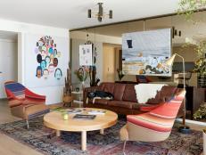
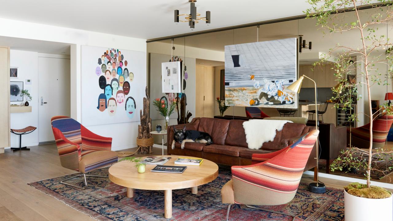
Living Room Features Vintage Leather Sofa & Mirrored Wall
A vintage leather couch and a pair of modern armchairs with Serape fabric off stylish and comfy seating in this living room. Artwork by Barry Magee from the clients' collection decorate the walls and add interest to the design. A bronze mirror on the wall behind the couch visually expands the space.
Photo by: Andre Vippolis
Andre Vippolis
Those serape chairs were the client’s idea. He already had the chairs, but they were a dull gray. I wanted to change them. He was unsure, but then a few days later asked, “What about serape?” I was surprised. The day before he called I had been in Surfing Cowboys in Venice, and they had incredible serapes from Mexico City. So I drove down, picked out four and got everything to the upholsterer before the client could change his mind. Our upholsterer said four other designers offered to buy the finished chairs.
I found the vintage Borge Mogensen sofa and showed it to the client. It was the last thing for the room, tying it all together, and the patina on the leather was so good. It kept the room from feeling too new.
The faces painting is by California artist Chris Johanson and part of the client’s amazing collection. Everyone loves that painting.
What makes this project uniquely yours?
Every project is so different. I use a cohesive, holistic approach to space to create a timeless look. I also use natural materials, have an appreciation for location and natural surroundings, and favor artisan-created fixtures.
What “hidden gems” are in your design?
The simplicity of materials, which is very hard to do. The bronze mirrored wall that reflects the ocean is an outstanding detail in this project.


