


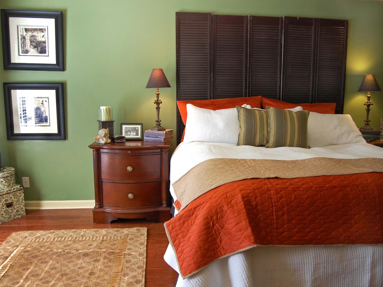
Naturally Sophisticated Green

Paulette Diamond, ASID, vice president of the International Association of Color Consultants North America says, "Use soft greens against neutral earth colors of sand, rock and soil, and use along with accents of deep, rich terra cotta." She says "a neutral green (between the poles of yellow and blue) creates a mindset of peace and tranquility. The more blue-based a light shade of green, the more refreshing it becomes."
Color trendwatcher Catherine B. Stein, president of the Color Council, says Kelly green is the color to watch. Having strutted down the runway several seasons ago, it's now showing up in accessories and is used as a fashion accent color for interiors.

Stein also notices a movement away from yellow-greens toward an interest in mint.
The ceiling, covered in a golden-hued metal leaf, makes the glaze on the walls look even richer, and lends the room a sophisticated, urbane look.

"This room is the perfect place for relaxing and entertaining," Canet says. "It is ideal for cocktails, after-dinner brandies, conversations or catching up on some quiet reading."

Get The Look
Just about any green can look sophisticated, Canet says. "It is all about how these colors are presented, and in what doses they are applied. While pink and green is very traditional, there is nothing clichéd whatsoever about bright pink and chartreuse! Even the most predictable and favorite combinations can be made to look fresh and new when applied correctly and with confidence."
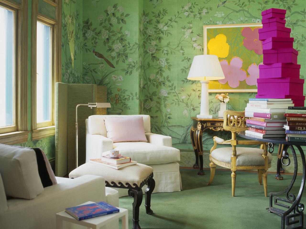
"I love green," Angus says. "I had this wallpaper custom designed and handpainted in China. I asked for peony bushes and chose the flower colors, as well as the background green."

The wall-to-wall wool carpet is also a deep, soft green – Stark Carpet Corp.'s Teide (color #7068). An Italian chair and Portuguese Rococo table add additional curves and a rich sense of history – beautifully highlighted by the contrast of the bright, modern graphic of Andy Warhol's "Flowers" silkscreen, created in 1970.
Get The Look
To provide storage – and contrast – Angus had bright pink boxes made to order and stacked them on a table. "I thought it would be fresh and punchy," she says. For a subtler use of green, she says, "lots of greens together can look very beautiful. And green with pale blue or pale violet is heavenly." While Angus adores green in almost any setting, she cautions against using it in a master bathroom. "You would put on way too much rosy makeup to compensate for the green cast of the walls, and could end up looking like a fool in the daylight!" she says.
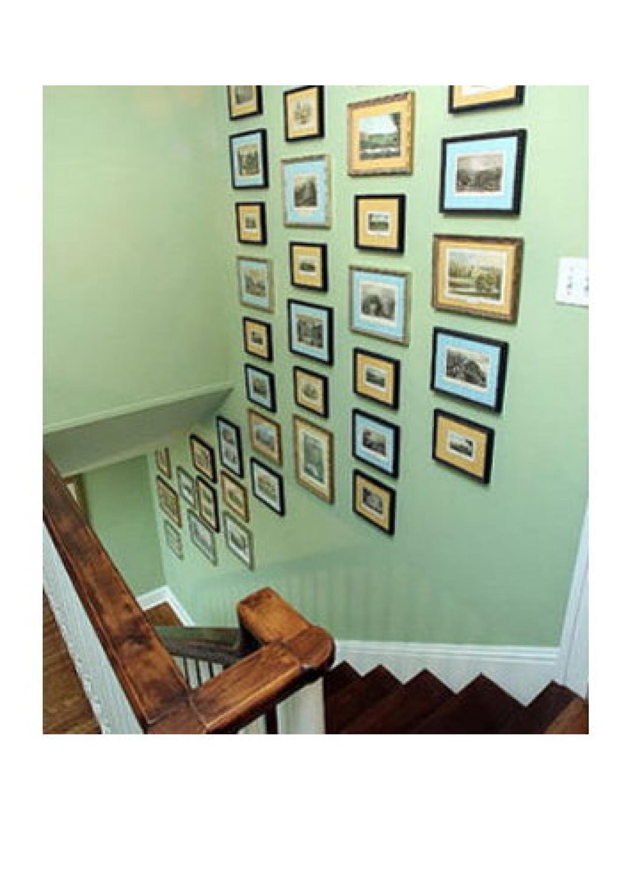
The blue-tinged green walls are the color of milk glass. "It's sort of soft but cheerful at the same time," Loecke says. He continued the color from the foyer up the front stairway to the second-floor hall, using the green as a backdrop for antique prints with alternating yellow and blue mats.
"This stairway wall is the first thing you see when you walk into the house, so it really had to be interesting," he says. "By alternating the mats, I added to the visual impact of the arrangement."
Get The Look
If you want to accent a secondary color like green with its two component primary shades, Loecke says, make sure you stick to the same color values as he did with these blue and yellow mats — pale with pale, clear with clear. "A navy blue wouldn't work with this green," he says. "It would be too dark. And a muddy yellow, which might work with a khaki green, would not be right here, either. With this bright, light green, you need a yellow that is bright and light, as well."
Loecke follows the same-value rule to create rooms in green and orange, and green and pink – "even green with lavender can work really well," he says. "Because green is a color you find in nature, it actually works well with just about any color, making it a nice alternative to gray or brown."
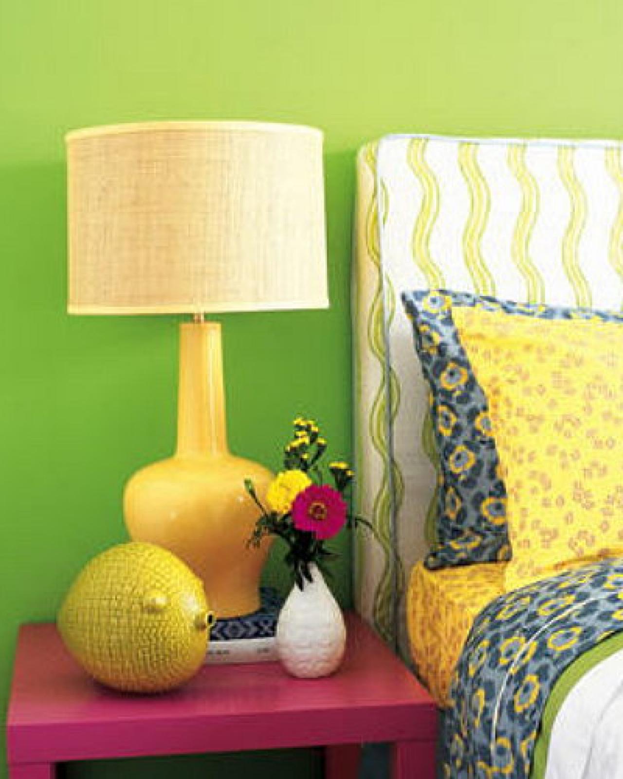
"The table, from Ikea, is a piece you don't expect to see in pink," he says, "and while I used pink as an accent throughout the room, I stayed away from a more even pink-and-green balance that might have looked preppier. I also avoided straight stripes, plaids and ginghams, and instead used a painterly, squiggled stripe on the headboard and large, modern leaf patterns throughout the room."
Get The Look
The patterns lend this space a youthful but not childish feeling, as does Loecke's restraint with the green paint. "I used this grass green only on the wall behind the bed," he says, "The other three walls are white. That way, you have the grassy green color but it doesn't overwhelm the room."


