Next Up

6 Perfect Color Palettes

By: Caren Baginski
November 25, 2014
Create the perfect color scheme for any room with tried-and-true paint colors and tips from color experts. Choose one of our ready-to-decorate palettes, or use our color wheel guidelines to create your own.
Price and stock could change after publish date, and we may make money off these affiliate links. Learn more.
1 / 6

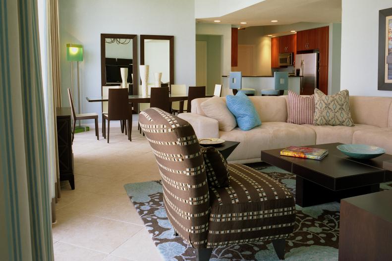
Brown, Blue and Cream

Create an effortless and versatile color scheme by combining brown, blue and cream, like designer Shelly Riehl David did in this kitchen, dining and living room. The trick is to keep the values of each color consistent, like the dark-brown furniture that ties into the brown of the rug. (We found it: Company C's Sachi Black Bean rug.) This frees you up to surprise with accents in similar saturations, but different colors, such as the green lamp and red striped pillow.

More photos after this Ad

2 / 6
From: Lori Dennis

Cinnamon, Purple and Green

When it comes to color, nature is a natural inspiration. Take a cue from the land right outside your window, or your favorite vacation spot. Designer Lori Dennis used muted earth tones in the master bedroom of a client's Palm Springs weekend home. The cinnamon nightstands and ceiling, muted lilac bedding and live green plants work well together as a triad color scheme.

More photos after this Ad

3 / 6

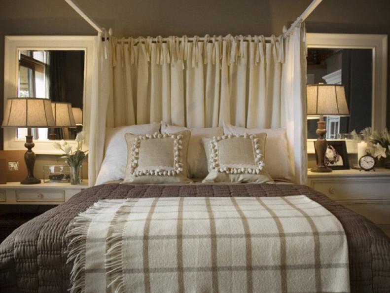
Tone on Tone

Shades of beige, cream and brown make for a restful, comfortable master bedroom, designed by Linda Woodrum for HGTV's 2007 Dream Home. Creating a monochromatic palette is as easy as picking up paint color swatches at a home improvement store. Simply choose one color you like, then go one value up and down from that color in the spectrum. To prevent monochromatic color from being monotonous, introduce textured fabrics and textiles.

More photos after this Ad

4 / 6

One Color, Same Intensity

When going all-out with color, like in this child's bedroom by designer Steven Miller, make sure the color intensities are similar. That is, don't pair pale pinks with neon pinks, or the room will feel disconnected. Likewise, if saturated blue is your color of choice, a pastel blue will look out of place. Even in analogous rooms, which tend to be calming, pick shades that have similar intensities. Photo by Matthew Millman.

More photos after this Ad