Next Up

26 Designer-Approved Dark Green Paint Colors for Every Room

September 03, 2026
Follow Maria on:

Emerald, olive and sage — oh my! Up the drama and the contrast in your casa with these favorite shades from designers and HGTV stars.

Price and stock could change after publish date, and we may make money off these affiliate links. Learn more.
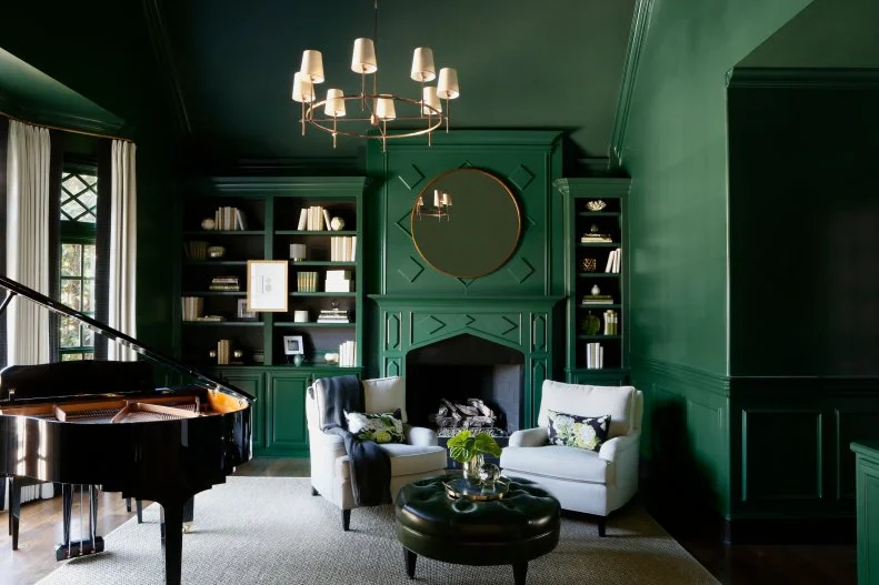
Photo: Matti Gresham Photography. From: Urbanology Designs
Scroll For More Photos
1 / 26

The Best Dark Green Paint Colors, According to Designers and HGTV Stars

Join the dark (green) side ... and never look back! Transform your interiors with dark green paints that bring depth and drama to your design while maintaining an inviting, earthy flair. We’re sharing gorgeous green spaces and the exact paint color for each to help you recreate the wow-factor at home. From rich emerald and mossy olives to smoky sage and the blue-green of your dreams — read on to discover your best green hue and tips for styling each shade to maximize its beauty in your space.
See More Green Paint Colors

More photos after this Ad

Photo: Paige Rumore Photography. From: Vernich Interiors
2 / 26

Courtyard by Sherwin-Williams

If there’s one space that will inspire you to saturate every square inch of your room in dark green, it has to be this study designed by Connie Vernich. The jaw-dropping, jewel-box design is drenched in a deep emerald hue not soon to be forgotten: Courtyard by Sherwin-Williams. The rich shade is at once luxurious, timeless and bold — making it the perfect pick for adorning the walls of formal spaces, like a home office or dining room.

See More of This Home

More photos after this Ad

Photo: Stylish Productions
3 / 26

Chimichurri by Benjamin Moore

Bring some flavor to your walls with this herbaceous hue from Benjamin Moore: Chimichurri. The delectable shade, inspired by aromatic parsley and oregano leaves, is ideal for creating a deep, velvety backdrop in your den, primary suite or dining room. This transitional sitting room pairs the earthy hue with beige walls, blonde oak floors, black built-ins and a sumptuous dove gray sofa.

More photos after this Ad

Photo: Nathan Schroder Photography. From: Urbanology Designs
4 / 26

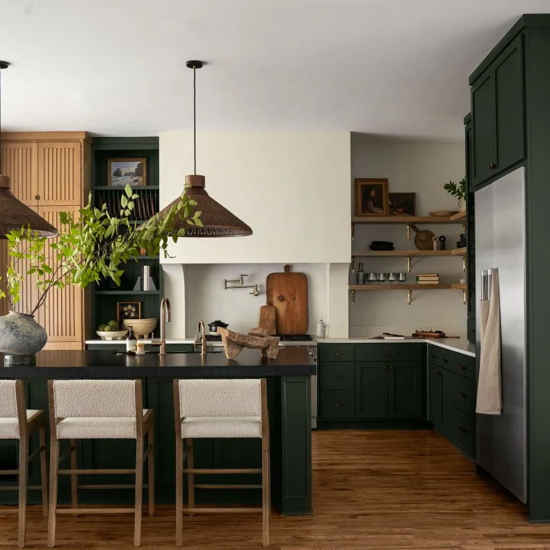
Laurel Woods by Sherwin-Williams

If you want depth and contrast in your space but want to avoid stark or sterile results, this earthen hue will not disappoint. Laurel Woods by Sherwin-Williams features a mix of green, charcoal and cyan tones, resulting in serene, soft and shadowy hue that complements any neutral interior. The team at Urbanology Designs uses Laurel Woods to coat the custom cabinetry in this head-turning kitchen. The moody forest hue serves as a supporting character to the creamy plaster range hood and complements the warm oak floors underfoot.

Green Kitchen Cabinets We Love

More photos after this Ad

Photo: Molly Culver
5 / 26

Calke Green by Farrow & Ball

Pastels are pretty, but no powdery pink or barely-there blue holds a candle to Calke Green by Farrow & Ball. This deep sage is rich and traditional, making it a favorite choice for elevating primary suites, powder rooms and parlours alike. Better still, the confident hue was inspired by the color found in the breakfast room at Calke Abbey. This winning washroom sports the English-inspired shade on the walls and ceiling, creating a handsome backdrop for a classic pedestal sink, brass lights and crisp monogrammed hand towels.

Best Bold Paint Colors for Every Room

More photos after this Ad

Photo: Robert Peterson, Rustic White
6 / 26

Jasper by Sherwin-Williams

This show-stopping shade of green is as dark as they come. Jasper by Sherwin-Williams is a rich, inky shade that’s so deep, it shifts from being a moody gemstone hue by day to a boundless black by night. The decadent hue drenches this contemporary living space, creating a dramatic backdrop for bone-colored carpet, ivory cabinetry, a velvet channel-tufted sofa and lush greenery.

See More of This Living Room

More photos after this Ad

Photo: Behr Paint Company
7 / 26

Grounded by Behr

Mossy and moody? Yes, please. Grounded Behr’s 2027 Color of the Year, and it’s easy to see why. The muted earth tone can bring balance and a sense of calm to your interiors with minimal to no effort on your end. The olive green features brown undertones that make it harmonious with wooden furnishings and appear ultra-rich against soft cream, beige and white hues.

More About Behr's 2027 Color of the Year

More photos after this Ad

Photo: Laurey Glenn
8 / 26

Secret Garden by Sherwin-Williams

Psst! If you’re searching for a dark green paint with minimal blue undertones, you’re in luck. We’re happy to divulge our go-to green for enriching walls — without cool tones weighing things down. Secret Garden by Sherwin-Williams is a lush shade that deepens and energizes your space, thanks to its unexpected yellow undertone. The natural hue saturates the walls and ceiling in this English-inspired pantry, its golden undertones complementing the rattan baskets and bins woven throughout the space.

See More of HGTV Dream Home 2026

More photos after this Ad

Photo: David Tsay. From: HGTV Magazine
9 / 26

Pine Haven by Dunn-Edwards

Escape the ordinary with a few coats of Pine Haven by Dunn-Edwards. The enchanting smoky emerald hue transforms the cabinetry in this contemporary kitchen, making the heart of the home the focal point of the house. The forest-inspired shade plays well with cool-toned materials and finishes, like the snowy subway tile, inky hardware and splashes of cerulean seen here.

Tour This Kitchen

More photos after this Ad

Photo: Jeff Herr . From: James Farmer
10 / 26

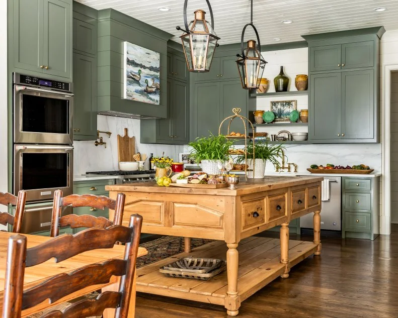
Jade Romanesque by Benjamin Moore

Consider this your sign to listen to the little voice in your head that’s urging you to paint your cabinets green. Jade Romanesque by Benjamin Moore is a dark olive green that promises to bring Old World elegance to any surface of your home. Here, interior designer James Farmer uses the earthy hue in a semi-gloss finish to enhance the custom cabinetry in this traditional farmhouse kitchen. The paint’s warm undertone pairs seamlessly with the golden oak island, acacia cutting boards, brass hardware and creamy marble backsplash.

More photos after this Ad

Photo: Joseph Bradshaw
11 / 26

Rocky River by Sherwin-Williams

Dip your toes (or paint roller!) into cool rushing waters and refresh your walls with Rocky River by Sherwin-Williams. The serene deep green boasts blue-gray undertones and plays nicely with fresh coastal color palettes. Here, designer Brian Patrick Flynn paired Rocky River walls with tailored teal drapery, a ticking-stripe sectional and a circus-tent statement ceiling featuring fellow Sherwin-Williams shades, Snowbound and Quietude.

See More of This Space

More photos after this Ad

Photo: Tomas Espinoza. From: Tiffany Brooks
12 / 26

Privilege Green by Sherwin-Williams

Privilege Green by Sherwin-Williams is a deep minty shade that creates a soothing, spa-like backdrop to even the most bustling locales. The saturated green features blue-gray undertones, making it a cool tone that looks at home next to airy blues and icy hues. Here, designer Tiffany Brooks pairs Privilege Green with orange and rust furnishings to invite interest and contrast into the design.

See More of This Space

More photos after this Ad

Photo: HGTV. From: Jenny Marrs, Dave Marrs and Fixer to Fabulous
13 / 26

Treron by Farrow & Ball

Pigeon by Farrow & Ball is a classic shade adored by designers and homeowners alike. So much so that the brand developed a dark green version of the iconic hue and named it Treron — a green pigeon that calls the jungles of Asia and Africa home. Treron is a smoky, soft green-gray that shines in traditional, modern and rustic interiors and looks especially handsome alongside natural wood and stone. Jenny Marrs used the stormy shade to elevate the cabinetry and create contrast against the white walls and tiles in this neutral kitchen from Fixer to Fabulous.

Our Favorite Neutral Paint Colors

More photos after this Ad

Photo: Joseph Bradshaw
14 / 26

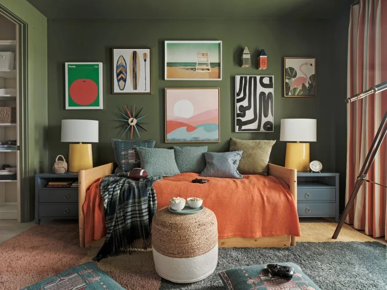
Oakmoss by Sherwin-Williams

Worried about dark paint feeling dreary? Don’t be. Oakmoss by Sherwin-Williams proves that deep hues can bring warmth and delight to your walls. The unique shade features a golden yellow undertone that looks spectacular alongside earth tones and autumnal colors alike. Oakmoss coats the walls and ceiling in this tween’s bedroom, creating a cocoon of coziness ideal for working through their reading list, watching tv or sleeping in on the weekends.

Get a Closer Look at Oakmoss

More photos after this Ad

Photo: Jared Kuzia, Sean William Donovan. From: Casagrande Studio
15 / 26

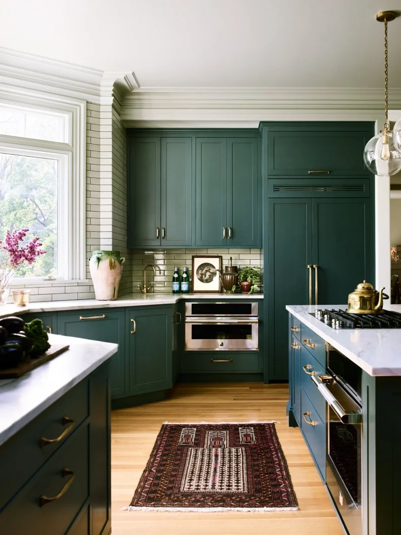
Yorktowne Green by Benjamin Moore

Transform your kitchen into a space that stands out in guests’ minds for years to come with this dramatic shade on your cabinets. Yorktowne Green by Benjamin Moore is a deep teal with prominent notes of blue, green and gray. The team at Casagrande Studio chose the dreamy paint to coat the cabinets in this stunning family home, and the results? Divine. Follow their lead and pair your Yorktowne Green with brass hardware and warm hardwoods for a space that feels balanced and beautiful.

How to use Dramatic Hues in Any Space

More photos after this Ad

Photo: Clay McLachlan. From: Jenny Marrs and Dave Marrs
16 / 26

Green Smoke by Farrow & Ball

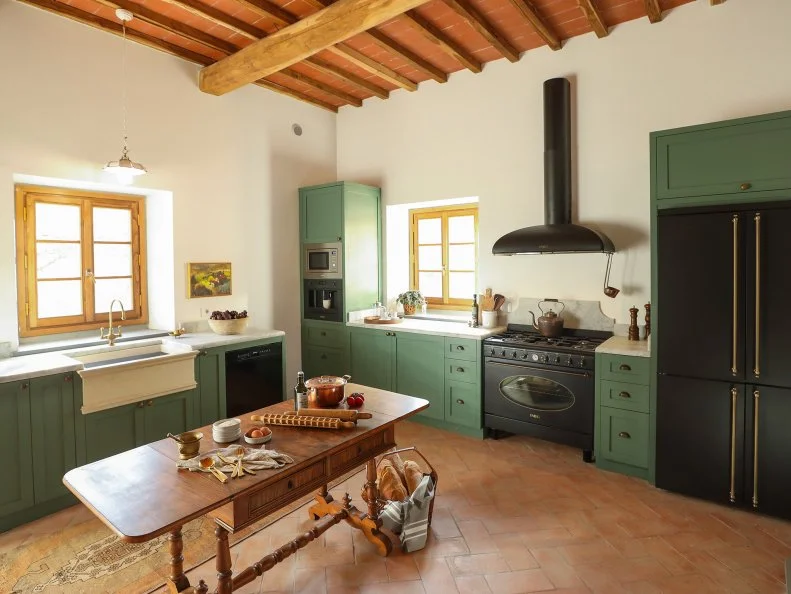
Designer Jenny Marrs employed Farrow & Ball’s Green Smoke to coat the cabinetry and complement the herringbone terracotta floor in the cucina inside their Tuscan villa featured on Fixer to Fabulous: Italiano. The attention-grabbing hue is described as dark and smoky, and features significant blue undertones that ensure it plays well with yellow- or orange-leaning furnishings and materials. Farrow & Ball developed the patina-inspired shade to bring a “weathered familiarity” to exteriors and tranquility indoors.

More About 'Fixer to Fabulous: Italiano'

More photos after this Ad

Photo: HGTV Home by Sherwin-Williams
17 / 26

Cloverfields by Sherwin-Williams

Bring a bounty of luck to your bedroom, kitchen or den with Cloverfields by Sherwin-Williams. This deep-yet-vibrant emerald hue commands attention on any surface, and it looks especially luxe when color-drenched on the walls and ceiling, or applied to cabinetry in a semi-gloss finish. Enhance its natural glamor by pairing the jewel-tone with unlacquered brass hardware or gilt light fixtures.

More Jewel-Toned Kitchen Ideas

More photos after this Ad

Photo: Laurey Glenn
18 / 26

Pewter Green by Sherwin-Williams

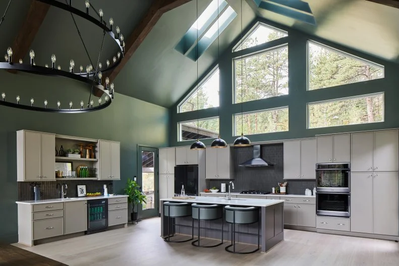
One of the ways designers make spaces with soaring ceilings feel a bit cozier is by choosing a dark paint. Here, Pewter Green by Sherwin-Williams blankets this grand kitchen in depth and invites the same forest tones found just beyond its cathedral windows into the home. The versatile green complements warm woods and cool-toned natural stone with ease, making it an easy, adaptable choice for any interior space.

Pro tip: Pair Pewter Green with polished nickel for a traditional look and matte black for modern farmhouse or rustic interiors.

More photos after this Ad

Photo: Arturo + Lauren. From: Laurie March
19 / 26

Highland by Portola Paints

Follow remodeling expert Laurie March’s lead and revive your white cabinets with a few coats of Highland by Portola Paints. The brand describes Highland as a “deep, mossy olive green,” and it comes in a Roman clay formulation. Unlike traditional interior paints, the Roman clay formula dries to a unique, plaster-like finish that lends an Old World elegance and lived-in look to freshly painted projects.

More photos after this Ad

Photo: Tomas Espinoza. From: Brian Patrick Flynn
20 / 26

Raging Sea by Sherwin-Williams

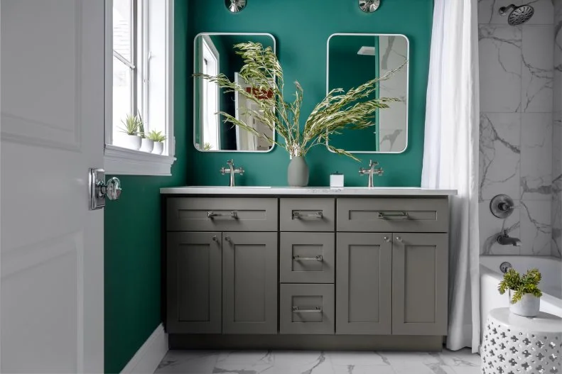
Leave friends green with envy over your home with a few coats of Raging Sea by Sherwin-Williams. The showy blue-green shade brings depth to your walls, creating a clean contrast against white trim, and looks fresh when paired with contemporary finishes like the white marble and gray vanity seen here.

See More Raging Sea

More photos after this Ad

Photo: Sherwin-Williams. From: HGTV Magazine
21 / 26

Billiard Green by Sherwin-Williams

The first words that come to mind when we see this handsome hue? Game on. Billiard Green by Sherwin-Williams draws inspiration from the felt covering a classic game table. The sporty shade is dark, soft and enduring, making it ideal for spaces you rarely reinvent, like a formal dining room, foyer, power room or study. And — of course — the walls of your family game room are always a solid option, too.

Get More Game Room Ideas

More photos after this Ad

Photo: Peter Wynn Thompson. From: Jenny Marrs and Dave Marrs
22 / 26

Vintage Vogue by Benjamin Moore

Set the mood in your basement, family room or home study with Vintage Vogue by Benjamin Moore. The intriguing hue is described as an “ultra-dark, smoky green” and designed to be used in place of black or brown in your design. Jenny Marrs offers ample inspiration in this space. She color-drenched the walls and ceiling and paired the shadowy shade with cognac leather armchairs, brass sconces and a vintage rust-colored rug for a balanced result.

More photos after this Ad

Photo: Tomas Espinoza
23 / 26

Retreat by Sherwin-Williams

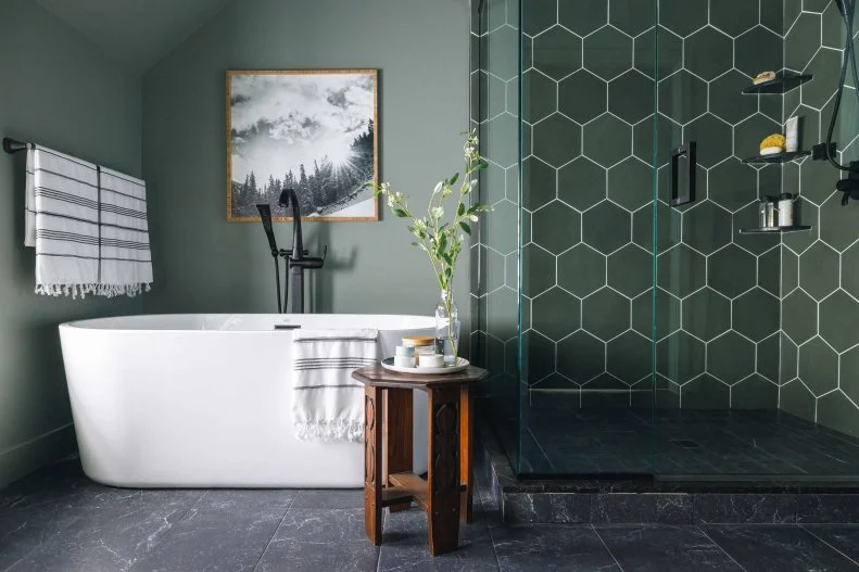
Muted, cool and calm — Retreat by Sherwin-Williams is the ultimate dark green to transform your bathroom into an at-home oasis. Here, designer Brian Patrick Flynn uses the grayish sage on the wall and ceiling to create a shadowy stage for a snowy-white soaking tub. Dusky gray porcelain tiles invite a lived-in texture underfoot, while glossy hexagon tiles a few shades darker than the walls line the shower stall.

See More of This Dreamy Bathroom Design

More photos after this Ad

Photo: Alison Gootee. From: HGTV Magazine
24 / 26

Rosemary by Sherwin-Williams

Pay homage to your favorite fall herb and paint your kitchen cabinets or walls Rosemary by Sherwin-Williams. Here, the muted silvery green coats a built-in pantry complete with mercury glass inlaid doors and brass hardware. The calming color works overtime in this space, complementing the soft white walls and providing fresh contrast against the geometric rose-and-marigold floors.

Tour This Kitchen

More photos after this Ad

Photo: Adam Albright. From: HGTV Magazine
25 / 26

Salamander by Benjamin Moore

Sweet dreams are easy to come by when your walls are painted Salamander by Benjamin Moore. The dramatic hue wraps the room in darkness, creating the ideal backdrop for catching z’s and turning off mental chatter at the end of the day. The ultra-dark, best-selling shade features a mix of blue, green and black and shifts between colors throughout the day depending on the light.

Tour This House

More photos after this Ad

Photo: Matti Gresham Photography. From: Urbanology Designs
26 / 26

Black Forest Green by Benjamin Moore

If you want a dark green so dark, guests assume it’s black at first glance, Black Forest Green by Benjamin Moore will not disappoint. The ultra-dark, inky green shade has the power to transform even the most open and airy spaces into a cozy cocoon. The design team at Urbanology Designs created a jewel-box effect in this craftsman living room, applying Black Forest Green to the walls and ceiling and staining the hardwood floors an equally mood shade of espresso.

See More of This Eclectic Texas Cottage Transformation