Next Up

The Best Bold Paint Colors for Every Room of Your Home

April 26, 2022
Follow Lauren on:

Tropical-cocktail powder rooms, wasabi kitchens, rich amethyst bedroom suites? Yes, yes and yes. When you’re ready to take the plunge with bright, deep and saturated shades, we'll help you make a splash.

Price and stock could change after publish date, and we may make money off these affiliate links. Learn more.
Scroll For More Photos
1 / 21

Ready for Big Color? On Your Mark, Get Set …

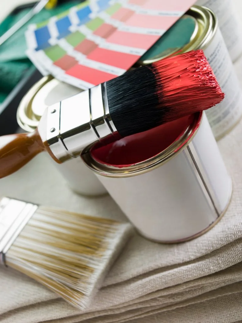
A grand gesture like a look-at-me paint shade works best when you’ve done a serious think-around ahead of time. Bold hues in particular are full of pigments that will change character as they pick up the textures in different surfaces, catch the light at various times of day, borrow a bit of personality from the objects you place on and beside them — you get the picture. The surefire way to know that you’re making the most effective power move is to buy a handful of sample pots, brush them with gusto across poster boards and take those trial patches on a thorough tour of your space. For even more prep pointers, look to our expert tips below, and be sure to show us your gorgeous grand-finale “After” pics.
READ MORE

More photos after this Ad

Photo: Dabito. From: HGTV Magazine
2 / 21

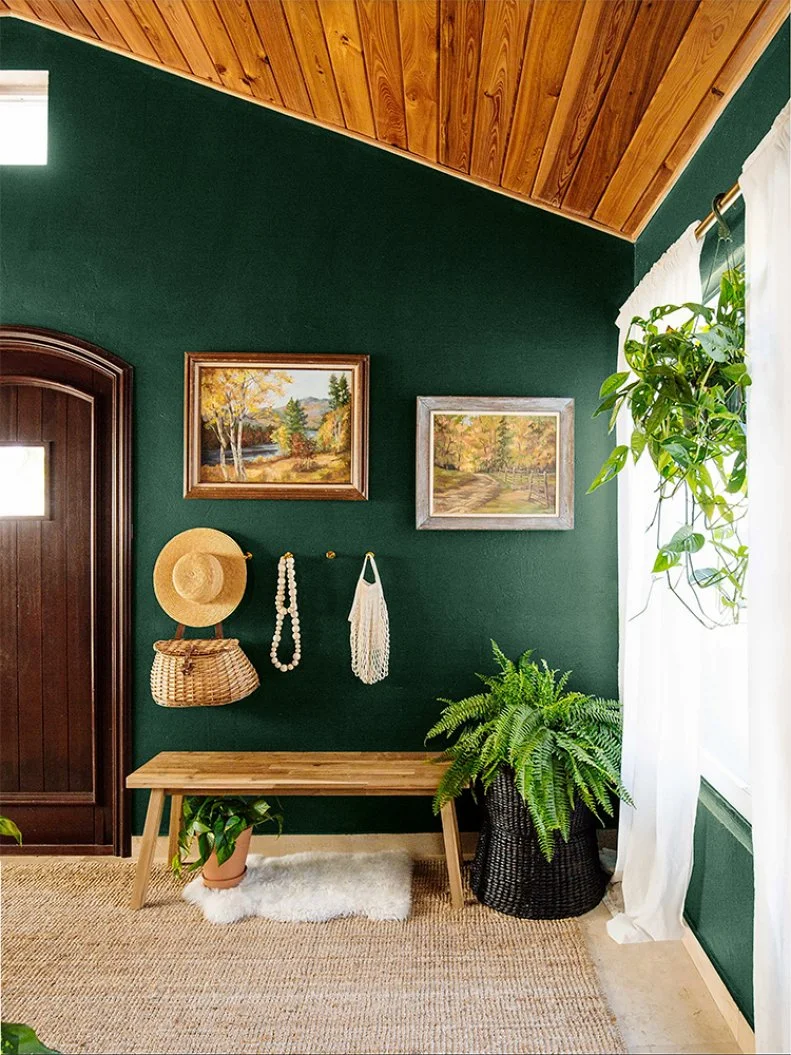
Go Deep With Green

Who says entering the home needs to feel like going indoors? A verdant entryway hue like this one beckons visitors into a leafy, shade-dappled glade, and that serene first impression will set the tone for every space that follows. (It should go without saying that an emerald tone of this sort plays beautifully with house plants and wood furniture.)

Try This Shade: Deep Pine, Dunn-Edwards

see more photos

More photos after this Ad

Photo: Dabito. From: HGTV Magazine
3 / 21

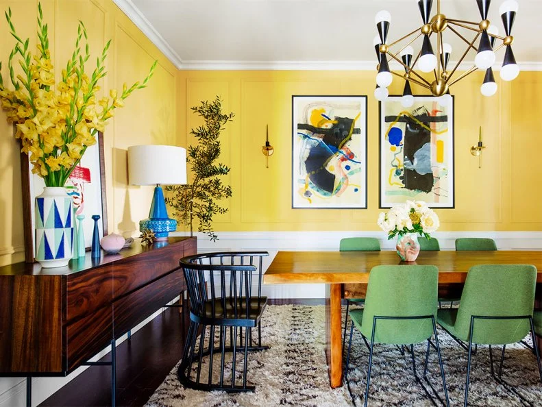
Set Your Sights on Sunny Yellow

Even with nary a window in sight, this sunny space evokes a Mediterranean afternoon. Invite the light in with a cheerful-yet-sophisticated shade that pairs beautifully with exotic art. This tone feels worldly rather than childish: It’s inspired by the bright leather footwear Moroccan men favor.

Try This Shade: Babouche, Farrow & Ball

learn more

More photos after this Ad

Photo: Graham & Brown
4 / 21

Try a Taste of Plum

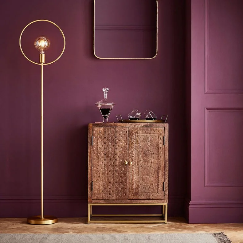
If luxurious metal finishes and intricate, warm wood strike your fancy, indulge in the richness of a velvety purple; there’s no better hue to frame brass. Tones like this one are also ideal for drawing gently sensual attention to molding and other architectural flourishes. The shadowed corner behind this bar area looks touchably soft, no?

Try This Shade: Epoch, Graham & Brown

see more photos

More photos after this Ad

5 / 21

Explore Vivid Coral

We know it would be daring to call this fantastically fiery shade of bright, pinky-red orange a neutral, but we will point out that designers were arguing for its versatility as an accent tone long before Pantone crowned it the Color of the Year for 2019. Just feast your eyes on how this more-is-more kids’ bathroom becomes a next-level gallery space with a little help from an undersea star.

Try This Shade: Picante, Benjamin Moore

More photos after this Ad

Photo: DANE TASHIMA. From: HGTV Magazine
6 / 21

Or, Wade Into Deep Blue

If that snorkeling-style palette gets your imagination going, consider how handsomely these inky navy walls add depth to a bedroom that’s also full of art. The color functions as an additional “frame” for pieces with wide white mats, and it also floats behind warm wood like this headboard and the slabs on the bookcase with ease. Oceanic tones are ideal for a space that, with the judicious use of a blackout shade, transitions from lively to restful.

Try This Shade: Stiffkey Blue, Farrow & Ball

see more photos

More photos after this Ad

Photo: Life Created - Stephanie Studer
7 / 21

Stargaze in Cosmic Black

Delicate, sky-blue ceilings have had something of a moment lately, and they raise an interesting question: Isn’t it time we started thinking of those spaces as a way to celebrate high-drama night skies? In this fabulous Arizona bath suite, high-contrast tile floors and playfully graphic Roman shades rise up and culminate in a dead sexy, inky-black ceiling. Tub soaks deserve moments like this.

Try This Shade: Pitch Black, Farrow & Ball

see more photos

More photos after this Ad

Photo: Rifle Paper Co.
8 / 21

Pour Some Burgundy

Borrow a bit of classic drawing-room glamour by outfitting a sitting area with jewel-red walls that gleam like a glass of very good wine. That unabashed drama turns sweet botanical patterns (like the Strawberry Fields fabric on this Rifle Paper Co. armchair) into absolute showstoppers — and genuine botanicals (like the architectural branches arranged in a glass vase on an occasional table here) look exquisite in their company as well.

Try This Shade: Classic Burgundy, Benjamin Moore

see more photos

More photos after this Ad

Photo: Behr
9 / 21

Go Mad About Saffron

This oh-so-stylish gallery wall and bench demonstrate how effectively taking a subtle cue from artwork (here, the sepia undertones in two pieces and the warmer brushstrokes in the abstract canvas) and dialing up the saturation in one tone can turn a neutral space into a major moment. A vibrant, pollen-orange tone utterly transforms this entryway's cool stone flooring and tufted charcoal bench. Even the potted snake plant looks just that bit lovelier.

Try This Shade: Saffron Strands, Behr

see more photos

More photos after this Ad

Photo: Benjamin Moore/John Bessler
10 / 21

Submerge Yourself in Marine Blue

When a feature wall just doesn’t pack the wallop it once did, consider rolling up your sleeves, using a tarp and tape on the floor and painting everything else. This immersive living room’s walls, fireplace, built-ins, chair rail, window hardware and ceiling are all aqueous blue — and a trio of armchairs and a nail-studded coffee table come along for the ride. When making a move like this one, look for paint that responds to natural light (as on the ceiling here) to give your space dimension.

Try This Shade: Deep Ocean, Benjamin Moore

see more photos

More photos after this Ad

Photo: Lisa Hubbard
11 / 21

Get Creative With Charcoal

Balance dark and light in a trend-conscious bedroom like this one by painting the walls a deep gray that’s nearly (but not quite) black. Both windows and ceiling details will pop against what feels like negative space, as they do here, and pale, textural upholstery, area rugs and bedding are a crisp contrast rather than a wan washout.

Try This Shade: Soot, Benjamin Moore

see more photos

More photos after this Ad

Photo: Jared Kuzia Photography. From: Kristina Crestin
12 / 21

Or, Channel Islands in the Kitchen

This crisp coastal kitchen already has the blues, thanks to gorgeous paneling on lower cabinets and the wall of storage beside the white tiled backsplash. What develops its texture and takes it into true destination-kitchen territory is the tuned-up, bright-blue paint at the marble-topped island. It’s high time cooking and entertaining felt like a perpetual shoreside vacation.

Try This Shade: Blue Suede Shoes, Benjamin Moore

see more photos

More photos after this Ad

Photo: Photo Credit: Edward Addeo ©
13 / 21

Wrap the Room in Red

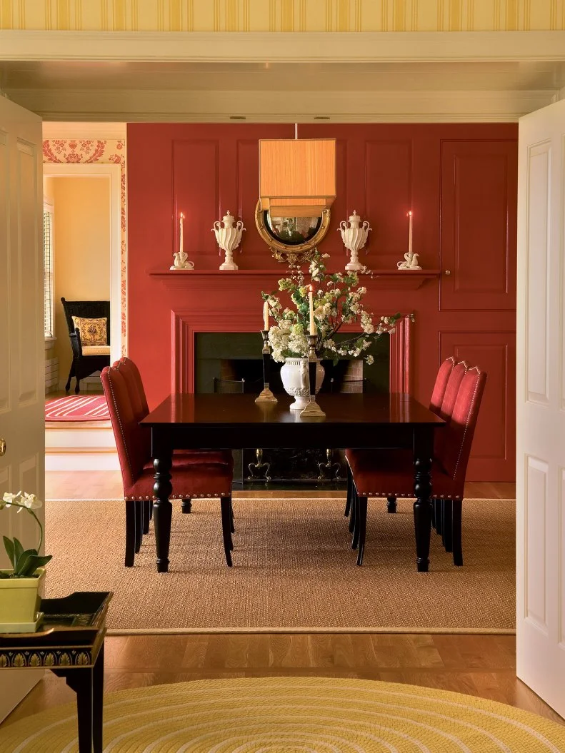
Scientific studies have shown (seriously) that energizing shades like this one have very tangible effects on our motivation levels and mood — so if you want to throw an absolutely epic dinner party, crimson’s the way to go. (A bedroom in the same shade, by contrast, would have you tossing and turning all night.) Spice up the conversation with lively carnelian, and if another space is visible at the same time, use smaller bits of that same shade as an accent elsewhere (as in the patterned wallpaper seen through the doorway to the left here).

Try This Shade: Incarnadine, Farrow & Ball

More photos after this Ad

Photo: Christopher Dibble. From: HGTV Magazine
14 / 21

Deploy Near-Neon Yellow

Like the go-get-‘em red in that dining room, this modern yellow is an energizing backdrop — in this case, for a home office. When a space is quite literally for taking care of business, don’t be shy about reaching for a wall color that makes you sit up a little straighter. Bonus: When your room itself is nice and colorful, neutral office furniture feels like a calculated (and stylish) note of contrast.

Try This Shade: Sulfur Yellow, Behr

see more photos

More photos after this Ad

Photo: Rifle Paper Co.
15 / 21

Luxuriate in Regal Blue

Meant to evoke blue copper ore and the splashes of dark color on a songbird’s throat, this ultrapigmented deep blue loves colorful, nature-inspired patterns like the painterly blooms and leaves on this Rifle Paper Co. bench. It’s also an elegant, on-trend partner for shades of blush. If you’ve dabbled in desert- or tropical-toned pieces, use this opulent hue to change their mood to something a bit duskier and more mysterious.

Try This Shade: Scotch Blue, Farrow & Ball

More photos after this Ad

Photo: Tomas Espinoza. From: Brian Patrick Flynn
16 / 21

Create a Sea-Green Retreat

When your top-story bedroom boasts a vaulted ceiling with four skylights and two windows, why would you let all that angled sun fall across white walls? This dimensional green makes a large space feel intimate, and it’s a sophisticated compromise between masculine and feminine tones that’s perfect for a shared room.

Try This Shade: Cloverfields, HGTV Home by Sherwin-Williams

More photos after this Ad

Photo: Stacy Zarin Goldberg. From: Zoe Feldman Design
17 / 21

Add a Twist of Lime

If maximalism with classic, ornate silhouettes and energetic patterns is the name of your game, go all in with a tart hue on the walls. Here, dark and intricate Chinoiserie and Hollywood Regency vintage furnishings feel fresh and playful against citrus-colored molding.

Try This Shade: Acid Drop, Farrow & Ball

see more photos

More photos after this Ad

Photo: David Christensen for Southeastern Designer Showhouse & Gardens
18 / 21

Garnish With Olive

Sure, you could ground a classically gorgeous en-suite bath full of veined stone and crowned with a tortoiseshell-and-burlwood mirror with, oh, some shade of cream, but when a space calls for a bit of zing, think of the garnish that concludes a classic martini. This updated take on midcentury green loves browns and pinks, and fair warning: It’s an addictive introduction to strong color.

Try This Shade: Bancha, Farrow & Ball

see more photos

More photos after this Ad

Photo: Claire Esparros for Homepolish . From: Justin DiPiero
19 / 21

Sweeten a Space With Berry

With a warm, seasonal tone that recalls fruit cobblers and farm stand bushels, this shade loves to be thrown in with purple-blue tones, and it’s a lovely, unexpected choice for bedrooms with white furnishings like these glamorous shelves. Use white trim to emphasize the color’s summery feel, and keep flooring pale to keep the mood light.

Try This Shade: Elderberry Wine, Benjamin Moore

More photos after this Ad

Or, Pick Apple Green

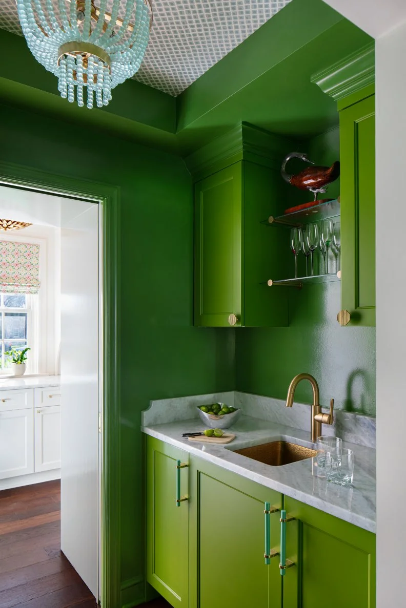
Much like powder rooms and walk-in closets, pass-through pantries and bar spaces are low-stakes places to go absolutely bananas, so to speak, with color. This unapologetically vivid space is just a delight to take in: the stone and brass paired with the green! The beach-glass-blue flush-mount pendant! The wallpaper on the ceiling! When your small space needs personality, make big moves.

Try This Shade: Douglas Fir, Benjamin Moore

see more photos

More photos after this Ad

Photo: Chad Jackson Photography. From: McCroskey Interiors
21 / 21

Get a Bit Rusty

This ferrous burnt orange puts a playful western spin on traditional, boyish bedroom items like suiting-inspired linens, mounted antlers and vintage tchotchkes. Against a neutral wall, the same pieces would feel a bit dated; in the context of Grand Canyon tones, they’re delightfully adventurous.

Try This Shade: Determined Orange, Sherwin-Williams

see more photos