Next Up

The Best Neutral Paint Colors for Every Room

March 18, 2022
Follow Lauren on:

Background tones like these earthy grays, easy going beiges and fresh-canvas whites will set the stage for any and all decor you bring home and partner beautifully with feature walls. So feel free to work them into any color palette — these hard-working neutral paint colors play very well with others.

Price and stock could change after publish date, and we may make money off these affiliate links. Learn more.
Photo: Shutterstock
Scroll For More Photos
1 / 21

Factors to Consider Before You Paint

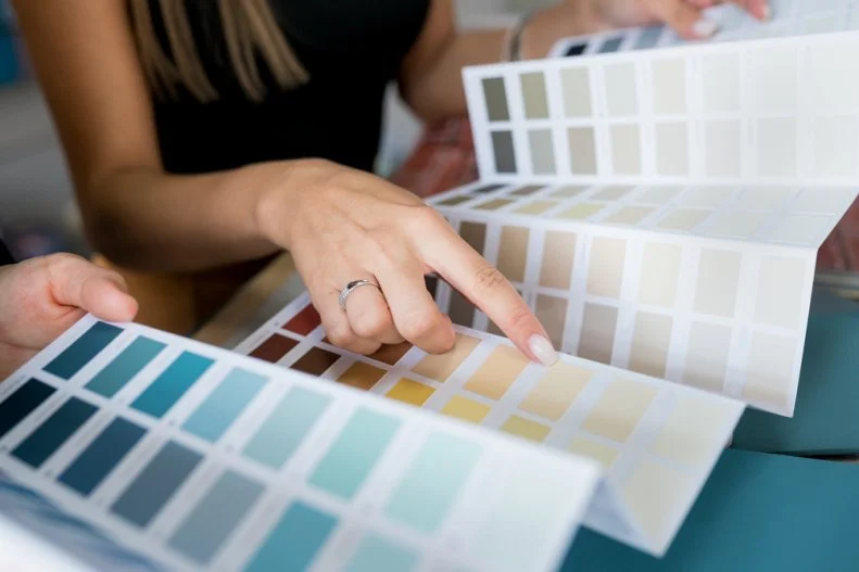
Though neutral hues are prized for suiting just about everything, choices like lighting, furnishings and the paint finish itself (flat, eggshell, satin or gloss) will all affect how the hues pictured here appear on the walls in your space. Make a gradual shift to a new tone by buying a sample pot of the paint color you have in mind, then applying it to poster board that you can eyeball in different spots at different times. For more been-there, painted-that tips, check out our painting guide, below.
LEARN MORE

More photos after this Ad

Photo: Valspar
2 / 21

Welcome With Warm, Transitional White

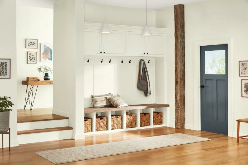
Establish a cozy tone that begins in the foyer and flows throughout an open-concept space with a soft, organic white. This color snuggles up to hardwood floors, exposed beams and natural fibers like the woven rattan baskets in this stop-and-drop area, and it also balances cooler shades like the steel blue seen here on the front door.

Try This Shade: Gilded Linen, Valspar

see more photos

More photos after this Ad

Photo: Jamie Sentz
3 / 21

Try a Traditional Gray

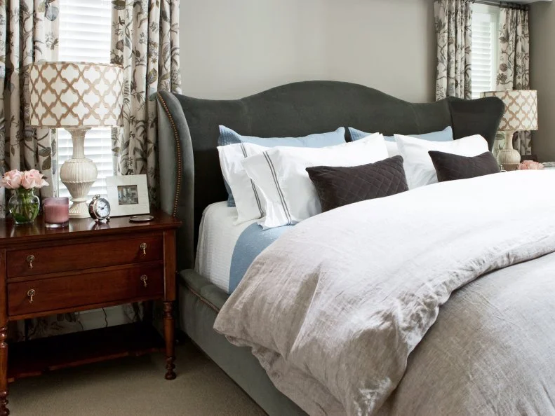
With subtle warmth that hints at a bit of taupe in its family tree, this timeless medium gray loves textiles. Consider how naturally it pairs with both floral curtains and the upholstered velvet headboard here, and don’t be shy about introducing it to linen. Choose a saturated tone like this one when you want your wall color to have a bit of presence.

Try This Shade: Rockport Gray, Benjamin Moore

see more photos

More photos after this Ad

Photo: Rifle Paper Co.
4 / 21

Warm Up With a Tawny Tan

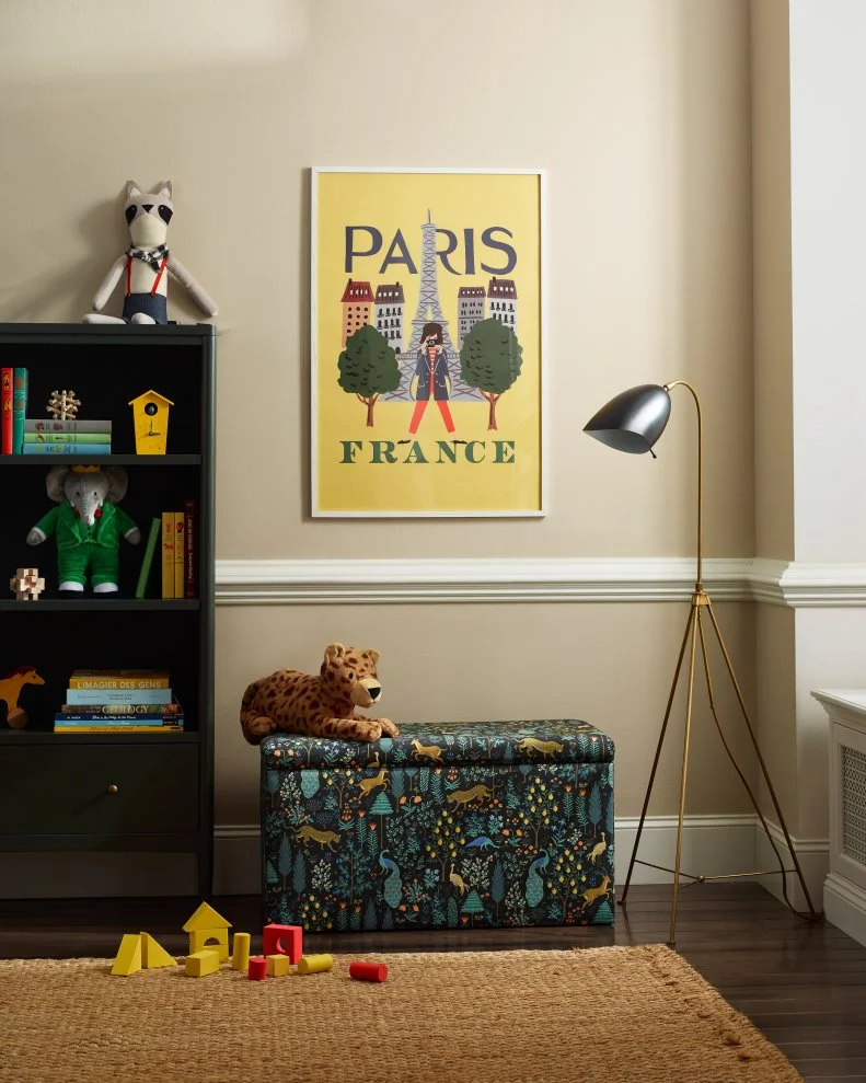
This shade complements everything from bold midcentury hues (like those in this playroom’s poster and Rifle Paper Co. storage bench) to rough-spun, organic accessories like a woven sisal area rug. For a lighter look, carry a tan like this one across an unadorned wall. To emphasize its richer notes, frame your space with white molding.

Try This Shade: Cord, Farrow & Ball

More photos after this Ad

Photo: Valspar
5 / 21

Soften Focus With a Pale Pastel

Warm, barely-there shades of peach and blush complement most skin tones, so they’re perfect for walk-in closets and bath suites with mirrors and dressing areas — and as you’d imagine, they’re ideal backdrops for selfies and portraits. Toasty neutrals like this one are also sophisticated alternatives to stark white for gallery walls.

Try This Shade: Subtle Peach, Valspar

More photos after this Ad

Photo: Brian Patrick Flynn
6 / 21

Or, Make a Sultry Statement

A darker gray-brown with red undertones heats up a bedroom like magma far beneath cool volcanic rock; we’re still in neutral territory here, but there’s a sensual side to this tone that helps colorful artwork come alive. Raise the stakes by brushing it across a single statement wall, or use it to envelop a private retreat.

Try This Shade: Silhouette, Benjamin Moore

see more photos

More photos after this Ad

Photo: HOWDY © Gray Malin
7 / 21

Breathe In Seaside Mist

Add a bit of oomph to coastal spaces by sailing past white paint and tinting your walls with a cool gray that’s ever so slightly briny. This lakeside sunroom's aqueous gray has a green undertone meant to evoke the atmosphere of an estuary, and it frames natural scenes beautifully.

Try This Shade: Cromarty, Farrow & Ball

see more photos

More photos after this Ad

Photo: Rifle Paper Co.
8 / 21

Try Stone With a Bit of Lichen

Keep your eyes peeled for grays that feature just a hint of green, like a well-weathered boulder that’s gathered a touch of moss. A warm neutral sets off deep, cool hues like the peacock blues in this Rifle Paper Co. headboard, and it polishes up antique gold and brass accessories with style. This khaki-like tone is perfect for detailed molding, thanks to how its mood changes with the light — and it’s a designer darling.

Try This Shade: Nantucket Gray, Benjamin Moore

see more photos

More photos after this Ad

Photo: HOWDY © Gray Malin
9 / 21

Wrap Walls in Off-White

This convivial color is just one shade away from pure white: With a hint of sunny yellow, it delivers crisp contrast with black dining chairs and complements both natural wood and whitewashed floors. That versatility makes it a winner to surround skylights, frame fireplaces and beckon guests down hallways. What we’re saying is that you’re probably going to want to buy this easygoing hue in bulk.

Try This Shade: Wimborne White, Farrow & Ball

see more photos

More photos after this Ad

Photo: Sherwin-Williams
10 / 21

Cultivate the Ultimate Calm

This go-anywhere, suit-any-style designer darling is a placid gray with cool blue and purple undertones, and it’s a welcome addition to any space in need of a bit of serenity. If you’re aiming for a warm and fuzzy neutral, this one isn’t quite the ticket — but if you’re aiming to make your room feel like a breath of fresh air, this is the hue for you.

Try This Shade: Passive, Sherwin-Williams

see more photos

More photos after this Ad

Photo: Tomas Espinoza. From: Brian Patrick Flynn
11 / 21

Set a Gold Standard

A chameleonic yellow-taupe that’s ideal for integrating mixed metals in industrial and contemporary spaces, this versatile shade feels crisp in a kitchen and supports off-white textiles in cozy-up common spaces like living rooms and dens. It’s both deep enough to make walls feel dimensional and light enough to carry all the way across the ceiling. How’s that for modern multitasking?

Try This Shade: Chatroom, HGTV HOME by Sherwin-Williams

see more photos

More photos after this Ad

Photo: David Owen Strongman / Getty Images. From: Love It or List It, Too
12 / 21

Grow Into Botanical White

Modern, elemental spaces like this airy living room call for tones that seem to dissolve the border between indoor and outdoor living. Paired with a pale, ultra-tactile Moroccan area rug, a toasty brown leather sectional and engineered hickory floors, this petal-fresh white feels like an extension of the scenery.

Try this Shade: Cotton Knit, Behr

More photos after this Ad

Photo: Karen Forsyth of Tallulah Lane
13 / 21

Frame Art With Silver

If you’re cultivating a collection and fancy a background with personality of its own, introduce your artwork to a cool, pale silver-gray. This color is the best of two worlds: its richness evokes traditional elegance (consider how lovely it looks against white-accented molding here), and its tone counterbalances playful bursts of contemporary color like these abstract pieces and look-at-me blooms.

Try This Shade: Sterling, Benjamin Moore

see more photos

More photos after this Ad

Photo: Benjamin Moore
14 / 21

Improvise With a True Neutral Gray

A soothing, of-the-moment gray that functions as the consummate host, this pale hue has yet to meet a style or splash of color it doesn’t love. It’s also sophisticated enough to hold space on a bedroom wall all by itself.

Try This Shade: Metropolitan, Benjamin Moore

learn more

More photos after this Ad

Photo: HGTV Home by Sherwin-Williams
15 / 21

Mellow Out With Taupe

Integrate elements like traditional molding, feminine curves, midcentury case goods and even an intricate area rug with a calmly confident neutral that pulls them all together. In the right light, this color reads just a bit pink, but well-layered undertones give it longevity that will outlast blush-based crazes.

Try This Shade: Emerging Taupe, HGTV HOME by Sherwin-Williams

see more photos

More photos after this Ad

Photo: Tomas Espinoza. From: Tiffany Brooks
16 / 21

Stretch a Creamy White Canvas

Consider how well-chosen white paint serves as a blank page for textiles and accessories. In this rustic-contemporary guest room, the curtains’ bold red stripes add a blush of color to the wall near the bed. The pure white mats framing the artwork above it, in turn, create contrast and play up its pastel notes even more.

Try This Shade: Navajo White, HGTV HOME by Sherwin-Williams

see more photos

More photos after this Ad

Photo: Tomas Espinoza. From: Tiffany Brooks
17 / 21

Sample a Mushroom

Utility spaces needn’t feel sterile, and a versatile neutral makes a laundry room feel cohesive: It creates a middle ground between stark white appliances and lacquered gray cabinets, and it’s much more forgiving than white paint would be in the same space. Carry a color like this one across the ceiling to give a transitional space a contemporary feel.

Try This Shade: Loggia, HGTV HOME by Sherwin-Williams

READ MORE

More photos after this Ad

Photo: Graham & Brown
18 / 21

Or, Take a Powder

Pretty up bath suites and walk-in closets with a puff of balanced white. A well-composed hue like this one functions a bit like cosmetics for your walls. Featuring both yellow and red pigments, its subtle warmth makes it an ultra-flattering building block.

Try This Shade: Pressed Powder, Graham & Brown

More photos after this Ad

Photo: Graham & Brown
19 / 21

Go Glam and Gray

Channel effortless chic in modern, minimalist spaces with a mid-tone gray that’s not too warm and not too cool. Like an early spring day, this personable tone feels moody and temperate all at once — and it’s a crowd-pleasing, urban-feeling alternative to standard white.

Try This Shade: Barker, Graham & Brown

More photos after this Ad

Photo: Sherwin-Williams
20 / 21

Run a Warm Bath

If you’re looking to paint a space that gets western light, reach for an off-white with a warm beige undertone; a creamy, enveloping hue like this one loves soft (rather than stark) light. To play up those undertones even more, pair this shade with a feature wall in a warm shade of peach or blush.

Try This Shade: Panda White, Sherwin-Williams

see more photos

More photos after this Ad

Photo: Graham & Brown
21 / 21

Or, Comb the Beach

If your space gets ultra-bright southern light, in turn, try a versatile gray-brown that mimics the color of shorebirds’ feathers and won’t wash out completely in sun-drenched spaces. A base like this one suits an assortment of organic tones like the chocolatey sofa and range of pillows here, and it adds interest without adding muddiness or weight.

Try This Shade: Plover, Graham & Brown