20 Commandments of Working With Neutrals
Nothing creates effortless style quite like a great neutral palette. Get the most out of your pared-down color scheme with Christina Anstead and HGTV design experts' tried-and-true tips.

Related To:

Photo By: Gilles Mingasson/Getty Images
Photo By: Jennifer Boomer/Verbatim Photo Agency
Photo By: Gilles Mingasson/Getty Images
Photo By: Julie Soefer Photography
Photo By: Matt Harbicht/Getty Images
Photo By: Michael Hunter
Photo By: Brian Patrick Flynn
Photo By: Amber Thrane
Photo By: Amy Bartlam
Photo By: Matt Harbicht/Getty Images
Photo By: Julie Dodson
Photo By: Michael Hunter
Photo By: Gilles Mingasson/Getty Images
Photo By: Leslee Mitchell
Photo By: Alyssa Rosenheck
Photo By: Jim Tschetter
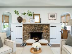
Go Bold With Textures
When working with a palette devoid of color, texture is key to creating interest. Here, Christina Anstead fills her oversized sectional with a mix of pillows in knit, shaggy and linen textiles. Woven baskets and trays, as well as the layered area rugs, add tactile appeal.
See More Photos: Rustic Farmhouse Meets Functional Firehouse
Employ Black With Style
Ground your neutral design with black. The shade may bring depth and dimension to any room, but it's especially needed in a space where soft shades can blend together. The black hardware and fixtures forge a striking contrast against the pale woods and bright whites of this bathroom.
Establish Shine
Metallics give the same juxtaposition to a neutral palette as black does. And yes, you can integrate both at the same time. Natural wood tones reign supreme in this farmhouse kitchen. An oversized copper pendant and galvanized range hood, as well as black fixtures and window trim, deliver the right amount of contrast to the space.
Highlight Furniture
Neutrals allow furnishings to stand on their own. Christina Anstead's open dining room and kitchen sticks with pale woods, blacks and whites to allow the design elements, from the dramatic woven pendant to the belt-strapped bench and horseshoe dining chairs, to speak for themselves. Of course, in this space, the real showstopper is the glass wine cellar, which also gets a boost from the hushed palette. Cheers!
See More Photos: Take a Look Inside Christina Anstead's New Home
Embrace Architectural Details
Just like with furniture, architectural details get to be the star of the show in a neutral room. If you're fortunate enough to have stunning exposed ceiling beams or wainscoting, let it shine with the colorless scheme. If not, create your own. The walls of this relaxing bedroom go from so-so to stunning with the addition of crown molding and shiplap.
Mix in Patterns
Solid on solid on solid can be a bit boring. Infuse your space with patterns to add intrigue, such as the geometric chair, paisley throw pillow, capiz shell side table and abstract art Christina Anstead uses in this relaxed living room.
But Seriously, the Patterns
For some of us, patterns can be intimidating, but a neutral palette gives you the freedom to use them without feeling over the top. Wallpaper with caramel-colored flowers on an oatmeal backdrop joins forces with thatched bedding, damask curtains and a graphic bench to compose a happy, cohesive design — all because they rely on a neutral color scheme.
Understated Extravagance is a Thing
Just because you're sticking with a sparse color wheel doesn't mean you have to skimp on luxurious design. While a lot of people lean toward neutrals to form a calm environment, they can also be used to tie together a myriad of lavish motifs, such as in this glamourous Art Deco bedroom.
Think About Silhouettes
When you're keep the shades of your space to a minimum, it's important to consider the shape of the furnishings you're bringing in. Everything in this dining room — the modernized Old-World-inspired chandelier, the elegantly curvy dining chairs with cabriole legs, even the collection of ornate mirrors — has a striking profile.
Wood Tones are Your Friend
They're naturally neutral and bring a lovely warmth to any space, but don't go matchy-matchy with your wood choices. Variation always constitutes a more interesting design. Rustic ceiling beams and the coffee table usher in deep, rich shades, while medium tones are found in the built-in hutch, floating shelves and dining chairs. Finally, the flooring comes in at the lightest with an almost blanched finish.
You're Not Limited to One Tile
It's hard to beat a crisp white bathroom, especially when it features luxurious marble tiles. To keep the tile design from feeling one note, two distinct shapes are used. Traditional subway tile surrounds the bathtub and shower, and small hexagons are laid for the floor. P.S. Don't miss how touches of metallic and a glossy black floating vanity balance out the light and airy scheme.
Add In (Some) Color
Neutral rooms don't mean you have to throw out all color. Actually, the greatest benefit of a neutral setting is its versatility. Use your muted hues on walls and big furnishings so that you can incorporate color in accessories. It's an easy way to change the look of your room with the seasons or trends. Here, a large abstract painting and pair of pillows usher in vivid hues to this casual living space.
Play Chess With Finishes
Mark out a strategy when working with tone-on-tone designs so that they don't fall flat. The sleek canopy bed and glossy nightstand are softened by linen pillows, knit bedding and a striped duvet. Completing the look are the mercury glass and galvanized finishes on the lamp and mirror.
Yes, You Can Use Beige
Beige is often considered a bad word in decorating, since it evokes images of builder-basic paint and big-box-store sofas. However, as evidenced by this classically elegant bedroom, the-color-that-shall-not-be-named can have some pretty stunning results. And if you want to call it by another name — sand, wheat, ecru, buff, camel or biscuit — your secret is safe with us.
Not Just Beige
Neutral isn't limited to taupe, gray, white and black. Some colors, like the cadet blue in this dining room, read as neutrals to the eye because they provide a landing space among patterns and textures. The soft blue-gray shade used on the wainscoting, molding and ceiling lacks the intensity and saturation of its bluer counterparts, which allows it to act as a neutral in this room.
Don't Compete With the Focal Point
A quiet color scheme does real justice to a design element that you want to stand out. Soft gray cabinets pair with crisp white countertops to deliver a timeless aesthetic to this kitchen. But most importantly, they keep the focus on the statement pieces of the room — the geometric backsplash tile and herringbone flooring.
Use Them With Any Design Style
Whether you favor the completely classic, urban modernism, rustic farmhouse or Scandinavian minimalism, neutrals are most likely the first step to achieving the look you want. Every room needs space to breath and nondescript shades provide the perfect resting spot.
Keep It Simple
Take the minimalist approach to a neutral palette by trying a monochromatic color scheme. A serene gray setting is ideal for this contemporary bedroom. The cool shades of gray flow from the walls to the built-ins to the bedding for an easygoing yet oh-so-chic style.
Consider It an Investment
Neutrals are classic for a reason. They never go out of style. One day you may tire of the chevron area rug, the ultra-violet throw pillows or the palm-tree wallpaper, but smartly chosen neutral pieces will the last the test of time.
It All Comes Down To …
Variety. Whether it's through textures, finishes, patterns, layering, shapes or shades, diversity is crucial to constructing a neutral room that is carefree and chic rather than ho-hum and basic. So, go ahead, mix it up.