


Family Beach Home With Colorful Accessories
Chango & Co. redesigned a beach house for repeat customers with an eye on creating a fun, creative family environment through the use of bright colors, playful patterns and soothing textures.

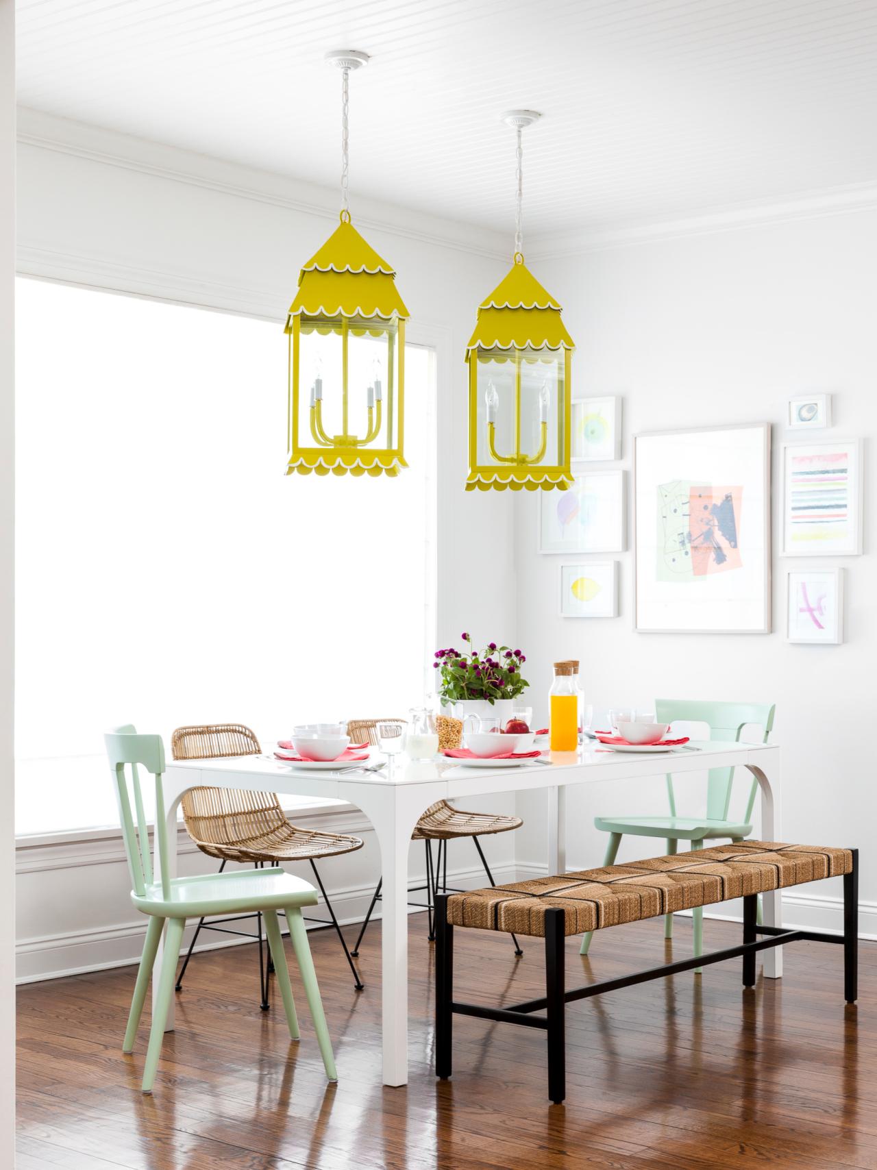
Mismatched Seating Adds Playful, Casual Vibe to Beach House Breakfast Nook
Mismatched seating adds to the playful, casual vibe in this beach house breakfast nook. The natural materials used for the bench and chairs is balanced out by the mint green end chairs and bright yellow, lantern-style pendant lights.

Photo by: Sean Litchfield Photography
Sean Litchfield Photography

What did your clients want?
This project was for a repeat client, so understanding their needs was seamless. Their goal was to create a home which acted as a fun and creative haven for them and their three young children. The idea was to build them an escape that provided shelter from NYC apartment life. We created rooms filled with detail and imagination, which encourage the children of this family to play and let loose while in this home.
What was your biggest obstacle?

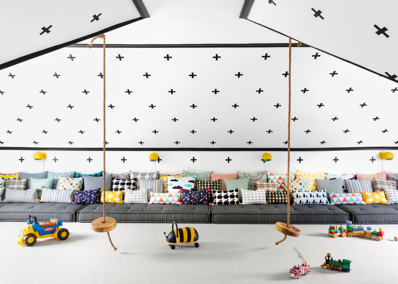
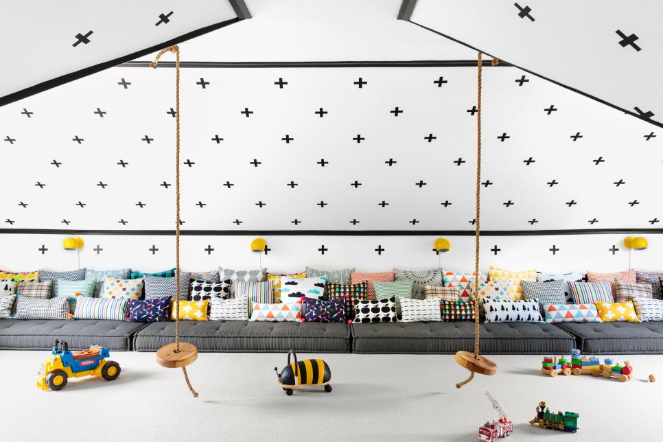
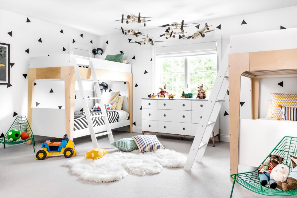
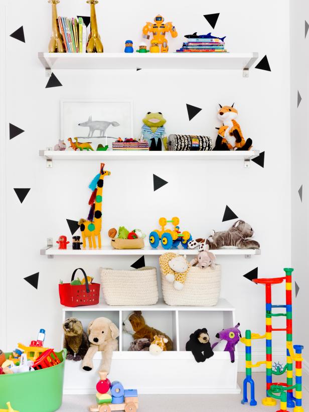
Black and White Playroom Designed to Encourage Joyful Play
Designed to encourage joyful play, this expansive play space is packed with fun features that will lift the spirits of all who enter it. The crisp white walls boast a Swiss cross pattern and are trimmed in black to highlight the architectural details of the room. The highlights of the space are the expansive stretch of cushions topped with colorful throw pillows and ceiling-hung rope swings.
Photo by: Sean Litchfield Photography
Sean Litchfield Photography
We had 10 weeks to work on this project from concept to installation, so there wasn’t much room to do serious construction. The architecture of the home was lackluster and some moldings and trims did need to be reworked, but overall we decided that the home would be painted in crisp white to become a canvas for all the fun elements we integrated into it. This way the architecture receded, letting the interior design shine through, and made the home look and feel more relaxed and welcoming. One of the most challenging moments was the process of putting up the thousands of wall decals that made up the gridded pattern in the playroom. It took three interns two full days to measure and properly place each one of the black plus signs by hand on the crisp white walls of the slanted ceilings of the room. That was certainly a fun process.
Did the surroundings influence your design?
The home is located near the beach in this Hamptons town, so we wanted to create an easy and relaxed environment. That said, we didn’t want to repeat the expected blue-and-white motif that one has come to expect of a beach home. Instead we looked to the colorful coastal towns of Mexico for our color clues, and opted to use bright pinks, greens, yellows and every color in between to make this family home come to life.
How do the bold patterns and bright colors impact the design?
Implementing pattern and color was really important to cancel out what we felt was an inconsequential structure, and a layout which, although it lacked flow, could not be changed. We intended the color and pattern to be a great distraction from what we did not like about the home, and are very happy to see it worked, given all the attention this project has received.
What tied the design together?
Overall, the broad elements of this home are entirely neutral. Window treatments are white and linen; walls, trims and other elements are all white; and the color element is supplied mostly through furnishings and accessories. We worked to balance out things and add just as much as we could to each room without it being overwhelming.
What was your favorite space to design?

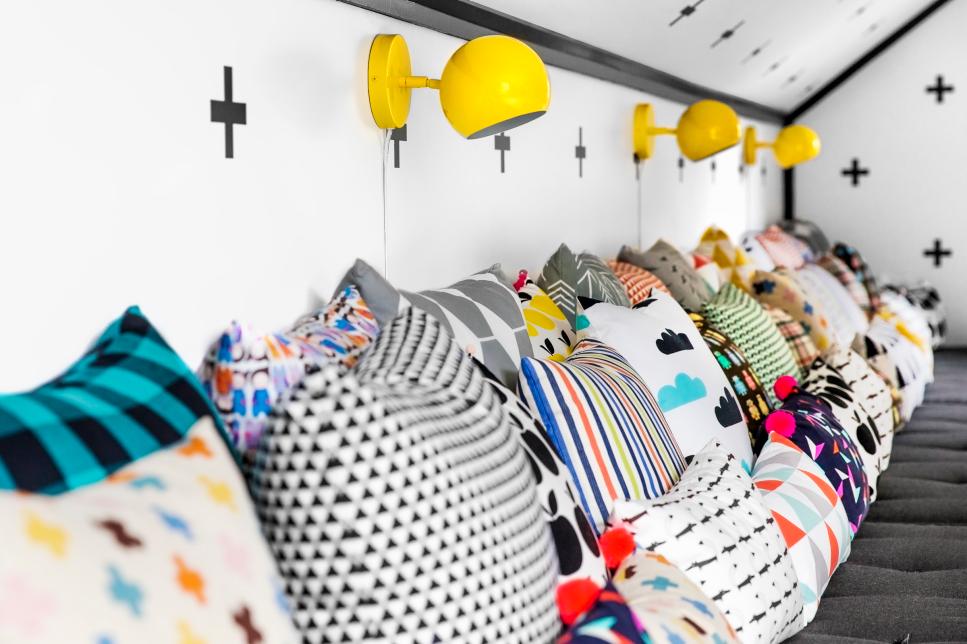
Dream Playroom Features Teepee, Rope Swings and Floor Cushions
Chango and Co. created every child's dream play space in this expansive playroom. Floor mattresses line one wall and are topped with playful throw pillows for crashing, a teepee provides a place for dreaming, and rope swings hang from the ceiling for extra fun. A bold Swiss cross pattern livens up the walls, and black trim highlights the architectural features of the room.
Photo by: Sean Litchfield Photography
Sean Litchfield Photography
When we first visited the home I immediately fell in love with what would later become the playroom. When we saw the space, it was just a dingy and dark attic space, but the potential was all there. That was the space which was the most fun to put together and also the most difficult and technical.
What’s your advice for making a white room interesting?
Making white walls work requires layering of texture. White walls play well with sand-colored sisal or wool rugs, linen, burlap, raffia and other neutral elements which add depth. Adding color through accessories is also a sure way to wake up a white room.
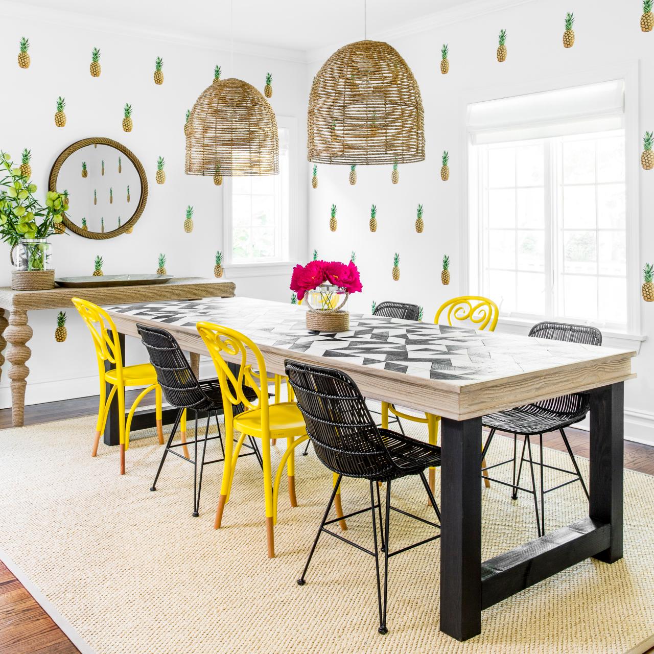
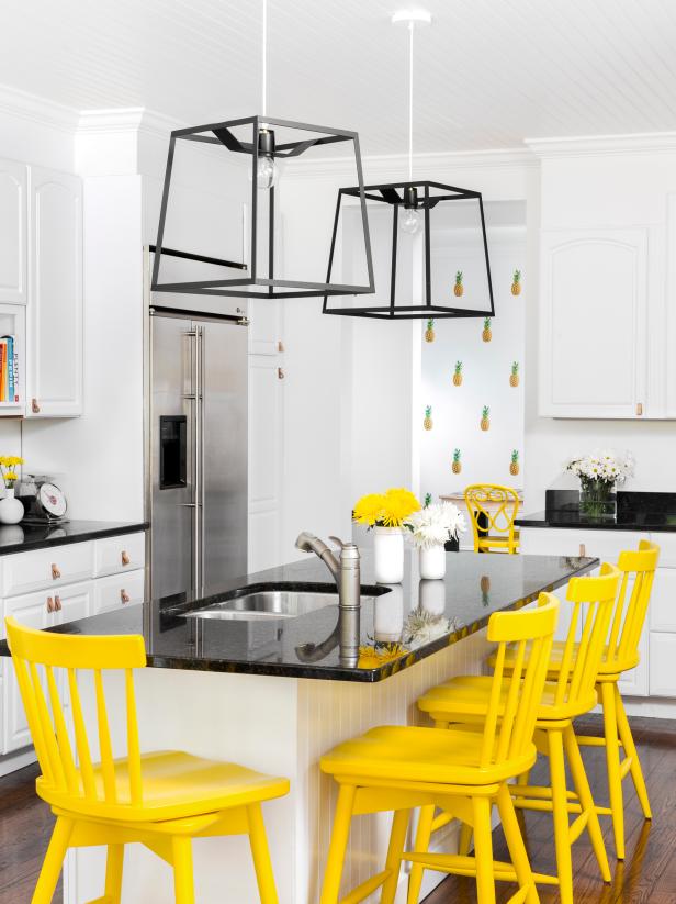
Why did you use pineapple wallpaper in the dining room?

Pineapple Wallpaper, Yellow-and-Black Chairs Make This a Dining Room for Fun
Pineapple print wallpaper and a bold yellow-and-black color scheme ensure dinner conversation never gets too serious in this playful beach house dining room. Oversized basket pendant lights add to the relaxed nature of the home.
Photo by: Sean Litchfield Photography
Sean Litchfield Photography
The pineapples are actually decals. We saw them and fell in love with them immediately. I mean, who doesn’t want life-sized pineapples on their dining room walls? Dining rooms are a great place to have fun with pattern and color, since they aren’t spaces we spend that much time in and bold elements will encourage conversation when hosting a dinner party.
How did you create the playroom design?
Fun: We wanted a space that encouraged the kids to have fun in it, and honestly, we achieved it by thinking like little kids when picking everything that went into this space. It was a fantastic collaboration of minds with my design right hand, Charlotte Sylvain. We just let loose and enjoyed ourselves.
What “hidden gems” are in your design?
One of my favorite little details in this project are all the elements we had made by local artists. The flowers on the dining table, for example, were made for us by a crepe-paper expert. The pillows in the playroom were all made of different fabrics printed by local artists, which when put together created a bright and happy collection of patterns. We also loved the vintage wooden airplanes which we hung from the ceiling in the boys’ room. There are so many little moments in this home, and all of them were a joy to design and execute.


