
.-Battle-on-the-Beach-courtesy-of-HGTV.-.jpg.rend.hgtvcom.196.196.suffix/1714761529029.jpeg)


Contemporary Townhouse Embraces Clean Lines, Pops of Blue
A California townhouse was given a contemporary, feminine feel through the use of vibrant blue and gold furnishings and accessories. Irregularly shaped rooms feature workable layouts that live larger than their footprints.

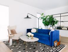
Eclectic Living Room With Blue Sofa
While this living room is petite, it still boasts lots of style with the bright blue sofa and black and white rug. A fur pillow on top of the white armchair adds texture to the space.

Photo by: Caitlin McCarthy Design
Caitlin McCarthy Design

What did your client want for her townhouse?
My client wanted her space to feel warm and inviting. She loved the clean lines of the modern multilevel home she had just acquired, but craved inviting spaces within it. She also expressed how much she appreciated unique, unexpected pieces, especially chairs, that would make a design truly her own. This was obviously a mindset we shared and made the hunting process that much more fun.
What was your biggest obstacle?

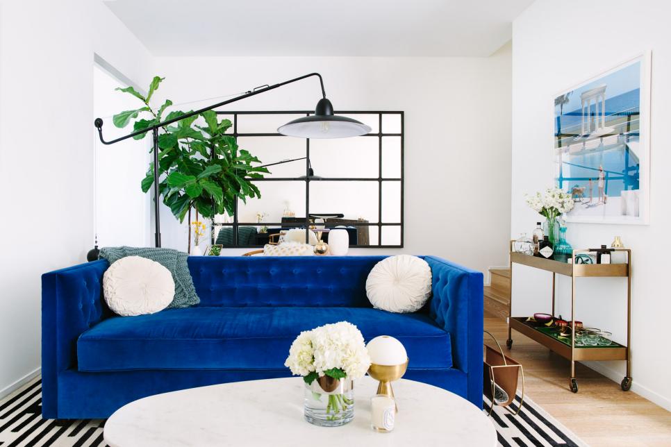
Eclectic Living Room With Blue Sofa
A bright blue sofa is the centerpiece of this eclectic living room. It is adorned with round white throw pillows. A white round coffee table is topped with fresh flowers.
Photo by: Caitlin McCarthy Design
Caitlin McCarthy Design
While the home offered an incredible opportunity to explore height, with vaulted ceilings and a central stairwell, it challenged in oddly proportioned rooms. For the size of the home, the living room was narrow and constrained, making layout a challenge. In the master bedroom, the large space required a different way of approaching scale. Ultimately, those challenges informed the choices so much that those features actually became my favorite aspect of the design.
What inspired this design?
My client already had two pieces when she called for design services: the midcentury chair in the living room and the wingback bed in the master. Incorporating them into the overall look was key, but was also a great jumping-off point for the direction of the space. In order to also celebrate the architectural interior features, I knew I had to mix vintage with modern, fluid with structural, and neutral with vibrant. I knew chalky, white walls in the living room would help retain that fresh feeling she was initially drawn to and highlight the tall ceilings, but I was excited to bring in color, texture and plush accents to make her feel at home. In the end I wanted to achieve a sense of assertive, feminine chic that felt warm and inviting.
How did you select the upholstered bed and pair of midcentury-modern nightstands used in the bedroom?

Gray Upholstered Headboard and Small Nightstand in Eclectic Bedroom
An upholstered gray headboard adds style to this eclectic bedroom. A fur throw adds texture to the space.
Photo by: Caitlin McCarthy Design
Caitlin McCarthy Design
The upholstered bed was already owned by my client at the start of the project, and I was thrilled to have it already as a piece in the space. So often the biggest challenge is incorporating existing pieces and thankfully that was not the case with this project. The best part about the bed is the scale. The master bedroom of this townhouse was proportionally large for the rest of the home and considerably elongated. Finding over-scaled pieces is key when working with large rooms. Thankfully, Jonathan Adler makes beautiful, large-scaled walnut and brass midcentury-inspired nightstands that are actually modular. I'd been hoping to place them in a project for a while, so I was thrilled when my client went for them. The groovy feel was really working in the space —so posh, with seventies-inspired hotel-style ripple-fold drapes and a funky, bold accent chair ordered up right away to complement it.
Did the color palette help room transitions?

Eclectic Space With Black Table and Photography
A modern black table is topped with a Buddha statue in this eclectic space. Black and white photography adorn the walls.
Photo by: Caitlin McCarthy Design
Caitlin McCarthy Design
Keeping a consistent color and texture palette felt right for the home. With few walls, zones flowed into each other with ease and you could see a large combination of the interior at a glance. The biggest design element that I felt was essential to the overall feel of the home was to incorporate high contrast. The only space where that was pulled back a little was the master bedroom, where a grass-cloth accent wall almost bleeds into the bed frame and floor-to-ceiling drapes. At the gallery landing, framed black-and-white photos contrast against white walls and the delicate, linear console table feels playfully graphic. Below the vibrant blue sofa in the living room, bold contrast is celebrated with an energetic ivory-and-cordovan line design rug that sends the eye around the room. These plays on pattern keep the spaces captivating, while the overall color palette makes it feel consistent.
How did you choose the blue and gold palette used throughout?
Jewel tones and metallics have an opulent effect: in warming up the space, bringing in old world colors and textures (blue, teal, marigold, velvet, brass, marble, silk), juxtaposed beautifully against the 21st-century architecture. It created balance between utility and style. Color palettes are often intuitive. I look at a space and think, what does this need, what is it craving? In this case, it was craving depth, which oceanic blue achieves so well.
What was your favorite space to design in this home?
I love how the master bedroom came together, but the living room was my favorite room to design. It was the first approach to the space and had to be meticulously planned just so. I love a puzzle, and the size constraints made the layout a challenge that I was excited to solve.
Did a particular element tie the design together?
The rug in the living room was a splurge, as it is handwoven and made of silk and wool, but my client wasn't originally sold on it — at all. Whenever proposing a big-budget item (really any item for that matter), it's important to provide as much information, history and assurances as possible. I really felt that the pattern of the rug would bring the room to life, but it wasn't possible to view it, or even a similar piece, in any Los Angeles showroom. I had a trip to New York planned during the project, so I arranged for the stock room at ABC Home to set aside time for me to see the rug in person. I took dozens of photos, close up, far away, and from every angle. I felt it, I walked on it and I confirmed every detail of its material, place of origin and weaving method. When I returned to L.A., I promised her it would be worth it, and convinced her to move forward. I was right. It was perfect in every way, and she was thrilled with the effect.
How did you select the vibrant blue living room sofa?
My client wanted a velvet-upholstered sofa. Of course that could go in absolutely any direction, from deep and cushy to rigid and formal, from chesterfield style to French rococo. I wanted to steer the design into structured comfort, so I proposed a jewel-toned blue sofa, with clean lines and tailored cushions, that was constructed with quality stuffing and luxe fabric. Investing in a lasting sofa for a living room is a staple of my design philosophy.
What “hidden gems” are in your design?
The over-scaled mirror in the living room really makes the space feel much larger than it is. This is a well-known trick designers never tire of using. Whenever you see a large mirror in an interior, try to picture it without, and you'll notice just how well the mirror succeeds at making the space, in effect, doubled.


