


Family Home Gets Midcentury-Style Makeover
Designer Barbara Vail reinvigorated a family home with a vibrant, midcentury-modern style. Heirloom and era-authentic furnishings pair up with metallic details and subtle patterns to create a space fit for entertaining and cozying up with family and friends.

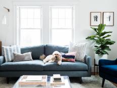
Relaxing Living Room With Subtle Patterns
With clean white walls, soft natural light and a spacious rug underfoot, the living room of this historic Cambridge, Mass., home is at once bright and ethereal. Patterned pillows add subtle visual interest to the sofa, as well as encourage rest and relaxation with man's best friend.

Photo by: nicolebaasphotography.com
nicolebaasphotography.com

What did your clients want for their home?
The family of four (and pup) craved a cozy, stylish and colorful space that was functional for their busy lifestyle — space for playing games, having friends over, movie nights and doing homework — as well as a dining room that they could entertain in, hence the extension table. The living room connects to the dining room, so they needed to relate and flow with one another. The home isn’t midcentury, though. It was originally a two-family Craftsman style that was converted into a single-family home. Many of the midcentury pieces were passed down from their family, so it was more of a style preference.
Did they want the design to be pet-friendly?

Sapphire Blue Armchairs Meet Metallic Finishes
Opposite the sofa, two sapphire blue armchairs denote a more formal sitting area for entertaining guests. When paired with a copper side table and high-gloss pillows, the gems make an especially chic statement.
Photo by: Nicole Baas Photography
Nicole Baas Photography
They wanted eclectic yet functional living and dining spaces. This living room is really the heart of the home and also the first room you see when you walk in, so it needed to make a bold statement. Yes to it being pet-friendly (and kid-friendly) — both the sofa and side chairs are covered in performance fabrics.
How did you make the home more functional?
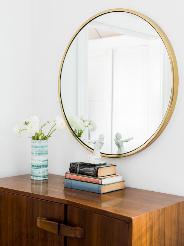
The space is fairly small, so there wasn’t too much we could do with the actual layout. The previous furniture was way too large in scale for the space and took up the whole room. We added a lot of pieces that were the proper scale and moved the TV location to make it blend in a little more with the gallery wall. The space also serves as a walk-through from the front entry, so the furniture had to be arranged accordingly. An area rug grounds the room and the space is dotted with new pieces in a midcentury aesthetic, as well as family heirlooms like the cabinet below the mirror and artwork. Colorful accessories like the Rebecca Atwood pillows tie it all together and the fig tree adds an organic element.
What was your biggest obstacle on this project?
The biggest obstacle was probably that the living room is fairly small and reachable via a walk-through from the entry (as mentioned above). Therefore, we had to keep that path clear, which I took literally with that Lucite coffee table. That piece was intentionally transparent to give the illusion of space, while also giving the clients functional furniture. The lighting was also an obstacle — there was a construction-grade flush-mount on the ceiling and two awkwardly placed sconces. We made a statement with the overhead piece using a large capiz pendant. One of the sconces was removed and the other was replaced with a functional reading light.
What inspired the midcentury-modern design?
A lot of the inspiration came from some of the furniture heirlooms and artwork they already owned that weren’t given the spotlight they deserved. For example, the cabinet to the left of the sofa was an existing piece that we reinvigorated with a simple round mirror, vintage books and accessories. We also rewired the midcentury sconce (also preexisting) with a different wire to give it a refreshed look.
How did you create room transitions?

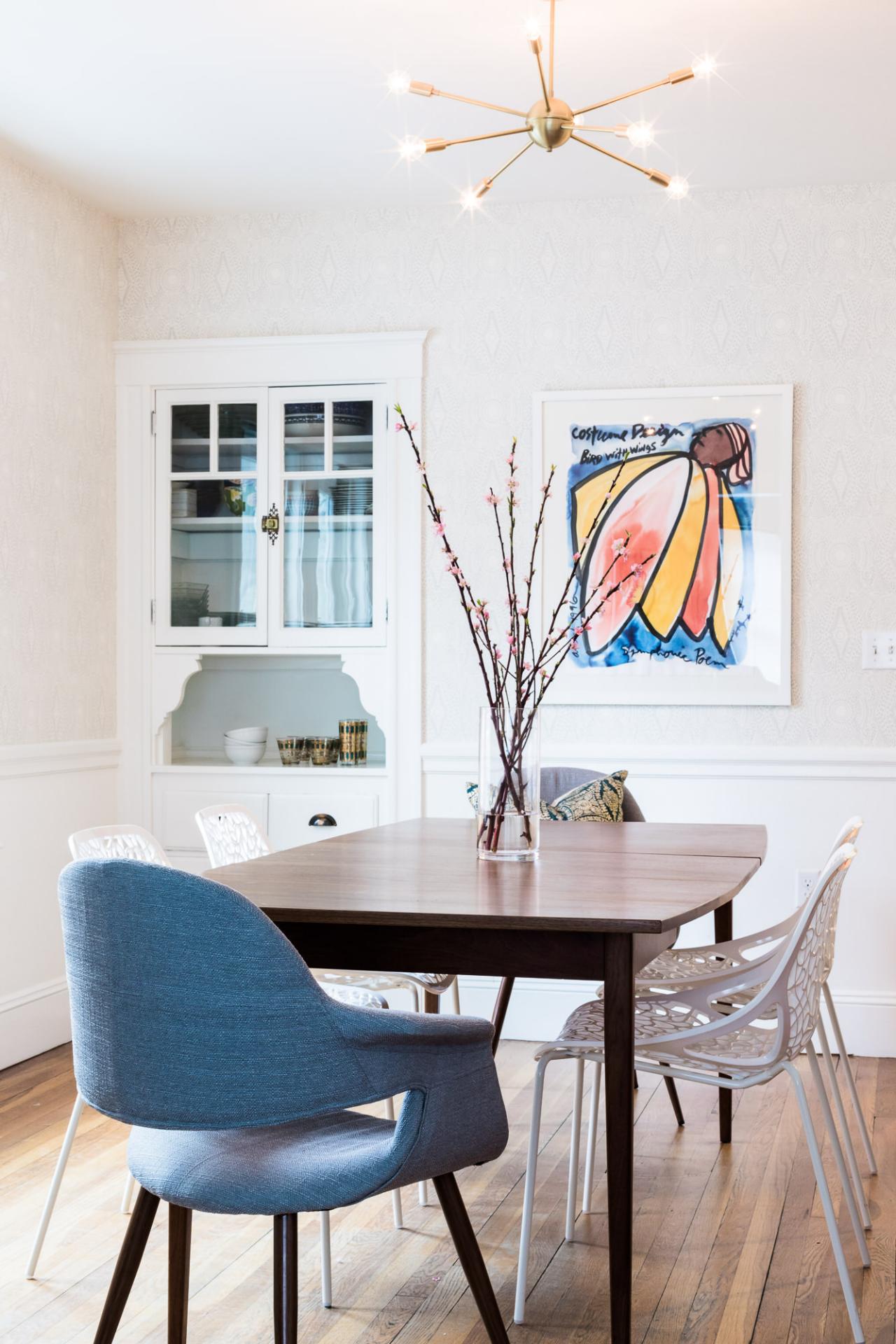
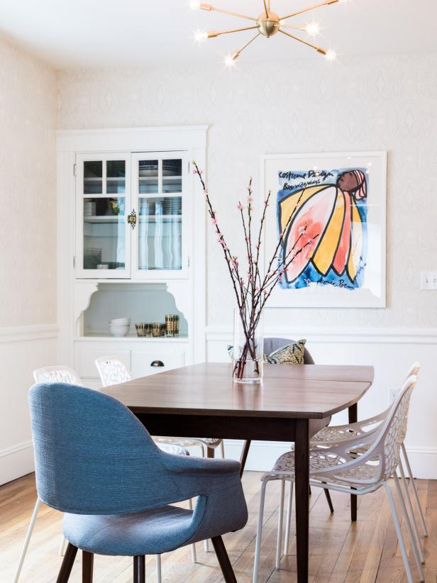
Midcentury Dining Room With Blue Hues
Just down the hall sits a formal dining room steeped in midcentury modern style, with a Sputnik light fixture and large square table. Blue armchairs anchor either side of the room and echo the hues in the framed artwork.
Photo by: Nicole Baas Photography
Nicole Baas Photography
I made sure the overall color concepts worked well together in both spaces. While we added wallpaper to the dining room, it’s in a neutral color, to not add a jarring contrast. The modern painting in the dining room also brings in a lot of the blues from the living room, while the brass pieces in both spaces coordinate well.
Why did you use a white palette throughout?
The clients had just repainted the space before I arrived and I decided to keep it white as it served as the perfect backdrop for all the color we incorporated.
What was your favorite room to design?
The living room, because I love challenging spaces. Combining beauty and function is my favorite.
What tied the design together?
I would say the midcentury, colorful aesthetic is repeated throughout. Deep blues, teak, brass and patterned fabrics blend together to make this space really feel like a home.
What is your favorite feature?
The wallpaper in the dining room is subtle, elegant and whimsical. I love how it serves as a backdrop to the large modern art piece that was commissioned by a family friend. Hygge & West described the wallpaper pattern as “Inspired by a painted mural in an old hotel bar in San Miguel de Allende, Diamante was created using a stippling technique to create a dramatic, yet delicate pattern.” I also love the sputnik pendant in the dining room that was hand-made in Arizona.
Tell us about some of the furniture.

Living Room Includes Floor-to-Ceiling Bookcase
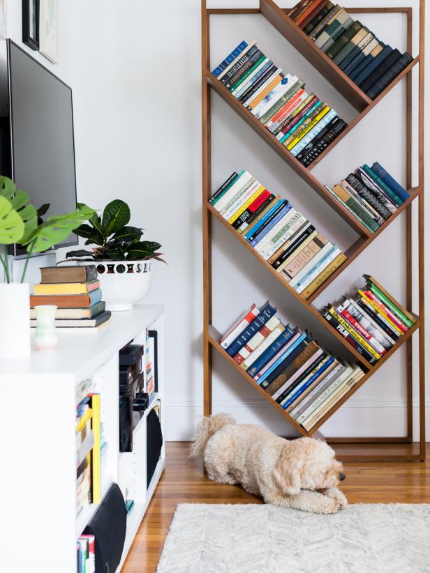
To make the room feel even more warm and welcoming, designer Barbara Vail layered the space with her client's vast book collection. With their spines arranged by color and size, the novels easily enliven the white walls.
Photo by: Nicole Baas Photography
Nicole Baas Photography
The amazing teak buffet is from a local midcentury shop called Retro Craft. The extending dining table is also vintage and was sourced from a midcentury dealer in New Hampshire. Surprisingly, the gorgeous blue velvet chairs were from Room & Board and the angled bookcase is from CB2; it’s all about mixing retail items with authentic pieces to give it a curated look. Adding the Rebecca Atwood pillows to the chairs also gave them a designer feel.
How did you integrate your style into this project?
Incorporating statement plants is one of my signatures, as well as colorful textiles like the mud-cloth pillow from One Affirmation and the hand-screen-printed Rebecca Atwood pillows. Also, mixing up textures like the wool rug, woven sofa, and velvet chairs and pillows.
What “hidden gems” are in your design?
The locally sourced sideboard and dining table, vintage accessories throughout, and family heirlooms including artwork and the midcentury cabinet in the living room.


