


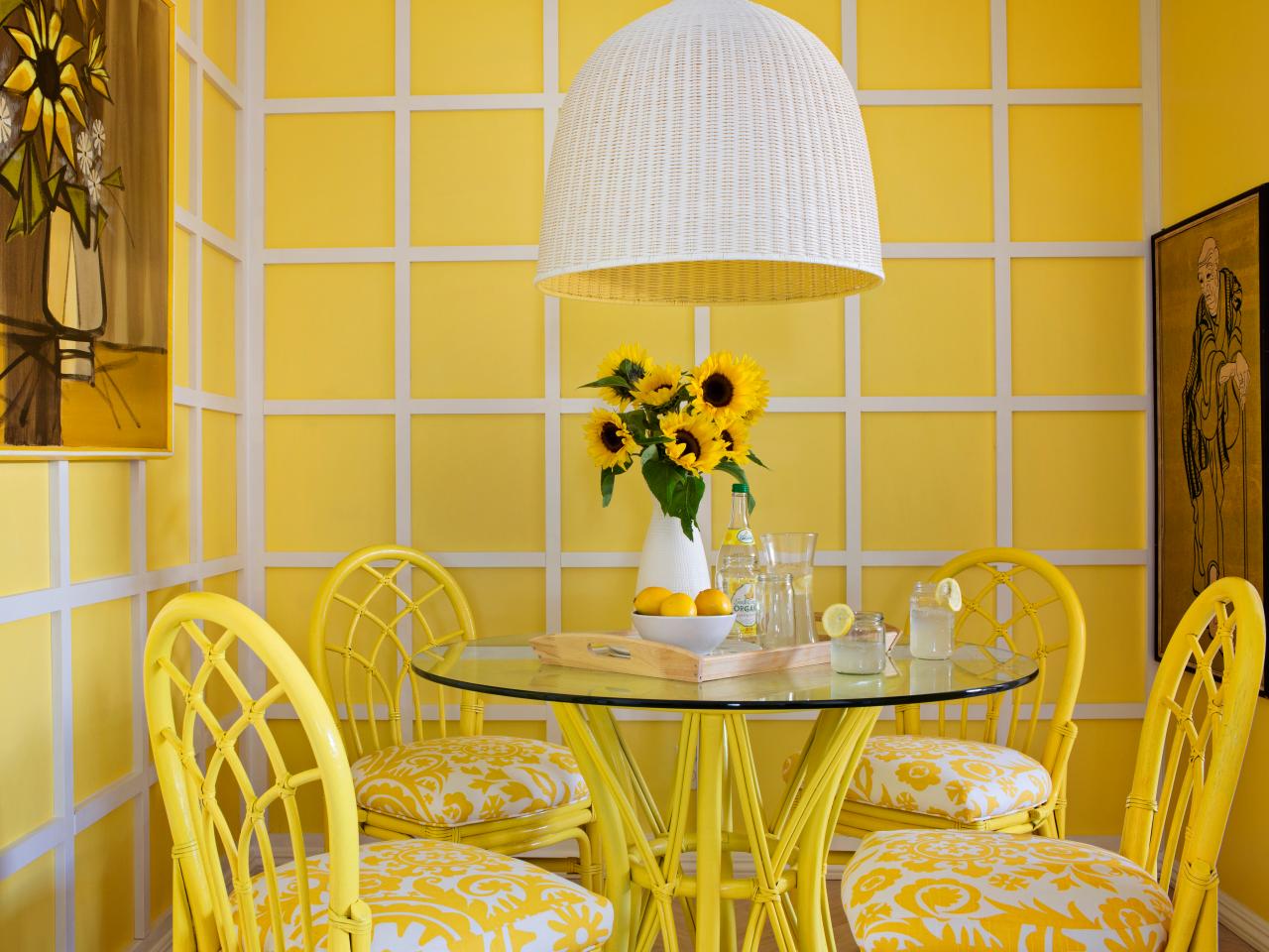
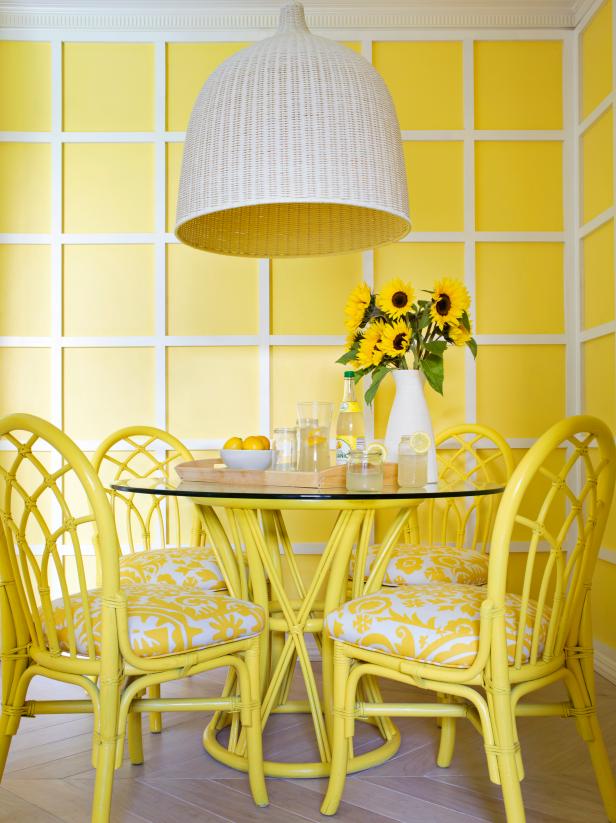
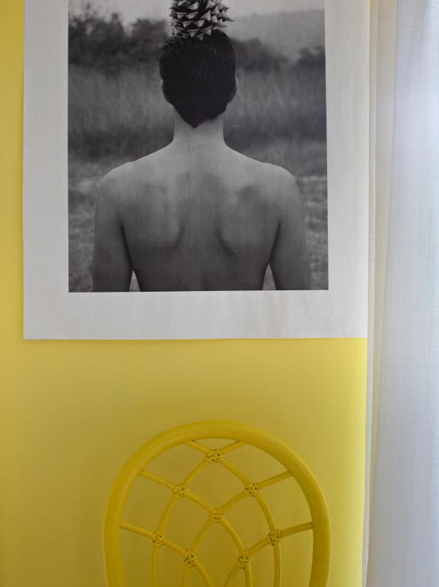
Cheerful Yellow Breakfast Nook

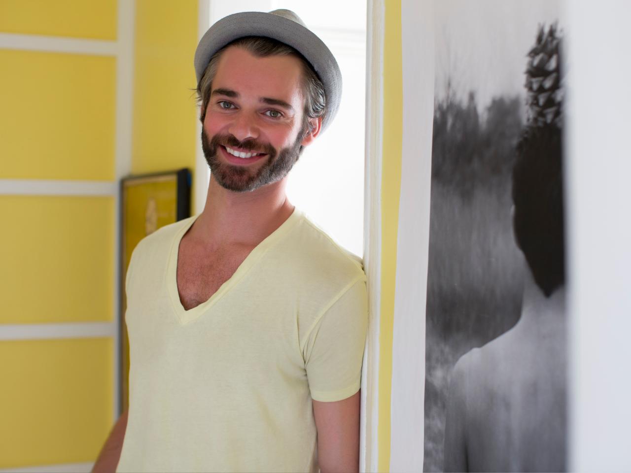
Lifestyle photographer Daniel Collopy is an expert not only when it comes to the inner workings of a camera, but also when it comes to all things related to light, natural or artificial. "Photography is my passion," says the Australian-turned-Angeleno. "It's about playing with light and shadows. A subject can be beautiful, but the moment it's lit in the perfect way, it becomes extraordinary."
When it came time to redesign the 7-foot by 9-foot dining space of his 800-square-foot West Hollywood apartment, friends and clients found it no surprise that he opted for sunshine yellow as his color of choice.

As far as the room's design was concerned, he was stumped. "I shoot amazing interiors all the time," Daniel says. "But, as my father says 'A painter never paints his own house,' so designing my own place, I was spoiled for choice."
After going over dozens of ideas, he decided to stick with three main elements for the design: an architectural treatment on the walls, unique flooring and glossy painted furniture.
Planning the Project
Daniel set a timeline of two weeks and a budget of $2,500 to accomplish the following to-do list:
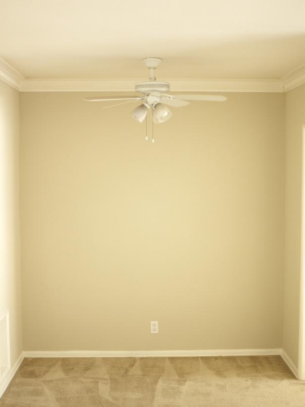
- Tear out the existing wall-to-wall carpet
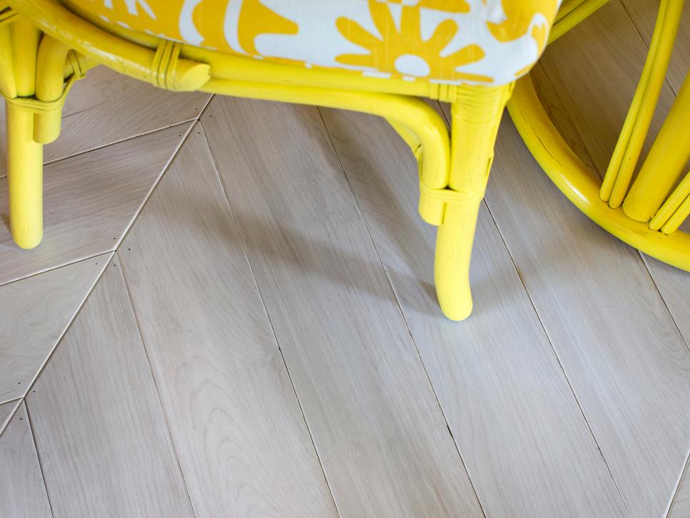
- Install herringbone flooring made from white-stained plywood
- Clad the walls with removable architectural paneling
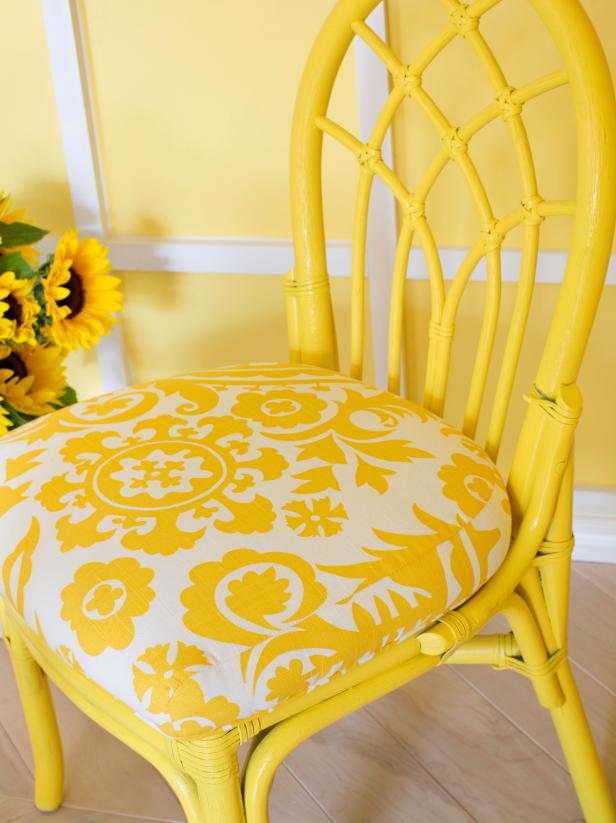
- Find vintage Floridiana furniture and update it with yellow paint and a patterned fabric
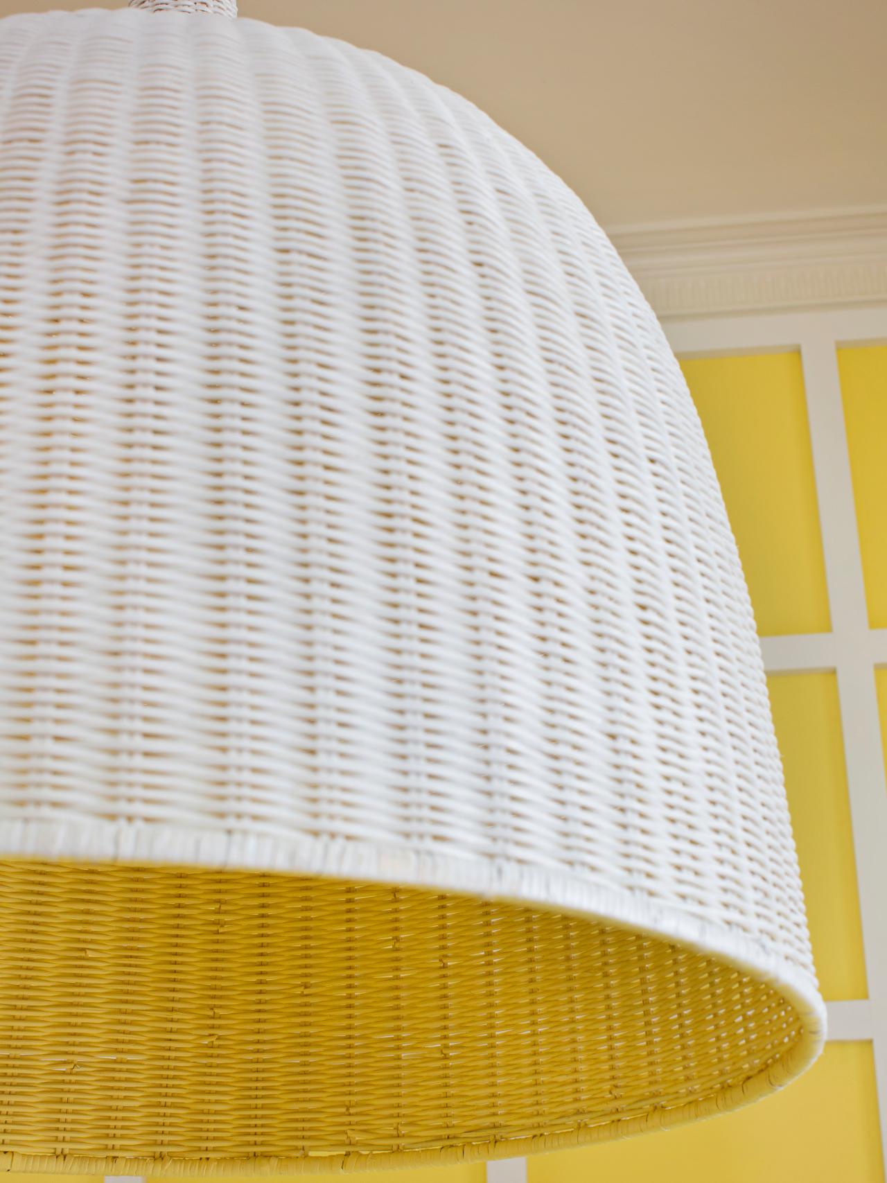
- Replace a ceiling fan with a pendant made of organic materials
- Delineate the area from the adjoining rooms with draperies
Bright Yellow Breakfast Room
See All Photos


The first part of the project was the messiest: removing the carpet. "Why would anyone have (carpet) in a dining room? It holds so much dust," Daniel says. He cut it into 4-foot strips with a utility knife, but the tack strips that held it down to the subfloor also needed to be removed. To remove them, he used a mini crowbar to remove the tack strips one at a time. The whole process took about two and a half hours.

Tackling the Floors and Walls
Next up was the design of Daniel's custom floors and wall paneling. To figure out the proper scale and proportion for each he enlisted the help of a contractor friend.
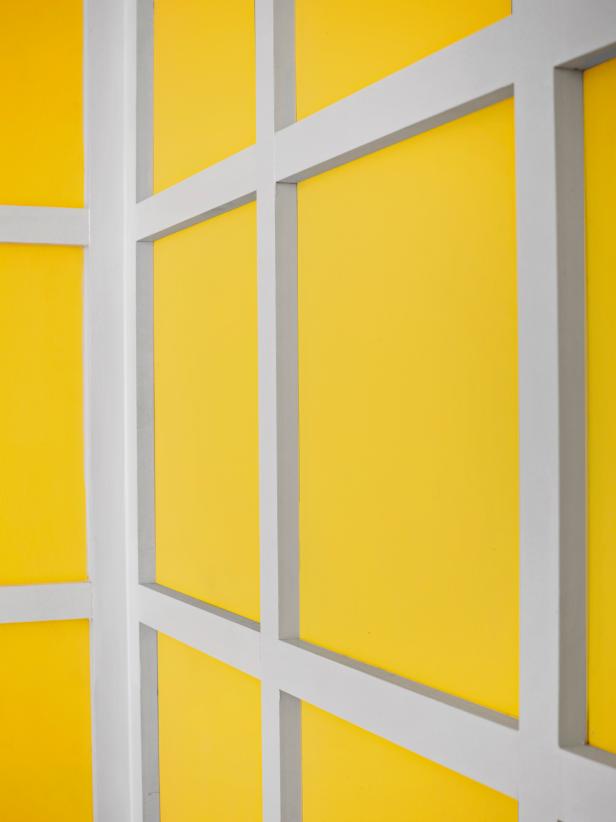
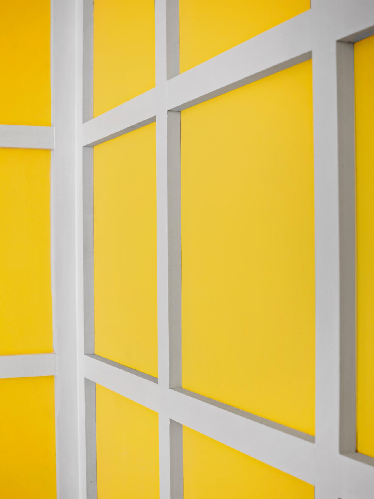
"I wanted a classic, squared paneling look for the walls, yellow with white trim, but there was a lot of math involved in spacing each square correctly," Daniel says. "The floors were even trickier. Since they were meant to be herringbone style, it was all about the pitch."
In order to keep the square panels symmetrical, Daniel's contractor suggested using 14-inch squares that were evenly divisible by the size of the walls, taking into consideration 1x3 strips of MDF (medium density fiberboard) between each square.
To get the proper angle for the herringbone floors, an L-square was placed parallel with the walls to find the room's center point. Then the pitch was traced onto paper and used as a guide for mitering the wood planks so they'd line up properly upon installation.
To keep the floors organic and graphic, Daniel had them stained instead of painted. "I thought solid white on the trim and on the floors would look kind of matchy-matchy, plus I like having organic elements in my home," he says. "By staining the wood planks white, they'd help tone down the yellow, but also allow some of the grain to show through."
After the floors and wall paneling were cut and built, it was time for installation. To attach the wall panels so that they'd be removable, Daniel's contractor cut them into four panels: two for the back wall and two for the adjacent left wall, leaving off the center and end trim pieces. Once the panels were screwed into place, the center and end trim pieces were attached with a nail gun, hiding the seams.
To ensure the finished product looked top-notch, the sides of the trim pieces were caulked and then painted with touchup paint. The flooring panels were glued down one at a time, then held together with painter's tape to help close the gaps between each plank until the glue was dry.

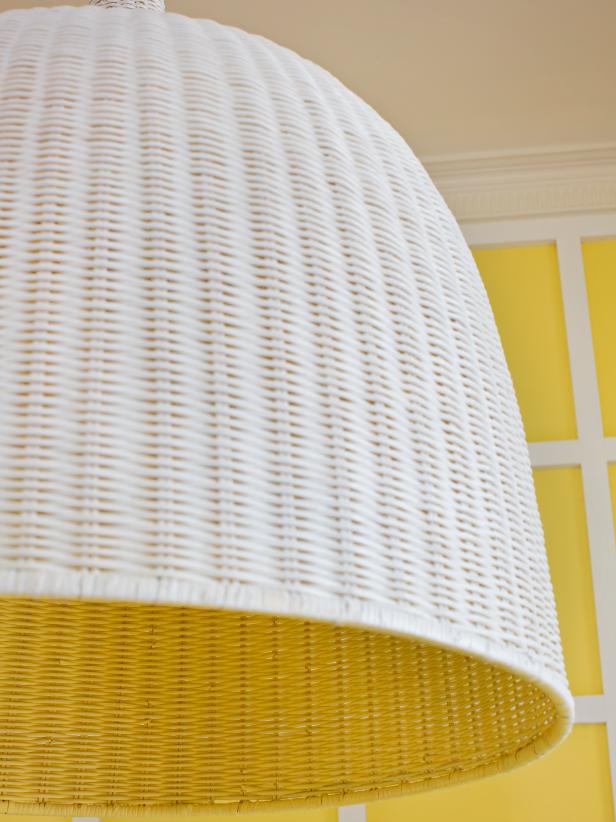
Creative Lighting Idea
Installing the woven pendant light brought up an unforeseen obstacle. The beige of the woven wood clashed with the tight white and yellow color scheme of the room. To keep the fixture in check with the color scheme, Daniel had his contractor spray the outside of the pendant white and the inside yellow.
This also gave the pendant graphic impact, allowing it to stand out from the yellow-and-white paneled walls. He hung white linen draperies to delineate the space from the apartment's nearby entrance.
Daniel is thrilled with his yellow dining room, whether he's hosting a party or drinking coffee in the morning. His only remodeling regret: "The single bulb pendant looks good but doesn't give off great work light at night, which is when I do a lot of my post-production. I wish I would have considered that before getting attached to it."
Although the lack of lighting presents problems at night when he's editing his images, Daniel says working in the dining room during the day is a different story. "The yellow is perfect, so much that I never want to leave the space."


