


Jane Lockhart Talks Color Tips

What do green olives, pretzels, coffee beans and blue napkins have in common? They're all part of the color palette for a living room makeover in Jane Lockhart's Get Color! series. Jane, a veteran interior designer and color expert, takes the basic color wheel and gives it a custom whirl by creating palettes from inspirational items, such as colorful spices from the Orient, brilliant floral arrangements and other vivid displays of hue, including the premiere show's celebratory palette pulled from party foods and supplies.
HGTV.com talked with Lockhart about the power of color, color trends and how to banish color qualms.
What's the big deal with color? Why is it so important?
Expressing how you feel through color is a major aspect of home décor, with life, really. Color is why you buy one piece of jewelry and not another, one pair of jeans and not another. Much of why we select anything is based on color. And manufacturers know that. That's why we see the same item year after year, but in a new and different color.
Color is really an overlooked part of marketing. Sixty percent of the decision to buy is based on the color — not how did a piece of clothing look on the model, but did it come in the color you wanted. It's hugely important. Just go into a drug store and look in the toothpaste aisle at how long people spend going through the rack looking for their favorite color of toothbrush. Same with cars. Sure it's important what's under the hood, but what do folks think about? They think "Am I a red person or a silver person?" Companies like Volvo have even developed their own distinctive color palette for the Volvo driver.
People have an association to rooms because they don't like the color. They may not remember the color, but the impression stays with them.

How are colors changing?
Overall people want to know that neutrals are available, but they're looking for a little bit more energy. Through the '90s color was very quiet. We didn't see a lot of color; it was an age of little contrast. You can get bored of beige real quick. Now we're going back into a decade of much higher contrast and to get contrast you need brighter colors. There's been a reluctance to celebrate with color because of everything that's happened in the world, but in the past few years people have realized that they need to celebrate what they have and not what they don't have.
We're seeing a lot of hot colors now. Citrus colors like apples, oranges and green apples. And tropical colors, such as turquoise set against a background of neutrals. And the red these days is getting pinker and the green is getting greener. We still use all of the standby classic colors, but they're getting clearer, and the natural colors are brighter. Everything is a stronger version of what we've seen in the past.
Why are people so afraid of color?
A lot of people don't know what they want. As much as we live in color — it's everywhere around us — it's amazing how much of a mystery it still is to most of us. Lots of times people finally decide to use color and they start with a darker color and then they get scared. So they have it lightened up and it looks wimpy and doesn't have any impact. People come over and say, "Oh, I thought you were painting." Or a neighbor comes over and tries to talk them out of the darker color. But if it took you two years to pick the color, it's probably right. Trust your instincts. You have a 50-50 chance that it will look great.
Any tips to help folks gain more color confidence?

Well, it doesn't get easier if you wait. And the biggest mistake is not doing anything. The irony of that is people will invest in bathroom fixtures and hardware and ceramic tile that are expensive and not easily changed. They find the courage to go dramatic with that, but they're chicken with the paint color on the walls or the color of a pillow. There are ways to make a change without too much worry.
- Start small and get big. If you do change colors don't do everything at once, unless you're the kind of person who can handle that. Most people can't. Less than 15 percent of people have an ability to visualize what a space is going to look like in a certain paint color. It's so overwhelming because it's on all of the walls. Once they see the accessories, they're OK. But until that time we all go through a quiet panic. To avoid that, start a new color with throw pillows and candles. Buy a scarf in the color and see how it makes you feel. We live in a decade of high accessorization. You can have the Armani suit in gray, but you jazz it up with color in accessories. It's the same in your home. If you bought the beige or grey sofa you can express how you feel now with slipcovers or jazzier accessories. You don't have to do everything at once.
- Roll out a big swatch before doing walls. Sometimes what we do on the show is sometimes we've had pizza and we have the box left over. We roll the color on the back of the box and hold it up on the wall. Then you don't have to buy any special cardboard or big expensive swatches, you have your big pizza box sample.
- Check the lighting. People are surprised by how much color is affected by light. With the bigger swatch you can move it around to natural and artificial light and see how the light affects it.
Anything ever go wrong when you're working on someone's color makeover?
Oh, it's usually the little things that happen that seem big at the time. We spilled all the coffee beans that represented brown in the room palette all over the floor. We picked up and picked up but every time we'd go in the room there'd be a little crunch and somebody would say "For God's sake did we not get all those coffee beans yet?"
And then, of course, someone ate all of the chocolates off the prop table one time. I guess they didn't realize that I was using them to demonstrate chocolate brown. It was "Where are my chocolates?" and when I'm looking around I suddenly see a lot of guilty looks. The cameraman and lighting guys are trying to avoid my gaze. Well, that's a danger of using real food for your color palette.
How is your own home decorated? Is it colorful?
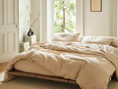
I live in a loft in downtown Toronto. It has 18-foot ceilings and a spiral staircase in the center. It's quite light. It was all done in gray and pink in the 1980s, so when I moved in I painted it all natural linen. It's really like a greenish beige. And I have a dark charcoal kitchen with really deep accents of taupe and white. And a powder room that is painted a sun-dried tomato color. Throughout the space I use a robin's egg blue as an accent color. It's a neat mixture. My office is another contrast; it has a natural brick wall in it and it is painted an olive green that's almost black.
Anne Krueger is a frequent contributor to HGTV.com. She has written for In Style, This Old House, Martha Stewart Living and The New York Times.


