Next Up

Living Room Color Ideas: Which Paint to Pick

February 24, 2022
Follow Lauren on:

From just-right whites and soothing neutrals to ethereal pastels and boldly saturated statements, there’s a paint shade (or two!) to match every living room’s personality. Take a spin through these on-trend hues and timeless classics to suss out the color of your happy place.

Price and stock could change after publish date, and we may make money off these affiliate links. Learn more.
Scroll For More Photos
1 / 21

Here's How to Audition a New Hue

Though you’re seeing each recommended paint color as it looks in one room, the way it will look in your room depends on everything from your lighting sources and the time of day you’re viewing it to the colors of materials you arrange around it and the finish you choose. That’s why it’s crucial to dip your toe in a new tone: Buy a sample pot and apply it to a poster board that you can eyeball in different corners of your space before splashing out on a full transformation. Read more pros’ painting pointers below.

learn more

More photos after this Ad

Photo: Design by Jocelyn Chiappone, Digs Design Company, digsdesignco.com. Photography by, www.natrea.com
2 / 21

Soothe With Barely There Blue

Deeper than off-white but more delicate than a robin’s egg, this bare hint of blue is practically a reflection rather than a color. It’s a fantastically subtle way to set the stage for deeper tones in textiles and accessories, and a feather-light way to introduce coastal style.

Try This Shade: Borrowed Light, Farrow & Ball

see more photos

More photos after this Ad

Photo: Donna Griffith
3 / 21

Or, Dive Into an Aquatic Blue

Paired with an abstract painting and area rug in similar tones, the dazzling sapphire on these walls is both serene and substantial enough to counterbalance an extremely vivid sectional. This tone highlights molding and lets the trio of matted drawings mounted on the wall leap to the foreground.

Try This Shade: Deep Ocean, Benjamin Moore

see more photos

More photos after this Ad

Photo: Stacy Zarin Goldberg. From: HGTV Magazine
4 / 21

Strike Midnight

If the night sky inspires you, consider how this galactic almost-black becomes the star of the room when it envelops one wall and its cabinetry. Note that we said almost-black: To land this look, use paint with just a hint of blue to add dimension and dramatize details.

Try This Shade: Black Blue, Farrow & Ball

see more photos

More photos after this Ad

Photo: Jolie Home
5 / 21

Or, Keep It Light and Bright

Looking for a powerhouse to use throughout your spaces? If a color could give a room the feel of cotton that line-dried in the sun, this would be it. It’s bright, clean and crisp, “but it also has a subtle warmth that makes your house feel more like a home and less like an art gallery,” as Jolie Home’s Lisa Rickert puts it.

Try This Shade: Palace White, Jolie Home

More photos after this Ad

Photo: Ansley Real Estate, a member of Luxury Portfolio International. From: Ansley Real Estate Christie's International and Luxury Portfolio International®
6 / 21

Go Old-School With Pink

Bridge the gap between stately architecture and contemporary furnishings by reaching for a color with timeless appeal. With just a hint of warm yellow, this tawny pink helps both heirloom details and newer pieces look their best. Bonus: It’s gorgeous beside verdigris and house plants.

Try This Shade: Setting Plaster, Farrow & Ball

More photos after this Ad

Photo: Willie Cole. From: HGTV Magazine
7 / 21

Add a Dash of Spice

Swathed in a well-mannered neutral, this Colonial home’s traditional living room would be both lovely and rather forgettable. Silhouetted against a warm, vibrant red, on the other hand, the classic mantel, sofa and mirrors are showstoppers. Long story short: if your heirlooms are leaving you cold, don’t be shy about turning up the heat. (You can always bring it back down again with a few blue accessories.)

Try This Shade: Cayenne, Sherwin-Williams

SEE MORE PHOTOS

More photos after this Ad

Photo: Danielle Roxanne Nagel. From: HGTV Magazine
8 / 21

Or, Make Your Walls Blush

Though accent walls in vivid shades tend to gobble the spotlight, supporting characters like this pale blush — which doubles down on similar tones in the artwork, sectional and area rug without turning the room into a pink palace — deserve recognition, too. Flirt with just one pastel surface to give your own space that je ne sais quoi.

Try This Shade: Pale Jasper, Dunn-Edwards

SEE MORE PHOTOS

More photos after this Ad

Photo: Christopher Dibble. From: HGTV Magazine
9 / 21

Create a Glade

Head straight for the forest by choosing a single, classic green and taking it from the floor to the ceiling — baseboards, paneling, built-ins, walls, the works. There’s contrast in this moody room, but it’s ultra-subtle: Look closely and you’ll see the wall finish is flat, while the shelves are satin.

Try This Shade: Tate Olive, Benjamin Moore

More photos after this Ad

Photo: Benjamin Moore
10 / 21

Cultivate a Delicate Green

This breezy, barely-there sage with just a touch of gray gives indoor spaces like this one the feel of an outdoor living room. Accented with textiles in pale, complementary blue and green tones, it skews gently coastal. Counterbalanced with warmer earth tones, it’s a solid foundation for a bit of desert chic. This versatile mid-tone is a designer darling, and it’s easy to see why.

Try This Shade: October Mist, Benjamin Moore

SEE MORE PHOTOS

More photos after this Ad

Photo: Andrew Boyd. From: HGTV Magazine
11 / 21

Or, Really Spring Forward

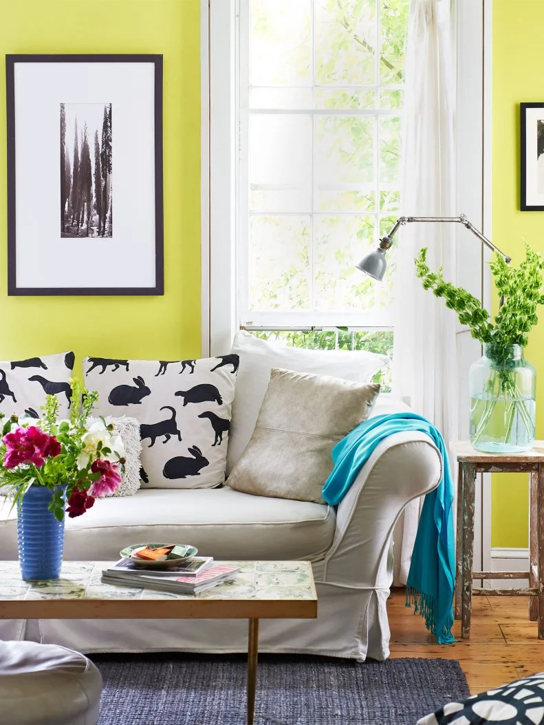
If you’re ready for something considerably more vivid, look to your fruit bowl for inspiration. This juicy green functions like a punch of tart citrus that finishes and brightens an otherwise-bland dish and gives neutral pieces like the slipcovered sofa and black-and-white art a jolt of contemporary energy.

Try This Shade: Grape Green, Benjamin Moore

SEE MORE PHOTOS

More photos after this Ad

Photo: Sherwin-Williams
12 / 21

Snuggle Up in Sable

This rich neutral grounds a space with warmth and depth. It’s a sophisticated background for textural organic materials like the corner support beam and fireplace surround in this luxe, contemporary sitting area. It’s also the perfect frame for a verdant view.

Try This Shade: Urbane Bronze, Sherwin-Williams

see more photos

More photos after this Ad

Photo: Valspar
13 / 21

And, Add Layers for Warmth

This new neutral, in turn, benefits from a subtle hint of lavender. The dimensional color in this gray contrasts with copper, rich wood, caramel-colored leather and tile and brickwork. Swaddle your space in a tone like this one to draw the eye to creamy whites and rich organic elements.

Try This Shade: Winter Calm, Valspar

SEE MORE PHOTOS

More photos after this Ad

Photo: David A. Land. From: HGTV Magazine
14 / 21

Visualize Blue Skies

Might we interest you in a summery accent ceiling? It’s hard to repress a grin in this light-filled Pittsburgh living room, where designer Alisha Gwen stuck to subtle walls and went big overhead. She integrated that vivid hue by carrying it through a pair of French doors, then reaching for fabric in the same color family to upholster a loveseat.

Try This Shade: Lazy Sunday, Benjamin Moore

see more photos

More photos after this Ad

15 / 21

Or, Fill a Small Space With a Big Blue

Who says you can’t tackle a diminutive room with a major statement? This look-at-me blue makes absolutely everything pop. It’s so vibrant that it functions as both artwork (note the empty frames at left) and a window treatment.

Try This Shade: Caribbean Azure, Benjamin Moore

More photos after this Ad

Photo: Colin Price Photography
16 / 21

Create Contrast With Navy + White

A well-deployed accent tone creates dramatic angles in this sun-drenched San Francisco space, where sunset-colored art and case goods pop against maritime blue. It also has the effect of making the living room’s whites look even brighter. Nifty, no?

Try This Shade: Hale Navy, Benjamin Moore

learn more

More photos after this Ad

Photo: Graham & Brown
17 / 21

Channel the Islands

Given the hours we log in our living rooms — Americans spend more waking hours there than in any other parts of our homes — isn’t it time they took cues from our vacation destinations? Paired with a hibiscus-colored door (and why not?), this vibrant coral is energizing and refreshing all at once.

Try This Shade: Aloha, Graham & Brown

see more photos

More photos after this Ad

Photo: Valspar
18 / 21

Or, Climb a Sand Dune

Use a southwestern stunner like this warm clay tone to put a contemporary spin on classic midcentury boho tones. Warm pastels are ideal for updating wood paneling, and they serve as an atmospheric backdrop for desert-inspired accessories.

Try This Shade: Pale Powder, Valspar

More photos after this Ad

Photo: Valeria Jacobs
19 / 21

Freshen Up With Gray-Tinted Green

Reach for an atmospheric, cloudy green to cool down a rustic, contemporary space. This color wraps itself around whitewashed brick and balances exposed beams with ease, and it would look fabulous in a Craftsman-style space.

Try This Shade: Evergreen Fog, Sherwin-Williams

More photos after this Ad

Photo: Benjamin Moore
20 / 21

Or, Tend a Field of Green

Like the super-saturated blue we recommended a few slides ago, this historic hue is lovely enough to fill a frame all by itself. It’s also the ideal partner for rich, stained wood and unbleached linen. This tone takes you from zero to “well-heeled country squire” in no time.

Try This Shade: Fairmont Green, Benjamin Moore

More photos after this Ad

21 / 21

Whisper With Gray

This bestselling ‘greige’ could be the ultimate city-apartment neutral: It’s a sophisticated designer favorite that offsets vivid red textiles and buttery brass with style. If urban, Art Deco-inflected style is your sweet spot, brush away.

Try This Shade: Penthouse, Benjamin Moore

see more photos