


Vibrant Nursery With Classic Appeal

Blue and Neutral Contemporary Nursery With Bird Wallpaper
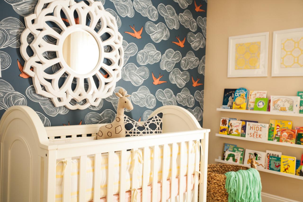
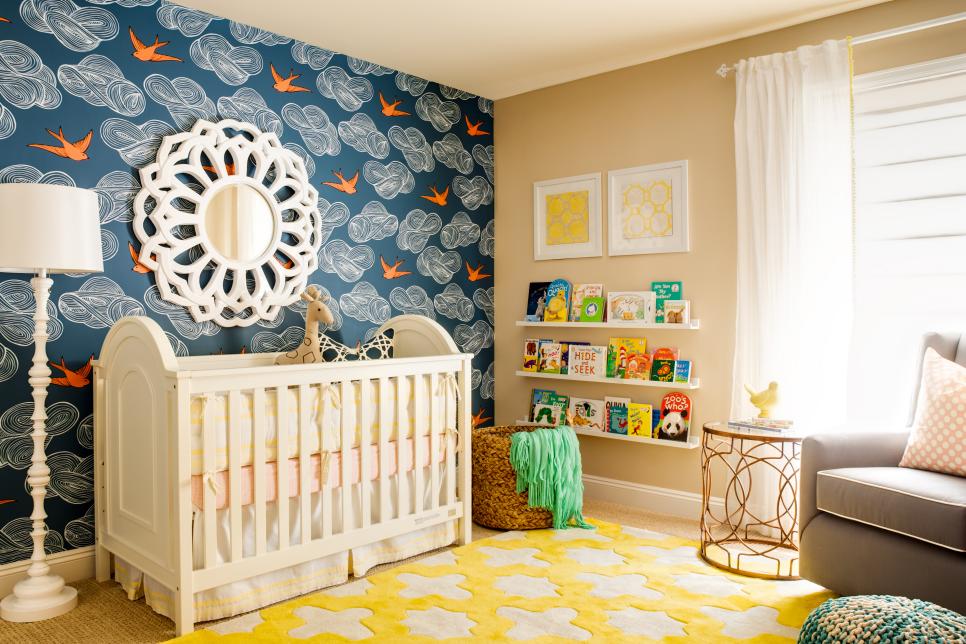
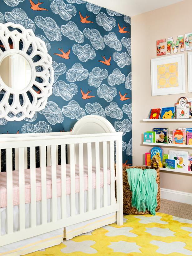
Orange sparrows swoop amongst the clouds on the charming wallpaper in this so-chic nursery. An ornate white mirror echoes the graphic patterns on the walls and ties in with the white crib.

Photo by: John Woodcock Photography
John Woodcock Photography
What were the main items on your clients’ wish list for remodeling/redesign their space?
Their space was pretty much a clean slate when they started. The couple had purchased an older home and revamped the whole thing. The mom was very excited that she was having a girl and wanted to make sure the room felt “girly” yet sophisticated. She also wanted the room to feel light, bright and cheery.
What were the main objectives and goals you set out to accomplish for your client?
Katie, the baby’s mother, has a classic preppy look, so I wanted to bring that style across in her nursery. Hygge & West, the wallpaper manufacturer, had photographed the paper with a pair of bright yellow rain boots. I just loved the juxtaposition of yellow with the paper so this was my main inspiration for the room.
I decided to go with a color palette that was preppy, with navy blue as my base color. The pops of coral and mint and the bright yellow rug brought the room to life. The room has great natural light, so I used a lightweight drape on the window with a tiny pom-pom fringe detail.
Photos
See All Photos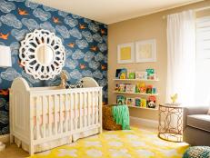


Every project presents a unique set of challenges. What was your biggest obstacle in the remodel/redesign of the space, and how did you deal with it? Any memorable moments?
This room was actually well laid out, with the focal wall behind the bed visible from the doorway, which was ideal. One of the hardest things is when you get your heart set on a particular product and it isn’t available when you want it. This particular rug was on back order for quite a while. We went round and round about selecting a new one but I think we both knew it was worth the wait. And it was!
Jen and I decided we were going to line the dresser drawers with the extra wallpaper. Easy, right? Well, it was quite a sight as we were out in 104-degree weather trying to apply spray mount to the back of this wallpaper as it kept rolling back up onto itself. We were hot, sticky and frustrated, but it was a labor of love.
Seeking design inspiration is what draws our readers in and makes them fall in love with a space. What was the inspiration for this project?
I had pinned this sparrow wallpaper on my Pinterest board and I had it in the back of my mind for the perfect opportunity to use it. I find myself doing this with certain things. Sometimes a particular piece of art, a rug or even a wallpaper pattern gets my wheels turning for the next project. Dreaming up new things to create from inspiration is the best part of design.
Was there a specific piece of furniture, fabric, color, texture or piece of art that was essential to bringing the design together?

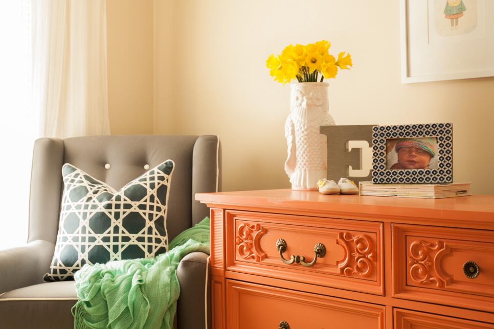
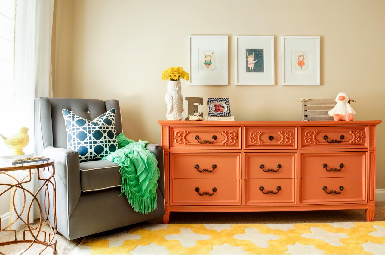
Multicolored Contemporary Nursery With Orange Dresser
Bright colors and graphic patterns make this nursery chic and cheerful. Artwork and accessories tie in with the bold color scheme, helping to unify the space.
Photo by: John Woodcock Photography
John Woodcock Photography
I think that the vintage dresser was what really gave the room some personality and made it unique. We had it painted in the coral hue that we pulled from the color of the birds in the wallpaper. This tied the two sides of the room together.
After putting a lot of time and energy into this project, what makes you proudest of the end result? What is your favorite feature, element or detail of the space and why?
The best part for me is making a family feel comfortable in their space and proud of their home. As I presented this room to Katie, I told her that it was a risk, not a typical “safe” design. I even had a couple other options for her in case she was scared by it. Once I pulled it out of my briefcase to show it to her, she put her hand over her mouth and said, “Oh, my gosh, I’m going to cry. It is perfect!” It is moments like that where you know you are bringing a little bit of happiness to people’s lives through design, and that is the most rewarding thing for me. Why not be surrounded by things that make you happy? This is why design is so important.
The coral-colored dresser and the yellow rug complement the playful sparrow wallpaper to create a cheery and fun nursery. How you were able to balance the use of several bold patterns and colors in the nursery?
I love mixing patterns and colors. I think there is definitely an art to it, but if you take a little risk it will pay off tremendously. I have a couple of rules for mixing patterns. If a pattern is a similar scale I try to make sure they are used on different planes. I also like to have a healthy mix of organic patterns as well as linear ones. I like to add in colors that are a little unexpected; I think if you have a decent ground color such as a navy blue or gray it’s a little easier to do.
What makes this project uniquely yours? Is there a particular design element that you incorporate into every project you work on?
I would say that my style is a little bold. I try to keep some classic elements, but still pop in some fun surprises. I like to pop in a mix of patterns, textures and bold colors. I have noticed that I almost always have some sort of stripe element in my designs. I think stripes are classic and are sometimes a nice break for the eye when mixed with other patterns. I also love to use navy blue; I think that it is a great ground color and there are so many colors that pop so well with it.
Our readers love the small details. What are the “hidden gems” in your plan that really made a big difference in the overall success of your design?
My favorite little details in the room were the wallpaper-lined drawers in the vintage dresser and the cute little art prints I found on Etsy from an artist abroad.


