


One-of-a-Kind Movie Theater
Doyle Coffin Architecture redesigned the historic Prospector Theater in Ridgefield, Conn., to house four movie theater screens, a cafe and a street-like marquee area. The eye-catching design boasts skylights, a copper penny ceiling and specialty lighting throughout.

Street View Prospector Theater
The Prospector Theater features a modern glass addition with wood and copper details. The front historic façade was recreated, transforming the building from traditional to contemporary, introducing expanses of glass and wood for a seamless transition with a warm, inviting feel.
Photo by: Jeff Goldberg/ESTO
Jeff Goldberg/ESTO

What did your clients want for the theater remodel?
From the early stages of planning and designing for this project, the most significant objective was mission-driven design. The Prospector Theater is the first of its kind, a non-profit first-run movie theater; however, the movie theater use is secondary to its primary use as a vocational training facility for adults with developmental disabilities. Employees are referred to as “Prospects” and are trained to work in the theater. Additionally, each Prospect selects an area of interest (i.e. technology, hospitality, retail, etc.), and receives extra training that allows them to pursue their passions. The goal for each Prospect is that through employment at the theater, they will eventually graduate and move on to prospective jobs in their area of interest elsewhere in the community. We worked with our client to make this vision a reality by converting what was once a 500-seat, single-screen theater into a community destination with four screening rooms, a café, a restaurant, a bar/lounge and a generous lobby where people can meet for a date or a family night out. The flexibility of these spaces was essential to accommodate a growing list of uses, events and job opportunities. The Prospector Theater opened in November 2014 and now employs more than 85 Prospects and counting.
What improvements did you make to the theater?

Jeff Goldberg/ESTO
The original movie theater was called the Ridgefield Playhouse and opened in 1940. It was designed by John Eberson, an architect renowned for his “movie palace” designs. In 1970 the building was gutted and turned into a bank that remained in operation until 2008. The building sat unoccupied for a few years and had fallen into disrepair before it was purchased in 2011 by our client. When structural and programmatic issues determined the need to take the entire building down, it was very important to the town and the Ridgefield community that the character of the front facade be maintained. The original building was carefully documented so that the front 16 feet and other details could be rebuilt to its original 1940s glory. In addition to maintaining the historic Prospect Street entry, the new theater needed to provide an accessible entrance from the parking lot, which is at a lower topographical elevation. As a result, the main lobby is located approximately six feet below Prospect Street to be on the same level as the parking lot. A glass box was added to the original building footprint to create a new sense of entry that complemented, but did not compete with, the historic presence. This also allowed the design to become more visually open on the east facade, identifying the threshold between the original building footprint and the new east entry.
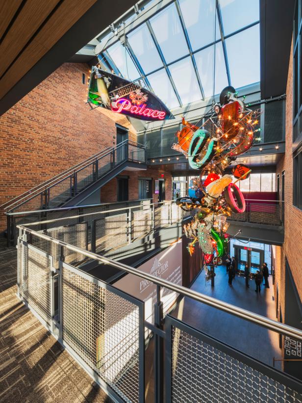
We believe the artwork makes the building unique. The client wanted to be sure that all interior finishes and artwork in the building had meaning and represented the mission of the theater. For example, the Prospectolier, a chandelier designed by a Philadelphia artist, consists of two pieces: one approximately 27 feet tall and 1,000 pounds and the other 7 feet tall and 500 pounds. The client and artist visited a variety of flea markets to hand-pick the items that would become part of the chandelier. The artist then created the sculpture, incorporating lighting design into the piece to showcase it during the day as well as at night. The goal of the theater shares the same goal as the chandelier: to take discarded objects that appear inadequate and impractical and create something that is dynamic, beautiful and functional, showcasing each element’s true potential. In the case of the Prospector Theater, this means to showcase the talents of their employees, to see beyond their disability and recognize them as beautiful, hardworking and determined individuals who can make significant contributions to society and their respective communities.
Photos
See All Photos


What was your biggest obstacle during the project?
The design was driven by the needs of this mission while integrating requirements for a first-run movie theater. The building’s relationship to the street, elements of scale, materiality and openness were designed to complement the town fabric. In order to accommodate increased need for space and because of the site restraints and need for parking, the additional building program was expanded downward into the ground in order to maintain the original building height and scale. The front facade of the building was rebuilt and beyond it the new building transforms from traditional to contemporary detailing. The design challenge to create a building that was open while still functioning as a movie theater was solved in the design of the lobby, which offers flexibility for a variety of uses for both moviegoers and community members alike. A ceiling representing the traditional sidewalk marquee marks the entrance to the theaters. This dynamic space also provides a wide spectrum of uses: opportunities for socializing, training sessions or pep talks before an event. The most memorable moment was when our client decided halfway through construction that a commercial kitchen was needed. The design team and construction team were required to work together to modify the building systems to accommodate the complexities of a commercial kitchen over the top of a state-of-the-art movie theater. The second most memorable moment was when our client decided halfway through construction that a fourth theater was required. We ended up compromising on storage space in order to create this fourth screening room in the basement.
What inspired the theater’s design?
Our client challenged us to create sparkle. Knowing that she loves the color pink, we looked for creative ways to infuse color and sparkle into our design. With the front 16 feet of the original building having been painstakingly re-created we decided to decorate the interior of the original 16 feet using traditional detailing for the trim, paneling, windows and doors. The ceiling coffers and trim are true to the Georgian Revival style of the original design. We used pink glitter wallpaper on the walls and in the coffers to create a Hollywood vibe. A Greek key mosaic similar to the one in the original lobby floor was created and enhanced with the new name of the theater. The original poster frames were adapted to hold new digital signage. The second floor of the re-created historic portion of the building hosts a small lobby decorated in white, with painted wood coffers, a white leather banquette and a crystal globe chandelier. Opening off the small lobby are opulent restrooms using marble flooring and counters and oval pearlescent tiles on the walls.

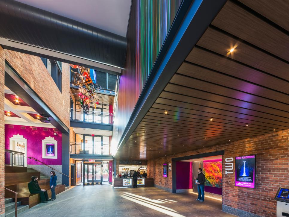
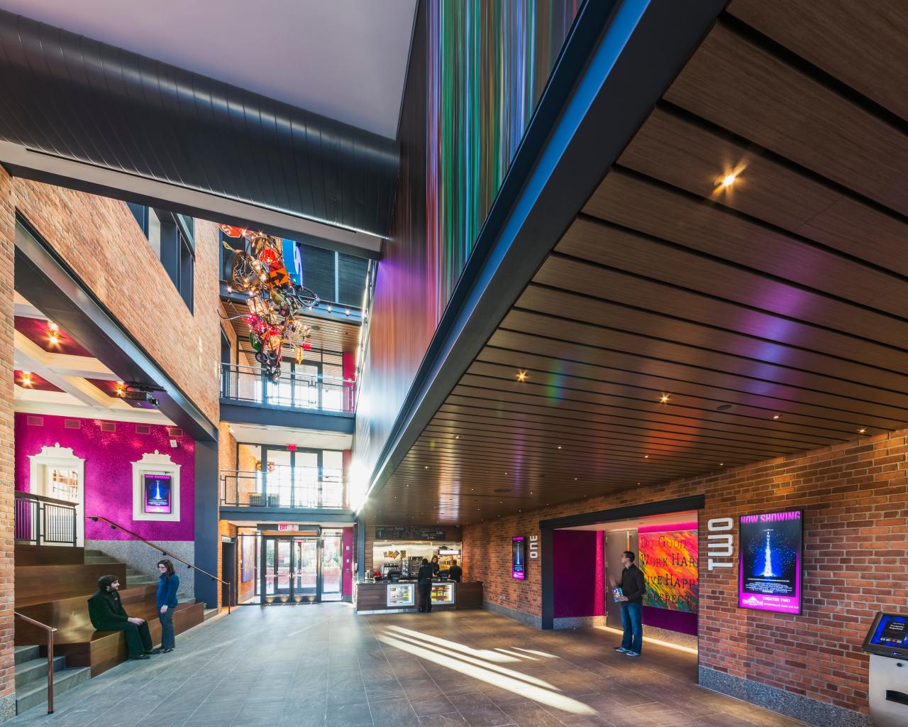
Prospector Theater Lobby
This dynamic space also provides a wide spectrum of uses. The lobby is an extension of the street, drawing patrons in and offering casual seating with a screen above for viewing previews and promotions. A ceiling representing the traditional sidewalk marquee marks the entrance to the theaters.
Photo by: Jeff Goldberg/ESTO
Jeff Goldberg/ESTO
As the building stretches beyond the re-created front 16 feet, we brought the brick from the exterior inside creating the impression of a streetscape with a marquee over the theater entrances, “street vendors” such as the ticket booth and concessions, and shops accessed off the street like the Heads Up Café. This part of the building was designed to have an industrial feel using brick, wood, granite, exposed steel and ductwork. Stainless steel railings and wire-mesh panels surround the balconies. In the theaters walnut trim and paneling is combined with perforated metal panels (for acoustics) on the walls. Each theater was given a unique ceiling treatment from floating wood coffers to a barrel-vaulted copper mesh to blue-painted starlight paneling. Much of the furniture was sourced from Design Within Reach, featuring Eames chairs and drum poufs in Theater Three, Victoria Ghost Chairs and Zero tables in the Star Bar, Frank Gehry twist cubes and System 123 lounge chairs in the upper lobby, and Aeron chairs in the offices. For a project focused on employing adults with disabilities, special considerations on the interior environment needed to be addressed. The mission constantly pushes Prospects beyond their physical and psychological comfort zones. The building was seen as a tool to aid in this endeavor. A bright interior, easing the movement and tasks of Prospects who may have physical or visual impairments was a key design consideration. This was sustainably achieved using daylight via a large skylight and expanses of full-height glazing in the facade.
As a business, theaters are about efficiency: moving people from tickets to concessions to theaters within a rigid schedule dictated by showtimes. Efficiency in cleaning and upkeep is critical for the first-rate experience expected by the customers. To aid this process, design and material selection took inspiration from sustainable concepts, like walk-off mats at entries minimize dirt and debris introduced into the building. In the main lobby, granite pavers were used to accommodate the high traffic, and for easy cleaning and longevity. For carpeted areas, a low-pile, hygienic and moisture-resistant carpet tile was selected, allowing for easy cleaning of spilled popcorn and soda. Materials and design considerations such as these help Prospects learn skills and perform cleaning and maintenance duties.
How did you create transitions throughout the theater?
The experience of the lobby is an extension of the street, drawing patrons in, offering casual seating with a screen above for viewing previews, promotions and aspects of the theater’s mission. The ceiling beneath the projection booth represents a traditional sidewalk marquee, marking the entrance to the theaters. Connecting all main floors, this dynamic lobby space creates opportunity for socializing among employees and patrons. It is used for training sessions, a place to hang out before work, grab lunch or have pep talks before an event. The design accommodates the flexibility required for a multiuse movie theater while supporting the needs of its mission by creating an environment for adults with disabilities to learn, grow and find employment in the community.
What was your favorite room/space to design?
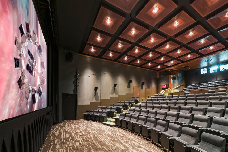
Theater Three was our favorite space to design as well as the most difficult. Reminiscent of John Eberson’s atmospheric design, Theater Three was designed with an open starlight ceiling. This multifunctional theater has 55 fixed stadium seats and an open floor providing flexibility of seating types and layouts. With movable walls that open into an alcove overlooking the courtyard, this theater can host a variety of events including lectures, galas, and round table-screenings and birthday parties. The design of this theater was extremely complicated since it is located over the top of Theaters One and Two. In order to keep sound from penetrating between theaters, we needed to isolate the concrete slab and structure between floors. We had to design a double concrete slab, the first slab fixed and attached to the structure and the second floating, upon which Theater Three was built. All of the theaters were created using box-within-a-box design criteria in order to create the ultimate movie-watching experience.
What is your favorite feature of the theater?
The atrium is one of the best design features of the Prospector. Within a relatively small footprint we were able to incorporate four theaters, but it is the volume of the three-story atrium space that makes the entry lobby and building feel larger than it actually is, which in turn makes the whole experience of the theater grander. The atrium space not only brings daylight into the lobby, but it helps serve as a reference point while exiting the theaters. The community stadium seating in the atrium allows people to gather and the atrium projector allows people to see information about the theater, upcoming attractions and educational programming.
Why did you attach pennies to the café ceiling? And how did the mosaic fireplace come about?

The 33,712 pennies glued to the ceiling (all heads up) pay tribute to the building's 40-year history as a bank. We originally contemplated putting medals and coins in the countertops or flooring, but as we were considering ceiling finishes we realized that the effect of copper pennies on the ceiling with the proper accent lighting would evoke a sense of warmth and sparkle. Employees had an active role in assembling the ‘penny panels’ that were then installed in the ceiling, allowing them to be a part of the building’s construction.
By giving the cafe the name Heads Up it not only refers to the pennies, but also symbolizes the way people hold their heads when they are engaged in meaningful employment. The artwork built into the design of the building tells the story of the theater. The fireplace mosaic incorporates found objects combined with Special Olympics medals won and donated by employees. The artwork, a virtual “I Spy,” was created to teach and encourage people with spectrum disorders to initiate and engage others in reciprocal conversations.
What makes this project uniquely yours?
We strive to create a sense of place in all projects that we undertake. We want our design to reflect the character and function of its intended use. We incorporated a lot of wood into this project (specifically walnut), from the rain screens and soffits on the exterior of the building to the ticket booth, concession area, seating risers, trim, paneling and ceilings on the interior of the building. The scale of a movie theater building is quite large and imposing; by adding a natural element like wood, it softens and humanizes the building/space. Wood is a very tactile material which ages and takes on an ever-changing patina. We also like the juxtaposition of wood and brick and how the lighting plays on the different surfaces.
What “hidden gems” are in your design?

Prospector Theater Screen Three
Theater Three of the Prospector Theater was designed to make patrons feel as though they were watching a movie from a rooftop under the stars. Comfortable lounge chairs provide the ultimate movie watching experience while also providing maximum flexibility for the space.This multi-functional theater has 55 fixed stadium seats and an open floor providing flexibility of seating types and layouts. It features movable walls that open into an alcove overlooking the courtyard. This theater space can host a variety of social events.
Photo by: Jeff Goldberg/ESTO
Jeff Goldberg/ESTO
The lighting in the building is one of the “hidden gems” setting the stage for the variety of functions and events taking place in the Prospector. The entire building is lit with energy-efficient LED bulbs. Different lighting strategies were incorporated into this project. Significant areas of the building are lit with indirect light sources such as cove lighting (the brick walls in the atrium/lobby, in the restrooms and on the perforated metal panels in the theaters) and up lighting (the penny ceiling in the Heads Up Café and blue ceiling in Theater Three). We incorporated floor lighting into the stainless steel walk-off mats and granite pavers to create a carpet effect at the entry doors. Each of the four theaters has a unique lighting scheme with the starlight ceiling in Theater Three being the most notable. We worked directly with Tivoli on the design of these custom panels. Each panel has four circuits allowing the intensity of the LEDs to vary on each panel, creating a twinkling effect. The density of the LEDs on each individual panel also increases from the lower wall plate to the top of the vaulted ceiling giving a sense of depth/distance. The overall effect is reminiscent of watching movies under the stars like drive-in theaters from years past.


