Next Up

Exterior Paint Colors Buyers Hate

June 13, 2025

If you plan on selling your home in the near future, avoid these exterior paint colors that buyers tend to dislike.

Price and stock could change after publish date, and we may make money off these affiliate links. Learn more.
Scroll For More Photos
1 / 21

The Best Paint Colors for Selling Your Home

Improving your curb appeal is always a great idea, but when it's time to sell your house, it's an absolute must. One of the most effective ways to boost your home's curb appeal before selling is to paint your exterior. However, there are some exterior paint colors buyers hate that you'll want to avoid. To help you sift through the seemingly infinite number of paint colors, we've spoken to designers and paint experts about the exterior paint colors buyers hate, and which colors they suggest trying instead.

See These Curb Appeal Looks From the US

More photos after this Ad

Photo: Courtesy of homeowners. From: HGTV Magazine
2 / 21

Avoid: Bright Sunshine Yellow

“While exterior paint color is a personal choice, there are certain shades that tend to be less popular among homeowners and prospective buyers due to factors like maintenance, neighborhood cohesion or limited curb appeal," explains Ashley Banbury, color marketing manager at HGTV Home by Sherwin-Williams. “Bright sunshine yellow, for example, can be overwhelming on a large scale and is especially prone to fading under UV exposure."

Cape Cod Color Palettes

More photos after this Ad

Photo: Kevin Fiscus. From: HGTV Magazine
3 / 21

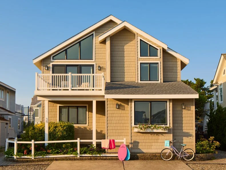
Try Instead: Softer Yellows

If you're after that yellow glow, buyers tend to prefer softer yellows. "A softer alternative like Napery offers a more timeless and inviting look while maintaining better durability in the sun," Ashley recommends. Midday (pictured above) is another great exterior paint option that offers that yellow glow without overwhelming brightness.

Find More Yellow Exterior Paint Colors

More photos after this Ad

Photo: Ryan Liebe. From: HGTV Magazine
4 / 21

Avoid: Golden Tans

While they can result in undoubtedly attractive exteriors, Ashley says, “Buyers also tend to avoid golden tan hues because they lack the versatility needed to complement a range of architectural styles and can easily clash with surrounding homes."

Tour This Home

More photos after this Ad

Photo: Roger Mastroianni. From: HGTV Magazine
5 / 21

Try Instead: Warm and Versatile Tans

"In contrast, Canvas Tan brings warmth and versatility to work with most architectural styles and has a welcoming aesthetic to optimize curb appeal," explains Ashley. Another great option is Tanglewood by Behr (pictured above), which brings in beautiful gray and green undertones.

See More Inviting Exterior Colors

More photos after this Ad

Photo: Mary Ann Carter/Getty Images
6 / 21

Avoid: Bold Purples

“Similarly, bold purples rarely make it to the top of the list for exterior applications," says Ashley. "These deeper tones lend themselves to specific architectural styles, like Victorian homes in older neighborhoods, but otherwise can feel polarizing compared to other houses in the area."

More photos after this Ad

Photo: Jeff McNamara. From: HGTV Magazine
7 / 21

Try Instead: Calming Grays

"A more crowd-pleasing option like Serious Gray, which has subtle purple undertones, brings a sense of depth and personality without overwhelming the neighborhood," offers Ashley. Software (pictured above) is an alternative option offered by Sherwin-Williams, offering a deep charcoal hue that pairs well with brighter warm colors.

Check Out More Gorgeous Grays

More photos after this Ad

8 / 21

Avoid: Bold Pinks

“Bold pinks tend to present challenges as well, not only because of their intensity but also because vibrant hues can highlight dirt and more easily fade over time," explains Ashley.

More photos after this Ad

Photo: Amanda Pittman; Del Rio Real Estate, Inc.. From: HGTV Magazine
9 / 21

Try Instead: Rosy Pinks

Swap the bold, hot pinks for subtler pinks, and you're golden. "For a softer, more elegant take, Rosy Outlook has gained traction, particularly in southern markets where houses are painted in a variety of charming hues," offers Ashley.

These Houses Are Pretty in Pink

More photos after this Ad

Photo: Poppi Photography. From: HGTV Magazine
10 / 21

Avoid: Lime Green

“Lime green is a rare find on the exterior of a home because of its overwhelming intensity," says Ashley.

Would You Live in a Standout House?

More photos after this Ad

Photo: Roger Mastroianni. From: HGTV Magazine
11 / 21

Try Instead: Gray-Undertone Greens

"Homeowners looking for a striking green that feels fresh yet still grounded often opt for Clary Sage, a beautiful mid-tone with soft gray undertones that gives it an edge while elevating the hue’s versatility and curb appeal," offers Ashley.

Find More Gorgeous Green Homes

More photos after this Ad

Photo: Jonathan Garza, ahs Design group. From: Luciana Corwin
12 / 21

Avoid: Glossy Blacks

Glossy blacks can create striking curb appeal, but only on very specific homes. Oftentimes, they result in a look that Cathleen Gruver, Lead Interior Designer of the Virginia-based Gruver Cooley Interiors, says is "too harsh and shows dirt and imperfections easily."

More photos after this Ad

Photo: Adam Albright. From: HGTV Magazine
13 / 21

Try Instead: Soft Blacks

Cathleen recommends sellers choose a softer black over glossy blacks, such as Benjamin Moore's Wrought Iron, which she calls "a soft black with subtle warmth that feels sophisticated, not stark."

Tour This Modern Mountain Home

More photos after this Ad

Photo: Courtesy of homeowners. From: HGTV Magazine
14 / 21

Avoid: Neon or Bright Primary Colors

While certainly eye-catching, Cathleen says homes painted in neon or bright primary colors often "feel juvenile or overly trendy, especially on traditional architecture."

Would You Live in a Standout House?

More photos after this Ad

Photo: Peter Baker. From: HGTV Magazine
15 / 21

Try Instead: Cool Navys

For a bold look that maintains elegance, homeowners should consider bold navy finishes. Cathleen recommends Sherwin-Williams Naval, calling it "a rich, timeless navy that adds depth without overwhelming." Another popular navy option is Benjamin Moore's Hale Navy (picture above), which offers a subtler navy hue with gray undertones.

Fall In Love With Blue Houses

More photos after this Ad

Photo: Mark Pinkerton. From: HGTV Magazine
16 / 21

Avoid: Army Green

While we've seen beautiful green exteriors in all sorts of shade, going all in on army or olive green can sometimes lead to a drab or institutional look, according to Cathleen.

Gorgeous Green Homes From Across the US

More photos after this Ad

Photo: Andrew Pogue. From: HGTV Magazine
17 / 21

Try Instead: Soothing Sages

For a green shade that still feels welcoming and homey, Cathleen loves soothing sages. Her recommendation? "Sherwin-Williams Evergreen Fog — a fresh, sage-gray green that feels modern yet organic." Baize Green (pictured above) is another soothing mid-tone green option from Sherwin-Williams.

Green Homes From Across the US

More photos after this Ad

18 / 21

Avoid: Aqua Blue

Cathleen recommends avoiding mint greens and aqua blues, as they "feel too niche or dated outside of certain mid-century homes."

More photos after this Ad

Photo: Joseph Bradshaw
19 / 21

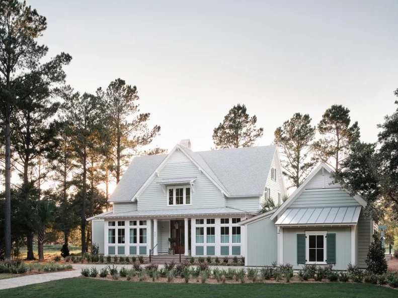
Try Instead: Soft, Coastal Greens

Instead, Cathleen recommends coastal greens, touting Sherwin-Williams Sea Salt, which she describes as a "soft, coastal green-gray that feels fresh and clean. Sherwin-Williams Quietude, featured on HGTV Dream Home 2025 above, is another muted green option with coastal flair.

Check Out HGTV Dream Home 2025

More photos after this Ad

Photo: Photography by Ashley Gieseking. From: HGTV Magazine
20 / 21

Avoid: Bright Whites

Have you ever driven by a white house and noticed that something was off about it? Cathleen says bright whites can be blinding in the sun, on top of showing every speck of dirt.

See More Homes With Outstanding Curb Appeal

More photos after this Ad

Photo: Moya McAllister. From: HGTV Magazine
21 / 21

Try Instead: Warm, Creamy Whites

Alternatively, warmer whites look much more natural and appealing on a home's exterior. Cathleen recommends Sherwin-Williams White Duck. "It's a warm, creamy white that feels soft and natural in daylight, she describes. Benjamin Moore's Spanish White (pictured above) is another great option for a white paint that isn't too stark.

See More Dreamy White House Colors