

Next Up

A Guide to Erin Napier’s Best 'Home Town' Color Palettes

Updated on January 10, 2024

We pulled together Erin's most timeless Home Town color combinations. Here's how to re-create them in your own space.

Price and stock could change after publish date, and we may make money off these affiliate links. Learn more.
Photo: Laura Good
Scroll For More Photos
1 / 12

Erin’s Top Color Schemes

From the simplicity of a gray-and-white bathroom to the vibrancy of a teal kitchen, Home Town host Erin Napier uses color to tell a design story — all while staying true to her love of restoring and preserving historic homes. Whether her vision begins with a paint color, wallpaper, accessories or furnishings, she pulls together the just-right palette for each space and homeowner. Get ready for some major design inspiration ahead.
MORE ON HOME TOWN

More photos after this Ad

From: Erin Napier, Home Town and A House With History
2 / 12

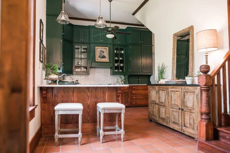
Forest Green + Terra Cotta

Discover the gorgeousness of forest green and terra cotta, a color palette that exudes history while also staying of the moment. For this 1910 kitchen remodel, Erin and Ben were able to save and restore the ultra-high cabinets and original terra-cotta tile flooring. Moody green paint transformed the upper cabinets, whereas the lower cabinets received staining. Warm and earthy hues create an inviting atmosphere ideal for the heart of this home.

MORE FROM SEASON 1

More photos after this Ad

Photo: Laura Good. From: Erin Napier
3 / 12

Navy Blue + Green

Another sure-fire way to find a color palette that works together is to pick a wall covering you love. Designed for the Napiers’ youngest daughter, Mae, this enchanting bedroom is brought to life by the whimsical wallpaper. Erin chose navy and green out of an array of soft hues on the wallpaper, and wove it into Mae's bedding.

TOUR THE HOME

More photos after this Ad

From: Erin Napier
4 / 12

Light Blue + White

If ever in color-scheme doubt, turn to blue and white: Erin's coastal color palette simply doesn't fail. For this seaside home reno, she found a clever nook for an awkward spot. Beachy blue on the cabinets and banquette seating creates an airy, inviting ambiance, while touches of crisp white keep the space fresh. Natural wood tones deliver a balancing note of warmth.

MORE FROM SEASON 4

More photos after this Ad

Photo: Todd Douglas/ Getty Images. From: Erin Napier, Ben Napier and Home Town
5 / 12

Denim Blue + Persian Orange

Take a look across the color wheel to find a no-fail pairing, and remember you don’t have to stick with the primary shades. Instead of opting for a bold pairing, like true blue and orange, go for softer, more sophisticated tones. Muted yet complementary hues make for striking curb appeal on this charming bungalow.

TOUR THE HOME

More photos after this Ad

Photo: Laura Good
6 / 12

All the Earth Tones

Warm, cozy earth tones will outlast any fickle trends. They’re the sink-right-in shades for the most welcoming of spaces. For this living room, Erin combines creamy whites with soft browns and tans to create a minimalist Scandinavian vibe with a touch of boho. In keeping with her and Ben’s love of restoring the old, she refinished the original floors and stained them a light wood tone. The fireplace now boasts a luxe marble surround and sand-colored mantel.

TOUR THE SPACE

More photos after this Ad

Photo: Todd Douglas/ Getty Images. From: Erin Napier
7 / 12

Gray + White

Erin's not afraid to mix and match patterns — but for those of us who haven't mastered the art, pattern play can be intimidating. We'll use this bathroom as a guide. Like Erin did here, begin with a simple color palette (gray and white) and stick to it, no matter what patterns you choose to accessorize with. Erin used three drastically different styles of tile: Spanish-style floor tiles; vertically installed, large-format marble tile on the shower walls; and basketweave tiles on the shower floor. Additionally, she brought in patterned towels and abstract artwork. The hues pull everything together to create a cohesive and spa-like main bathroom design.

TOUR THE HOME

More photos after this Ad

Photo: Laura Good. From: Erin Napier
8 / 12

Teal + Honey Brown

Contrasting hues are an easy way to make a big statement. This combo of bold teal cabinets with subtle honey-colored butcher block not only mixes warm and cool shades but reinvigorates this once-dated kitchen. An abundance of white — on the walls, upper cabinets and range hood — allows the new color scheme to be on full display. Intentional details, from the Moroccan tile accents to the brushed-brass hardware to the bright-hued rug, round out the kitchen's cozy feel.

SEE THE SPACE

More photos after this Ad

Photo: Laura Good, Laura Good, Laura Good. From: Erin Napier
9 / 12

Cornflower + Canary Yellow

Bright, springy and classic, this blue-and-yellow union brings a now charmingly upbeat dining room to life. Retro-inspired floral wallpaper bursts onto the scene, playing against a bounty of neutral tones found in the traditional wainscoting and furnishings. The decision to keep everything else in the space neutral leaves the wallpaper in the spotlight.

SEE THE SPACE

More photos after this Ad

Photo: Jessica McGowan/Getty Images, Jessica McGowan/Getty Images, Jessica McGowan/Getty Images. From: Erin Napier
10 / 12

Red + White + Blue

The classically Americana color palette is right at home in this kids’ bedroom, where soft blue walls set the scene. Capturing nostalgia and comfort, iron beds layered with quilts and plaid blankets are the design equivalent of hot dogs at a baseball game. Jute rugs ground the room in texture and pattern. Erin also infused the playful space with a mix of vintage and contemporary accessories that marry old and new.

SEE THE RENO

More photos after this Ad

From: Erin Napier
11 / 12

Celery Salt + Butcher Block

Bringing color into spaces isn’t all about flashy, vibrant hues. It’s often more about subtle tones that infuse a space with color without overwhelming it. Here, Erin opts for celery salt, a cream with springy green undertones, and the natural wood tones of butcher block. Ben custom-made the countertops, combining oak, mahogany and cherry reclaimed woods. For the flooring, they incorporated the same two hues to create a checkerboard motif.

TOUR THE HOME

More photos after this Ad

Photo: Todd Douglas/ Verbatim. From: Erin Napier and Home Town
12 / 12

Coral + Turquoise

Kids’ bedrooms are made for playful color combos — such as the whimsical coral-and-turquoise scheme in this sweet space. What we love most about the design (besides, of course, the dreamy daybed) is its neutral foundation. Not only does an all-white backdrop read utterly fresh, but it gives the child — and parent — a chance to play with various hues and patterns as time goes on.

MORE FROM SEASON 2