


A 10-Year Remodel With Lofty Goal


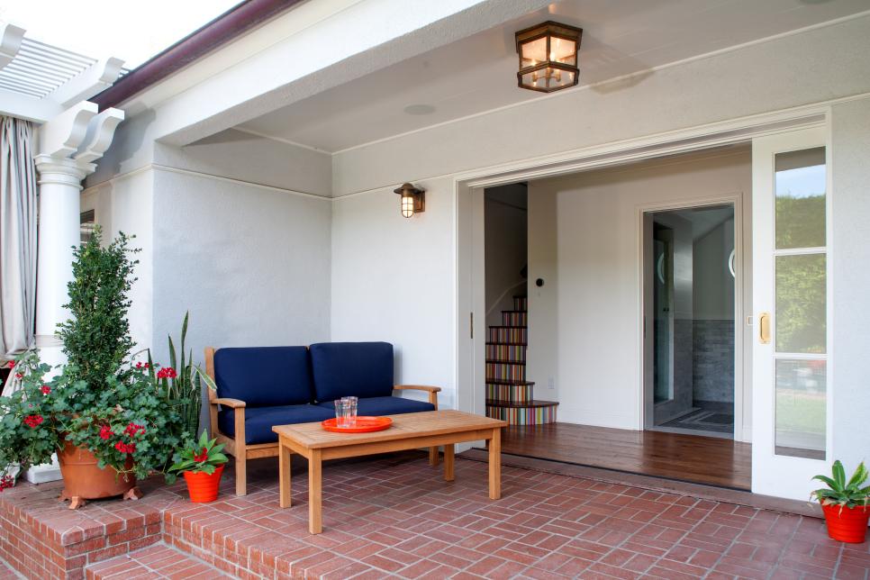
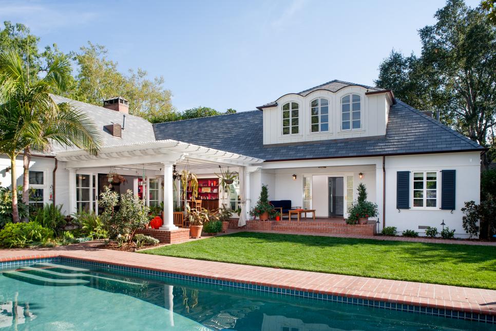
Pergola Bridges New & Old
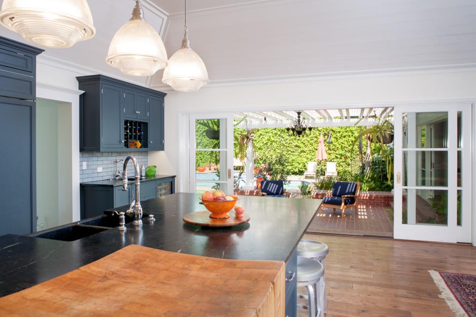
The painted wood pergola helps to connect the two-story addition to the original home, creating a lovely outdoor space overlooking the lawn and pool.
Photo by: Lee Manning Photography
Lee Manning Photography
What were the main items on your client's wish list for the remodel?
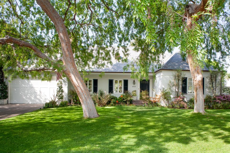
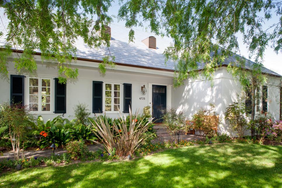
The main goal was to keep the original style and character of the old house but bring it up to date and make it usable. My clients bought the home because of its large, private backyard and existing pool. They wanted easy access to the exterior from any room, and they wanted a seamless transition from indoors to outdoors. The existing home had a beautiful front elevation, but an unsuccessful remodel from the '80s had left the interior a series of dark, choppy spaces.
We worked on this house in two phases over a period lasting more than ten years from start to finish! In the beginning we created a design for the entire house, then decided what could be done first and what needed to wait a few years. We ended up splitting the project in half, working on the living room and master renovation first, and tackling the kitchen and loft second.
Photos
See All Photos


What spaces were most important to your client?
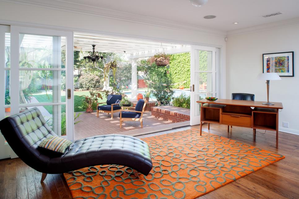
The living room and kitchen were both really important. We designed them to be separate spaces that would be tied together outside when all the doors are open. The outdoor pergola is an extension of both rooms.
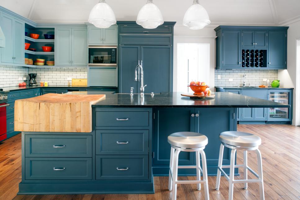
When my clients bought the house, the living room was in two sections: a small living space and an outdoor patio that had suffered an unsuccessful attempt at conversion into a TV room. The former kitchen wing included a kitchen, dining room, maid's room and a small bath. We removed all the walls to create a large family kitchen with an open floor plan.
Outside, an old pergola was replaced with a larger one set on brick plinths that can double as seating. This new outdoor space now serves as the main dining room for my clients.
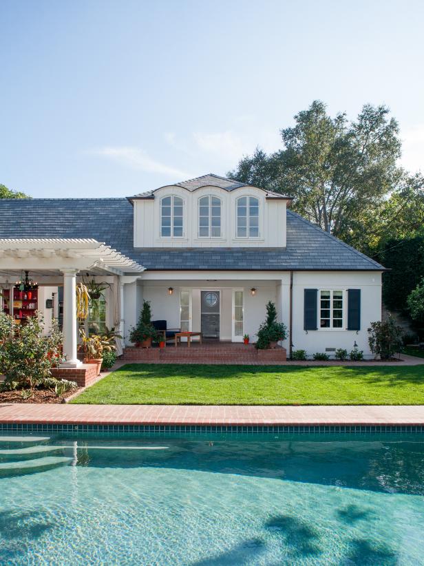
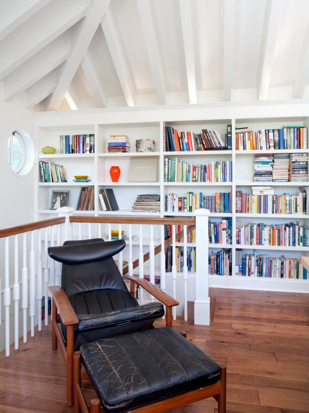
One of my clients works from home, so the new second story loft was another important space. I wanted it to look like an original part of the house. Our goal was to make the exterior look like a large dormer window, but to have a sense of space on the inside. Guests are surprised at how lofty the second floor feels.
How well was the original space working for your clients, and what changes did you make to help it fit their lifestyle?
These clients are very colorful people, but the old house did not reflect that at all. We worked together to create a really fun, vibrant space. I presented some rather bold color schemes, and the clients were agreeable to them from the start.
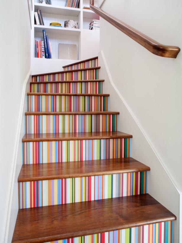
The striped stairs were a late addition that I really love. We were thinking of adding some colorful tiles to the risers, but we hadn't found anything that had the "wow" factor we were looking for. Then one of the homeowners brought a beautiful striped shirt to one of our meetings and asked if the stairs could match the shirt, and the rest is history! We adapted the concept to the wallpaper as well.
My clients often entertain large groups. The house now easily accommodates groups of 100 or more without feeling crowded. Because of the mild southern California weather, parties can easily flow inside and out.
What were your biggest obstacles in the remodel, and how did you address them?
The new second floor loft is my favorite space and was the most challenging to design. I was especially concerned about keeping the exterior roofline low, so it looked like a large dormer, while creating a lofty feel inside. This was not easy! I ended up exposing all of the interior roof framing to open things up as much as we could. There is a lot of "stuff" that usually goes in between those roof joists—insulation, lighting, electrical conduits—and we had to figure out a place for it all to go. We ended up putting the required amount of rigid insulation on top of the roof, and then used uplighting and a central pendant to light the space. Two of the beams are slightly larger than the rest to hide some electrical conduit. But don't tell anyone…
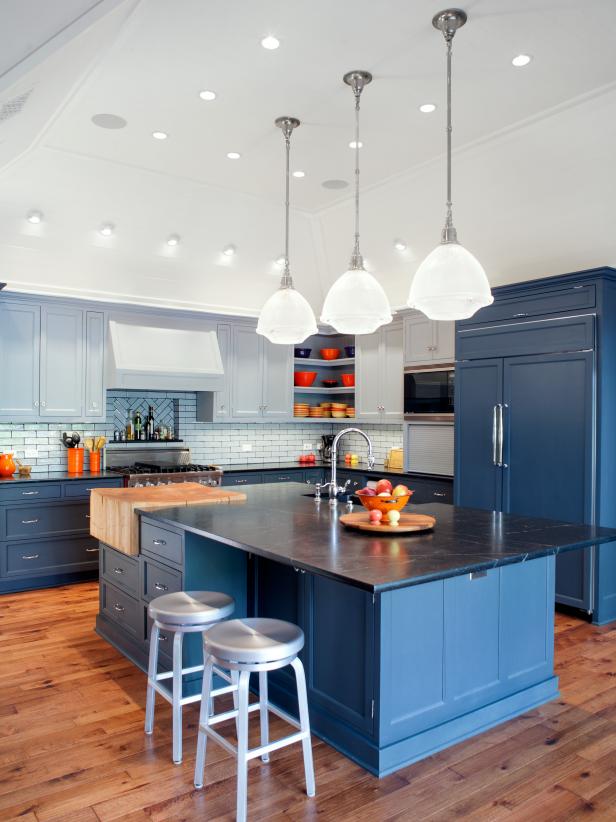
The kitchen island was another big challenge. We had a particular size in mind for the island, and my clients wanted to use a single slab of soapstone for the entire countertop. We would find what we thought was the perfect piece, only to learn that the vendor didn't have enough to meet our needs. It took weeks to find the stone, but we finally managed. The island cabinetry was then built to fit the slab. My clients found the kitchen's antique chopping block while on vacation in Michigan. It was easy to design it to fit, but supporting it was another story. That thing weighs a ton! So the island was easy to draw but quite a challenge to make a reality.
How did you make transitions from room to room without losing the individuality of each space?
One trick I used for easing transitions from one space to another is to use a consistent threshold. In this case, we used a chunky cased opening at the transition from foyer to living room, living room to kitchen, and kitchen to stair hall. The spaces all have different ceiling heights, but this unifying element draws them all together. The hand-scraped hickory floor is continuous throughout the space as well.
Was there a specific piece of furniture, fabric, color, texture or piece of art that was essential to bringing the design together? Is there a pattern, material or color that's repeated throughout the home?
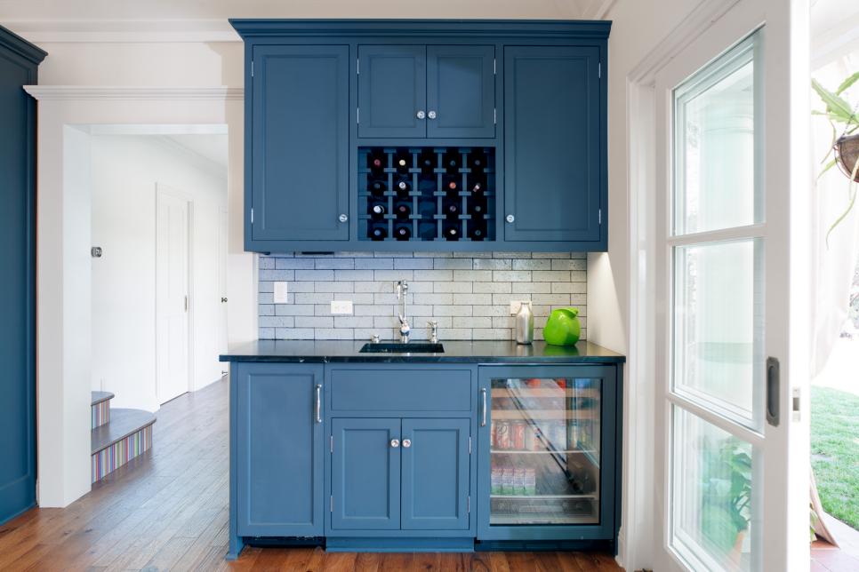
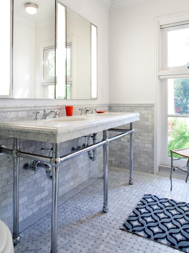
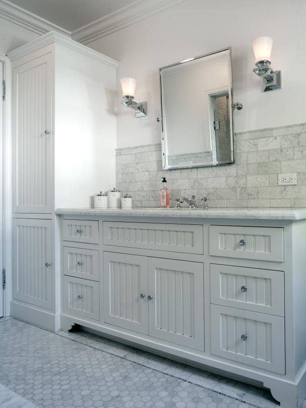
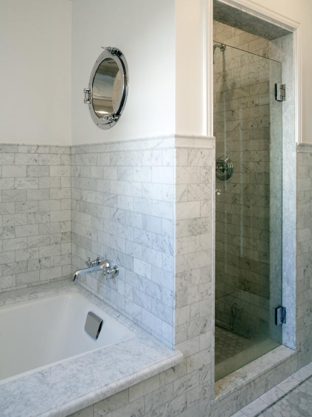
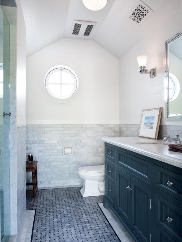
We started with a subtle nautical theme, which can be seen throughout the house. At one of our first design meetings my clients showed me an antique porthole window that they had in storage. We found a home for it in the guest bathroom shower. From there, I added shiplap boarding to several rooms, and we chose nautical light fixtures as well. The blues used in the kitchen were also ocean-inspired.
What's the best thing about this home, in your opinion?
What I love most is that this home is unique to my clients. It was a true collaboration, perfectly balancing my design sense with their personalities.
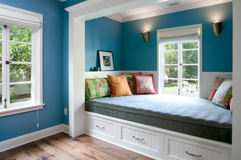
The addition of the loft space on the second floor is packed full of beautiful architectural elements with the beams, arched windows and built-ins. What was the inspiration behind this space? How did you work with the existing structure to create the addition?
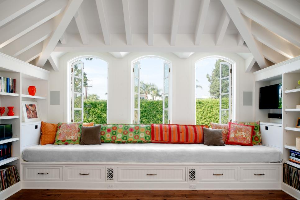
What a lot of visitors won't realize is that most of this wing of the house is new, and to me that's a huge compliment! When designing additions to older homes my main goal is to make it look original. I did a lot of research on French-inspired homes like this one, and I found several beautiful images of arched windows. The idea of a built-in daybed along a wall of arched windows seemed perfect, and the view of the pool from that space is beautiful.
As the addition took shape, I had to figure out how to maximize the interior volume while keeping the "dormer" feel on the exterior (as explained before). The last thing I wanted was a huge box looming over the backyard. I wanted the second floor to feel quiet on the exterior.
What makes this project uniquely yours? How did you use integrate your style into this project?
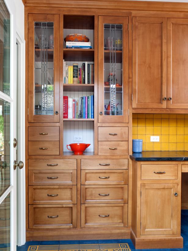
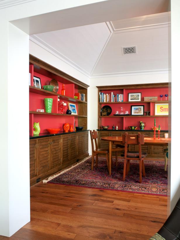
My work takes inspiration from beach houses, with lots of painted wall and ceiling boards, as well as basic flat moldings. I like to use simple, clean lines and then inject color. I love when clients are willing to use colors that aren't typically used, such as the bold red in the dining room shelving or the striped stairs.
I guess colorful kitchens are becoming my trademark! We chose the blue cabinet colors in the kitchen, and then my clients picked out that red Viking range which was the final pop.
What are the "hidden gems" that helped make your design a success?
I like to add cozy nooks wherever possible. In this house they have the daybed in the second floor loft as well as another daybed in the guest bedroom overlooking the pool. It's large enough for an adult (or a few kids) to sleep there. We added a TV on one wall so it doubles as a great place to watch a movie. It's also the favorite spot for their two dogs.


