






The 3 Colors You Hate Most + The Right Way to Use Them
Orange, brown and lime green — these colors can be tricky to get right. A designer weighs in on these underrated hues and explains how to use them correctly.

As a TV producer, my job is to have three backup plans for every great idea should it fall flat. Overall, my job is to ensure content keeps viewers/readers/audiences both informed and engaged. While presenting at an event at Epcot in Orlando, Florida, I turned the focus onto the crowd thinking to myself “I wonder if I ask them their likes and dislikes about design and decorating whether they’ll actually tell me.” And did they ever.
While a half dozen topics sparked amazing, albeit fun and light, debate, color was the one I found the most fascinating. Here’s a rundown on the colors people seemed to dislike most, along with my attempt to show how, when done right, these colors can be breathtaking.
Orange
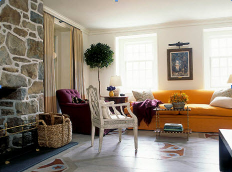
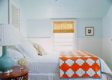
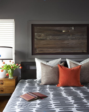
Above all other colors, orange took home the medal for the most-hated Color. What sucks most about this, particularly for me, is that about 30% of my portfolio sports this vitamin C-spectacular hue. In an attempt to win them over, I mentioned how all shades of orange once lived on my black list until I started using it simply in accent pieces. As these three images below by designers Jeffrey Bilhuber, Leslie Klotz and Chad Eisner from House Beautiful demonstrate, orange is a gender-neutral color that instantly adds energy to any room, even if it’s simply with a throw blanket. Okay, I totally get the idea that a room painted high gloss tangerine can be hard to take; however, small doses of orange can work wonders in otherwise muted rooms.

Brown
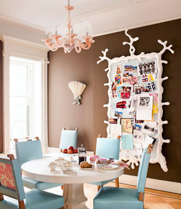
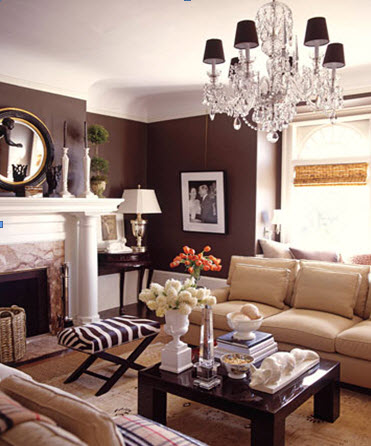
Coming in at a close second was brown. And just to fill you in on my feelings, brown is the color I’m most likely to use when I decorate. I get the notion that most naysayers think it’s dark, masculine and often associated with being muddy. Well, um, just don’t use a dark, muddy shade of brown; instead, shoot for elegant, neutral and classic.
In the dining room below by Jonathan Berger from House Beautiful, there’s no sign of the color being dark. Instead, it serves as a mediator between the femme pinks and the boyish blues. Next, a living room by David DeMattei proves that the right brown, when paired with neutrals, can be classic and elegant with no cliched association with hyper-masculinity. Last, I used a brown in a main bedroom as a backdrop for layering grays and burnt oranges, resulting in an earth-tone-fest that was both sleepy and sexy.
Lime Green
In third place was lime green — which is kinda fascinating since orange, brown and lime green is a timeless color combo. Of the three colors, I get why lime green makes the list; it can be totally Romper Room-ish when done incorrectly. Similar to a wild tiger, lime green needs to be tamed if you wanna live with it indoors.
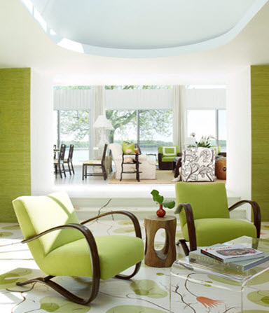
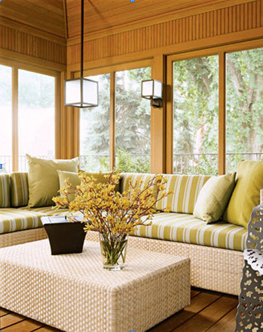
The first image, a living room by designer Christina Murphy, shows how lime can be bold and dominant but toned down with tons of white. Next, a sunroom by designer Andrew Flesher sports layered limes seen in upholstery; the different tones placed next to one another seem to make them less lime-y and more mossy. Last, a kitchen by Jonathan Adler shows that just a few small bursts of graphic lime-green prints can instantly add pizazz to an otherwise calm, white-and-silver color scheme.




.jpg.rend.hgtvcom.231.174.85.suffix/1738869872256.webp)

