Next Up

How to Implement a Monochromatic Color Scheme

July 02, 2025
Follow Lauren on:

What is a monochromatic color scheme, you ask? From color drenching and pattern play to tone-on-tone tricks and designers’ best bold moves, we’ve got everything you need to choose a direction and swing for the fences.

Price and stock could change after publish date, and we may make money off these affiliate links. Learn more.
Photo: Dan Cutrona. From: HGTV Magazine
Scroll For More Photos
1 / 21

Monochromatic Color Palette: One Inspiration, Infinite Variations

On paper, monochromatic design sounds simple: You pick a color and stick with it, right? Settling on one of the 12 components of the traditional color wheel (which is broken down into the primary colors red, blue and yellow; the secondary colors orange, green and violet; and six tertiary colors, like yellow-orange and blue-violet) is a start. Deploying that color in ways that make your space feel comfortable and interesting, now — that involves variations in tint (when it’s lightened with white), tone (when it’s deepened with gray) and shade (when it’s darkened with black). You’ll also add dimension to your space with fabrics and finishes that texturize your color of choice. All of that might sound a bit complicated, but when it’s executed with inspiration — as in this magnificent home office, which exudes coziness and creativity in equal measure — those canny choices should feel almost effortless. In the monochromatic spaces to follow, we’ll show you just how to make them.

How to Use a Color Wheel to Help Decorate Your Home

More photos after this Ad

Deploy Deep Blue in a Powder Room

If you’re experimenting with a monochromatic palette for the first time, might we suggest starting with a small space? Flavor Paper’s iconic Fracture pattern (see here), a large-scale abstract mural with dimensional blue and a seam of rich gold, fills up most of this diminutive room on its own. Texas designer Laura Umansky then doubled down on the look by matching it to the solid color she chose for the vanity, baseboard and window trim. She gives the eye a bit of a break with a pale stone countertop, neutral flooring, and an off-white Roman shade. Strictly speaking, white and black don’t violate a monochromatic scheme, since they’re considered the lightest and darkest possible versions of any other color, respectively. Here, they have the added benefit of making this space feel chic rather than Smurfy.

Blue Paint Colors Our Editors Love

More photos after this Ad

Photo: Rob Pryce
3 / 21

Or, Set the Mood in a Sun-Drenched Office

This generous office space uses color drenching — that is, when a room’s walls, built-ins, trim and ceiling are painted the same shade — to counterbalance the natural light with an oceanic blue similar to the powder room’s wallpaper. A long velvet sofa and an assortment of throw pillows layer in slight variations on that signature color, and ivory accessories provide neutral counterpoints like the powder room’s countertop and flooring. Warm, metallic accents on the framed photograph and floor lamp give the blue a bit of dimension, much as the wallpaper’s gold seam did. Since this room’s windows are uncovered, its neutrals also echo the mountainous Utah vistas beyond them.

See More of This Home

More photos after this Ad

Photo: Trevor Tondro. From: Jackson Paige Interiors
4 / 21

Match a Rich Neutral to Stained Wood

In this intimate Los Angeles lounge space, the deep gold tone that carries through paint on the wall and ceiling and rich, tufted velvet on the sectional is echoed in the built-in cabinets’ floor-to-ceiling wood panels. Matching a stain to your monochromatic color scheme is a fabulous way to layer the look of your space. Here, the spectacular graining in that wood adds subtle texture that doesn’t make the room feel crowded. Flush-mounted sconces reflect against the paint’s satin finish and add even more interest to that all-enveloping color.

Neutral Paint Colors We Love

More photos after this Ad

Photo: Ryann Ford, Ryan Street Architects. From: Butter Lutz Interiors
5 / 21

Enhance Gray With Subtle Stone

This oh-so-chic gray bath in jewelry designer Kendra Scott’s home (transformed by Texas designer Amy Lutz) demonstrates how beautifully slabs of marble can extend a monochromatic gray space. Tone-on-tone patterns, like the veining in the vanity countertop and the shower stall and the foil detailing on the wallpaper, make the repeated use of a single base color feel sophisticated rather than monotonous (monochromatic spaces should never feel monotonous).

Bathroom Color Schemes We're Loving Right Now

More photos after this Ad

Photo: Ryann Ford, Ryan Street Architects. From: Butter Lutz Interiors
6 / 21

Try a Wall-to-Wall White Hallway

To make the most of a narrow hallway in the same home, Lutz chose a classic white that carries through the mats and frames she used on the walls’ extensive art installations. The choice is canny for several reasons: It lets details like the elegant arches and skylight come into focus, it soaks up every bit of natural illumination from that skylight and it makes dozens of artworks feel calm and cohesive rather than overwhelming. That commitment to white also makes the few deviations from it — the stair rail, the sconce and the graphic art framed at the end of the hall — feel extra-special.

HGTV Stars' Favorite White Paints

More photos after this Ad

Photo: Tim Lenz, Styling: Mariana Marcki Matos, Architect: Appel Architecture and Builder Ecostruct . From: Crystal Sinclair
7 / 21

Or, Set the Tone With Black

At the other end of the spectrum (pun intended), drenching a traditional hallway (like the one in this Brooklyn brownstone) in satiny black puts a fresh spin on traditional woodwork that might otherwise feel fussy. Much as a velvet jewelry box creates an opulent, neutral frame for brilliant stones, monochromatic black spaces are ideal frames for both the rooms beyond them (here, the airy sitting area you can see at the far end of the hall) and artistic installations like the freeform, mirrored sconces mounted above the molding. Bonus: This ultra-dark monochromatic treatment camouflages wear and tear like a dream (unlike the comparatively high-maintenance white hallway we just featured).

Paint It Black: The Glory of Dark Interiors

More photos after this Ad

Photo: Jane Beiles. From: D2 Interieurs
8 / 21

Infuse Furniture With Medium Blues

A monochromatic space can feel like a contract with your future self: Do you really love one color enough to go all in for the long haul? Enter the commitment-phobe’s take on the treatment. This contemporary, open-plan living and dining space’s unquestionably blue mood has nothing to do with its walls, window treatments or flooring. Strategic use of blue textiles and accessories establish the color story here, and this home’s inhabitants can swap them in and out as they like without overhauling everything.

Beautiful Blue Living Rooms for Any Style

More photos after this Ad

Photo: Jane Beiles. From: D2 Interieurs
9 / 21

Or, Invest in a Blue Base

This bedroom, in the same home, goes all in on the same range of tones with a barely-blue carpet and a wash of watercolor wallpaper. Those blues then recur in the upholstered headboard, bedside pendant, textural linens and the built-in shelves’ interior. A monochromatic base is an ideal anchor for a child’s bedroom, as individual elements can evolve with the room’s occupant and still feel cohesive.

Blue Kids' Rooms We Love

More photos after this Ad

Photo: Avery Nicole Photography. From: Heather Scott Home & Design
10 / 21

Build a Not-So-Basic White Kitchen

The most common monochromatic space is, of course, a white kitchen — but all white kitchens are not created alike. Developing personality in a space like this one is all about subtle texture — the elegant, traditional marble tile on the backsplash, the ginger-jar collection displayed in the glass-fronted top cabinets and the bistro stools’ weave — and charismatic accents like the gold-accented trio of lanterns and exposed ceiling beams. It’s also crucial to give the eye a place to rest, as with the walnut-toned flooring underfoot, as white on every last surface would be overwhelming.

White Kitchens That Are Anything But Vanilla

More photos after this Ad

Photo: Will Ellis Photography. From: The New Design Project
11 / 21

Try a Textural, Off-White Bedroom

Along similar lines, this dreamy white New York City bedroom deploys understated, abstract pattern on the feature wall and accent rug to make the space feel serene and special at the same time. Mirrored nightstands and table lamps make even more of the natural light suffusing the room, and nubbly chenille on the upholstered bed and armchair are minimalistic yet cozy. Knotty planks on the flooring beneath the area rug, in turn, add an organic note that can counteract neutrals’ tendency to feel sterile.

Dreamy Ideas for a Not-Boring White Bedroom

More photos after this Ad

Photo: Reagen Taylor Photography. From: Butter Lutz Interiors
12 / 21

Frame a Fireplace With Smoke Gray

Heating up a mid-tone neutral, in turn, is all about strong geometry and bold moves. This dramatically color-drenched living room boasts smoke gray that complements its vaulted ceiling and streamlines the look of the windows and doors. It also creates a frame for that magnificent marble fireplace. Rich brass hardware on the globe pendant, sconces and kidney-shaped coffee table pick up the warmth of the firelight, and a quartet of symmetrically-arranged velvet armchairs in two related grays layer the look even more.

Trend: Monochromatic Living Rooms

More photos after this Ad

Photo: Tomas Espinoza
13 / 21

Ease In With Color Blocking

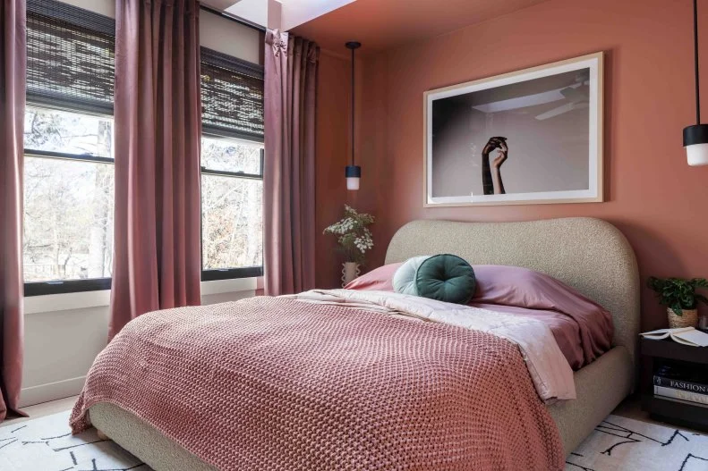
HGTV Smart Home 2024’s blush guest bedroom demonstrates how vertical color blocking — here, an alcove at one end of the space that envelops the bed in color, then extends that color through the window treatment and linens — splits the difference between a fully monochromatic design and one that can transition that way. To experiment with a look like this, paint a feature wall in the color you’ll eventually extend through your room, then swap textiles and furnishings one at a time as you move outward from that wall.

See More of This Bedroom

More photos after this Ad

Photo: Stacy Zarin Goldberg. From: Zoe Feldman Design
14 / 21

Taste-Test Blue-Gray in the Pantry

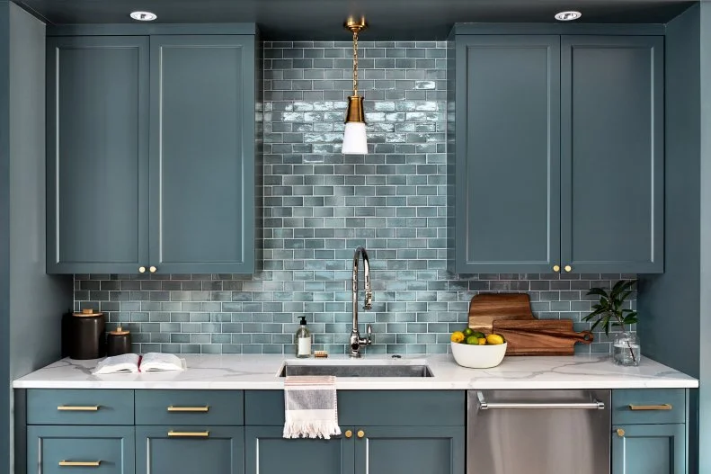
If you’re hankering for an immersive kitchen but aren’t quite ready for a main-course color story, make like Washington, D.C. designer Zoe Feldman and cook up a monochromatic pantry first. She deployed the same oceanic blue on the upper and lower cabinets, walls and ceiling, then chose hand-glazed, backsplash-spanning subway tile that begins with the same shade and lightens in an on-trend ombre effect.

Stylish Ideas for Modern Butler's Pantries

More photos after this Ad

Photo: Hilton & Hyland, a member of Luxury Portfolio International. From: Hilton & Hyland
15 / 21

Frame a Spectacular View With Charcoal Gray

Gorgeously versatile gray performs all sorts of roles in this transitional home office, where transitional details like built-in shelving and cabinetry develop rich dimension and a handsome pair of arched French doors framing a patio and hillside view take center stage. A gray velvet Chesterfield balances the matching, marble-topped cabinets across the room. Those two horizontal swaths of gray also provide a tonal transition between the warm wood flooring and the white tray ceiling.

Dark + Dramatic Colors for Any Room

More photos after this Ad

Photo: Marili Forastieri. From: Megan Pflug
16 / 21

Tailor Allover Blush With Black

This monochromatic blush bedroom is fresh rather than frilly, because its washes of barely-there color — that just-pink wall paint, those translucent curtains, the romantic linens — share space with a dark, architectural table lamp, a tie-dyed bolster pillow and a crisply contemporary canopy bed. Remember, black doesn’t compromise the color scheme here, but it outlines the room’s softness like a calligrapher’s fine lines on watercolor. Deploy accents like these to give an otherwise-pastel space a bit of definition.

Bedroom Color Guide

More photos after this Ad

Photo: Tomas Espinoza
17 / 21

Go Green in a Bath Suite

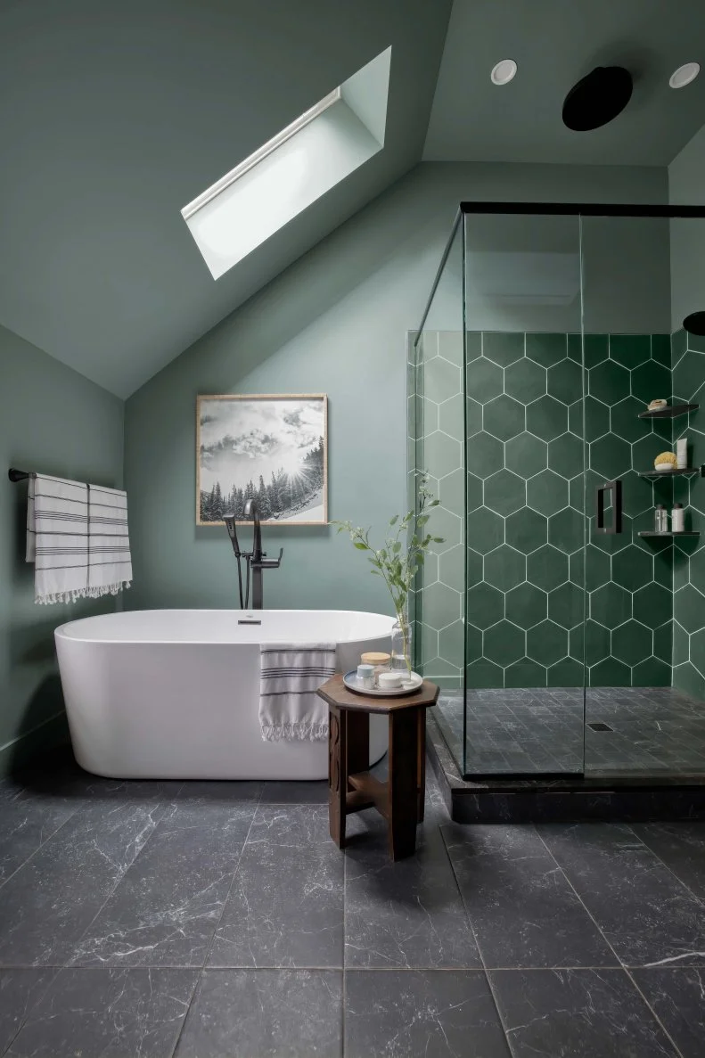
HGTV Dream Home 2022 echoes its verdant Vermont setting with all-enveloping sage green, a new neutral that’s equally elegant in traditional spaces and on-trend, contemporary spa baths. Here, the silvery-gray color drenches the walls and ceiling, then transitions to a deeper tone in the hex-tiled shower. Try complementing a monochromatic sage green space, as designer Brian Patrick Flynn did, with dark flooring that emphasizes the color’s undertones and black hardware that adds a bit of polish.

See More of This Space

More photos after this Ad

Photo: Joseph Bradshaw
18 / 21

Or, Soak in Serene Blue

For HGTV Dream Home 2023, in turn, Flynn reflected the crisp Colorado air in a main suite awash with atmospheric gray-blue. Every bit as versatile as sage green, this main bath MVP (most valuable pigment) is a handsome match for classic chrome fixtures, charcoal-toned porcelain flooring and a pale vanity countertop. In this walk-in shower, hand-glazed Zellige subway tiles in slightly darker blue tones add another layer to the space’s design.

See More of This Space

More photos after this Ad

Photo: Dylan Chandler. From: HGTV Magazine
19 / 21

Invigorate With Pink

When you’re prepared to go all in on a supersaturated space, consider Tiffany Brooks’s fuchsia home library. From the built-in cabinetry and shelving to the walls and window hardware, every vertical surface in this room is unapologetically pink — and Brooks amplifies its effect on her daybed and cornice with a pattern that incorporates similar colors. Checkerboard flooring is bold enough to hold its own against all that color, and a small, neutral area rug reveals just a hint of it beyond its scalloped edges.

The Best Bold Paint Colors for Every Room

More photos after this Ad

Photo: Courtesy of Joybird for Pantone
20 / 21

Warm Up the Living Room With Mocha

Pantone’s Color of the Year for 2025 — Mocha Mousse, a warm, chocolate brown — reflects the design world’s taste for neutrals with cozy character and suits monochromatic design schemes beautifully. Pale enough to feel fresher than ‘70s earth tones, this quietly luxurious color suits walls, upholstery and window treatments — and more is unquestionably more.

See More of Pantone's Color of the Year

More photos after this Ad

Photo: Brian Wetzel. From: HGTV Magazine
21 / 21

Tint a Sitting Room Tone-on-Tone Teal

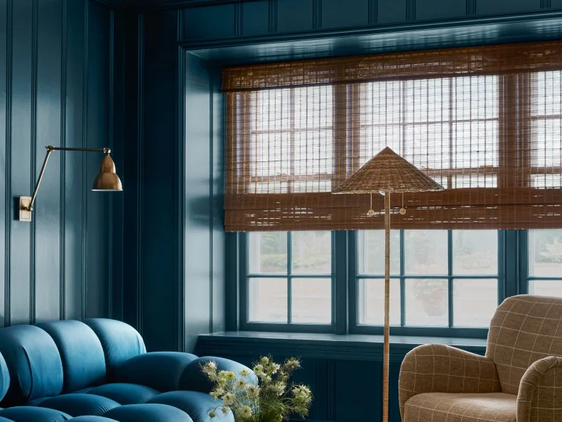
Inspired by the sensual tone of the tufted sofa she’d selected for the space, designer Brittany Hakimfar drenched this room in a matching color (Benjamin Moore’s New Providence Navy, which has bright teal undertones) for an all-enveloping effect. The paint’s satin finish is especially effective for paneling, as its planes and furrows create stripes with sunlight and shadow. This monochromatic room is anything but monotonous.

Blue Paint Colors Our Editors Love