Next Up

9 Interior Paint Colors Buyers Hate—and What to Use Instead

June 16, 2025

Getting ready to sell your home? Don’t put it on the market before checking these interior paint colors buyers hate.

Price and stock could change after publish date, and we may make money off these affiliate links. Learn more.
Photo: Laurey Glenn
Scroll For More Photos
1 / 19

Interior Paint Colors Buyers Hate

There’s a lot that can turn someone off while house hunting—damage, clutter and curb appeal, to name a few. One of the easiest and most high-impact changes to make is repainting your walls. But what colors do buyers dislike? We've pulled together the top 9 paint colors that buyers hate and what you should use instead.

See Dated Features Homebuyers Always Notice

More photos after this Ad

Photo: Ryan Garvin. From: Erica Bryen Design
2 / 19

Don't: Bright White

It makes sense that sellers often opt for bright-white paint when trying to refresh their home, but according to Colette Archambault, co-founder of Hunter Hill Interiors, its stark, sterile appearance is better suited for a hospital. “Bright white can also create harsh contrasts and show imperfections more easily,” she adds.

Check Out Our White Paint Guide

More photos after this Ad

Photo: Photo by Tamara Flanagan Photography, design by Hunter Hill Interiors
3 / 19

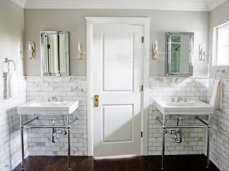
Do: Simply White by Benjamin Moore

Archambault prefers a white paint with warmth to it, one of her favorites being Benjamin Moore’s Simply White. “It has a softness that makes a space feel welcome and refined,” the designer explains. You still get the crisp, modern look—just without the harshness.

See HGTV Stars’ Favorite White Paints

More photos after this Ad

Photo: Constance Mariena. From: Kerra Michele Huerta
4 / 19

Don't: Cool Gray

Not all grays are created equal. In fact, Kathryn Linea Rund, Strategic Design and Development Advisor at HouseCashin, says that “grays with blue or purple undertones feel cold and unwelcoming.” Even when paired with warm furniture and finishes, it still feels corporate and stiff.

More photos after this Ad

5 / 19

Do: Mindful Gray by Sherwin-Williams

The beauty of a greige like Sherwin-Williams Mindful Gray is that it balances warm and cool tones. According to Rund, this is what makes it so versatile and “perfect for open-concept layouts and home staging.”

More photos after this Ad

Photo: Janet Mesic Mackie. From: Mark Lavender
6 / 19

Out: Bright Red

Psychology tells us that red is a powerful color—especially vivid shades. “Often perceived as intense and overwhelming, red can make a space feel smaller and may evoke strong emotional responses,” explains Andrea Viscuso, licensed real estate agent at Compass.

More photos after this Ad

Photo: Arnelle Lozada. From: HGTV Handmade
7 / 19

Do: Cavern Clay by Sherwin-Williams

Though not actually red, this warm terracotta color—Cavern Clay by Sherwin-Williams—has red tones that make it a worthy substitute. Rund says it “brings an earthy elegance without overpowering a room,” though she does recommend it for accent walls and smaller spaces.

See Warm Paint Shades from HGTV Magazine

More photos after this Ad

Photo: Amy Bartlam. From: Jenn Feldman Designs
8 / 19

Don't: Black

Though moody hues aren’t necessarily bad to buyers, black is a different story. “Even though it’s daring, painting a whole room black absorbs light and depth, resulting in a flat and lifeless appearance,” Barbara E. Tanaka, Strategic Home Design and Organizing Advisor at Real Estate Bees, says of the color. (Plus, imagine how many coats of primer the new homeowner would need to paint over it!)

More photos after this Ad

9 / 19

Do: Hale Navy by Benjamin Moore

A classic navy, however, is different. One of her favorites, Tanaka recommends Hale Navy by Benjamin Moore or a similarly deep hue with a little bit of sheen “for a refined appearance that adds dimension and a hint of luxury without overpowering the room.”

See Jewel-Toned Kitchen Design Ideas

More photos after this Ad

Photo: Eric Perry
10 / 19

Don't: Olive Green

Nature-inspired greens are always going to be timeless—because what would be more timeless than the great outdoors? That said, olive green can too easily read as muddy, which Rund declares is “drab, especially in small spaces” and “often associated with older, out-of-date design trends.”

More photos after this Ad

Photo: Valeria Jacobs
11 / 19

Do: Evergreen Fog by Sherwin-Williams

On the other hand, sage is right on trend. Rund describes Evergreen Fog by Sherwin-Williams as “a soft and sophisticated green with gray undertones that feels calming, clean, and modern.” It has the ability to ground any space while still adding color.

See Green Paint Colors Our Editors Love

More photos after this Ad

Photo: Lauren Rubinstein. From: Kandrac & Kole Interior Designs, Inc.
12 / 19

Don't: Builder Beige

Considered a default color you can find in a lot of new builds, painting a nondescript beige on the wall is supposed to be versatile and classic. Rund argues, however, that it “feels bland and dated” and “lacks warmth and personality.”

More photos after this Ad

Photo: SARAH NATSUMI MOORE
13 / 19

Do: Pale Oak by Benjamin Moore

Considered a go-to by many designers, Viscuso says Benjamin Moore's Pale Oak “is a subtle color with a tiny touch of greige-slash-tan that looks great in any space.” Whereas “builder beige” looks heavy on the wall, Pale Oak has an irresistible airiness to it that makes your home feel lighter and brighter.

See Neutral Paint Shades from HGTV Magazine

More photos after this Ad

14 / 19

Don't: Light Blue

Though pretty, Krasovec insists that light blue can feel “too bright and childlike” in a home. It’s also more difficult to build a color palette with and limiting when it comes to style and patterns.

More photos after this Ad

Photo: Robert Peterson, Rustic White
15 / 19

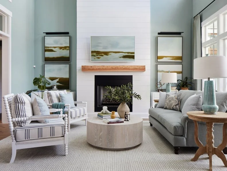
Do: Stardew by Sherwin-Williams

The soft, Sherwin-Williams Stardew blue walls in the living room help unify this space with the adjacent kitchen and keep things feeling open and spacious. A large coquina fireplace brings a historic element found throughout St. Augustine design into the living area and connects this space with the area's history.

More photos after this Ad

Photo: preston lee. From: Preston Lee
16 / 19

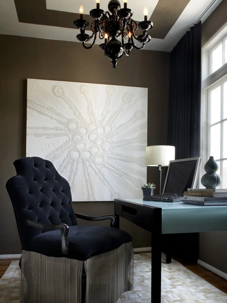
Don't: Dark Brown

Browns like chocolate and espresso are dated shades, not to mention especially heavy for a room to carry. “It can make spaces feel smaller and weighted, as it brings a traditional, masculine, and even oppressive feel,” says Rund.

More photos after this Ad

Photo: Laurey Glenn
17 / 19

Do: Nutshell by Sherwin-Williams

Though just as deep and rich as a darker brown, Rund recommends this earthy brown, Nutshell by Sherwin-Williams, as it’s “softened by mauve and taupe undertones, leaving a room feeling curated, rather than cavernous.” You get all the sophistication without the visual weight.

See Pantone’s 2025 Color of the Year

More photos after this Ad

Photo: Raquel Langworthy
18 / 19

Don't: Turquoise

Originally taking inspiration from the ocean, the bright and bold hue is now seen as juvenile and outdated. “It’s become the cliche color of coastal-themed bathrooms and mermaid-decorated children’s rooms, limiting a buyer’s potential,” Rund describes.

More photos after this Ad

Photo: Laurey Glenn
19 / 19

Do: Quietude by Sherwin-Williams

An option that still has coastal roots, Quietude by Sherwin-Williams is light, breezy, and reminiscent of sea glass. According to Rund, you get the same spirit without overwhelming a space.

See Our Favorite Beach House Color Palettes