Next Up

14 Tips for Decorating With Chartreuse, One of This Year's Buzziest Hues

October 09, 2026
Follow Lauren on:

This bold-as-you-please, yellow-green hue can infuse interiors of all kinds with fresh energy. We’ll show you how and where to add it to the mix at your place.

Price and stock could change after publish date, and we may make money off these affiliate links. Learn more.
Photo: Katie Charlotte, Baron Gibson Architecture + Design. From: Isabel Ladd Interiors
Scroll For More Photos
1 / 15

How to Find Balance With Chartreuse

Splashing out on a strong, saturated color like chartreuse — a chameleonic, technically-cool shade that can behave like a warm one — is unquestionably a power move. Like the storied French liqueur it’s named for (first described in 1605 and created with more than 130 ingredients), there’s a lot going on there. Chartreuse the hue and chartreuse the quaff are both at their best when mixed thoughtfully.

They’re also both transformative, and fine artists have adored the je ne sais quoi of that yellow-green for centuries. A hint of chartreuse will bring an oomph-lacking traditional interior to vibrant life. Adding chartreuse to a midcentury modern space’s palette will make the room feel more layered and rich. Chartreuse can even enliven neutral and organic spaces; think of shoots of new growth hinting at winter’s end. Want to see just how that’s done? We turned to designers who love the high-wire act of working with chartreuse paint, textiles and accessories, and they’d just love to show you the ropes.

The Best Bold Paint Colors for Every Room

More photos after this Ad

2 / 15

Build a Dining Room Around Opulent Chartreuse Fabric

Houston-based designer Sarah West wants each of her projects to feel unique, and using chartreuse in this one infused it with emotion. “Life is short, why not make it happy? Walking into this dining room layered with chartreuse created just that feeling for this special family.“

“Chartreuse was so popular in the late ‘60s and early ‘70s, which is one of my favorite periods,” she continues. “Pairing it with antiques from [that era], a midcentury opaline light fixture and the richness in the velvet window coverings created the layered composition I was looking for in the space.”

More photos after this Ad

3 / 15

Use Chartreuse Upholstery as a Focal Point

“I treat chartreuse and really all earthy greens as neutrals that are great to layer on top of or provide bright accents in a space,” says South Carolina-based designer Amanda Louise. “As a color that's found so often in nature, chartreuse creates a bright moment for your eye to rest in any space. I find it works really well on large-scale upholstery and textile accents.” Case in point? The velvety fabric she used to spectacular effect on the banquette in this cheery breakfast nook. Who wouldn’t love to start the day here?

See More Beautiful Breakfast Nooks

More photos after this Ad

Photo: Brittany Ambridge
4 / 15

Try a Chartreuse Window Treatment

Houston-based designer Paloma Contreras took chartreuse all the way to the ceiling with spectacular moire curtains in this energizing sitting room on Manhattan’s Upper East Side. She created the space as part of the 47th annual New York Kips Bay Decorator Show House and chose to put a fresh spin on the stately Georgian mansion’s architecture.

“Chartreuse has been one of my favorite colors to use in design for as long as I can remember,” Paloma told us. “That mix of yellow and green feels so chic, with a warmth and energy that brings a room to life. It’s a little unexpected, which is part of its appeal, especially alongside classic furnishings.” Tablescaping touches like fresh hydrangeas, a green-bound notepad and a brilliant Czech glass match holder extend the hue’s effect.

“The chartreuse drapery and deep blue sofa create a striking combination, while the white walls and chairs give the eye a place to rest,” Paloma explains. “That balance is what makes a bold color feel livable.”

More photos after this Ad

Photo: Rebecca McAlpin. From: Michelle Gage Interiors
5 / 15

Feature Chartreuse on an Accent Wall

Once little more than bare brick, white walls and cold concrete floors, this penthouse loft now boasts a downright cozy sleeping nook (anchored with the intricate pattern and vibrant chartreuse-and-teal colorway of Lewis & Wood’s “Squawk” wallpaper). In a space with high ceilings and few architectural elements to define zones, a strong statement like this color makes the “bedroom” feel distinct.

More Nature-Inspired Wallpapers We Love

More photos after this Ad

Photo: Marc Mauldin. From: Theresa Butler Interiors
6 / 15

Pair Chartreuse With Strong Prints and Tropical Hues

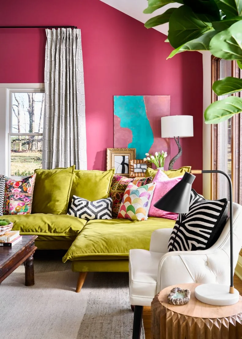
Channel the spirit of Palm Beach — or The Beverly Hilton’s iconic Martinique wallpaper — by leaning into chartreuse’s affinity for luscious, bloom-toned pinks and high-contrast patterns. In this playfully contemporary living room, hibiscus-pink walls and graphic pillows make the vivid green sectional feel like the most natural choice in the world.

More photos after this Ad

Photo: Cati Teague
7 / 15

Add Chartreuse to Make Sweetness Feel Sophisticated

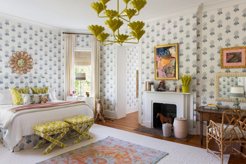
Chartreuse’s strong character can hold its own against an array of patterns and palettes and cast them in a new light, as color-loving, Atlanta-based designer Gina Sims demonstrates here.

“We feel that using a ‘funky’ color in an otherwise sweet palette is the key to taking a design from fine to wow,” Gina explains. “In this bedroom, the soft blue, pink and merlot could feel quite sweet, or even youthful. To avoid that, we funked up, or ‘elevated,’ the palette by incorporating the brown and chartreuse. Chartreuse is a great unexpected color to use in accents."

How to Pattern-Drench Your Home

More photos after this Ad

Photo: Cati Teague Photography. From: Gina Sims
8 / 15

Experiment With a Chartreuse Area Rug

Speaking of taking a space from fine to wow, consider how Gina used chartreuse to elevate this chic, contemporary living room. Mild-mannered blush walls and a stately traditional mantel develop alter egos by sharing space with chartreuse curtains inspired by a midcentury Scandinavian block print and a chartreuse area rug. Chartreuse peeks out yet again in the windswept scene above the fireplace.

More photos after this Ad

Photo: Patrick Cline. From: HGTV Handmade
9 / 15

Punctuate a Pass-Through

The built-in cabinet across from the fireplace in this 1930s Long Island bungalow once sported “frilly doors and accents” that did not suit the artist and writer who bought and overhauled it. To infuse the area with the graphic style they love, they removed the cabinet’s doors and details, then gave its interior a coat of bold, chartreuse paint that turns the passageway into a place to pause.

See More of This Vibrant Makeover

More photos after this Ad

Photo: Jared Kuzia Photography. From: Kristina Crestin
10 / 15

Define French Doors With Chartreuse

Farmhouse Fixer designer (and fierce Rock the Block competitor) Kristina Crestin added a whimsical touch to this painterly playroom — and demonstrated again how striking a fresh green feels combined with deep blue — by painting its French doors chartreuse. That hue then recurs in the wall-mounted botanical sconce, the storage cubbies’ fabric bins and large-scale, abstract canvas presiding over them.

Painted Trim Ideas to Spruce Up Any Space

More photos after this Ad

Photo: Jared Kuzia Photography. From: Kristina Crestin
11 / 15

Or, Use It to Brighten a Built-In

Kristina turned this hard-working space into a design moment, in turn, by tinting this floor-to-ceiling built-in vivid chartreuse. The bold color doesn’t feel cartoonish because she balanced the striking color with restrained, organic choices like slate tile flooring, stained wood for the bench and water hyacinth bins.

More photos after this Ad

Photo: Mia Baxter Smail. From: Sarah Wittenbraker
12 / 15

Transform Timeworn Case Goods

If you love everything but the finish of a new-to-you piece, consider this faux-bamboo buffet’s second life in vivid chartreuse. Because a similar color echoes in the gleaming lampshades’ interiors — and because the lamps themselves and the books and vessels stacked between them feel polished rather than kitschy — the buffet is now the focal point of a confident composition

How to Paint Wood Furniture

More photos after this Ad

Photo: Lisa Romerein. From: HGTV Magazine
13 / 15

Pull Chartreuse From a Tropical Pattern

Inspired to build her entire bedroom around Cole & Son’s lush Savuti wallpaper, Seattle homeowner Jessica Cantlin reached for a bold coverlet that draws from the print’s lush foliage — and her move is a fine one to recreate. Bright, saturated greens are intuitive accents for jungle-dark patterns like this one, and bed linens are a beginner-friendly way to explore your relationship with chartreuse.

See More of This Playful Home

More photos after this Ad

Photo: Stacy Zarin Goldberg. From: Zoe Feldman Design
14 / 15

Anchor a Maximalist Space With Chartreuse Walls

Replete with sculptural Art Deco pieces, fanciful patterns, jewel-toned velvet and a gallery’s worth of art, this family’s living room would have felt haphazard against white walls. Enveloped in chartreuse, it’s both eclectic and cohesive in the best way.

Tour This Color- and Pattern-Filled Home

More photos after this Ad

15 / 15

Or, Introduce Chartreuse in a Moody Space

Sarah West also incorporates hints of chartreuse in rooms’ subtler details, as in this sofa’s striated green fabric and its intricately-embroidered accent pillow. “From a design perspective, don’t be afraid to bring in colors or textures that are unexpected,” she advises. “Sometimes that single aspect in a room is what leaves your guests remembering their experience in your home.” Though chartreuse is a natural hue, it’s a relative rarity in contemporary homes — and discovering it can be a delight.