Next Up

The Best Nature-Inspired Paint Colors for Every Room

June 13, 2022
Follow Lauren on:

Bringing the outdoors in has never been lovelier — or trendier, for that matter. Whether you’re looking to channel the drama of a fiery tropical sunset with bold, warm tones or soak in the serenity of a shade-dappled forest with cool, deep hues, we’ve highlighted the must-see sections of Mother Nature’s style guide. Ready to get painting?

Price and stock could change after publish date, and we may make money off these affiliate links. Learn more.
Photo: Annie Sloan
Scroll For More Photos
1 / 21

How to Paint Like a Natural

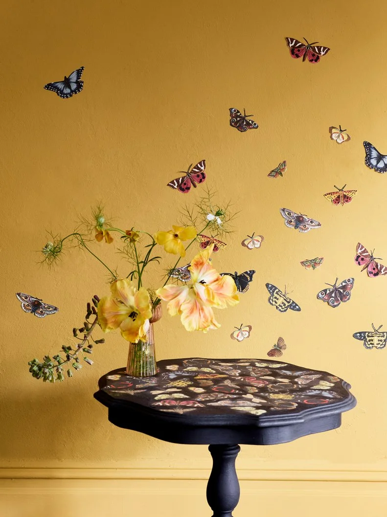
Paint shades can be as unpredictable as the flora, fauna and phenomena that inspire them, and how they react to your unique environment depends on how you light your home, when you’re looking at the walls, what else you’ve used to furnish your rooms and so on. Explore the one-of-a-kind ways colors and finishes react to your spaces by buying sample pots of paint, then applying it to poster boards that you can move around and observe in different areas. Take in more tips for pro-level painting with our guide, below. (Love this room? It features Annie Sloan’s Winged Wildlife RHS Decoupage Paper and Carnaby Yellow Wall Paint.)
LEARN MORE

More photos after this Ad

Photo: Jeff Herr . From: James Farmer
2 / 21

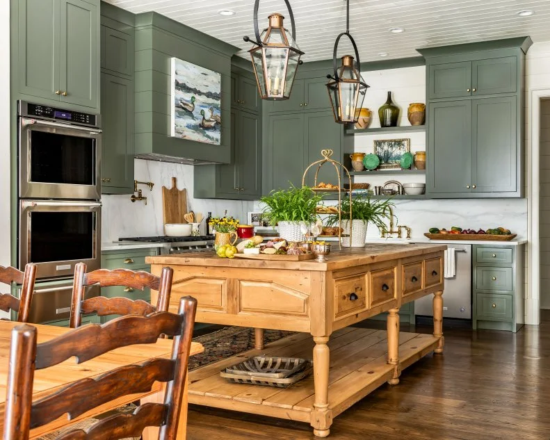
Season With Sage Green

Southern designer James Farmer gave this family retreat in Georgia a sense of place by referencing the spectacular woods surrounding it. The medium-green tone he chose for these kitchen cabinets complements stone treatments like the marble he used on the countertops and backsplash; its earthiness also pairs beautifully with wood, of course, and warm metals like gold, bronze and copper. Deploy a shade like this to infuse your room with sylvan tranquility.

Try This Shade: Jade Romanesque, Benjamin Moore

see more photos

More photos after this Ad

Photo: Lucy Call
3 / 21

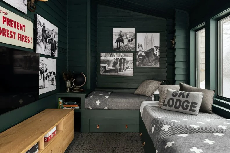
Or, Get Lost in the Forest

This cooler, deeper green is the perfect choice for a contemporary cabin: Its deep tones add dimension to the wall’s repurposed shingles and beckon the snowy Montana landscape inside. Try carrying a tone like this one across window hardware and built-in cabinetry to let your interior frame dissolve seamlessly into the outdoors.

Try This Shade: Tarrytown Green, Benjamin Moore

see more photos

More photos after this Ad

Photo: Mike Chajecki
4 / 21

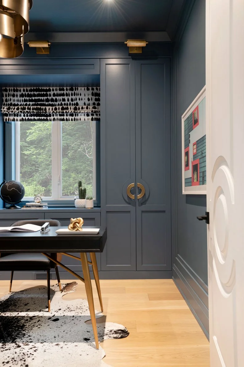
Settle In With Dusky Blue

Cultivate a serene feel in a home office by reaching for a smooth grayish blue that evokes a motionless body of water just before the last light of day fades. This color’s cool undertones contrast beautifully with warm organic elements (like the hardwood floor here) and rich accessories in gold and bronze.

Try This Shade: Philipsburg Blue, Benjamin Moore

see more photos

More photos after this Ad

Photo: Lauren Pressey
5 / 21

Or, Head Into a Storm

This nautical space feels adventurous rather than tranquil, thanks to the textural application of aqueous blue paint that recalls a wind-buffeted sea. Los Angeles designer Hillary Stamm gave the room a masculine character with an impressionistic portrait and an armchair with rugged details.

Try This Shade: Portola Paints, In the Navy

see more photos

More photos after this Ad

Photo: Madeline Tolle
6 / 21

Channel a Big Cat's Confidence

Reaching for black paint might seem like a stark choice, but as LA-based designer Jessica Nicastro demonstrates in this elegant kitchen, it’s a natural when paired with creamy, veined stone and layered neutrals. The key to success with a move this bold is to choose a color with depth: The black deployed here is rich and textural, with pigments that come alive in the light just as a jungle denizen’s velvety coat would.

Try This Shade: Black Panther, Benjamin Moore

see more photos

More photos after this Ad

Photo: HGTV Home by Sherwin-Williams
7 / 21

Apply an Indigo Wash

Create a dreamy bedroom by tinting your walls and ceiling with a cool, pale blue. Like the remote, volcanic Alaskan islands for which it’s named, this shade has a red undertone at its core, which means it harmonizes well with creamy whites, warm wood and pink-hued textiles.

Try This Shade: Aleutian, HGTV HOME by Sherwin-Williams

see more photos

More photos after this Ad

Photo: Ron Bowman
8 / 21

Or, Try Terra Cotta

If you prefer warmth front and center, in turn, try a ferrous neutral like this one: Grounded with a strong earth tone, the kitchen’s dazzling white cabinets, tile and island have an organic anchor. This iron-rich shade also complements mixed metals and warmer textiles like the shades on the island’s pair of pendants.

Try This Shade: Cavern Clay, HGTV HOME by Sherwin-Williams

see more photos

More photos after this Ad

Photo: Tomas Espinoza. From: Brian Patrick Flynn
9 / 21

Refresh With Breezy Aqua

The crystalline waters of the Caribbean breathe contemporary coastal style into this dreamy, casual bedroom. Paired with crisp white molding and a delightfully shaggy area rug that evokes sea foam, this tone feels youthful but not childish — and it’s perfect for a teen.

Try This Shade: Aquamarine, HGTV Home by Sherwin-Williams

More photos after this Ad

Photo: Annie Sloan
10 / 21

Bring Desert Pink to the Kitchen

Though warm, pale pink has been trending for the past several years, its appeal goes back centuries. This particular color was inspired by 18th-century French interiors, where white paint was quite literally mixed with red earth to create this delicate, mineral tone. Color blocked with plum cabinets and white countertops, its elegance is fresh and timeless all at once.

Try This Shade: Antoinette, Annie Sloan

see more photos

More photos after this Ad

Photo: Sherwin-Williams
11 / 21

Luxuriate in Mist

For a moody take on pale green, try refreshing the bathroom with a tone that includes whispery hints of pastel gray. That base provides dimensionality that picks out details like the molding on the walls surrounding this tub; its morning-bright dewy notes, in turn, make the space feel sweet and clean.

Try This Shade: Rainwashed, Sherwin-Williams

see more photos

More photos after this Ad

Photo: Molly Culver
12 / 21

Plant a Succulent Green

Like a slow-growing desert plant that packs moisture into small, plump leaves, this rich green is a showstopper in close quarters. Consider how beautifully it suits a powder room by Houston designer Mary Patton. Its deep, masculine tone serves as an excellent backdrop for a pale, sculptural pedestal sink.

Try This Shade: Calke Green, Farrow & Ball

More photos after this Ad

Photo: Annie Sloan
13 / 21

Dig Into Rich Brown

Design trivia time: What do French country and midcentury modern interiors have in common? Answer: An abiding love of deep, earthy brown, a color that complements both delicate oil paintings and bold, architectural furniture with ease. Try a deep, earthy tone with this one beside an ultrasaturated bright color as with the trompe l’oeil runner on these stairs — or pair it with delicate pastels for a more understated look.

Try This Shade: Honfleur, Annie Sloan

see more photos

More photos after this Ad

Photo: Annie Sloan
14 / 21

Gobble Up Golden Light

In spaces where warmth and light are extra-precious, make the most of them with a rich orange-toned yellow inspired by the natural ochre clay used to make pigments in the south of France. This radiant hue can polish up a rustic space, as in this sunroom, or add a burst of organic energy to a more modern home.

Try This Shade: Arles, Annie Sloan

see more photos

More photos after this Ad

Photo: Tomas Espinoza. From: Brian Patrick Flynn
15 / 21

Reach for Rose Gold

This muted blush boasts a copper undertone that functions like a temperate Mediterranean breeze. It adores both metals like these pendants and variegated tile, and it’s subtle enough to carry through several rooms in an open-plan home without overwhelming the eye.

Try This Shade: Avid Apricot, HGTV HOME by Sherwin-Williams

see more photos

More photos after this Ad

Photo: Robert Peterson; Rustic White Photography. From: Brian Patrick Flynn
16 / 21

Add Spice With Turmeric

If you fancy a makeover that feels earthy and glamorous all at once, audition the bold golden-orange tone that’s been spreading across fashion runways and channeling ‘70s confidence in on-trend interiors in recent years. This energetic hue enlivens neutrals and makes deep greens look utterly fantastic.

Try This Shade: Rayo de Sol, HGTV HOME by Sherwin-Williams

see more photos

More photos after this Ad

Photo: Annie Sloan
17 / 21

Color Block Naturally

Interested in a feature wall or two-tone treatment? Borrow a bit of organic intuition and let a natural scene — such as, say, a lush jungle and a hazy summer sky — inform your choices. Here, two time-honored tones feel delightfully, organically new in combination with one another.

Try These Shades: Duck Egg Blue and Amsterdam Green, Annie Sloan

see more photos

More photos after this Ad

Photo: Stylish Productions
18 / 21

Or, Char Your Greens

Add a sultry note to a feature wall by deploying green with a smoky undertone; as in this polished, contemporary living room by Washington, D.C. designer Shoshanna Shapiro, the hue lends elegant depth to decorative molding and makes arctic whites and lime-washed wood feel luxurious.

Try This Shade: Benjamin Moore, Chimichurri

More photos after this Ad

Photo: Annie Sloan
19 / 21

Fathom Deep Blue

When delicate details (like the woodwork on this white mantel and mirror) merit a spotlight, contrast them with oceanic teal to cultivate a bit of drama. Pigments in this rich color complement both dark and vivid greens, and they look even richer paired with gold — which stands to reason, as 19th-century blues like the ones Vincent van Gogh deployed in "Starry Night" inspired it.

Try This Shade: Aubusson Blue, Annie Sloan

see more photos

More photos after this Ad

Photo: Sherwin-Williams
20 / 21

Stir In Creamy White

To emphasize the warmth of natural light, paint your walls a delicate off-white with soft beige undertones (think of the pale swirls in a just-prepared cupful of latte art). A rich neutral like this one is the lively opposite of greige: It feels indulgent rather than prim.

Try This Shade: Panda White, Sherwin-Williams

see more photos

More photos after this Ad

Photo: Behr
21 / 21

Pick Fresh Greens

If you’ve gone a little plant-crazy over the last few years, you’re not alone — and we suggest you double down on your fronds and tendrils by splashing a transitional space or two with fresh green paint. This pale celadon can function as a neutral, but it’s loveliest as a half-step between the indoors and the outdoors, and a gentle reminder of our connection to our surroundings.

Try This Shade: Back to Nature, Behr

see more photos