Isabel Ladd Shares Her Expert Tips
Interior Designer Isabel Ladd is an expert on all things color and pattern and shares her top tips on mixing these elements in your own home. Scroll through to see her 14 tips that will change how you look at adding color and pattern into your space.
More photos after this Ad
Layer Rugs
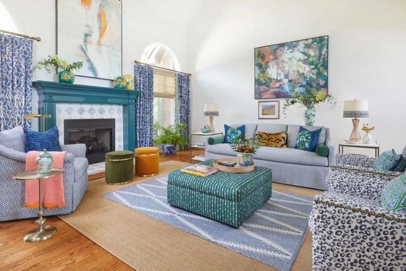
Isabel says, "layering rugs is great when you have fallen in love with a beautiful rug (but it’s just not the right size for the entire room), or a large version is beyond your budget. You’ll want two juxtaposing materials. I start with a classic sisal as the base so that the more colorful rug on top can stand out. The base rug should be large enough to ground the room."
See More On Layering Rugs
More photos after this Ad
Perfect Placement
When it comes to rug placement, Isabel says, "I like rugs that are positioned approximately 12” away from a fireplace or main wall. I also place at least the first two legs of the sofa or club chairs on this rug. The layered rug is generally more colorful and pattern-full. If there is a coffee table over it, then make sure this layered rug is larger than the coffee table. If there is no furniture on top of it, then I usually like to leave about 18-24” of the base rug visible. But there’s really no hard rule to this – I just visualize what looks best."
More photos after this Ad
Tough Fabrics
"Consider tough upholstery fabrics like heavily textured blends, sumptuous velvets, or heavy-duty patterns for your big pieces. But, if you love a fabric that is not upholstery grade, talk to your upholsterer about having the fabric “knit-backed” to make it sturdier. You can always have your upholstery protected and cleaned with a company like FiberSeal, so don’t stress too much if you find a fabric you LOVE, but are afraid of spills," she suggests.
More photos after this Ad
Keep a Tight Color Palette
When it comes to color, Isabel suggests to "keep a tight color palette but add in unexpected pops of colors. Though blues and greens were the base colors in this home, pops of chartreuses, pinks, yellows, oranges, and reds are emphasized throughout."
See These Kitchen Color Palettes
More photos after this Ad
Unexpected Color
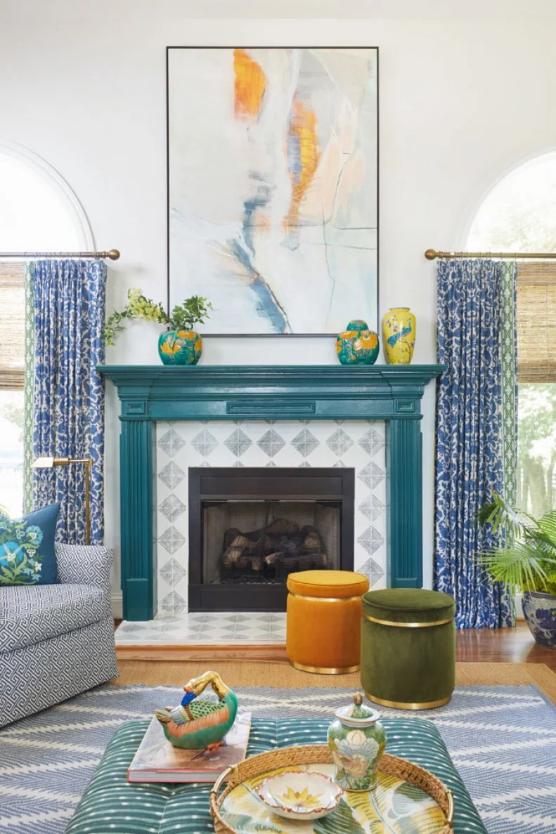
Furthermore, she says to "add in an unexpected color you don’t see anywhere else in the room. This could be a chartreuse chair, an orange lampshade, a va-va-voom red something or other. You get the idea: a punch of something punchy."
More photos after this Ad
Curated Art
"Get art that looks good on its own, not art that matches your furnishings. This makes for a more curated, collected art collection and allows you to pull an array of colors from the artwork into decor pieces," she explains.
More photos after this Ad
More photos after this Ad
Swap Lampshades
When giving her tips on pattern mixing, Isabel says "swap out white lampshades for patterned ones. They’re like a party for your lamps. Scale is important, so opt for shades that are wider than your base."
More photos after this Ad
Repeat Contrasting Colors
"Repeating contrasting colors in different shades makes for a strong statement. Light, medium, and dark blues and greens are repeated throughout this home, which cohesively blend the color palette," she explains.
More photos after this Ad
Perfect Pattern Equation
Isabel shares her perfect pattern method which "usually involves pairing of the following: a large-scale floral + small scale floral/leaf + Geometric + global pattern (like a batik or block print) + luxe solid (like velvet) + organic materials (like rattan or sisal) + a burst of color you don’t see elsewhere in the room (chartreuse is my go-to)."
More photos after this Ad
Go All-Out With Wallpaper
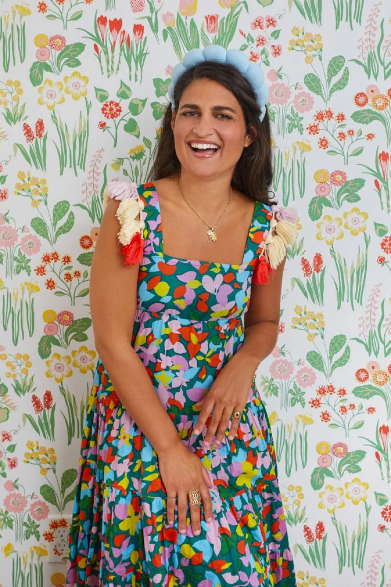
Isabel says "I only select wallpapers with serious pizzazz! To transform “normal” spaces into OTT getaways, GO. ALL. OUT. Choose a striking pattern that resonates with you and embrace it fully. Wallpaper an entire room for a powerful impactful (Bye, Bye Accent walls!)"
See More Timeless Wallpaper Designs
More photos after this Ad
Balance is Key
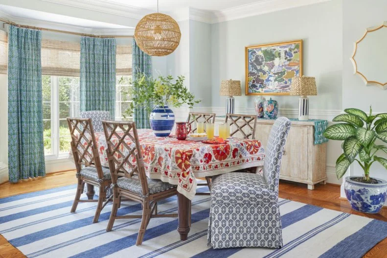
"Balance is of utmost importance. In a room with a kaleidoscope of pattern, ground the space with a sisal rug and sprinkle in natural materials like wood or rattan furniture."
More photos after this Ad
Bold Upholstery
She says, "you’ve heard it a hundred times: keep your large upholstery items neutral and add in pops of color. But I preach the opposite: BOLD upholstery is much more striking and functional (and then you can sprinkle in neutrals … like sisal rugs, grass woven shades, and wood or metal accents)."
More photos after this Ad
Unusual Colors
Isabel explains to "be open to unusual color palettes: peach + burgundy, olive + shell pink, light blue + lipstick red. They’re more interesting than conventional color standards."