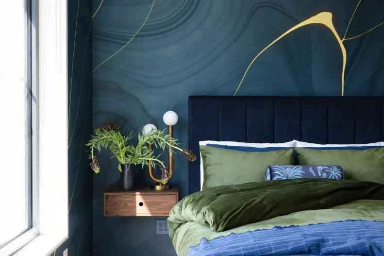
Next Up

25 Fall-Color Decorating Palettes to Transition Your Home to Autumn

September 22, 2026
Follow Lauren on:

Ready for a change? Our budget-conscious, it’s-OK-not-to-paint road maps are all you need to find your way into chic seasonal spaces.

Price and stock could change after publish date, and we may make money off these affiliate links. Learn more.
Photo: Lacey Land. From: Sarah Stacey Interior Design
Scroll For More Photos
1 / 26

Embrace Autumn Colors Like a Natural

Mother Nature moves from season to season in elegant increments. As the summer solstice gets further away, the golden hour arrives a few minutes earlier each evening; chlorophyll begins to seep from deciduous trees’ leaves, revealing the fiery pigments that remain. While it might feel as though the world changes overnight, we’re somewhere in between all the time.

What that means for your home — and this is about your home, though it might sound a cheesy folk song — is that you don’t need to color-drench your rooms or invest in a new sectional to develop a new aesthetic for the fall. (If you’re looking for an excuse to do one of those things, of course, we’re happy to help.) Consider the seasonal palettes we’re highlighting here; when a look speaks to you, read on for swap-outs and additions that can take your decor in that direction without transforming it overnight or requiring a major investment. Shall we turn over some new leaves?

Designer-Approved Ways to Decorate With Fall Colors

More photos after this Ad

Photo: Courtesy of Ola Zwolenik for Glidden
2 / 26

Smoke Blue + Chocolate + Honey

Glidden’s 2027 Color of the Year — so handy how those palettes are announced just in time for fall! — is Artifact, a warm, smoky blue that complements earth tones like this living room’s honey-colored floorboards and rich brown sofa beautifully. Additions like the terra-cotta pots perched on the stool, mantel and highboy can play up the warmth in a blue tone like this one; so can textural textile accessories like the nubbly, cinnamon-red and amber velvet toss pillows on the swivel chairs, the camel-colored stool beside the hearth and the taper candles perched atop the mantel. To move from this palette into a more wintery one, in turn, swap out some of those fabrics and tapers for jewel tones at the cooler end of the spectrum.

Blue-Gray Paint Colors for Every Room

More photos after this Ad

Olive + Silver + Brass

Transitioning a neutral contemporary dining room like this one from summer into fall is all about muted, textural tablescaping. Here, both the warm olive fabric on the dining chairs and the more putty-colored green paint on the molding and walls echo tones from the pastoral wallpaper mural. That color story continues on the dining table itself with textural, mottled greens in a handled vessel with a reflective patina that reads like antiqued silver; that cool metallic touch balances the three brass candlesticks. In lieu of introducing new colors to make olive feel autumnal, try bringing in mixed-metal accents and bloom-less, even dried arrangements that reflect the end of the growing season.

20 Stylish Ways to Decorate With Dried Flowers

More photos after this Ad

Photo: Courtesy of Sherwin-Williams
4 / 26

Celery + Cherry + Plum

While celery and stone fruit would be challenging in a salad, their combination in this bedroom feels crisp in all the right ways. Celery is the jointly-selected 2027 Color of the Year for Sherwin-Williams and HGTV Home by Sherwin-Williams; reaching straight across the color wheel for a saturated shade like the Kirsch Red dramatizing the nightstand and the plum velvet on the ottoman at the foot of the bed adds complexity that pulls the space from spring into fall. Switching from the windows’ breezy white sheers to a curtain with a pattern like the one on the coverlet would make the room feel even cozier; moving to white-on-white bed linens and swapping the plum ottoman with a paler piece from another room, in turn, will make it feel new again when the days start getting longer next year.

Our Favorite Green Bedrooms

More photos after this Ad

Photo: Corey Szopinski
5 / 26

Navy + Cornflower + Olive

Coastal-decor enthusiasts, this one’s for you: The serenity you’ve cultivated with mixed blues will feel even more dimensional mixed with early-fall sunlight to yield a rich olive. Add earthiness to an aqueous palette by adding green textiles with a golden base, then mixing in toasty brass and warm walnut accents.

Colors That Go With Green

More photos after this Ad

6 / 26

Amber + Chartreuse + Chocolate

Perfect for an everything-old-is-new-again entertaining season when all things ‘90s are trending again and we’re back in the Practical Magic universe, this throwback combination feels nostalgic rather than kitschy in dining rooms. Pair dark-stained furniture in serving spaces with mix-and-match colored stemware, vases and pillar candles; let the colors of maple syrup and the light in autumn trees guide your hand. Fussy-in-a-good-way damask is an ideal fabric for table linens and window treatments in a playful space like this one; it’s what a witch would choose.

More Seasonal Table Decor Ideas

More photos after this Ad

Photo: Duckworth Interiors
7 / 26

Burgundy + Rust + Carnelian

Let’s talk textile tone drenching, a practice that in this case takes a velvet sofa that complements the wall behind it and becomes downright decadent in the company of a matching ottoman-as-table and pillows that echo both it and the area rug. While the pale plank flooring and area rug keep the room from feeling too heavy, the velvet-on-velvet-on-velvet should feel like a bit too much; because the pillows aren’t patterned, they read as a sophisticated indulgence rather than a twee vignette.

More Cozy Spaces That Feel Like Fall

More photos after this Ad

Photo: Victoria Pearson, Builder: Brian Glenn Construction, Architect: Jeremy Oury at Kibo Architects, Design by Lonni Paul. From: Lonni Paul
8 / 26

Midnight Blue + Aqua + Parchment

This tone-on-tone space, in turn, feels autumnal because of how the warmth of its beamed ceiling and bookshelves’ contents counterbalance the moody blue built-ins and upholstery. This palette is a fall evening when the tinder in the fire pit hasn’t sparked just yet and you’re glad to have a coat; double down on that atmosphere with a quirky table arrangement like the vintage brass candlesticks gathered here. Replacing that brass with bright blooms and swapping out the pale, patterned pillows for saturated solids, in turn, would usher in a new growing season.

See More of This Montana Mountain Home

More photos after this Ad

Photo: Sean Litchfield, True North Development. From: Becky Shea Design
9 / 26

Powder Gray + Navy + Maroon

Let this dining room serve as your reminder that any mostly-monochromatic space is only a few dozen dahlias (and a handful of hydrangeas) away from feeling like a harvest festival. Whispery gray spaces are spectacular backdrops for jewel tones, as the quartet of ottomans serving as seats beneath this traditional table demonstrate; set your neutral home ablaze for a fall gathering by bringing in some statement upholstery of your own and heading to the farmers’ market and buying up all the seasonal blooms you can carry. (Then, stick to neutral, cohesive vases so you can mix and match your arrangement of arrangements, as it were, however you like.)

See More of This Home

More photos after this Ad

Photo: Stacy Zaring Goldberg. From: Zoe Feldman Design
10 / 26

Celadon + Deep Coral + Gold

Bold as you please like the season’s first turning leaves, the pleated-velvet accent chair in this magnificent nook partners with the triangular table beside it and the burled dresser behind it to feel as thrilling as a crisp breeze. Delicate greens and antique golds like these can feel a bit superannuated in the absence of a strong statement, and this rich orange-red is that statement. Shake up the pastel-and-metallic spaces in your home with a similar visual exclamation.

Gorgeous Ways to Style Brown Furniture

More photos after this Ad

11 / 26

Tangerine + Forest Green + Pearl Gray

Real talk: The pleated and button-tufted pillow on the sofa is nearly enough to recast the room all by itself. That said, the faux sheepskin beside it is a pitch-perfect textural touch, and the glossy greenery stationed throughout the room creates cohesion among its curios.

What Colors Go With Orange?

More photos after this Ad

Photo: Sean Litchfield. From: Casagrande Studio
12 / 26

Teal + Goldenrod + Mahogany

So many breakfast nooks delight in the sun, and so few do it with color-drenched ceilings and walls to make the tables at their hearts look like fabled artifacts in an Indiana Jones movie! No such mistake occurred in this space, and its tulip table’s rich color goes toe to toe with its pollen-bright dining chairs and the kaleidoscopic cushions framing the banquette. Autumn is a season of darkness and light, and the spaces that capture it best embrace both.

The Best Bold Paint Colors for Every Room

More photos after this Ad

Photo: Kevin Brost LLC
13 / 26

Cocoa + Cream + Black

Develop seasonal character without straying too far from a black-and-white space’s neutral roots by introducing a rich, earthy brown that’s coziness personified. If you’re prepared to color-drench, an all-enveloping effect like this one is worth the effort; if you’re more interested in cozying up monochromatic bedding like the mixed pattens in this bedroom, experiment with low-commitment additions like its two pairs of fawn-colored velvet pillows.

More Warm and Cozy Brown Rooms

More photos after this Ad

Photo: David Patterson, Photoshoot Stylist: MC Gatti. From: Rumor Designs
14 / 26

Taupe + Rust + Cayenne

While swapping bedside table lamps from season to season isn’t really a thing for most people, perhaps it should be a thing? Consider how the look-at-me red bodies of the fixtures here pick up the fox’s ruddy coat in the painting on the bedroom wall and the ferrous fibers in the throw blanket at the foot of the bed. Swap that throw for an apple-red plaid and you’re ready for winter; swap it for unbleached linen and change the lamps’ shades, in turn, and this space could feel springlike in no time.

50 Inviting Bedroom Color Schemes

More photos after this Ad

Photo: Emily Followill
15 / 26

Amethyst + Peach + Olive

Set a fall dining table that evokes the season without tipping over into kitsch by combining silk foliage with real blooms and leggy branches, then accenting place settings with two sets of colored glassware and ceramic gourds (in white and green, not the expected orange). These arrangements feature roses, asters, Mexican sage and cut cabbage stems.

Designer-Approved Thanksgiving Decor Ideas

More photos after this Ad

Photo: Stephen Karlisch. From: HGTV Magazine
16 / 26

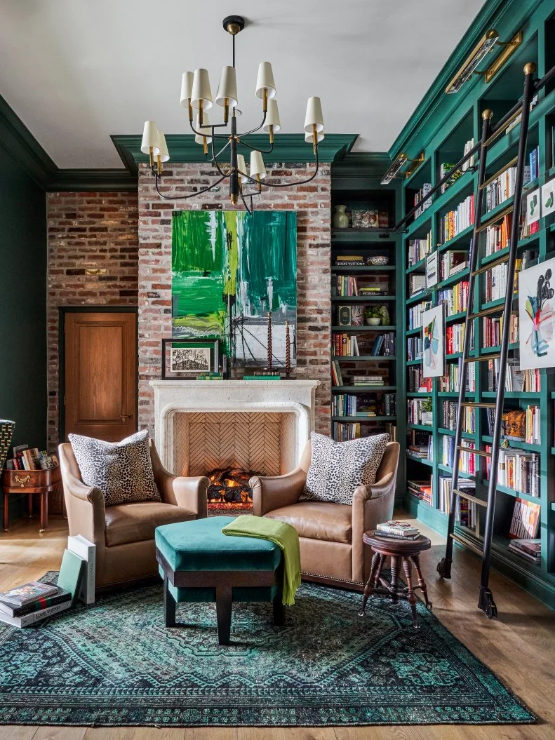
Emerald + Fawn + Lime

Cozy up a library or living room by taking a single seasonal tone — here, the opulent green that carries from the extra-tall bookcases across the exposed-brick fireplace to the opposite wall — and reiterating it in several textures. Because the overdyed area rug and five-sided ottoman are both soft and touchable, the woodwork and wall that match them gain a bit of their tactility. (Matching artwork and books above and on the mantel, in turn, draw the eye back down to a source of warmth.)

Reading Nook Ideas

More photos after this Ad

Photo: Christian Torres. From: Crystal Sinclair
17 / 26

White + Charcoal + Sunflower

This black-and-white living room owes its seasonal feel to its devilishly-clever gallery wall installation — here, a long, shallow shelf supports framed art at the center of a larger framed piece of wallpaper—and well-matched toss pillows. Transition from one season to the next by replacing the half-dozen pieces on the shelf, then changing out your cushion covers for an array that matches the tones in the new artwork.

Gallery Wall Ideas

More photos after this Ad

Photo: Graham & Brown
18 / 26

Auburn + Harvest Gold + Loden

Wallpapering around a niche is great, but have you tried wallpapering around a niche and then pulling a color out of that paper to paint the niche’s interior and your trim? This space would be autumnal with no furniture or accessories at all, of course, but the dried hydrangeas in a tortoiseshell-glass vase, matching unframed still life and velvet chair level it up thrice.

Gorgeous Nature-Inspired Wallpaper Patterns

More photos after this Ad

Photo: Avery Nicole Photography. From: Sarah Stacey Interior Design
19 / 26

Claret + Ocean Blue

The painted paneling and audaciously-upholstered dining chairs in this maximalist space are tough acts to follow, but the one-two chromatic punch of its intricate area rug and the rich spray of foliage atop the table do the job nicely and lend the room its seasonal character. If you’re not in the market for a vintage floor covering, look to a company like Ruggable for a durable new version in a similar pattern. (Psst: This rug-and-matching-arrangement move is similarly effective in the kitchen.)

How to Layer Rugs Like a Pro

More photos after this Ad

Photo: Joseph Bradshaw
20 / 26

Charcoal + Navy + Granite

This masculine, cabin-inspired space plays with summer-recreation details — the curtains’ black-and-white buffalo plaid, the wall-mounted oars, the rug’s vintage-inspired woven pattern — then desaturates them to evoke a moody fall tableau rather than a cloudless summer sky. Where better to curl up with a book on a rainy day?

See More of This Suite

More photos after this Ad

Photo: Matti Gresham Photography. From: Urbanology Designs
21 / 26

Mustard + Storm Blue + White

While it might be a bit extreme to argue that all daybeds in windowed nooks should feature box valances that convert them to canopied reading chambers, we’re prepared to defend that position. This room-within-a-room invites the very best sort of midafternoon lounging, and its coordination with the larger space’s accent rug and armchair are immensely satisfying.

Color Theory 101 and the 60-30-10 Rule

More photos after this Ad

Photo: Laurey Glenn
22 / 26

Leaf Green + Evergreen + Ruby

This North Carolina bedroom’s camp-blanket coverlet establishes an outdoorsy atmosphere that its woven leather bench and wall art deepen; its green-on-green pillows and burlwood occasional table and lamp base, in turn, layer the color story and give the space a more refined feel. Carry a palette like this even further with details like the trio of books beneath the canister of eucalyptus branches.

Tour This Home

More photos after this Ad

Photo: Katie Fiedler. From: Cortney Bishop Design
23 / 26

Turquoise + Persimmon + Antique Gold

This boho bedroom owes its autumnal feel to both its palette and the dimensionality of its Moroccan wedding blanket and accent pillows. Anchor an eclectic space like this one with symmetrical arrangements on either side of the bed, then experiment with linens and tableside accessories to evoke different seasons.

Oriental-Style Rug Inspiration

More photos after this Ad

Photo: Nicole Franzen, Architecture By: Martha Picciotti of Picciotti Design. From: Jette Creative
24 / 26

Slate + Cotton + Pomegranate

This off-black-and-off-white bedroom sets the stage for low-effort, high-impact seasonality via its bedside vase of vivid celosia stems and bold throw pillow and blanket. Work in an accent color like this with one monochromatic element (here, in the vase), one tone-on-tone piece (here, the pillow with several reds) and a third element that includes just a bit of your tone (here, the blanket’s red stripe).

Paint It Black: The Glory of Dark Interiors

More photos after this Ad

Photo: Rob Pryce
25 / 26

Copper + Cornflower + Camel

To lean into the season in a moody bedroom like this one, simply pull tones from the wallpaper. At present, the upholstered bed matches the pattern’s stylized blooms and its linens and bolster pillow pick up its neutral midtones; a more summery version of the same space would feature white-on-white bedding, a paler rug to replace the bedside jute and nightstand blooms in lieu of a glossy houseplant.

Tour This Home

More photos after this Ad

Photo: Niamh Barry
26 / 26

Cacao + Blush + Coffee

This seasonal space anticipates hibernation with dark, cocooning walls that invite truly long-term lounging; the more delicate tone of the bed’s linen duvet, in turn, echoes the sophisticated arrangement of dahlias on the nightstand. Strike a balance like this one by anchoring your space with a deep, earthy color that you can then layer with a gentler version of the same tone — here, the warmer throw blanket — and soften with a floral pastel.

How to Use Dark and Dramatic Hues in Any Space