This Eclectic Family Home in Charlotte Is Glam + Playful
Charlotte, North Carolina, designer Ashley DeLapp created an eye-popping contemporary retreat with Hollywood vibes that delivers bold style without skimping on comfort and kid-friendly durability. Take a closer look at her toolbox of tricks.

Related To:
Striking Color in Small Doses Makes Cozy Spaces Look Chic
When architect-turned-designer Ashley DeLapp first met with her client to discuss transforming this Charlotte, North Carolina, home, they did not fire up a social-media inspiration board. The homeowner is a part-time stylist, you see, and she “specifically asked for something unique; she didn’t want to see anything she had seen on Instagram before,” Ashley explains. Her client’s husband, in turn, prioritized comfort. Presented with a blank slate, Ashley was tasked with creating one-of-a-kind spaces that made a strong impression and offered long-term livability for a young family of five. So, how does that work?
Lesson one: These fabulous fuchsia armchairs were her jumping-off point for the family room. “When you have neutral walls, in this case gray, you need to have a pop somewhere, something to draw your eye,” Ashley says. “These chairs were the perfect way to do just that.” Is a supersaturated color like this one ever too much? “I never shy away from color as a designer. It’s what clients come to me for, so I would never say it’s a no-no,” she explains. “I would say that when using bold colors to make sure you edit. Too much of a good thing could quickly become overwhelming.”

Carry Variations on a Single Accent Hue Throughout Your Home
“The pillows were custom using the Matthew Williamson print Talavera from Osborne & Little. I had been dying to use this print, and it’s really bold, so this was the perfect project for it,” Ashley says. “I used shades of pink throughout the home, and my client wanted something different. I chose to pull out the brightest pink from the pillow fabric and then let everything else play a supporting role.”
Style Bookshelves Thoughtfully — and Know When to Stop
Ashley chose Schumacher’s Haruki Sisal Plum grass cloth to create a rich backdrop for the family room’s built-in bookshelves. As for styling, “I typically start with books and photos to create varying heights and then fill in with accessories,” she says. “My client had the books, we both shopped for accessories, and I edited as I went.” Even the pros learn through trial and error: “It’s a long process of placing, rearranging and curating to get just the right look. Especially when I use grass cloth or wallpaper in the back of bookshelves, I never want so many accessories that you can’t see the paper anymore.”
Statement Vases + Vertical Greenery Add Height + Movement to Vignettes
The pair of gold and white ceramic Harp & Finial vases Ashley chose for the coffee table — and the sculptural bells-of-Ireland stalks she arranged in them — are its undisputed stars. “I always opt for architectural silhouettes when choosing flowers,” she says. I like the way they cascade out of a vase, giving an effortless look, even if they were placed strategically!”
As for the vessels in which she displays them, “I like to keep proportions in mind when selecting a vase for flowers. The longer the stem, the taller the vase,” she explains. “I like to find vases with interesting embellishments or unique bases, it just adds another layer to the arrangement.”
Choose a Wall Color That Works Everywhere
The same warm, neutral greige Ashley chose for the family room — Sherwin-Williams’s bestselling Repose Grey — recurs here in the foyer and throughout the home. Here, it lets the crisp black front doors, elegant gold pendant and vivid, intricate area rug take center stage. “The rug is a wool flat weave by Jaipur Living,” she says. “I wanted some texture to break up the floors and didn’t want something too thick that would make it hard to move the dining chairs in and out.”
Make Big Gestures in Small Rooms
Ashley treated the surfaces of this diminutive powder room like a single statement wall. As she designed the space, “I chose the wallpaper first, I was obsessed with it! It is Designers Guild Mattiazzo in the Damson colorway,” she says.
Instead of choosing simpler accents for that vivid initial choice, she made additional statements with a floating concrete vanity and an intricate gold mirror. “I think knowing my client has a bold sense of style directly influenced patterns I chose for her home,” Ashley explains. “I gravitated toward bigger scale patterns, bolder colors and some might say risky applications of those colors. That’s the beauty of design, though. You can use it to express yourself the same way you would with your clothing choices.”
Keep Ornamentation to a Minimum in the Kitchen
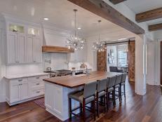
In a contemporary space like this one, elegant lines and smooth, clean surfaces are less-is-more luxuries. “I prefer an uncluttered kitchen,” Ashley says. “Privacy wasn’t an issue here, so there was no need to cover up the windows. If I can get away with no window treatments, I will go that route every time. I prefer tons of natural light if possible.”
How, then, did she choose the few decorative pieces she deployed? “When I style a kitchen, I usually include a couple of cutting boards, layered together, and strategically placed accessories,” she says. “If you have the luxury of storage and can keep appliances off the countertop, I suggest adding a plant or floral arrangement, and layering some serving pieces together. I love the scale of these pendants. The height was perfect for the tall ceilings, but I like that they don’t take up a lot of visual space.”
Use Closet Organizers and Proper Hardware in the Pantry
Speaking of the luxury of storage, consider the attention to detail in the pantry (which Ashley’s client stocked with help from an organization expert once the design was complete). It’s no accident that this space looks a bit like a well-planned walk-in closet. Ashley used materials from the source she chose for the principal bedroom’s storage space. “I do like to add nice hardware to pantry cabinets, even if they are behind closed doors most of the time,” she notes.
Prioritize and Invest in Just-Right Storage
Speaking of well-planned walk-in closets, in turn, let's detour from the kitchen for a moment to consider the wonderland Ashley created in the 160-square-foot space adjacent to the principal bedroom. “This is a closet system from Plus Closets that can be customized to fit any space,” she says. “The highlight here was the 360-degree shoe spinner we tucked in the corner to hold her shoe collection. It holds up to 200 pairs of shoes! She also wanted to have an island to organize her accessories.” Spectacular, no?
Customize Barstools to Elevate a Kitchen Island
Ashley diverged from the kitchen’s clean, monochromatic look on the island’s outer edge, where a quartet of plush barstools complement the saturated pinks she used in other rooms. She tapped a custom furniture manufacturer in nearby Hickory to create pieces that were both durable and ornamental. “The seats are covered in a faux leather from Kirkby Design, Laser in Dewberry,” she explains. “The backs” — that is, the portions of the seats that are least likely to take a direct hit from spilled food or drinks — "are covered in Nicolette Mayer’s Agate Roccocco fabric by Scalamandre.”
Skip Window Treatments When You Can
The same clever choices Ashley made in the kitchen’s prep areas — leaving the windows bare to maximize light, keeping surfaces clean and upholstering with a sturdy textile — pay off in its sleek eat-in space as well. “My client really wanted to keep this area light, so we went all white to complement the kitchen,” she recalls. “The table was chosen first; I like using glossy surfaces, especially when kids are involved, it’s much easier to clean. The chairs are covered in a faux leather, which is extremely kid friendly.” She topped the table with a playful, graphic Dutton Brown urchin chandelier.
Use Colors and Finishes to Make a Bathroom Kid-Friendly, Not Age-Specific
This lovely bathroom, designed for the homeowners’ daughter, has a youthful, romantic feel that won’t feel outdated in a year or two. Ashley chose blossom-bright Sherwin-Williams Impatiens Petal for the cabinets, then extended the color story with paler pink ceramic and glass pieces on the countertop. A graceful oval mirror and double-globe sconces give the space a subtle femininity, and rich metallic finishes add warmth.
Set the Mood With a Sleek Ceiling
The unabashedly sexy ceiling treatment Ashley applied in the dining room was easier to execute than it looks. “Achieving a high gloss finish with paint is very expensive, so I opted to use Phillip Jeffries Vinyl Lacquered paper in Paint It Pink,” she says. “For a similar look, I’ve used Benjamin Moore’s Bashful on ceilings before and it’s just gorgeous. I would advise readers to use barely there shades; they will add interest but not be something you would get tired of. Subtle shades like Bashful give off a warm glow at night and help create ambiance. If you want more of a statement, I love using black on a dining room ceiling. It’s an easy way to add drama to a space.”
Give Existing Pieces New Life With Graphic Accents
The show-stealing flamingo painting in the dining room took some negotiating. “My client had the dining table and sideboard already, but when I saw that art piece, I had to convince them to use it. It’s so much fun and the colors are gorgeous. It just tied everything together. I love how unexpected it is: Who has flamingos in their dining room?” Paired with Art Deco-inspired table lamps and flanked by jewel-green side chairs, the antique sideboard now oozes contemporary chic.
Turn Transitional Spaces Into Style Moments With Decadent Details
This glamorous spot between the dining room and kitchen is, unsurprisingly, Ashley’s favorite part of the home. “The butler’s pantry is painted Sherwin-Williams Jitterbug Jade and [that] was the first decision when designing both of these spaces. The bar area is visible from the foyer, so I wanted it to be a 'wow' moment, something completely unexpected,” she says.
As for the veined stone it frames, “the kitchen is white with a subtle countertop, so the bar was a great place to go bold and use a marble-look quartz,” Ashley explains. "The hardware is from Modern Matter. They are a local company here in Charlotte, and I love using their hardware for special areas. I used their polished brass finish to reflect light and their Dalmatian Jasper stone for the accent. It’s honestly like adding jewelry to your cabinetry, and you can mix finishes and gemstones to get a custom look.”
Complement a Large-Scale Statement With Subtler Patterns
Ashley’s pink and green color story continues in spectacular fashion in the home office, on a painterly feature wall. “This wallpaper was my inspiration [for the room], it is gorgeous! It’s based on art from [contemporary artist] Liza Hathaway Matthews. As soon as I saw it, I knew it would be perfect.” She balanced that pattern with a smaller, tone-on-tone woven drapery fabric with a subtle wave: Clarke & Clarke’s Fiji. “I didn’t want to compete with the Cotton & Quill wallpaper, and this had enough visual interest to hold its own without taking away from the feature wall.”
This pairing, and the rest of her design scheme, suited her clients perfectly. “When I showed them the design concepts, they were super excited, but after waiting for construction to wrap up, and finally seeing the finished spaces installed, it was even better than they expected,” Ashley says. “The goal was a totally unique house, and they definitely have that!”

Photo By: Erica Mark Photography