Next Up

Create a Mood With Color

November 25, 2014
Choosing just the right color for your home can be a daunting task. To make color selection less intimidating, many interior designers suggest considering the feeling each color inspires.
Price and stock could change after publish date, and we may make money off these affiliate links. Learn more.
1 / 17

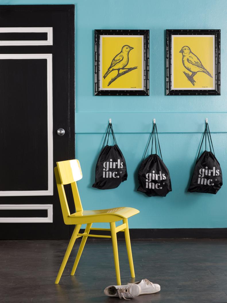
Yellow: Hello, Sunshine

No color epitomizes cheerfulness and high energy like yellow. Intense shades such as canary yellow are extreme attention grabbers, which is why the color is used for traffic signs or in advertisements. Although associated with positivity and sunshine, it's also the most optically straining color due to the amount of light it reflects and has been known to encourage babies to cry. That being said, yellow works best when used in small amounts.

More photos after this Ad

2 / 17

Yellow-Orange: Warms It Up

Also known as ochre, this shade is warm and welcoming. With just a hint more orange than mustard yellow, it's a nurturing tone that is commonly used in gathering areas such as kitchens and dining rooms.

More photos after this Ad

3 / 17

Yellow-Green: Room for Growth

Yellow-green tones such as pea green are associated with both nature and growth. Often considered by designers a difficult color to use, pea green is most successful when paired with other earth tones, particularly brown or orange. To encourage growth, designers turn to pea green as a gender-neutral choice for kids' rooms. When combined with turquoise, it takes on a masculine feel but when used with pale pink, it becomes more feminine.

More photos after this Ad

4 / 17

Green: Good Luck Charm

The color of money, generosity and fertility, green is considered calming and pleasing to the senses. In fact, health spas and doctors' offices routinely use pale shades of green on walls and furniture to keep their guests and patients relaxed. Bolder, saturated shades of green can brighten up the darkest of spaces.

More photos after this Ad