


17 Spring Color Palettes You Can Use Year Round
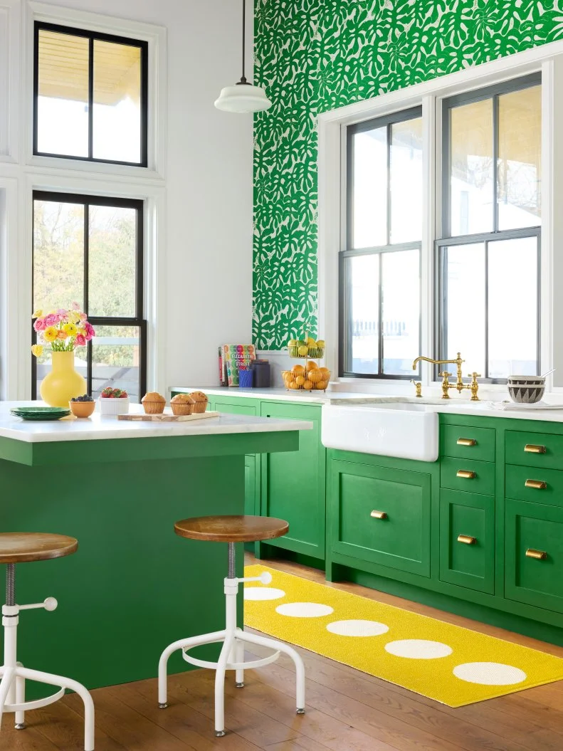
After months of gray skies, heavy layers and lingering winter blues, spring calls for a brighter, lighter and happier palette. From barely-there pastels to more saturated shades, the season’s colors feel optimistic and fresh. The key is pairing them thoughtfully, balancing sweetness with structure, so even the softest hues feel intentional and sophisticated enough to live in your home year-round. Read on to see all the tried-and-true spring color palettes designer's love.
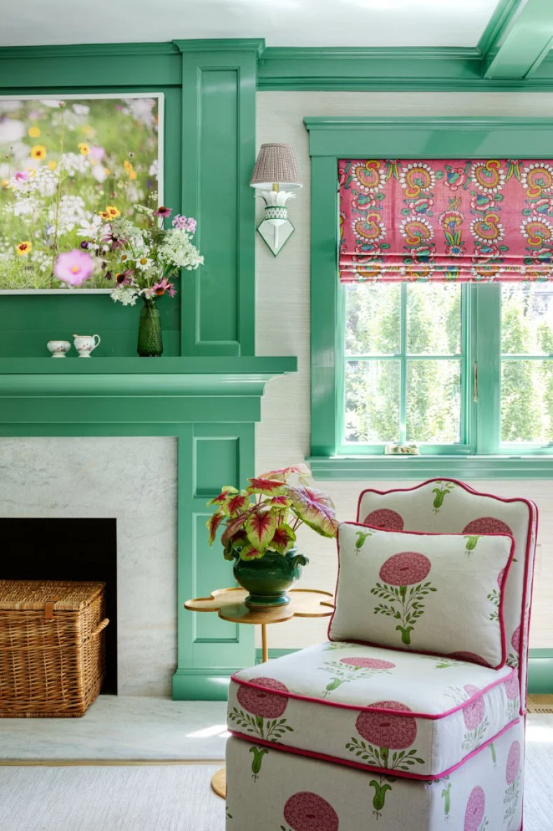
Let's kick things off with two standout colors that create a buoyant, high-energy atmosphere when paired together: aqua green and raspberry. To keep the duo balanced, use raspberry sparingly as an accent. In this cheery living room designed by Rhonda Everts, window treatments and pillows deliver just the right punch.