


1920s English Cotswold-Style Home Gets Refreshed for Chicago-Area Family of Eight
Tasked with making a 1920s English Cotswold-style home comfortable for a family of eight, Chicago architect Michael Abraham honors the original design of the home while updating it for the 21st century.


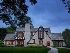
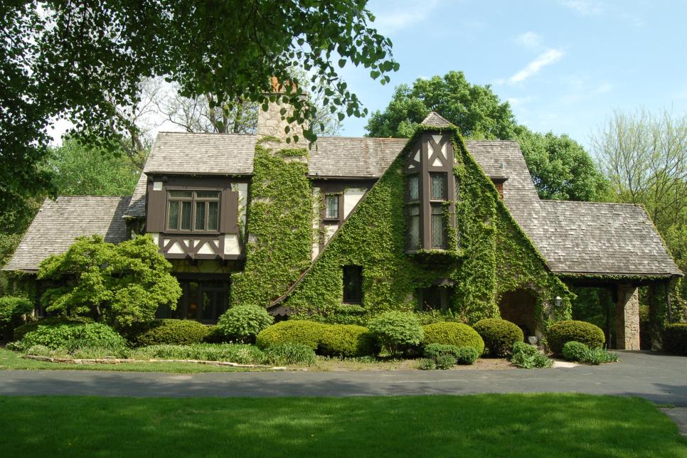
Gorgeous French Country Home
Clad in gray stone with a hint of Tudor style, this renovated home exterior is lovely to look at it.
Photo by: Michael Robinson
Michael Robinson
Q: What was important to your client during this remodeling project? What was the inspiration for the design?
A: The main goal was to remodel an old home for a modern family of eight without losing the charm of the original design. The home was originally designed by R. Harold Zook, a locally renowned architect from the 1920s-1950s. Many original elements of the house remained and were the source inspiration along with other homes of his that remain in the western suburbs of Chicago.
Q: You chose a contemporary aesthetic for a traditional-style house, which worked out beautifully. How did you know the design would come together?
A: Originally the house was considered somewhat avant-garde when it was completed in the 1920s. So, we thought, "What would Zook do to this house today?" He certainly would not redo a 1920s period piece; he would modernize it with a twist.
Q: What changes did you make to the home to help it function better for a large family?

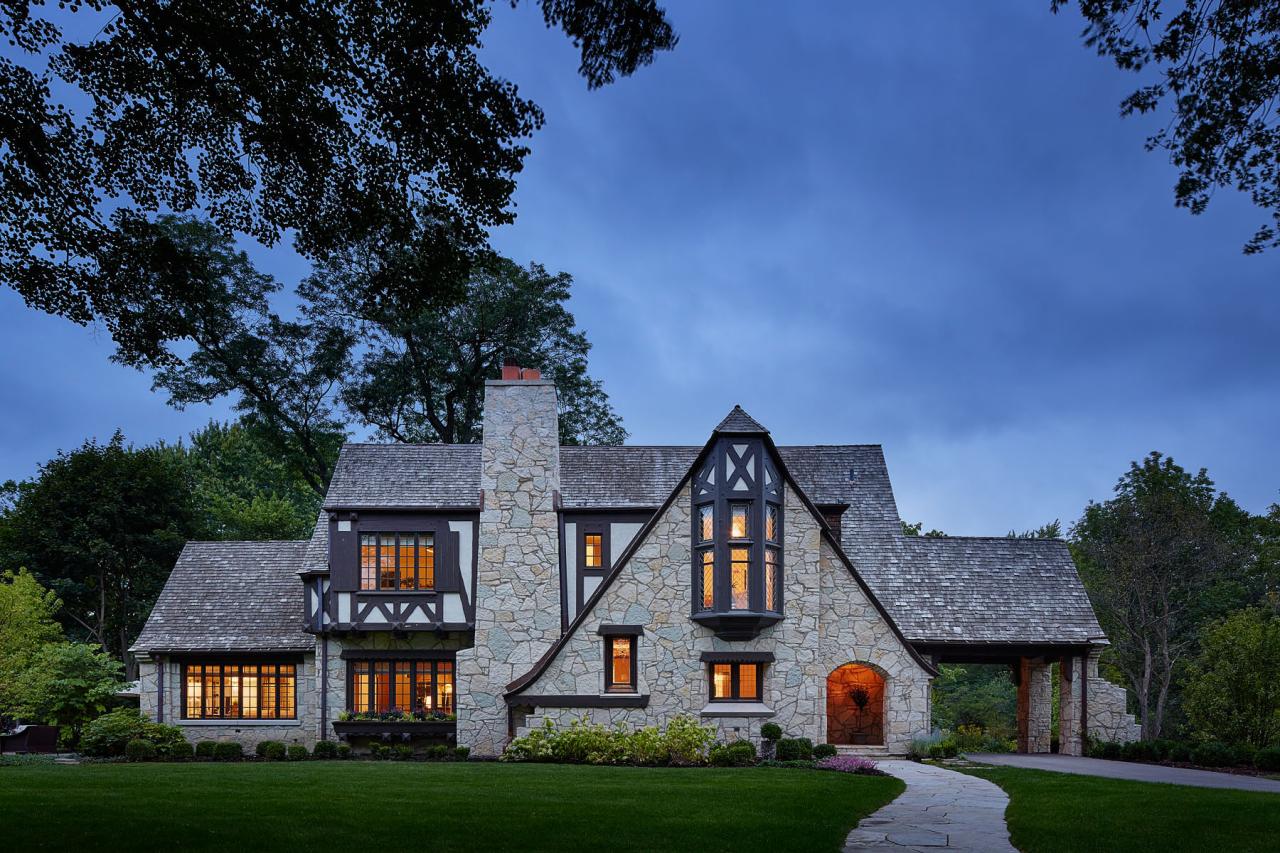
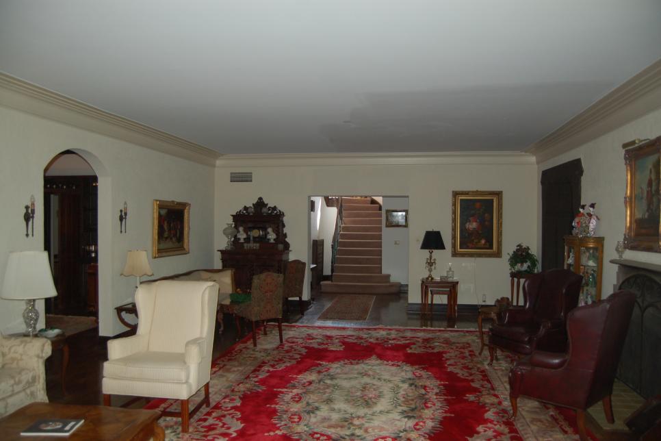
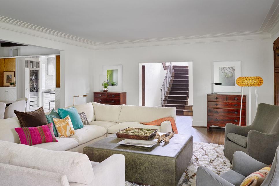
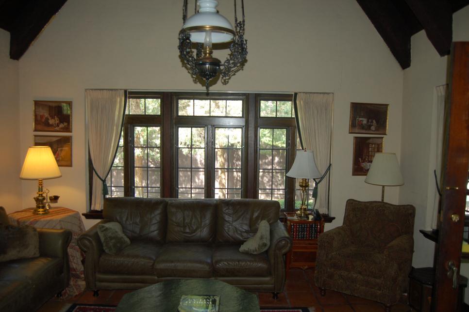
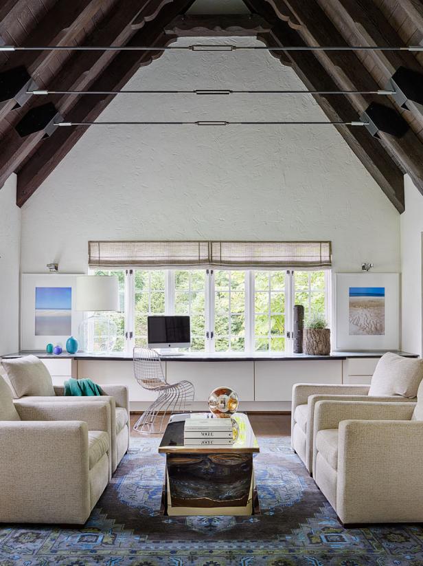
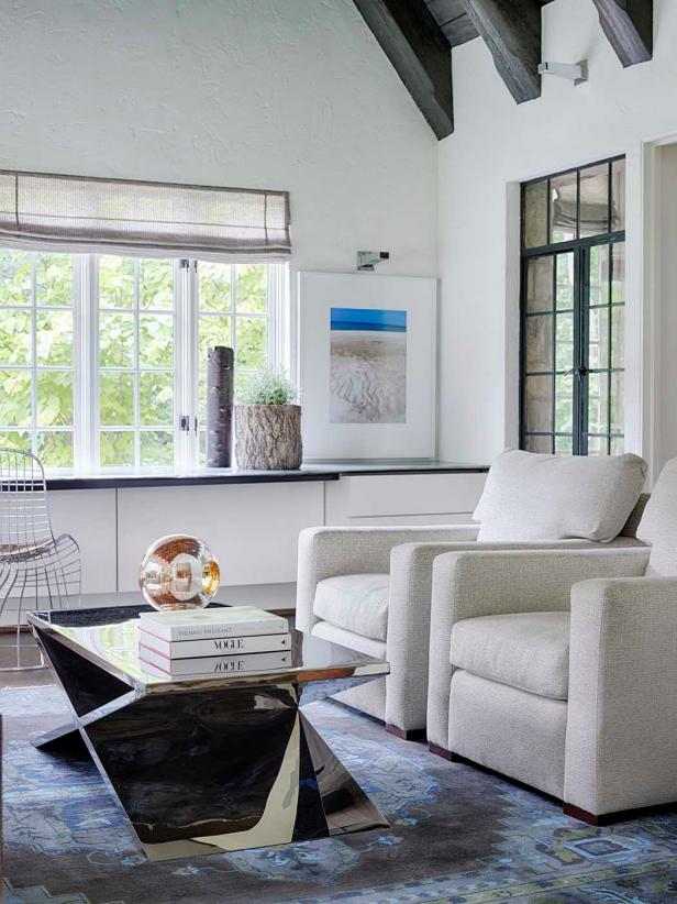
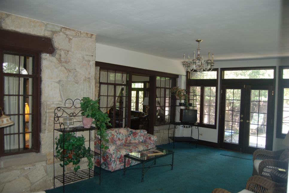
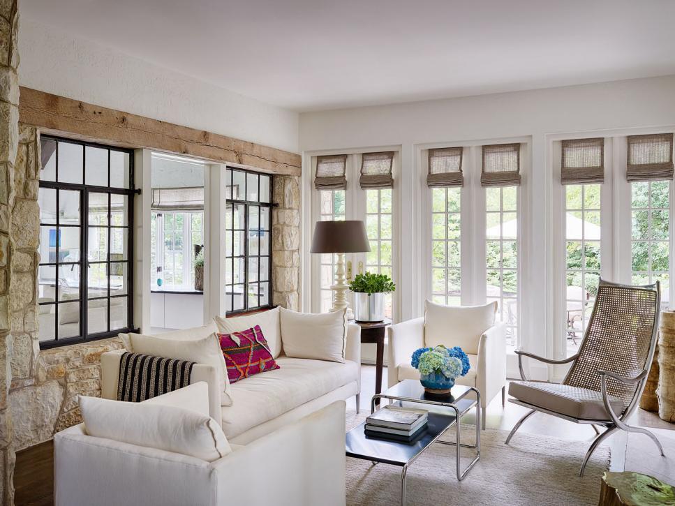
Refreshing Family Room
Once a dark and dated space, the family room feels light and bright thanks to the white walls and furniture. The dingy blue carpet was removed and replaced with light floors.
Photo by: Michael Robinson
Michael Robinson
A: Initially the rooms were very small, and you could not see from one room to another. We removed walls, combined small rooms to create larger, open areas and enlarged openings from space to space. This created better flow for a large family and allowed light into the center of the house.
Q: What was your biggest obstacle during this project, and how did you address it?
A: The largest obstacle we had was needing to add living space that would seamlessly blend into the original design. An older, dated addition was removed, and a more contextual addition replaced it. With such a unique design, lots of care was taken to create a new living space that was undetectable from the existing one.
Q: Why did you select a neutral color palette for use throughout the home?

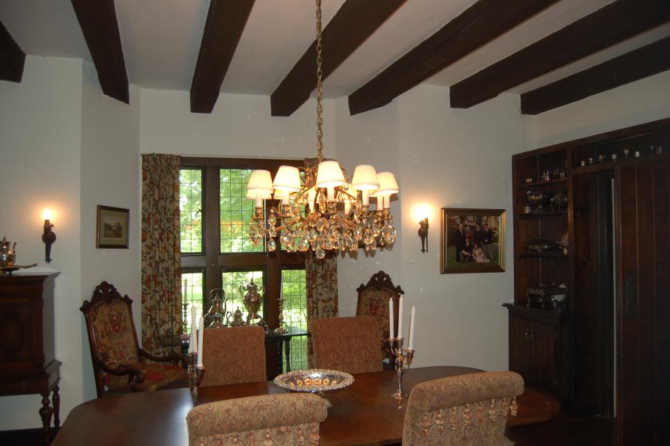
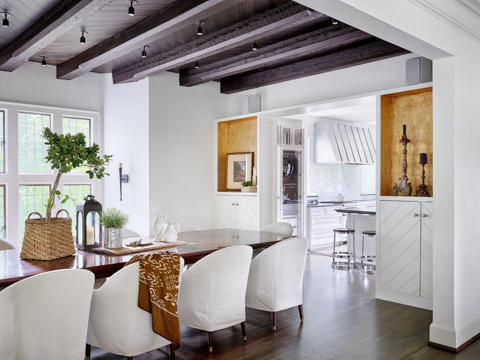
Fresh, White Dining Room With Exposed Beam Ceiling
Stark white walls and a dark wood beam ceiling provide beautiful contrast in this dining room. White, slipcovered chairs surround a long, dark wood table, providing a great spot for dining with friends and family. Niche shelves feature a gold backdrop that adds an elegant touch to the design.
Photo by: Michael Robinson
Michael Robinson
A: We chose a lighter palette for the walls to contrast with the existing (mostly dark) feature elements, such as the interior stone, wood beams and special doors.
Q: What is your favorite room or space in the home? What about your favorite feature?

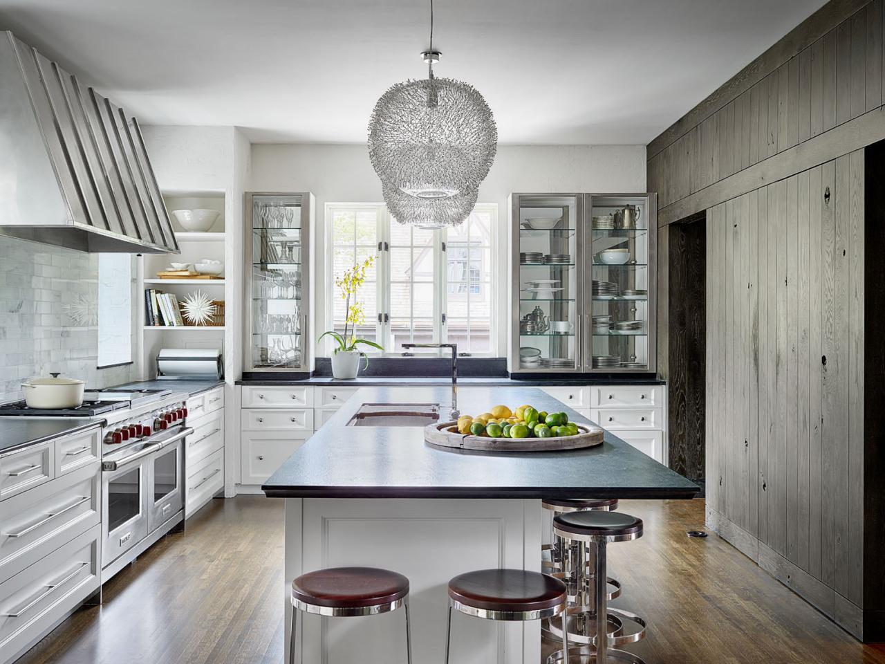
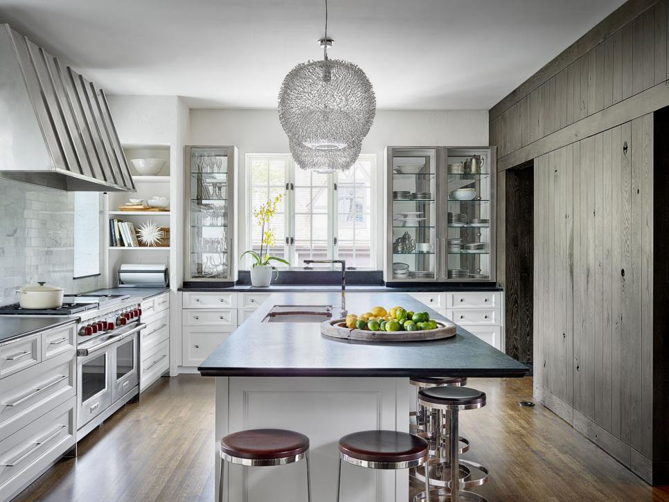
Striking Eat-In Kitchen
Talk about a "wow" factor. This stunning, renovated kitchen features hardwood flooring, beautiful white cabinets and a lovely kitchen island that serves as place to prep and eat. Black stone countertops add striking contrast to the fresh design.
Photo by: Michael Robinson
Michael Robinson
A: The left side of the kitchen, which was designed by Kathy Manzella of DeGiulio Design, is bright, clean and modern. On the right is the pantry wall designed by Michael Abraham Architecture, which includes the dark wood pantry. The way the two sides contrast yet complement each other is my favorite feature in the house.
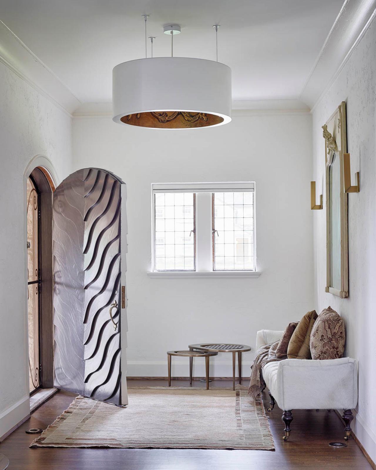
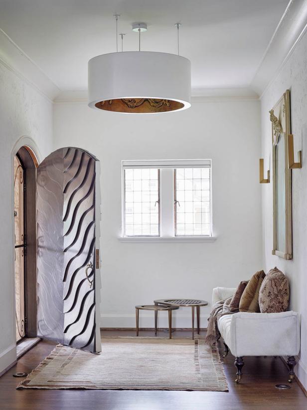
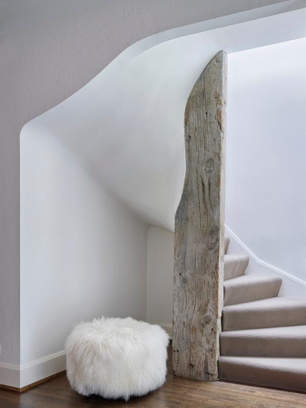
The front door is amazing -- it is rough and slick at the same time. It's original to the house, but it was fabulously modernized by Tim Thompson Designs.

Bright and Airy Entryway
Guests are greeted in the bright, white foyer featuring minimal furnishings that complement the stylish design.
Photo by: Michael Robinson
Michael Robinson
Q: Was there a specific element that was essential to bringing together the finished design?
A: The chevron pattern is a staple feature in a Zook-designed house. We embellished those originally patterns and subtly added similar patterns throughout.
Q: What are the hidden gems in your plan that really made a big difference in the overall success of your design?

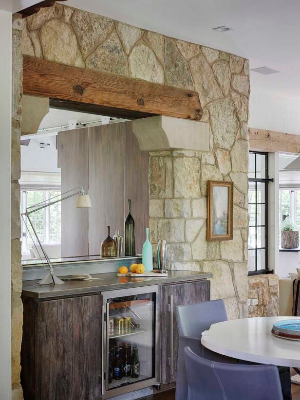
Bar in the Family Room
The beautiful stone wall stayed with the updated design of the family room and provided the perfect nook for a bar.
Photo by: Michael Robinson
Michael Robinson
A: This house started with many hidden gems -- the classic Zook spiderweb leaded glass window, the use of the chevron pattern throughout and the detailed beams and half timbering inside and out. Our objective was to continue to add the small details without overwhelming the house. Reuse of the home's metal windows in interior rooms, detailing the home's exterior stone around the bar opening and installing new metal work designed by Tim Thompson in the den and family room gave just enough to make a big difference.


