


Kitchen Update for Midcentury House

Contemporary Kitchen With Large Picture Window
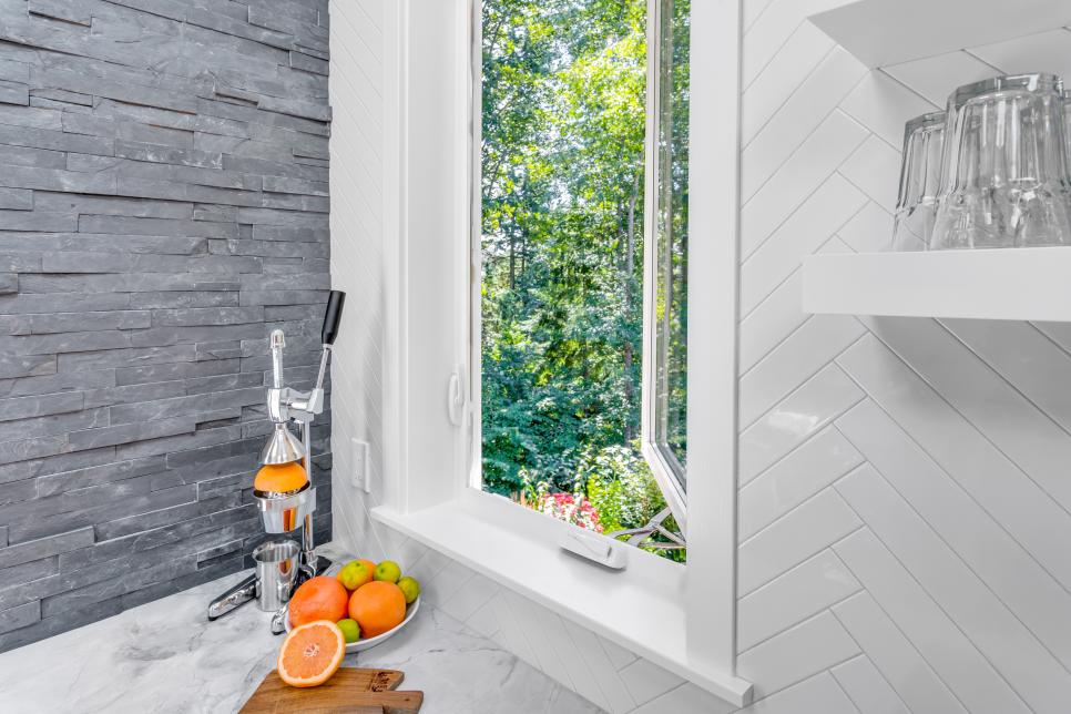
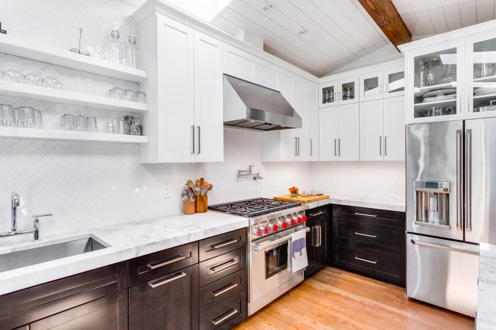
A large 4' x 6' picture window draws your eye to the view just outside this contemporary kitchen.The window is set in a slate stacked-stone accent wall, the striking interior complementing the equally striking outside view.

Photo by: Cory Holland
Cory Holland
What were the main items on your wish list for remodeling/redesigning your kitchen?
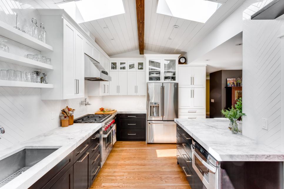
More space! The old kitchen felt dark and cramped. Low ceilings, lack of flow, lighting and natural light were all issues.
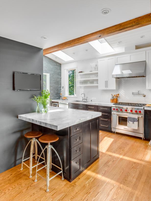
Better function. By creating zones within the design, multiple people can work in the space simultaneously without bumping into each other. A zone for socializing/kids/guests was also created to provide space for them to be in the kitchen, the heart of the home, but not in the way of the meal preparation.
Light and bright. By adding skylights, a large picture window, a Dutch door and multiple light sources, the kitchen feels bright no matter the time of day and functions well day to night. We live in the Pacific Northwest where it is often gray and dark. We are always looking for ways to make a room feel brighter.
What were the main objectives and goals you set out to accomplish for your kitchen?
My main goal was to create a timeless design that fit with the midcentury era of the house but wouldn’t feel dated today or 20 years from now. By selecting natural materials and a neutral color palette, a truly classic design was created.
Photos
See All Photos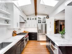


How well did the kitchen’s original layout work with your lifestyle? What improvements and changes did you make to better suit your changing needs? What makes this space unique?
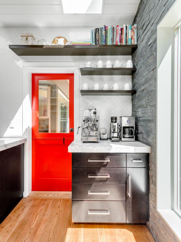
The previous layout was so cramped! Even though the actual square footage wasn’t unusually small, there was no flow to the space and the ceiling height was very low — the range hood hit you in the nose. Also, the peninsula was too large and cut into the dining area. There are now designated zones including a coffee zone, a work zone around the range, and a gathering zone on the now narrower peninsula so guests/kids feel like they are in the space without being in the way. We are constantly entertaining and even have a regular supper club, so it was important that I be able to enjoy a glass of wine with my guests while tending to what’s cooking. Also, if my husband is making breakfast for the family, I can get the morning latte started without getting in his way. Coffee is very important to Seattleites.
What was your biggest obstacle in the remodel/redesign of the kitchen, and how did you overcome it? Any memorable moments?
The most memorable moment was being six months pregnant without a functioning kitchen and a small toddler. Let’s just say there was a big push to finish the project on time.
In order to create the gable with the new pitch in the roofline, we discovered that we had to remove existing skylights in the master bathroom and the main staircase as they were too close to the new roofline. This was a big compromise in order to gain the height and light in the kitchen, and the end results are well worth the sacrifice.
Seeking design inspiration is what draws our readers in and makes them fall in love with a space. What was the inspiration for this project?
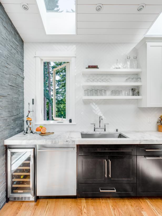
The inspiration for this project is both the era of the home and the Seattle-area location. Though the house is located in a neighborhood, there is a protected greenbelt in the rear yard with 100+-year-old trees. After designing several different floor plans, I decided on adding a large picture window at the end of the room; having cabinets in this location felt a bit like a “dead end.” The window not only provides light, but also draws you into the space — all the way from the entry of the house.
Was there a specific piece of furniture, fabric, color, texture or piece of art that was essential to bringing the design together?
There are three items that had to work in harmony (no pun intended) to make this room design work. First, I selected 2”x16” ceramic backsplash tile (a unique size) and had it installed in a herringbone pattern all the way up the 9’ wall. Second, I selected stone normally used for fireplaces to cover the entire window wall. Finally, I selected a quartzite countertop. The scale and pattern of each of these items worked together to make the space feel cohesive. The countertops have a lot of veining and movement while the tiles are neutral and a solid color. If the backsplash tile was a pattern, or even a color, it might have felt overwhelming with the countertops. The rock wall is a neutral color but is linear with different depths, adding a lot of interest but remaining timeless.
After putting a lot of time and energy into this project, what makes you proudest of the end result? What is your favorite feature, element or detail of the kitchen and why?
Honestly, it is the feeling I get by being in the space. The entire kitchen feels light and bright and is a space my whole family enjoys. It really is the heart of our home.
An addition or remodel can be tricky because you want it to blend seamlessly with the rest of the house, as if it was always there. How did you accomplish that with this kitchen?
We wanted to stay true to the midcentury era of the home, but with updates. We also wanted to make sure that the new gable pitch of the roof worked with the original roofline. We added an exposed beam, which is consistent with the era of the home, to tie in to the new roofline. Also, by adding a door and the new deck (aka barbecue heaven) the space feels like it was always there, instead of standing out from the original floor plan. The new wood floors were patched in and refinished to match the rest of the kitchen/dining space so the design flow with the rest of the house is maintained.
What makes this project uniquely yours? Is there a particular design element that you incorporate into every project you work on?
My motto is there should be one or two stars in every room and the rest should feel timeless — I never want a space to feel trendy. My designs usually have bold contrast and a pop of color, whether it is through paint, wallpaper or even fabrics. In my kitchen I painted my door bright red. I love how it adds contrast to the otherwise neutral kitchen. If I get tired of the red in a few years, it is easy to change.
Our readers love the small details. What are the “hidden gems” in your plan that really made a big difference in the overall success of your design?

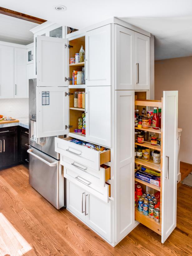
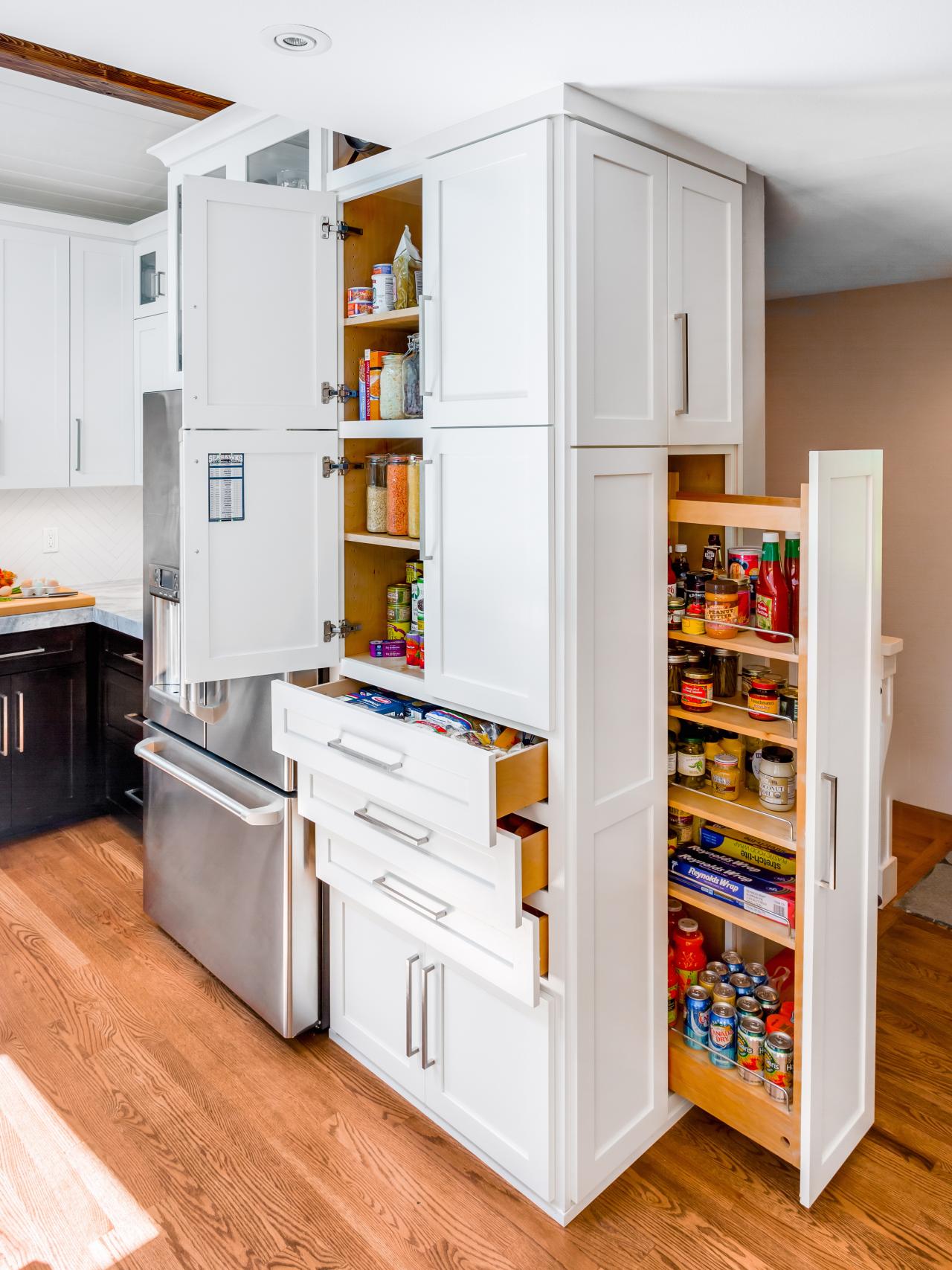
Contemporary Kitchen Storage and Pullout Pantry
A custom pullout pantry creates extra storage space in this contemporary kitchen. Plentiful drawers and cabinets help stow away other essentials while keeping them close at hand.
Photo by: Cory Holland
Cory Holland
The hidden gem in my kitchen is truly hidden: It is the pullout pantry I created. We didn’t have enough room for a walk-in pantry and I wanted to make the best use of all of the storage space I had. By designing a large pullout door on the end of my cabinet I get plenty of storage and something visually more interesting than a cabinet side panel.


