This DC Victorian — and Former Brothel — Is Now All About Clean Lines and a Unique Black-and-White Palette
Architect Sarah Snouffer of Third Street Architecture pulls off a carefully curated edit of a DC Victorian row house with loads of historic value.

Related To:

Photo By: Christy Kosnic
An Enviable Corner-Lot Row House Gets a Well-Deserved Makeover
Positioned just north of the US Capitol building, Washington, DC's Bloomingdale neighborhood is known for its Victorian row houses built by developer Harry Wardman, who constructed 180 row houses in the area between 1903 and 1908. While there are subtle architectural variations here and there, the Bloomingdale row houses stuck with a fairly consistent design, as Wardman and architects Nicholas R. Grimm and Albert H. Beers composed a formula that worked well for them. Due to the layout of row houses, their consistent design and the historic protections of the neighborhood, each row house is relatively equal in value to this day. However, a corner-lot row house is unique in that it boasts an additional long side filled with windows. In 1893, when mid-block lots were selling for $75, this corner lot sold for a staggering $200.
This is exactly what drew owners D'Artagnan Catellier and Eric Matthew Struchen away from their mid-block row house in DC's Shaw neighborhood. They teamed up with architect Sarah Snouffer of Third Street Architecture to renovate a stunning 3,984-square-foot Bloomingdale Victorian. As if its enviable corner position and rich history weren't enough to make the home noteworthy, it has a unique past that has made it the talk of the town. "We found out that it was a brothel during the 1980s and 1990s," says Sarah.
A Little Digging Uncovered an Original Front Door
The corner row house features rough-cut stone window lintels — horizontal supports above a door or window — which was a detail associated with Nicholas R. Grimm, as Albert H. Beers later opted for smooth concrete lintels when he became Wardman's primary architect in 1905. The home's exterior remains relatively unchanged, even boasting the original front door, which was once replaced. "There was an existing front door that was there from an early-2000s renovation that just did not meet the style of the home," notes Sarah. "After digging around, the original front door was found in storage in the basement. It was brought to a refinishing specialist in DC and, through a lot of time and love, the original door was put back in its rightful place." The corner row house is unique in that its front door is positioned on the long side, rather than the short front like the mid-block row houses.
A Modern Spin on a Period-Correct Victorian Vestibule
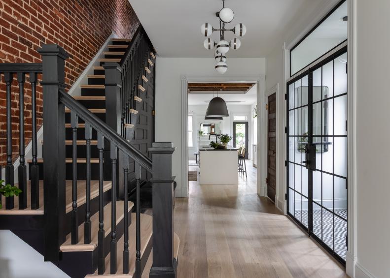
The original front doors open to an elegant vestibule with a mosaic tile floor, consistent with similar DC Victorians. While the space could've been scrapped in an effort to open up the narrow row house floorplan, Sarah instead extended it, adding a coat closet with another set of original doors found in the basement that served as a butler's double swing door in their past life. A traditional black-and-white marble tile in a modern chevron pattern was intentionally chosen to represent the home's blending of old and new.
This Renovation Combined Historic Features With Modern Touches
The goal of the renovation was clear from the start of the project. "We wanted to balance the beautiful, historic Victorian architectural features and scale of the home with the demands of modern life and a more clean, minimal aesthetic," says Sarah. Visually, this translated to preserving valuable Victorian details, such as the original paneling on the staircase that greets you upon entering the home, but editing the design through a modern, minimalistic lens. "After a few mock-ups, it became clear that the paneling needed to be a critical focal point and dramatic to stand out," she notes. The paneling was painted with a semi-gloss black. The little door leads to a broom closet that also contains the home's modem.
Peeling Back Plaster Revealed Original Brick Walls
Exposing the original brick along the stairs was a gamble. "We knew it was there, as it is standard construction in all row houses in the DC area. However, the condition of it was unknown. We peeled off small portions of the plaster and just hoped it was in good condition," explains Sarah. "Luckily in Bloomingdale, the original builders used high-grade brick on these party walls [shared walls between units] and time was good to the home, so we didn't have any large cracks that needed to be addressed."
Some Original Moldings Were Preserved, While Others Were Recreated
Impressively, this early 1900s Victorian still boasts many of its original moldings, as well as details like pocket doors and transoms. But Sarah and the team at Kraydi Builders installed recreations when necessary. "Where the original trim was in good condition, we stripped them and repainted. Where new trim was needed, we sourced trim material that matched the original," Sarah explains.
This Petite Powder Room Is Inspired by Historic Military Jackets
A petite powder room with a bold look sits next to the vestibule. "The inspiration (for the powder room) came from historic military jackets. We selected a perfect blue (Benjamin Moore Polo Blue) with brass accents to mimic the gold trim and buttons," describes Sarah. While the first floor maintains a look centered around black and white, the powder room's walls are a nod to the third floor.
An Elegant Chandelier Gives This Living Room a Beautiful Glow at Night
At the front of the row house's first floor sits a living room designed for entertaining, with plenty of flexible seating and standing room. "We wanted a more formal, yet comfortable front sitting room. This is really a focal point from the exterior at night as well, as the property is located on a corner along First Street. The Kuzco Lighting Bolla light fixtures provide a beautiful glow," says Sarah.
A Refinished Wooden Fireplace Pops Against This White Wall
The living room is dressed in bright whites and neutrals, allowing the wooden Victorian fireplace to pop. "During the 2000s renovation, [the fireplaces] were relocated from their original locations so we found new homes for them on the first floor. The wood mantel on the first floor is mahogany that was stripped and refinished onsite," explains Sarah.
Exterior Victorian Turrets Create Unique Styling Opportunities Inside
The home's Victorian architectural quirks, such as the three turrets that line the exterior, have an impact on the layout of the interior. The turrets make for small bays on each of the three floors, like mini rooms inside of the larger floorplan.
A Turret Bay Alcove Is the Perfect Spot for a Cozy Breakfast Nook
The turret bay off the kitchen serves as a small breakfast nook that's big on style. "Continuing with blending themes of historic and modern, we wanted to reference a classic European bistro table with a contemporary chair. These are from CB2 — Reign Small Round Marble Dining Table and Modernist Wood Dining Armchair Model 1532," offers Sarah. "We wanted the lighting throughout the home to really have a personality and be a statement. This is CB2’s Vesper String Light."
Uncovering Wooden Ceiling Joists Adds Organic Warmth to This White Kitchen
On the opposite side of the entry, through an original pocket door, is the fully overhauled kitchen that showcases Sarah's modern, minimalistic edit of the home. "We wanted to balance the historic characteristics of the home with a clean, minimalist kitchen cabinet design. We highlighted this by removing the drywall at the ceiling to frame the original joists and contrasted that with custom cabinetry in Benjamin Moore Chantilly Lace," says Sarah.
Track Lighting Sits Perfectly Between Exposed Joists
"Working the lighting into the kitchen ceiling was tricky because of the exposed joists. We chose a black track light so they would be as minimal as possible and require no housing units," Sarah explains. "Many people think '80s when they think of track lighting but today’s versions are minimal and meant to blend. This is WAC Lighting’s H Track system in black."
Adjustable Track Lighting Prevents Unsightly Shadows
Beyond the fitment between the joists, the track lighting offers another advantage to the space, as it allows for oversized pendants to hang above the island without casting an unsightly shadow, as would be the case with recessed lighting. "[The track lights] provide far more flexibility than recessed lighting," says Sarah."We can direct the lights to avoid the shadowing effect."
This Kitchen's Design Is All About the Subtle Details
The soft white paint used on the cabinets nearly matches the Caesarstone Cloudburst Concrete backsplash and countertop, which adds subtle textural variation to the monochromatic vignette. Sarah says she opted for a slab door with a rounded edge profile "to add another layer of detail without being too heavy."
A Dark Island Offers Contrast to a Mostly White Kitchen
Sarah then breaks away from the subtle approach to make a stark visual statement with the island, which is topped with Silestone Et Marquina, a durable engineered stone reminiscent of black Spanish marble.
Custom Black Shelving Match the Custom Vestibule Doors
Opposite the range wall is a wet bar fitted with open shelving rather than closed cabinetry. "After looking at many options, we felt that fully closed cabinetry on the wet bar side was too heavy for the space," notes Sarah. "That’s where the custom black metal and glass shelves came in, continuing the materials from the vestibule entry doors."
A Historically Protected Exterior Dictates This Home's Interior
The tiny window above the wet bar sink was preserved in order to maintain the historic exterior. "This is an original window that was painstakingly refinished. Because Bloomingdale is a historic neighborhood, we needed to keep the original features of the exterior," explains Sarah.
Clients' Needs Turn a Dining Room Into a Sitting Room
Behind the kitchen at the rear of the first floor is a sitting room that acts as a natural extension of the open kitchen. "Others may treat this space as a formal dining room, but we wanted to create a more casual seating option off the kitchen," offers Sarah in keeping with the homeowners' casual entertaining style.
An Alcove Bar Takes the Party to the Third Floor
The party continues to the third floor, where a dreamy alcove bar awaits just at the top of the stairs — a space where D'Artagnan and Eric can whip up their beverages of choice, old fashioneds and mezcal margaritas, without the trek to the first-floor wet bar.
Walnut and Dark Countertops Give This Built-In Bar Moody, Masculine Looks
Sarah describes the bar's inspiration as a combination of "midcentury, Mad Men and masculine," concocting the look by installing a luxe Caesarstone Vanilla Noir quartz countertop, then wrapping the alcove in walnut.
This Third-Floor Den Has a Moody, Masculine Vibe
The luxe, masculine look continues in the den and primary suite on the third floor. Walls and trim finished in Benjamin Moore's Gentleman's Gray provide a velvety backdrop for rich leather sofas and walnut appointments.
Third-Floor Windows Offer Prime DC Views
The windows on the third floor boast a view of the US Capitol building, as well as the surrounding Bloomingdale Victorians.
Heavy Trim Turns Ordinary Closets Into Faux Built-In Cabinetry
In the bedroom, Sarah installed new drywall closets, then built them out with heavier trim to mimic built-in cabinetry. This clever trick gives a distinguished look to an often utilitarian bedroom feature.
A Warm Walnut Bench Creates Hidden Storage Beneath This Window
For even more stylish storage, Sarah designed a custom walnut bench beneath the window with a butcher-block top that lifts to reveal storage space below.
Light White Oak Flooring Balances These Dark Walls
Sarah opted for white oak flooring finished with Bona NaturalSeal, the same hardwood flooring found throughout the home. The lighter flooring balances the effect of the dark walls and trim, joining the white ceilings in keeping the space feeling light and clean.
Space-Themed Wallpaper Helps Homeowners Display Their Personalities
For the third-floor powder room, the homeowners stayed true to the dark walls, but used wallpaper to show off their personalities. "We wanted something inspired by midcentury and geometric patterns," explains D'Artagnan. "This wallpaper evoked our interest in travel and maps but also gave us some whimsy and adventure in a small space. The paper is Engblad & Co Orbit Navy Celestial Paper."
This Main Bathroom Has a Spa-Like Feel
A step into the main bathroom feels more like venturing into a spa than a bathroom. "The design was definitely a collaboration between us and our architect," says Eric. "The overall idea was spa-like with the steam shower and soaking tub but it needed to fit into a tight bay," as the bathroom is positioned inside one of the home's many turret bays.
Historic Architecture Makes for Extra-Thick Shower Walls
You'll immediately notice the abnormally thick walls in the shower bay. This isn't just for looks, but a result of the home's historic architecture. "The walls are that thick because of the 1880s construction techniques and today’s needed insulation," explains Sarah. Tack on the necessary infrastructure to waterproof the shower and install tile, and you're left with extra-thick walls. "But it provides deep sills for all things storage," she adds.
Acid Etch Film Creates Privacy Without Window Coverings
Like many spaces on the third floor, the spacious shower boasts large windows with grand views, so there was no desire to cover them up. "We have added an acid etch film to the windows to bring in light but give privacy," says Sarah. Now the owners can enjoy sun-soaked showers with full privacy.
These Large Porcelain Tiles Mimic Marble Slab Walls
Large-format, 24" by 48," Architessa Himalaya in Dolomite porcelain tiles with a traditional marble look cover both the walls and ceiling, contrasted by modern black hardware. The use of extra-large tiles with coordinated grout is reminiscent of luxurious marble slab walls but at a much more accessible price point.
Custom Drawer Fronts Overhaul These IKEA Vanities
A walnut vanity ushers in a welcome warmth to the bright space. The sleek floating vanity is actually comprised of two IKEA vanities fitted with SemiHandmade walnut fronts. The end result is a luxurious and modern vanity look at a fraction of the price of comparable items.
This Second Floor's Color Palette Bridges the First and Third Floors
Bridging the bright white look of the first floor with the dark and moody aesthetic found upstairs is the second floor. The darkening color gradient of the three floors was an intentional part of the home's overall design. "We knew we wanted a bright, white-and-black aesthetic on the first floor and a more moody, private, masculine feeling on the third floor. The second floor really bridges those two ideas as a gradient and softens the transition," explains Sarah.
Spacious Ensuite Gives Guests a Getaway Experience
The second-floor houses an office as well as space for guests, with an ensuite that's spacious and private, with a design focused on creating a relaxing getaway experience for overnight guests.
A Massive Bathroom Is Split Up Into Two
"The existing second floor had a massive — I mean massive — bathroom that took up about a third of the floor," notes Sarah. "We split that bathroom up into two bathrooms — one became an attached bathroom for the ensuite and a second became a hall bathroom."
This Guest Bathroom Makes Guests Feel Like They're on Vacation
The aesthetic inspo for the guest bath was "clean, functional and welcoming. We wanted guests to feel at home, or — even better — on vacation at a great hotel, in their own spaces," offers Sarah. To achieve this, she employed soothing neutrals, luxurious finishes and organic details like the woven pendant above the vanity.
Neutral Finishes Tie This Ensuite Bathroom Into the Second Floor's Look
The floating vanity is reminiscent of the one found on the third floor, yet features fronts that are tailored to the second floor's color palette. Sarah chose Architessa Code in Chalk for the flooring, a soft-gray porcelain tile with a subtle texture to reduce slipping.
This Designer Encourages Wall-to-Wall Shower Niches Whenever Possible
The guest shower's most noteworthy feature is the enviable wall-to-wall niche, which adds to the home's modern, minimalistic inclusions. "When you can, run the niche from wall to wall for a more modern look," says Sarah. "This niche is 60 inches long, 4 inches deep and 12 inches high. Overall, anything new, we wanted a very edited design. Reducing the frame around a typical shower niche was one thing that was edited."
Shower Niches Are Great Opportunities for Creating Contrast
This textured porcelain tile (Architessa Stone Run Dark Rullata in natural) shower niche offers loads of contrast to the smooth white tile lining the shower walls. Shower niches are great opportunities for creating visual contrast with color, pattern, texture or all three.
A Half-Glass Splash Guard Gives This Bathroom a Minimalistic Look
To both show off the niche and avoid the heavy look of curtains and sliding shower doors, the choice was made for a minimalistic half-glass splash guard. "The half-glass splash guard is more than enough for this bathroom configuration to avoid water splatter," says Sarah.